Category: Uncategorized

  • A Guide to Accessible Menu Browsing That Works

    A Guide to Accessible Menu Browsing That Works

    A restaurant menu should help you choose a meal, not make you work for one. Yet tiny type, vague descriptions, cluttered ordering screens, and missing photos can turn a simple dinner decision into a frustrating guessing game. This guide to accessible menu browsing is for anyone who wants more clarity before spending money, whether you use a screen reader, experience decision fatigue, manage food allergies, or simply want to know what your meal will actually look like.

    What Accessible Menu Browsing Should Feel Like

    Accessible menu browsing is about being able to find, understand, and compare dishes in a way that works for you. It is not one feature or one type of diner. A person with low vision may need readable text and useful image descriptions. Someone who is overwhelmed by too many choices may need simple categories and clear portion details. A diner with dietary restrictions needs ingredient information they can trust.

    The common thread is confidence. You should be able to answer a few basic questions before you order: What is this dish? What comes with it? How large is it? How is it prepared? Does it fit my needs? And, when a photo is available, does it look like something I actually want to eat?

    Restaurants do not always provide every answer. That is why it helps to approach menus with a few practical habits and use more than one source of information when needed.

    Start With Your Own Decision Criteria

    Before opening a delivery app or scanning a QR code at the table, know what matters most for this meal. Maybe you are looking for something filling under a certain price, a dish without a specific allergen, or a meal that feels familiar after a long day. These priorities give you a filter when the menu gets noisy.

    For decision fatigue, narrow the field early. Choose a category first, such as bowls, sandwiches, or pasta, rather than reading every item in order. Then compare just two or three options based on the details that matter to you. More choices do not always create more freedom. Sometimes they create more stress.

    If you have accessibility or dietary needs, keep a short note on your phone with your go-to questions. For example: Is the sauce included? Can the topping be removed? Is the entrée spicy? Is there a gluten-free preparation method? Having the wording ready makes it easier to get a direct answer from restaurant staff.

    Make the Menu Easier to Read

    A digital menu can be more flexible than a printed one, but only if you use the tools available to you. Increase text size instead of straining through small type. Use your device’s zoom, display settings, or screen reader controls when an ordering page does not present information clearly. If the menu is a PDF, try viewing it in a reader that lets you enlarge text and move through sections more comfortably.

    Color alone should never be the only way to communicate information. A red icon for spicy food or a green icon for vegetarian food can be helpful, but the label should also be written out. The same goes for allergen symbols. If an icon is unclear, ask before ordering rather than making an assumption.

    Look for descriptions that answer real questions

    The most useful descriptions name the core ingredients, cooking method, portion cues, and major add-ons. “House special chicken” may sound appealing, but it leaves a lot unanswered. “Grilled chicken thigh with rice, roasted vegetables, and a garlic herb sauce” gives you something concrete to assess.

    When details are missing, look for patterns elsewhere on the menu. If every entrée includes a side, the restaurant may list those choices in a separate section. If multiple dishes use the same sauce or protein, one fuller description may clarify another. This is not a perfect substitute for clear menus, but it can reduce the guesswork.

    Use Photos as Information, Not Just Inspiration

    Food photos can do more than make a dish look tempting. An authentic image can show portion size, plating style, ingredient balance, texture, sauce level, and whether a meal matches the description in your head. That is especially valuable when the written menu uses unfamiliar terms or broad labels.

    Still, photos have limits. A polished promotional image may not show the standard portion, available substitutions, or what arrives after a long delivery trip. Lighting can change color, and a photo cannot confirm ingredients or food safety. Treat images as one useful piece of evidence, then pair them with the written description and any questions you need to ask.

    For diners who are blind or have low vision, images need meaningful descriptions to be useful. “Photo of food” does not help much. A helpful description might identify the dish, its visible components, container or plate size, and how it is presented. Good visual access means providing context, not simply attaching an image.

    Pic-ture That!™ is built around this idea: real meal photos can reduce uncertainty when they are accurate, community-powered, and connected to the dish someone is considering. Seeing what other diners received can make a menu feel far less abstract.

    A Guide to Accessible Menu Browsing Before You Order

    Once you have found a likely dish, pause for a quick confidence check. Read the full description rather than the item name alone. Confirm the price and whether sides, protein choices, or sauces cost extra. Check whether modifications are allowed, and make sure your selected changes appear in the final cart before payment.

    This step matters because restaurant ordering systems can hide important choices behind small buttons, drop-down menus, or default selections. A side of fries, a spicy sauce, or a paid add-on may be preselected. If a screen reader announces controls unclearly or the app does not show your choices in plain language, consider calling the restaurant directly. A short conversation can be more accessible than fighting a confusing checkout flow.

    For allergy-related needs, be specific and realistic. A menu label such as “nut-free” may describe ingredients but not cross-contact procedures. Ask whether the kitchen can accommodate your need, and decide based on the answer. Accessible browsing supports informed choices, but it should never pressure anyone to take a risk they are not comfortable taking.

    At the Restaurant, Ask for the Format You Need

    QR-only menus can create barriers when phones are low on battery, internet service is weak, or the page is difficult to navigate. You can ask for a printed menu, a staff member to read options aloud, or a clear explanation of a category you are considering. These are reasonable requests, not inconveniences.

    Be direct about the information you need. Instead of asking, “What is good?” try, “Which chicken dish is mild, comes with vegetables, and has the sauce on the side?” Specific questions usually lead to useful answers. If you are choosing between two dishes, ask staff to compare portion size, spice level, or preparation.

    If you are dining with friends, give yourself permission to take the time you need. Fast ordering culture can make people feel rushed, but a confident choice is worth an extra minute.

    Help Build Menus That Work for More People

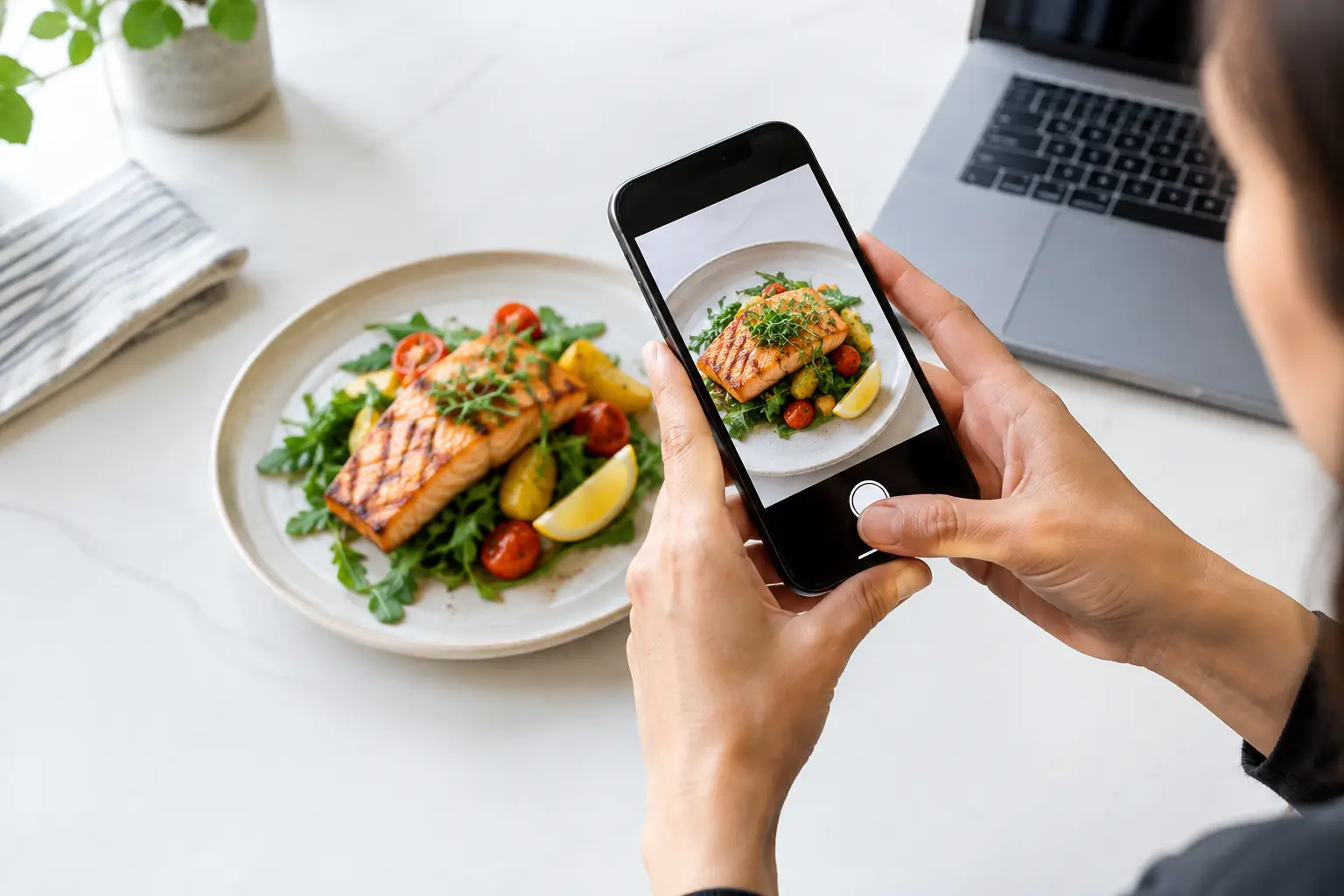
    Accessible dining gets better when diners share useful information. If you upload a meal photo, aim for clarity over perfection. Show the full plate when possible, use natural lighting, and make sure the photo matches the item name. A quick note about portion size, visible ingredients, or a successful modification can help another person decide with less stress.

    Authenticity matters here. A slightly imperfect photo of the actual meal can be more valuable than a heavily edited image that sets the wrong expectation. Community contributions make room for more menu coverage, more perspectives, and more people who need a better way to choose.

    The next time a menu leaves you guessing, look for the details that turn a name on a screen into a real meal. Clear information is not a luxury. It is how more people get to order with confidence, enjoy what arrives, and feel included at the table.

  • Trends in Restaurant Menu Technology That Matter

    Trends in Restaurant Menu Technology That Matter

    A menu used to be a list of names, ingredients, and prices. Now, trends in restaurant menu technology are changing that basic experience into something more visual, personal, and useful. For diners, the biggest shift is simple: less guessing before spending money on a meal.

    That matters when a dish description is vague, a menu is long, or an order is a treat you do not want to get wrong. It matters for people with visual impairments, people managing dietary needs, and anyone who has felt decision fatigue while scrolling through 40 menu items. The best menu technology does not add screens just for the sake of it. It gives people clearer information and more control.

    Trends in restaurant menu technology are shifting the menu

    Restaurant technology often gets framed around speed: faster ordering, quicker payment, shorter lines. Those benefits are real. But the more meaningful change is about confidence. Diners want to know what they are getting, how a dish is prepared, whether it fits their needs, and whether the portion looks worth the price.

    Restaurants are responding with digital menus that can do more than a printed card ever could. The opportunity is not to replace hospitality with a QR code. It is to make the menu easier to understand before a guest has to flag down a server, commit to an order, or deal with a disappointing surprise.

    Real food photography is becoming decision-making information

    Food photos are no longer just promotional content for a restaurant’s social feed. Increasingly, they are part of the ordering experience. A clear image can answer questions that text cannot: Is the sandwich stacked or open-faced? Does the salad look filling? How much sauce comes with the entrée? What does “loaded” actually mean?

    Authenticity is the key. A heavily styled studio image may look beautiful, but it can create another kind of uncertainty if the meal that arrives looks nothing like it. Diners are looking for photos that represent the dish they are likely to receive, including portion size, presentation, and meaningful details.

    Community-powered photos have a role here because they show food in real dining situations. They are not perfect, and photo quality needs thoughtful standards, but they can help build a more honest picture of a restaurant menu. Platforms such as Pic-ture That!™ are built around this idea: seeing real meals before ordering can make dining more transparent and less stressful.

    Accessibility is moving from an afterthought to a menu standard

    A digital menu is not automatically accessible simply because it appears on a phone. Tiny text, poor color contrast, image-only menus, inaccessible QR code flows, and confusing navigation can all create barriers. Good menu technology is designed for different ways of seeing, reading, processing, and ordering.

    For guests with visual impairments, useful features can include screen-reader-friendly menu structure, descriptive image text, adjustable text size, high contrast, and clear labels for dietary details. Visual dish images can also support confidence for guests who benefit from more context, but images should complement accessible text rather than replace it.

    Accessibility helps more people than many restaurants realize. Clearer layouts support older guests, people ordering in bright sunlight, customers using cracked phone screens, and anyone trying to make a quick choice while juggling a busy day. When menus are easier to use, more people can participate fully in the dining experience.

    AI can improve discovery, but it cannot replace accuracy

    Artificial intelligence is appearing across restaurant ordering, from recommendations to chatbot support and menu descriptions. Used carefully, it can help diners narrow choices based on preferences such as spice level, ingredients, dietary restrictions, or past orders. It can also help restaurants organize menu data that changes frequently.

    Still, AI has a clear limit: it should not invent details about food. A generated description that wrongly identifies an ingredient or overpromises a portion can create a bad experience fast. The same applies to AI-generated food imagery. If a picture is not an accurate representation of the dish, it may be visually appealing but it is not useful menu information.

    The better use case is assistance, not substitution. Technology can help guests find relevant options, translate complex menu language, or surface verified photos. Restaurants still need accurate data, human review, and a clear way to communicate when an item has changed.

    Better menus connect dietary information with real choices

    Allergen and dietary filters are becoming more common, and they can be genuinely helpful. A diner looking for vegetarian, gluten-conscious, dairy-free, or nut-free options should not have to decode every description alone. But filters must be handled carefully, especially when cross-contact or kitchen practices are involved.

    The strongest menus distinguish between ingredient-based information and safety guarantees. For example, a menu can identify dishes made without a particular ingredient while clearly stating when a shared kitchen may create cross-contact risk. That kind of clarity respects diners instead of giving false reassurance.

    Visuals can make these filters more useful, too. A person may know a dish is vegetarian but still want to see whether it is a substantial meal or a small side. Technology works best when it brings the practical details together: ingredients, preparation notes, price, image, customization options, and plain-language context.

    QR codes are evolving past the basic PDF

    The QR menu is here to stay, but the basic PDF version has obvious limits. It is often hard to read on a small screen, difficult to search, and frustrating for guests who need larger text or assistive technology. It also does little to help a diner compare options quickly.

    More useful digital menus are searchable, organized by category, easy to update, and designed for mobile screens from the start. They can show photos where photos answer real questions, offer language options, and allow guests to save favorites for later. For a restaurant, updates can happen without reprinting menus every time a seasonal dish changes or an ingredient runs out.

    There is a trade-off, though. Not every guest wants to scan a code, download an app, or use a phone at the table. Restaurants should keep a human-friendly alternative available, whether that is a printed menu, staff assistance, or both. Choice is part of accessibility.

    Personalized ordering should feel helpful, not intrusive

    Menu technology can learn what a guest tends to enjoy and make future ordering easier. Someone who regularly chooses spicy dishes may appreciate a recommendation. A customer who avoids shellfish may want those options filtered out by default. Personalization can reduce decision fatigue when it is transparent and easy to control.

    But diners should not have to trade privacy for a decent menu experience. Restaurants and platforms need to be clear about what information is collected, why it is used, and how users can change their settings. The most trusted tools give guests useful choices without making them feel watched.

    The community is becoming part of menu coverage

    No restaurant can photograph every dish in every variation, especially when menus change often. That creates room for diners to help build a fuller, more current view of what is being served. Community contributions can add fresh photos, flag outdated items, and show how meals look across locations and seasons.

    For this model to work, contributors need a reason to participate and the platform needs quality controls. Rewards such as restaurant gift cards can recognize the value of a useful upload. At the same time, clear photo guidelines, moderation, and item matching help keep the information trustworthy.

    This is bigger than sharing food for likes. It is a way for diners to help other diners make better choices. One clear photo of a meal can save someone else from ordering blind.

    What restaurants should prioritize next

    The smartest restaurant menu technology will not be the flashiest. It will be the technology that removes friction without removing choice. Start with accurate menu data, readable mobile design, and meaningful accessibility features. Then add visuals and personalization where they genuinely improve a guest’s decision.

    A beautiful interface cannot make up for a confusing menu, inaccurate photo, or inaccessible checkout flow. Restaurants should also measure more than clicks. Are guests finding what they need? Are they ordering with fewer questions? Are fewer meals being sent back because expectations did not match reality?

    The future of the menu is not about making every dining decision automatic. It is about giving every diner a clearer view of their options, so the next order feels less like a gamble and more like their choice.

  • Best Ways to Judge Portion Size Before Ordering

    Best Ways to Judge Portion Size Before Ordering

    A menu can tell you that a pasta dish is “hearty,” a salad is “shareable,” or a dessert is “generous.” But those words do not answer the question that matters when you are hungry and spending your money: How much food will actually arrive? The best ways to judge portion size combine practical menu-reading habits with something far more useful than a description alone – seeing the real dish before you order.

    Portion size is not just a nutrition question. It affects your budget, your appetite, your ability to share, and whether you leave dinner feeling satisfied or disappointed. For people with visual impairments or decision fatigue, vague menu language can make that uncertainty even more frustrating. A clearer picture helps make ordering feel like a choice, not a gamble.

    Start With the Dish Category, Not the Dish Name

    A restaurant’s idea of a “bowl,” “plate,” or “entrée” varies widely. One grain bowl may be a light lunch; another may be large enough for two meals. Before deciding, look at the category the dish lives in and compare it with the rest of the menu.

    A side of fries, for example, may be listed separately because it is meant to supplement a sandwich. If the same restaurant calls fries “loaded” or prices them close to an entrée, it may be a much larger portion. Likewise, an appetizer can be bigger than an entrée at a tapas-style restaurant, while an entrée at a fine-dining spot may be intentionally more restrained.

    Price can offer a clue, but it is not a measuring cup. A higher price may reflect premium ingredients, preparation time, or location rather than more food. Use it as one signal, then look for others.

    Read Menu Words as Portion Clues

    Restaurants often reveal more than they realize through their wording. Phrases like “single,” “half,” “personal,” or “individual” usually suggest one serving, although that serving may still be substantial. “For the table,” “family-style,” “platter,” “sampler,” and “feeds two” are stronger clues that sharing is expected.

    Pay attention to counts and weights when they appear. Three tacos, six wings, an eight-ounce steak, or a 12-inch pizza gives you a starting point. Still, numbers need context. Three street-style tacos are very different from three oversized tacos filled with rice, beans, meat, cheese, and toppings.

    Descriptions also hint at how filling a dish may be. A meal with protein, starch, sauce, cheese, and fried components will often feel more substantial than one built around greens or broth. That does not mean one is better than the other. It simply helps you order for the appetite you actually have.

    Watch for vague words

    “Large,” “small,” “light,” and “hearty” are subjective. A restaurant may call a 16-ounce soup “small” because it comes in a cup, while another serves a smaller bowl as a full meal. Treat these labels as invitations to look for details, not as dependable measurements.

    Use Real Food Photos to Find Scale

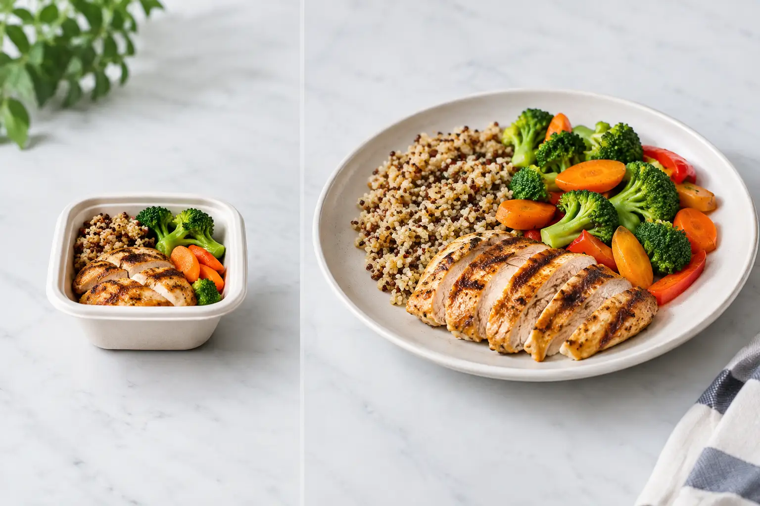
    A photo becomes truly helpful when it shows more than a close-up of melted cheese or a perfectly placed garnish. Look for visual reference points: the rim of the plate, a fork, a drink, a hand, a takeout container, or other dishes on the table. These details make it easier to estimate whether you are looking at a snack, a standard meal, or something built for sharing.

    Multiple customer photos are even better. One polished image can be misleading because of camera angles, cropping, or styling. Several real photos show whether the dish is consistently piled high, whether the container is shallow, and whether the portion changes between dine-in and takeout.

    Photos also answer questions menus often miss. Is the burger tall enough to require two hands? Are the noodles mostly vegetables or a generous mound of pasta? Does the “side salad” fill a small cup or arrive on a full plate? Those are practical details that affect whether an order feels worth it.

    Pic-ture That!™ is built around this kind of menu transparency: real images that help diners see what they are choosing before money is spent. Clear dish photos can reduce uncertainty for anyone, while making restaurant decisions more accessible for people who need visual information to order confidently.

    Compare the Portion to What You Already Know

    Your own dining history is one of the best measuring tools. Think about meals you have finished comfortably, meals that became next-day leftovers, and meals that left you searching for a snack an hour later. Use those memories to set a personal baseline.

    If a restaurant’s burrito looks similar in size to one you usually split, plan to split it. If a rice bowl appears to have the same volume as a meal that reliably gives you lunch tomorrow, factor leftovers into the decision. This is more accurate than following a generic rule because appetites, dietary needs, and meal timing differ.

    It also helps to consider what else you are ordering. A shared appetizer, bread basket, drinks, or dessert can turn a normal entrée into too much food. On the other hand, if you are ordering one small item after a busy day, a larger portion may be exactly what you want.

    Judge the Container, Not Just the Food

    Takeout containers can create a false impression. Food packed tightly into a small container may be more filling than a loosely arranged dish on a large plate. A wide bowl can look sparse in a photo even when it holds a satisfying amount, while a tall cup can hide a surprisingly small serving.

    When you see a photo, notice how much of the container the food occupies. Is the box filled to the edges? Does the dish cover the plate or sit in the center with lots of empty space? Is there a second container for sauce, sides, or toppings? These clues tell a more complete story than the camera angle alone.

    For items such as fries, wings, dumplings, and chips, count what you can see. For soups, smoothies, and grain bowls, compare the vessel to a familiar coffee cup, cereal bowl, or meal-prep container. You are not trying to estimate every ounce. You are trying to avoid an unpleasant surprise.

    Ask the Restaurant One Specific Question

    If the menu and photos still leave you unsure, ask a short, direct question before ordering. “Is this enough for one hungry person?” or “Would you say this side is shareable?” is more likely to get a useful answer than “How big is it?”

    For delivery, a quick call can be worthwhile when the order is expensive, when you are feeding multiple people, or when you have a dietary need that makes a disappointing meal especially difficult. Staff may not know exact measurements, but they often know which dishes customers commonly share and which ones generate leftovers.

    If you are dining with friends, asking at the table can work too. Servers regularly see portions leave the kitchen and may point you toward the better fit. Just remember that “enough” depends on the person. Give context when you can: one person, two people, light lunch, or full dinner.

    Plan for Satisfaction, Not Perfection

    There is no single correct portion size. A big serving may be a great value when you want leftovers. A smaller plate may be right when you want to try several dishes, save room for dessert, or avoid carrying food around afterward. The goal is not to order the most food. It is to order with fewer surprises.

    Before you tap checkout, take ten seconds to match the dish to the moment. Are you eating now, sharing, saving some for later, or building a meal from several small plates? Pair that answer with menu details and real photos, and you will make a far more confident call.

    The next time a menu uses a word like “generous,” let the image, the container, and your own experience define what generous means for you.

  • How to Order With Visual Cues at Restaurants

    How to Order With Visual Cues at Restaurants

    A menu says “crispy chicken sandwich.” But is it a thin fried cutlet or a thick, heavily breaded filet? Is the sauce drizzled on top or piled inside? Are the fries a full side or a few pieces tucked beside the sandwich? Those details can decide whether a meal feels worth the price.

    Learning how to order with visual cues gives you more control before you spend. Photos, menu layout, portion clues, colors, and ingredient placement can help you move beyond a vague description and choose food that actually fits your appetite, preferences, access needs, and budget.

    Start With the Dish, Not the Marketing Name

    Restaurant names are designed to sound appealing, not necessarily precise. Words like “loaded,” “house-style,” “classic,” and “signature” can mean very different things from one restaurant to another. A visual cue helps translate the name into something more useful: what is actually on the plate?

    When you can view a real photo of a dish, look first at the main component. Notice its size relative to the plate, bowl, utensils, or side dishes. A wide, shallow bowl may make a pasta serving look larger than it is. A stacked burger might photograph beautifully but still be difficult to eat. A salad may appear generous because of leafy greens while offering little protein or substance.

    Then look at what takes up the most space. If rice, fries, bread, or noodles dominate the plate, that tells you something different than a meal centered on vegetables, seafood, or meat. There is no universally right choice. The point is to order what you actually want, with fewer surprises at the table.

    How to Order With Visual Cues That Matter

    A food photo is most helpful when you know what to scan for. Instead of judging a dish only by whether it looks delicious, use the image to answer a few practical questions.

    Check portion and plate scale

    Look for familiar objects: a fork, a beverage glass, a ramekin of sauce, or the edge of a standard dinner plate. These give context that a close-up image cannot. A single taco on a large plate may be a snack-sized order. Three generously filled tacos may be enough for a full meal.

    Portion needs vary. You may be looking for leftovers, a light lunch, a shareable appetizer, or a meal that will keep you full through a long day. Visual information makes it easier to match the order to that moment.

    Read the toppings and sauces

    Menu descriptions often mention a sauce without explaining how much is used. A photo can show whether dressing is served on the side, lightly brushed over the food, or covering the entire dish. That matters for people avoiding certain ingredients, managing sensory preferences, or simply trying not to order something soggy or overly rich.

    Pay attention to hidden layers, too. Cheese, mayo, pickled vegetables, slaw, and spicy sauces may be visible in a cross-section or spread throughout the dish. If the photo leaves questions, ask the restaurant directly. Visual cues should support your decision, not replace a needed ingredient or allergy conversation.

    Notice texture before you order

    Texture is one of the biggest reasons a meal can disappoint. A menu may call something “crunchy,” but a photo can reveal whether the coating looks crisp, heavily battered, or softened by sauce. You can often spot char marks, creamy textures, thick broths, toasted bread, fresh herbs, and the difference between a chunky salsa and a smooth puree.

    This is especially useful if you have sensory preferences or decision fatigue. Choosing from a photo can feel more concrete than trying to build a mental image from a paragraph of menu language.

    Compare similar dishes side by side

    If you are choosing between two burgers, bowls, or entrées, compare the visuals instead of rereading both descriptions ten times. One bowl might have more vegetables, another might have more protein, and a third might be mostly grains with a small garnish. Similar prices do not always mean similar value for your needs.

    Look at the balance of the plate, not just the hero ingredient. This is where authentic diner photos can be more useful than heavily styled promotional images. You want to see what is likely to arrive, not only the version created for an advertisement.

    Use Visual Information Alongside Menu Details

    Photos bring clarity, but they are only one part of an informed order. The strongest decisions combine what you can see with what the menu tells you and what you know about yourself.

    For example, an image may show that a dish includes plenty of vegetables, while the written description confirms whether they are roasted, raw, or cooked with butter. A photo may show a large-looking bowl, while the price helps you decide whether it fits your plans. If you have a food allergy, dietary restriction, or medical requirement, written ingredient information and staff confirmation remain essential.

    This matters for accessibility, too. Images are valuable for many diners, but images without useful descriptions can exclude people who use screen readers or have low vision. A truly accessible ordering experience offers more than a photo: it provides clear dish names, accurate descriptions, readable text, helpful contrast, and image descriptions that communicate the same key details.

    If you are dining with someone who needs support, describe what is visually clear in practical terms. Instead of saying, “It looks good,” say, “The salmon is a full filet with roasted potatoes and green beans. The sauce is served over the fish.” Specific details give everyone a more equal chance to choose with confidence.

    Know When a Photo Can Mislead You

    Visual cues are powerful, but they are not perfect. Lighting can make food look brighter, crispier, or more colorful than it appears in person. A photo may feature extra garnishes, use a larger serving than the current restaurant portion, or show a dish before a recipe change.

    Community photos can also vary in quality. That is not always a drawback. A slightly imperfect image from a real meal may tell you more about portion size and presentation than a polished studio shot. Still, compare multiple photos when possible, especially for a higher-priced meal or a dish you are ordering for the first time.

    Timing matters as well. A photo of brunch from two years ago may not reflect today’s menu. Seasonal ingredients, new chefs, supply changes, and restaurant updates can all affect what arrives. Treat visual cues as evidence, not a guarantee.

    Make Your Next Order More Confident

    Before you add a dish to your cart or signal the server, pause for a quick reality check. Can you tell what the main ingredient is? Do you understand the likely portion? Can you see where the sauce, sides, and toppings are? Does the dish look like it will meet your hunger level and preferences?

    If the answer is no, choose a different option, look for another image, or ask one clear question. “Is the sauce mixed in or on the side?” and “Is this enough for one person?” can save you from an expensive guess.

    Apps such as Pic-ture That!™ are built around that simple idea: people deserve to see more clearly before they order. Real meal photos can reduce the uncertainty that text-only menus leave behind, while community contributions help the next diner make a better choice.

    Share the Clarity When You Can

    If you receive a meal that looks true to its photo, you have useful information. If it looks very different, that information matters too. Sharing an accurate picture of a dish can help someone decide whether the portion works for them, whether the ingredients match their preferences, or whether a restaurant is a good fit for their access needs.

    The best visual cue is not the most dramatic photo. It is the honest one: clear enough to show the real meal, recent enough to be useful, and specific enough to help another person order with less uncertainty. That kind of transparency makes dining feel more welcoming, one plate at a time.

  • 7 Best Tools for Accessible Dining Today

    7 Best Tools for Accessible Dining Today

    A menu can ask a lot of a diner. Picture a dish from a few words. Compare prices, portions, and ingredients. Decide quickly while the line moves or friends wait. For people with visual impairments, sensory sensitivities, dietary restrictions, mobility needs, or decision fatigue, that uncertainty can turn a simple meal into work. The best tools for accessible dining make the information clearer before an order is placed.

    Accessible dining is not one feature or one kind of customer. A wheelchair user may need reliable entrance and restroom details. A screen reader user needs a menu that can be navigated and read aloud. Someone managing food allergies needs answers they can trust. And plenty of diners simply want to see what they are paying for before committing to an unfamiliar dish.

    The most useful tools put choice back in the diner’s hands. Here are seven worth bringing into your next restaurant search.

    1. Real dish-photo platforms

    Text-only menus leave too much to imagination. Is the pasta a small appetizer portion or a generous bowl? Does “spicy” mean a light kick or a meal built around heat? Is the salad dressed heavily, topped with ingredients you avoid, or presented in a way that works for your sensory preferences?

    Real photos provide context that descriptions often miss. They can show portion size, ingredients, sauces, textures, plating, and how a meal actually arrives at the table. For diners with visual impairments, accurate images paired with useful descriptions can add another layer of information. For anyone experiencing decision fatigue, a photo can make the choice feel much faster and less risky.

    The key word is real. Heavily styled promotional photos can be useful, but community photos often better reflect what a guest will receive. Pic-ture That!™ is built around this idea: helping diners view authentic meal photos before ordering while inviting the community to add coverage and earn restaurant gift cards.

    2. Screen readers and built-in phone accessibility settings

    Your phone already includes powerful accessibility tools, and they can change the restaurant experience. VoiceOver on iPhone and TalkBack on Android read on-screen content aloud and help users move through apps, menus, reservation pages, and payment screens. Magnification, larger text, high contrast, color filters, and voice control can also make a small screen easier to use in a dim restaurant or on the go.

    These settings work best when a restaurant’s digital menu is designed well. Clear headings, logical button labels, readable text, and image descriptions matter. A PDF menu that looks polished but cannot be searched or navigated with a screen reader creates a barrier, not a solution.

    Before relying on a restaurant’s ordering page, take a quick look at how it behaves with your preferred settings. If it is difficult to navigate, calling ahead or using a platform with more usable menu information may save frustration later.

    3. Maps with accessibility details and recent reviews

    Maps are more than directions. They can help answer the practical questions that decide whether a restaurant is actually workable: Is there step-free entry? Is the doorway wide enough? Is accessible parking nearby? Is there an accessible restroom? Can a service animal be accommodated?

    Reviews and recent customer photos can fill gaps that a pin on a map cannot. Look for details about ramps, elevators, seating layout, noise level, lighting, and curb access. The most recent feedback is usually more valuable than a vague review from three years ago, especially when a restaurant has moved, remodeled, or changed its patio setup.

    Treat user reviews as helpful leads, not guarantees. Accessibility conditions can vary by entrance, time of day, staffing, and temporary obstacles. When one detail will make or break the visit, a quick call to the restaurant is still a smart move.

    4. Reservation tools with a notes field

    A reservation tool can be an accessibility tool when it lets diners share needs before arrival. Notes such as “step-free seating requested,” “space needed for mobility device,” “quiet table if available,” or “screen reader user may need menu support” give staff a chance to prepare instead of scrambling at the host stand.

    Be specific without feeling pressured to share more than you want. A short request is often enough. For example, asking for a table with clear access from the entrance is more actionable than writing only “accessible seating.” If your need is essential, follow up by phone. Digital notes can be missed, particularly during a busy shift.

    The trade-off is that reservation platforms only pass along the information. The restaurant still has to act on it. Choose places with a reputation for responsive service, and give them enough lead time when possible.

    5. Allergy and ingredient tools

    For diners managing allergies, celiac disease, diabetes, religious dietary requirements, or other food needs, menu filters can be a helpful starting point. They can narrow a long menu, flag common allergens, and make it easier to identify dishes worth asking about.

    But filters are not a safety promise. Ingredient lists can be outdated, recipes can change, and cross-contact risks are often not captured in an app. Use the tool to shape better questions, then confirm with restaurant staff. Ask whether an item can be prepared safely, not just whether it appears to fit a category.

    Clear digital menus help here too. When ingredients, substitutions, and preparation notes are easy to find, diners can spend less energy decoding a meal and more energy enjoying it.

    6. Communication tools for calling, messaging, and ordering ahead

    The best accessible dining plan is sometimes direct communication. Calling ahead lets you confirm access details, ask about a particular dish, request a modification, or find out when the restaurant is quieter. Messaging can be especially useful for people who prefer written communication or need a record of what was discussed.

    Ordering ahead can reduce pressure at the counter and give diners more time to review choices with assistive technology. It can also make pickup easier when standing in a crowded waiting area is difficult. If an app offers special instructions, use them clearly and keep them focused on what the kitchen or staff needs to know.

    Not every restaurant responds equally well through every channel. A smaller independent spot may be excellent by phone but slow to answer messages. A larger chain may have a polished app but limited flexibility. Use the channel that gets you a real answer.

    7. Personal decision-support tools

    Accessibility also includes mental energy. When every restaurant menu feels like a new research project, simple personal systems can help. Save favorite dishes and restaurants in a notes app. Keep a short list of questions you commonly ask. Use a checklist before trying a new spot: visual menu available, ingredients confirmed, access checked, and backup option nearby.

    For sensory needs, it may help to note which environments worked well. Was the lighting comfortable? Could you hear your dining companion? Did the staff explain options patiently? Over time, these details become a personal dining guide built around your real preferences, not generic ratings.

    This approach is not about making dining overly complicated. It is about reducing repeat uncertainty. A few saved notes can make the next decision easier, especially on a busy day when you do not have extra energy to compare ten menus.

    How to choose the best tools for accessible dining

    Start with the barrier you want to remove. If you need to know what a meal looks like, prioritize authentic dish photos. If navigating a digital menu is the challenge, test screen reader compatibility and text controls. If physical access is the concern, combine map details, recent reviews, and direct confirmation with the restaurant.

    The strongest approach usually uses more than one tool. A map can get you to the right place, a photo platform can make the menu easier to understand, and a quick message can confirm a seating request. Each closes a different information gap.

    Restaurants have a role here too. Accessible dining improves when menus use plain language, photos reflect actual dishes, digital content works with assistive technology, and staff treat questions as part of good hospitality. Transparency is not an extra. It is what lets more people participate fully in the simple pleasure of choosing a meal.

    For your next order, try one small change: look for a real photo, check the access details, or ask the question that helps you decide with confidence. A better dining experience often starts before you walk through the door.

  • A Practical Guide to Confident Menu Decisions

    A Practical Guide to Confident Menu Decisions

    A menu can turn a simple lunch into a high-stakes guessing game. Is the “spicy” chicken pleasantly warm or painfully hot? Does the salad arrive as a full meal or a few leaves beside a tiny cup of dressing? This guide to confident menu decisions is about replacing that uncertainty with useful clues, so you can order food that fits your appetite, budget, access needs, and actual cravings.

    You should not need culinary vocabulary, perfect eyesight, or endless patience to make a good choice. A clear dining decision starts with information you can understand and trust.

    Start with the meal you actually want

    Before reading every item on the menu, decide what a satisfying outcome looks like for you. Are you looking for something filling, quick, mild, shareable, protein-forward, or easy to take home? A dish can be popular and still be wrong for the moment.

    This small check-in narrows the field fast. If you need lunch that will carry you through a long afternoon, a light appetizer may not be the best value, even if the description sounds delicious. If you are ordering late and want comfort rather than a food challenge, an unfamiliar extra-spicy specialty may create more stress than joy.

    Think about the practical details, too. Your budget matters. So do dietary needs, texture preferences, allergies, and how hungry you are right now. Confidence is not about choosing the most impressive thing on the menu. It is about choosing what works for you.

    Read descriptions for the details that change the dish

    Menu descriptions often use big, appealing words: house-made, signature, crispy, fresh, bold. Those words can set a mood, but they do not always tell you what will land on the table. Look instead for concrete information about the protein, base, cooking method, sauce, garnishes, and sides.

    A few words can dramatically change the experience. “Grilled” and “fried” signal different textures and richness. “Creamy” may mean dairy, a heavier sauce, or both. “Market vegetables” can vary by day. “Served with” may describe a substantial side, or a small accent on the plate.

    When a description leaves a key question unanswered, pause before assuming. A burger listed with “special sauce” might be perfect for one person and a deal-breaker for someone avoiding dairy or spicy ingredients. If the restaurant can clarify, asking is reasonable. Clear questions help everyone: “Is the sauce spicy?” “Does this come with fries?” “Is the portion enough for one person?”

    Let real photos do the work text cannot

    Text tells you what a restaurant intends to serve. A real photo can show you scale, color, layering, toppings, sauce coverage, and the relationship between the main dish and its sides. That visual context is especially useful when two menu items sound nearly identical.

    Photos also help set expectations. You can see whether the pasta looks sauce-heavy, whether the tacos are street-taco size, whether the salad has substantial ingredients, or whether a dessert is built for sharing. That is not superficial. It is practical information that can prevent a disappointing order and wasted money.

    Still, use photos wisely. Lighting, plating, seasonal changes, and location can affect appearance. Community photos may show a dish as it was actually served, while polished restaurant images may represent an ideal presentation. Neither is automatically wrong. The most helpful visual reference is one that is accurate, recent, and clearly connected to the exact menu item.

    For people with visual impairments, photos alone are not enough. Useful visual menus should work alongside clear labels, descriptive text, and assistive technology. Dining confidence grows when information is available in more than one format, not when one format replaces another.

    Use a simple comparison method

    When you are choosing among several dishes, compare them using the same few questions. What is the main ingredient? How is it prepared? What comes with it? How much does it cost? What evidence shows what it really looks like?

    This approach is especially helpful with menus full of variations. A bowl, wrap, plate, and salad may all feature the same chicken, but their portions, toppings, and price can be very different. Rather than rereading every description from scratch, identify what changes from one option to the next.

    Pay attention to add-ons, too. Restaurants often make menus look affordable by listing a base price before extras. That is not always a problem, but it is worth noticing. If avocado, protein, cheese, sauce, or a side turns a $12 meal into an $18 meal, you deserve to make that choice knowingly.

    Build confidence around dietary and sensory needs

    A confident order is not only about flavor. It can mean avoiding an ingredient that makes you sick, a texture you cannot tolerate, or a level of spice that ruins the meal. Menus should make this information easier to find, but diners often still need to look closely and ask direct questions.

    For allergies, treat a menu label as a starting point, not a guarantee. Preparation methods, shared fryers, sauces, and substitutions can all matter. Let staff know about the allergy and ask whether the kitchen can safely accommodate it. If the answer is unclear, choosing another dish is a smart decision, not an inconvenience.

    Sensory preferences deserve the same respect. Some diners need sauces on the side, dislike mixed textures, or prefer familiar foods when eating in a busy environment. There is no prize for ordering a dish that feels overwhelming. Restaurants are places for enjoyment, connection, and nourishment, not pressure.

    Make room for uncertainty without letting it take over

    Sometimes you will not have every answer. Maybe there are no photos yet, the menu is vague, or the person taking your order is unsure. In that moment, choose the option with the fewest unknowns that matter to you.

    If you are deciding between an unfamiliar entrée and a clearly described dish you know you will enjoy, the familiar choice can be the confident one. On another day, when you have more time and feel open to experimenting, the unfamiliar dish may be worth trying. It depends on the stakes. A quick work lunch and a celebratory dinner do not require the same level of risk.

    You can also reduce uncertainty by sharing. Ordering two different items with a friend can make a new restaurant feel more approachable, provided sharing works for everyone’s dietary needs. Leftovers can create a safety net for a larger portion. Small choices like these make dining more flexible.

    Help create clearer menus for everyone

    The best dining information is built by people who have actually eaten the food. When diners share accurate meal photos and useful details, they help the next person order with less guesswork. A clear image of a bowl, sandwich, or dessert can answer questions a description missed.

    That community contribution matters beyond convenience. It supports more transparent, accessible dining for people who experience decision fatigue, use screen readers, have low vision, manage food restrictions, or simply do not want to gamble on a meal. Pic-ture That!™ is built around this idea: real food photos can give diners clearer choices while rewarding contributors who help expand menu visibility.

    If you contribute, aim for honesty over perfection. Photograph the actual dish in decent light when possible. Capture the full plate or container so portion size is visible. Add the correct menu name, and avoid filters that change the food’s color beyond recognition. The goal is not to make every meal look glamorous. The goal is to make the next decision easier.

    Your next order can feel simpler

    Menus will never explain everything, and restaurants can change dishes without warning. But you can make better choices when you start with your needs, look for specific details, use real visual evidence, and ask for clarity where it counts. The right meal is not the one someone else would choose. It is the one you can order feeling informed, included, and ready to enjoy it.

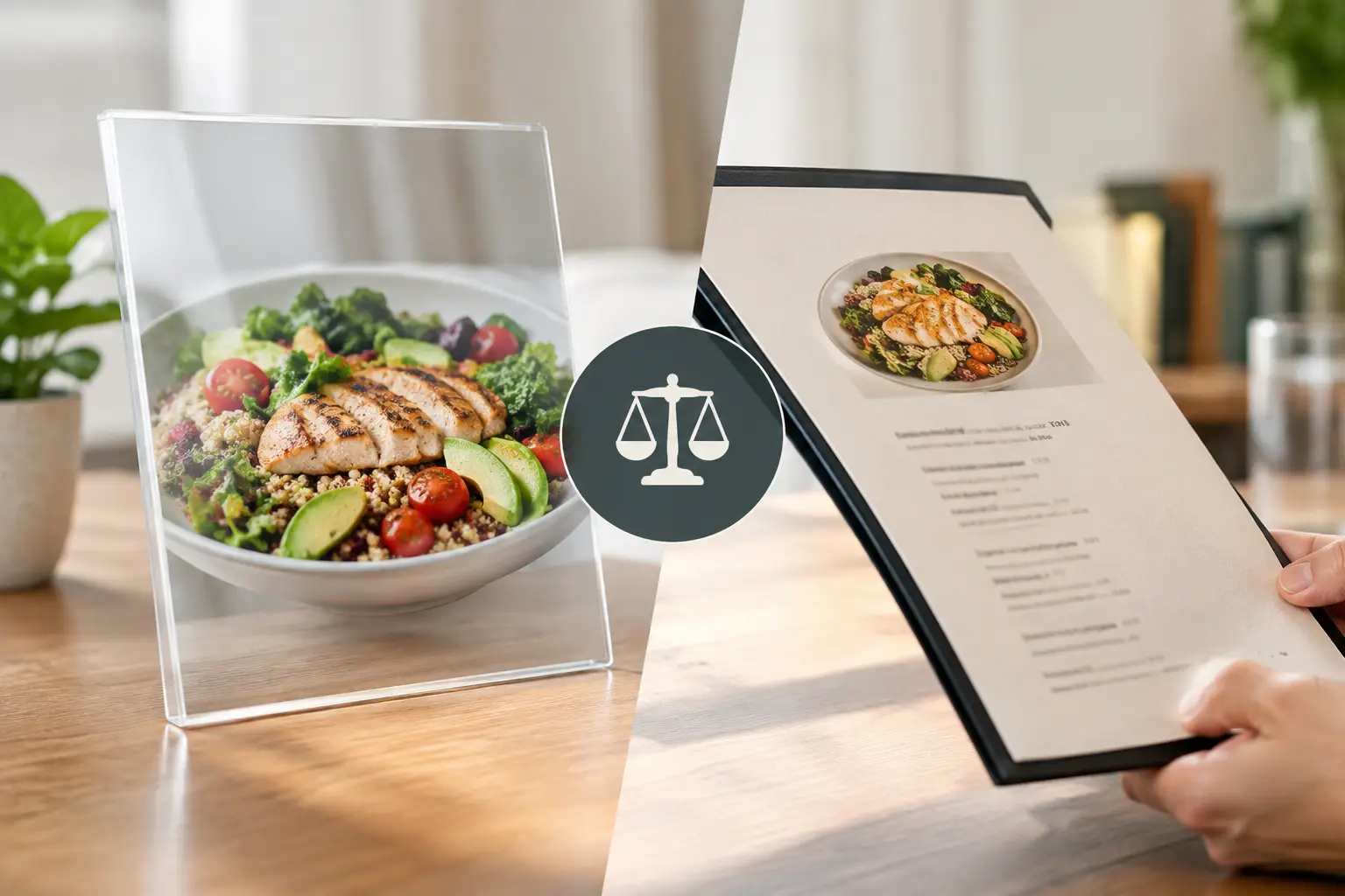
  • Are Restaurant Menu Photos Accessible Yet?

    Are Restaurant Menu Photos Accessible Yet?

    A menu can tell you a dish has grilled chicken, cilantro rice, salsa verde, and queso fresco. But are restaurant menu photos accessible when a diner needs more than a list of ingredients to decide? Not automatically. A food photo can build confidence and reduce the guesswork of ordering, but only when people can find it, view it clearly, understand it, and trust that it represents what will arrive at the table.

    That distinction matters. For many diners, a visual menu is not a bonus feature. It is a practical tool for choosing food with greater certainty, whether they have low vision, use a screen reader, manage decision fatigue, follow dietary preferences, or simply do not want to spend money on a meal that looks nothing like they expected.

    Are Restaurant Menu Photos Accessible?

    Restaurant menu photos can be accessible, but a photo by itself is not accessibility. An image without a meaningful description is invisible to a screen-reader user. A tiny photo that cannot be enlarged may not help someone with low vision. A heavily filtered marketing shot may be technically visible, yet still fail the diner who needs an honest sense of portion size, texture, toppings, or presentation.

    Accessibility is about whether a person can use the information to make a decision. The same principle applies to menu photography. If the photo helps one person but creates another barrier for someone else, the experience is incomplete.

    For blind and low-vision diners, useful food imagery needs strong text support. That means image descriptions that explain what is actually shown, not vague labels such as “food photo” or a copied menu name. A helpful description might identify the dish, its key visible components, how it is plated, and relevant details such as sauces on the side, a breaded coating, or toppings that are easy to miss in a written menu.

    For diners with low vision, usability also depends on image size, zoom controls, readable nearby text, clear contrast, and a layout that works without precision tapping. A beautiful photo squeezed into a thumbnail is not doing much work. Neither is a menu that forces users to pinch, scroll sideways, or hunt through an image gallery disconnected from dish names and prices.

    For people who experience decision fatigue, accessible photos create a different kind of relief. They turn an abstract list of choices into faster, more concrete comparisons. Is the salad a full meal or a side? Does the burrito come smothered in sauce? Is the dessert a single slice or something meant for sharing? Seeing the answer can reduce the mental load of ordering.

    A Photo Should Add Clarity, Not Create More Guesswork

    The best restaurant photos answer real questions a diner has before they order. They show what the meal usually looks like, not just what it looked like under a studio light on opening day. Authenticity is part of accessibility because it helps people act on the information in front of them.

    That does not mean every image must be professionally styled. In fact, community photos often provide the details polished marketing images leave out: the actual takeout container, the side dishes, the approximate portion, the amount of sauce, or what happens when a menu item is customized. A well-lit phone photo from a real meal can be more useful than a perfect promotional image when it is accurately labeled.

    There is a trade-off. User-generated images can vary in lighting, angle, and quality. They may show an older version of the dish or a personal modification that is not standard. The solution is not to reject community photos. It is to give them context. Clear labels can distinguish a restaurant-provided image from a diner photo, identify the specific menu item, and note visible changes such as “no onions” or “extra avocado.”

    Photos should never replace written menu information. A diner still needs ingredients, allergen guidance where available, price, dietary labels, and options for customization. Images work best alongside those details, helping customers form a fuller picture before placing an order.

    Making Restaurant Menu Photos Accessible

    Accessible menu photos start with the basics, but the basics need to be done well. Every image should be connected to the correct dish name and include a descriptive alternative text field that is available to assistive technology. Descriptions should be specific, plainspoken, and useful.

    Compare “A delicious pasta dish” with “Spaghetti in red marinara sauce topped with three meatballs and grated Parmesan, served in a shallow white bowl.” The second description gives a diner something they can use. It does not oversell. It simply shows the meal in words.

    Descriptions do not need to catalog every speck of seasoning. Focus on what changes a decision: ingredients that are visible, the dish format, toppings, sides, portion cues, and presentation. If a burger comes open-faced with fries, say so. If the rice bowl has a runny egg on top, say so. If the drink is a bright blue frozen beverage in a tall glass, say so.

    The visual design matters, too. Photos should be large enough to inspect, with an obvious way to zoom. Their labels should remain readable at larger text settings. The ordering path should work with keyboard navigation and screen readers, and it should not require a diner to interpret text baked into an image. If text appears in a photo, such as a callout about spice level or a limited-time offer, that information should also exist as real text on the page or app screen.

    Consistency helps people move quickly. When every dish image appears in the same place, uses a similar crop, and stays paired with its description, diners do not have to relearn the menu as they browse. A predictable experience is especially valuable when someone is hungry, rushed, tired, or juggling several access needs at once.

    Accuracy Needs Ongoing Attention

    A photo is only useful if it still represents the item being sold. Restaurants change plates, portions, garnishes, recipes, and packaging. Seasonal menus rotate. Delivery versions may look different from dine-in versions. Keeping images current takes effort, but outdated photos can damage trust faster than having no photo at all.

    A smart approach is to treat food photos as living menu information. Let diners flag mismatches, encourage restaurants to update changed items, and make it easy to add current photos when a new dish launches. When several community images show the same item, diners gain a more realistic view of natural variation instead of relying on a single idealized shot.

    This is where a community-powered model can make a meaningful difference. Platforms like Pic-ture That!™ invite diners to contribute real meal photos, helping build a fuller visual record of what restaurants serve. When contributions are tied to clear dish labels and thoughtful accessibility practices, they can support more informed choices for everyone.

    What Diners Can Look For Right Now

    Until visual menus become more consistent, diners can use a few practical signals to decide whether a restaurant’s photos are likely to help. Look for images that are attached to named menu items rather than a general gallery. Check whether the photo shows the full meal, including sides and containers when relevant. Read the menu description alongside the image, especially for ingredients, allergens, and modifications that a photo cannot confirm.

    If you use a screen reader and encounter an unlabeled image, that is valuable feedback for the restaurant or ordering platform. A short, specific message can help: “The menu image for the chicken sandwich has no description. Please add alt text describing the sandwich, toppings, and side.” It identifies the barrier and gives a practical next step.

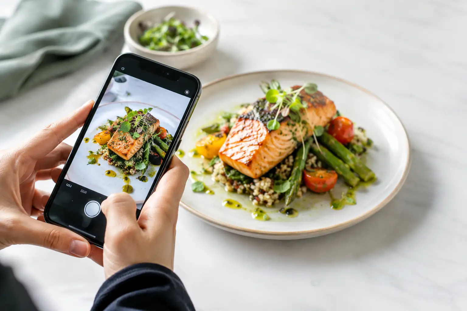
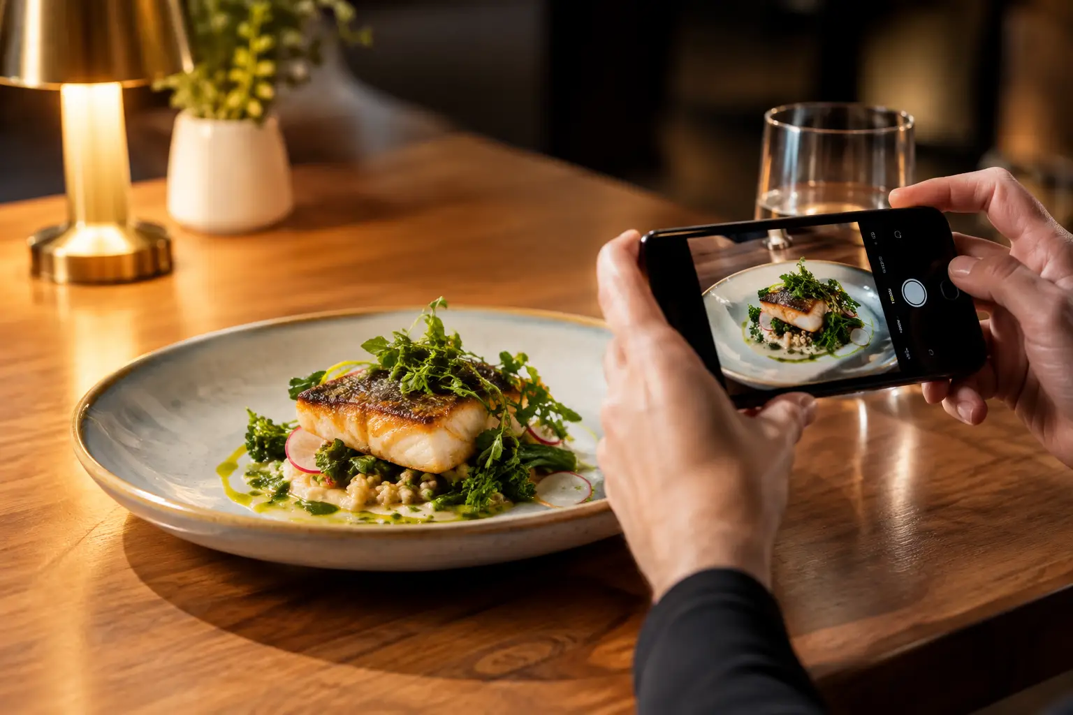
    If you are sharing your own meal photos, aim for clarity over perfection. Capture the full dish in decent light, avoid covering it with filters or text, and label the exact item. Mention modifications in the caption when they change the appearance. Those small details can save another diner from an uncertain order.

    Food should not be a guessing game reserved for people who can interpret every menu format with ease. The next time you photograph a great meal or notice an unlabeled menu image, think about the decision on the other side of the screen. A clearer picture, paired with clearer words, can help someone order with confidence.

  • How to Verify Dish Appearance Before You Order

    How to Verify Dish Appearance Before You Order

    A menu can tell you a dish is “crispy,” “loaded,” or “chef’s favorite.” That still does not tell you whether the portion is small, the sauce is heavy, the toppings are missing, or the meal looks anything like what you want. Knowing how to verify dish appearance before you order gives you more control over your money, your meal, and your dining experience.

    For many diners, this is more than a nice extra. Real dish images can reduce decision fatigue, help people communicate preferences, and make restaurant ordering more accessible. The goal is not to judge food by whether it looks perfect. It is to get a clear, honest sense of what will arrive at your table or door.

    Start With Real Photos, Not Marketing Images

    A polished restaurant photo can be useful, but it should not be your only source. Promotional images are often styled under studio lighting, plated with extra care, and photographed long before the dish reaches everyday customers. They show a restaurant’s intention, not always its typical serving.

    Look for recent photos taken by diners. These are more likely to reveal the actual portion size, the container or plate, the amount of sauce, the side dishes, and the way ingredients are distributed. A phone photo may not be glamorous, but it can be far more helpful when you are deciding whether a $20 entrée is right for you.

    Pay attention to whether multiple customer photos tell the same story. One photo can be an outlier. Five photos showing a compact burger, a generously filled burrito, or a salad with dressing served on the side give you a stronger signal.

    Authentic images also help separate menu language from menu reality. “Spicy” does not show how much chili oil is on the plate. “Seasonal vegetables” does not tell you which vegetables you will get. A real photo can make those details visible before you commit.

    How to Verify Dish Appearance With a Quick Photo Check

    You do not need to investigate every lunch order like a food critic. A fast, consistent check can help you order with more confidence. Start by matching the photo to the exact menu item, then look beyond the center of the plate.

    First, confirm the dish name and major ingredients. Restaurants may offer several versions of the same item, such as a chicken bowl, spicy chicken bowl, and grilled chicken bowl. A photo of the wrong variation can create the same disappointment as no photo at all. Check for obvious differences in protein, sauce, toppings, bread, or sides.

    Next, use visual context to estimate size. Plates, takeout containers, utensils, cups, hands, and tables can all provide a useful sense of scale. This is not an exact measurement, and portions can change, but it is often enough to tell the difference between a shareable appetizer and a light snack.

    Then look at the balance of the dish. Is the protein actually visible? Are the vegetables a garnish or a meaningful part of the meal? Does the pasta appear coated in a light sauce or sitting in a deep pool of cream? These details matter when you are choosing based on appetite, dietary preferences, or simply what sounds satisfying.

    Finally, check when the photo was posted. A recent image is usually more reliable than one from years ago, especially for restaurants that change menus, suppliers, packaging, or portioning. If recent photos look very different from older ones, trust the current evidence and consider asking the restaurant a quick question.

    Look for the Details Menus Leave Out

    Text menus are built to be short. They cannot always explain every visual detail that affects an order. Photos can fill in those gaps, but only if you know what to look for.

    For sandwiches, burgers, and wraps, check the bread-to-filling ratio, whether the ingredients are layered evenly, and whether sides are included. For bowls, inspect the base. A bowl described as rice, greens, and protein may be mostly rice, mostly greens, or half empty beneath a pile of toppings.

    For pasta, curries, soups, and saucy dishes, notice the consistency. Is the sauce thick, brothy, creamy, or oily? Does the dish arrive mixed together or with components separated? That can make a major difference for someone who dislikes certain textures or needs to avoid an ingredient that is difficult to pick out once served.

    For salads and veggie-forward meals, look for ingredient variety and preparation. A menu may promise roasted vegetables, but a photo can show whether they are large pieces, finely chopped, fresh, grilled, or served cold. It can also reveal if cheese, nuts, croutons, or dressings are already added.

    Desserts deserve the same attention. A slice of cake may be individual-sized or large enough to share. A milkshake may be topped with ingredients that are not listed. When spending decisions add up, seeing the actual presentation helps prevent small surprises from becoming frustrating ones.

    Use More Than One Source When the Order Matters

    It depends on the stakes. If you are grabbing a familiar coffee and pastry, one clear recent photo may be enough. If you are ordering for a group, managing a food sensitivity, trying a new cuisine, or choosing a meal for a special occasion, take a few extra minutes to compare sources.

    Restaurant social posts can show current dishes, but they are still curated. Delivery-app photos may be helpful, though they can sometimes be outdated or attached to a similar item. Community photo collections are especially valuable when they connect images to a specific restaurant, menu item, and diner experience.

    When photos conflict, do not assume one is dishonest. Portions may vary by location, lunch versus dinner service, seasonal availability, or whether a customer added modifications. Instead, look for the most consistent features. If every photo shows a large bowl but toppings vary, you can likely trust the bowl size while treating the toppings as flexible.

    If you still cannot tell, call or message the restaurant with one focused question: “Does the salmon entrée come with the vegetables shown in the photo?” Clear questions are easier for staff to answer than broad requests to describe an entire plate.

    Make Dish Appearance Part of Accessible Ordering

    Visual information should not be reserved for diners who can easily interpret a styled image. Accessible ordering means giving people meaningful ways to understand what a meal includes, how it is presented, and what to expect.

    For diners with visual impairments, useful dish information may include clear image descriptions alongside photos. A description such as “a wide white bowl holding short noodles, grilled chicken strips, broccoli, and a light brown sauce” offers more practical value than “delicious chicken pasta.” It identifies the components and arrangement without overselling the meal.

    For people who experience decision fatigue, photos can reduce the mental work of translating vague menu copy into a real meal. Seeing a dish may make the choice easier, especially when comparing similar options. The best visual menu tools pair accurate photos with plain-language descriptions, ingredient details, and easy ways to filter choices.

    That is why transparency matters. A photo is not just a sales tool. It can be information that helps people participate more confidently in everyday dining.

    Help Build Better, More Honest Food Photos

    If you find a dish photo that truly matches what arrived, it can help the next person make a better choice. Community contributions are most useful when they are accurate, recent, and tied to the correct dish.

    Take the photo in ordinary lighting when possible, and include enough of the plate or container to show scale. Capture the meal before it has been heavily altered, but do not worry about making it look professionally styled. The point is to show what a real customer received.

    If you add a note, keep it specific. Mention meaningful changes like added avocado, dressing on the side, a substituted side, or a half portion. Those small details protect the usefulness of the photo without turning your post into a full review.

    Pic-ture That!™ is built around this kind of community-powered clarity: real meal photos that help diners see before they spend, while giving contributors a chance to earn restaurant gift cards. Each accurate upload can make a menu more useful for someone who needs more than a clever description.

    The next time a menu leaves you guessing, pause before placing the order. Look for the real plate, notice the details that matter to you, and choose the meal you can actually picture enjoying.

  • Why Do Menu Photos Matter So Much?

    Why Do Menu Photos Matter So Much?

    You know the feeling. A menu sounds great, you order fast, and then the plate arrives looking nothing like what you pictured. Maybe the portion is smaller, the sauce is heavier, or the dish turns out to be built around an ingredient you were hoping to avoid. That gap is exactly why do menu photos matter to so many diners. They turn a guess into a decision you can actually feel good about.

    For a lot of people, photos are not a nice extra. They are the missing piece that makes a menu usable. A written description can tell you what is in a dish, but it often cannot show scale, texture, toppings, plating, or how ingredients are really combined. When restaurants leave that part to imagination, diners are left filling in the blanks. Sometimes that works. Often, it does not.

    Why do menu photos matter for real ordering decisions?

    Most food purchases happen quickly. You are hungry, comparing options on your phone, trying to stay on budget, and making a call in minutes. In that moment, a photo does something text alone cannot. It gives you immediate clarity.

    That clarity matters because menu language is often inconsistent. One restaurant’s “crispy chicken sandwich” could mean a thick hand-breaded filet on a brioche bun. Another could mean a thinner patty with lots of sauce and shredded lettuce. Both descriptions are technically true. Neither tells the full story. A photo closes that gap.

    It also reduces the risk of disappointment. When diners can see the actual meal before they order, they are less likely to end up with something that feels off. That saves money, time, and frustration. It also helps people feel more confident trying something new, because they are not choosing blindly.

    There is a business side to this too. Clear visuals can lead to better-fit orders and fewer surprises. But for diners, the bigger point is simple: seeing the food helps people choose the food.

    Photos make menus more accessible

    This is where the conversation needs to get more honest. Menu photos are often treated like a marketing feature, but they also function as an accessibility tool.

    For diners with visual impairments, the issue is not just whether a menu exists. It is whether the menu communicates enough useful information to support an informed choice. Text descriptions vary wildly in quality. Some are detailed. Many are vague. A strong photo paired with clear labeling can add another layer of understanding that helps users build a more complete picture of the dish.

    For people with decision fatigue, menu photos can also reduce mental load. Sorting through a long list of similarly worded items can be exhausting, especially when every option starts to blur together. Images create faster recognition. They help people narrow choices without having to decode every line.

    That does not mean photos replace good descriptions. They do not. Accessibility works best when information is layered, not when one format is expected to do everything. A menu should be easier to use, not easier only for one kind of user. Photos are part of that broader goal.

    What photos reveal that descriptions miss

    A menu description usually focuses on ingredients. Diners also care about presentation, proportion, and context.

    A photo shows whether the salad is mostly greens or loaded with extras. It shows whether the pasta is creamy or lightly dressed. It shows whether the tacos are packed or sparse, whether the side portion is substantial, and whether the “spicy” ramen looks rich and heavy or brothy and clean.

    Those details matter because people do not order ingredients in isolation. They order experiences, portions, textures, and combinations. Two burgers with nearly identical descriptions can feel completely different once you see the bun, thickness, toppings, and size.

    Photos can also set expectations around quality and consistency. If the visual looks authentic and current, it helps diners trust that the restaurant knows what it is serving. If the image looks overly stylized or clearly disconnected from reality, that trust can drop fast. People are good at spotting when a food photo feels more like advertising than information.

    Authentic photos build trust faster than polished ones

    This is one of the biggest trade-offs in menu imagery. Professionally staged photos can look beautiful, but they are not always the most helpful. If lighting, editing, and styling make a dish look dramatically better than it appears in real life, the photo can create the exact problem it was supposed to solve.

    Authentic photos often do more for trust. They show what a dish actually looks like when it reaches the table. That includes the imperfect but useful details diners care about: portion size, side placement, sauce amount, garnish, and real-world presentation.

    That is why community-powered menu photos matter so much. Real diners capture real meals in real settings. The result is often more practical than a perfect studio image. It gives other users a better sense of what they are actually buying.

    There is still a balance to strike. Photos should be clear, accurate, and well-lit enough to be useful. Grainy, dark images can create confusion too. The goal is not polished fantasy. It is reliable visibility.

    Menu photos reduce wasted orders

    Nobody likes spending money on a meal that misses the mark. Maybe the serving is much smaller than expected. Maybe the dish arrives covered in onions when the menu barely mentioned them. Maybe the entree looks much heavier than the description suggested.

    Photos help cut down on these mismatches. When diners can see the dish before ordering, they make choices that better align with their appetite, preferences, and expectations. That can mean fewer abandoned meals, fewer regret orders, and less food waste.

    This matters even more in delivery and pickup. Once the order is placed, there is less room to fix a mismatch. You are not standing in the restaurant asking questions. You are relying on the menu to carry the full decision. In that context, visual information becomes even more valuable.

    It also helps with budget decisions. If you are comparing two dishes at similar price points, a photo can reveal which one feels more satisfying or more aligned with what you want. That is a practical win, not just a visual one.

    Why do menu photos matter in a mobile-first world?

    Because most ordering now happens on small screens, under time pressure, with limited patience.

    Mobile users scan. They compare quickly. They make snap decisions between tabs, apps, and delivery platforms. Long descriptions are easy to skip. Photos communicate faster. They help people sort options, notice differences, and move forward with more confidence.

    This is especially true when someone is ordering in a group, multitasking, or trying to choose from a large menu. The easier it is to recognize what a dish actually is, the easier it is to order without second-guessing every choice.

    That speed matters, but accuracy matters more. A fast decision only feels good if it turns out to be the right one.

    Not every dish needs a photo, but the right ones really help

    There is some nuance here. Not every single menu item needs an image to be useful. Some dishes are already familiar enough that a photo adds less value. Others vary so much by location or customization that one image may only tell part of the story.

    Still, some categories benefit a lot from visuals: specialty drinks, combination plates, build-your-own items, desserts, and dishes with unclear names or house-specific presentation. These are the moments where a photo can answer questions a description leaves open.

    The same goes for first-time orders. If someone already knows a restaurant well, they may need fewer visuals. New customers usually need more help. Photos make that first experience less uncertain, which can be the difference between trying a place once and coming back again.

    For platforms built around real dish discovery, this is where the value becomes bigger than convenience. It becomes transparency. Seeing actual food before you buy it gives diners more agency. It shifts ordering from hopeful guesswork to informed choice.

    That is a better experience for people who want confidence, for people who need clearer information, and for people who are tired of spending money on meals that do not match the menu in their head. It is also why platforms like Pic-ture That! are tapping into something much bigger than food photos alone.

    A menu should help people choose well. When it shows the food clearly, it finally does.