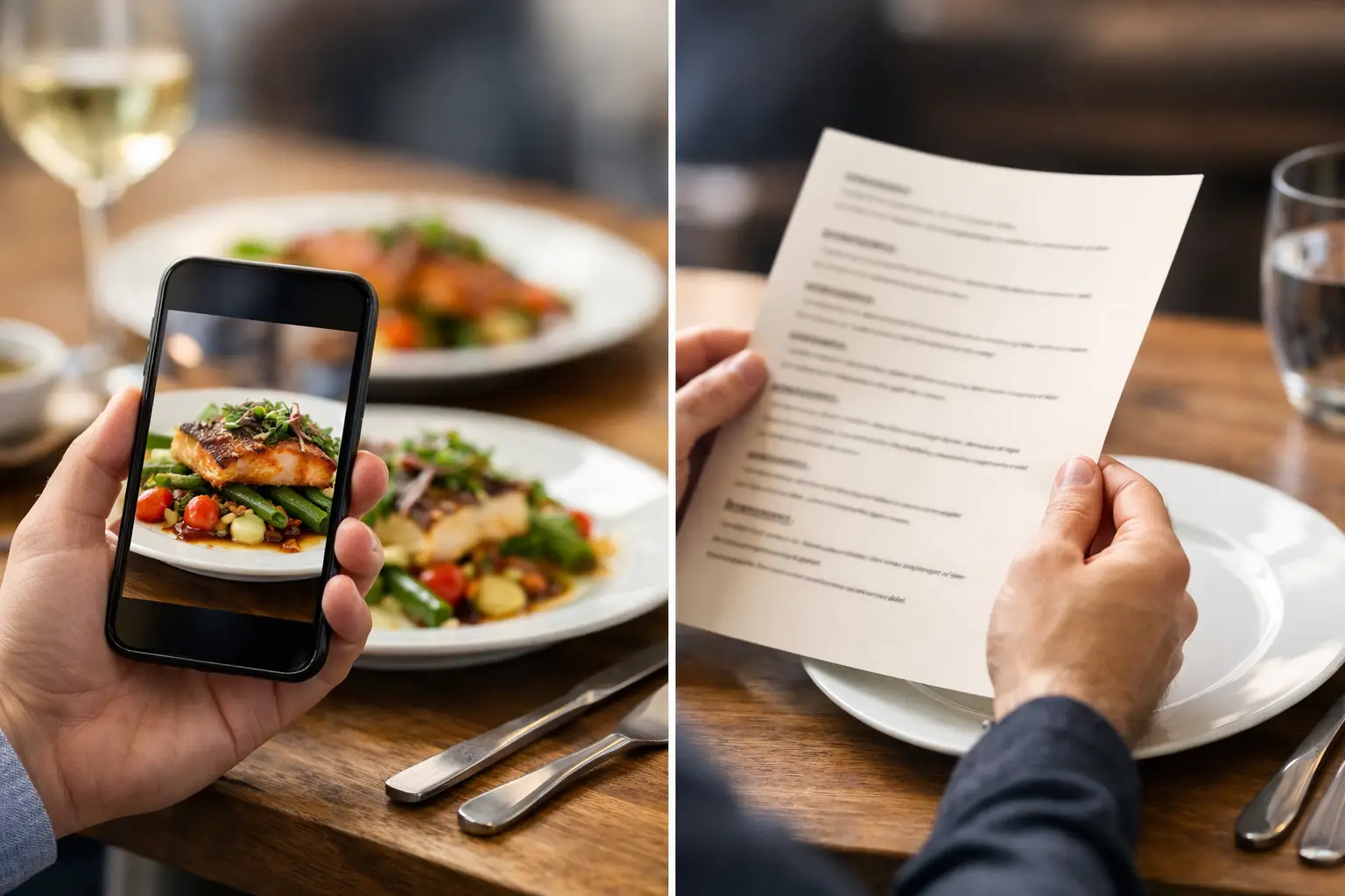
A menu says “crispy chicken sandwich.” You picture a thick, golden cutlet with a soft bun, pickles, and sauce in every bite. What arrives is a thin patty, an oversized bun, and a drizzle of sauce you can barely taste. That gap is why dish photos versus menu descriptions is more than a restaurant marketing debate. It is about whether diners can make a confident choice before spending their money.
Text can tell a story about a meal. A real photo can answer the questions that story leaves behind: How big is it? What is actually on the plate? Is the salad mostly greens or mostly toppings? Does the ramen look rich and hearty or light and brothy? For diners managing a budget, an allergy, a visual impairment, or plain old decision fatigue, those details matter.
Menu descriptions are useful, but they have limits
A strong menu description can make food sound irresistible. It can identify ingredients, call out a cooking method, and help someone understand a restaurant’s point of view. “Wood-fired cauliflower with tahini, herbs, and pomegranate” gives a diner meaningful information that a photo may not fully communicate.
But descriptions rely on interpretation. Words like hearty, generous, spicy, creamy, shareable, and crispy mean different things to different people. A “large” entrée may be a filling dinner for one person and a light lunch for another. “Spicy” can range from a mild tingle to something that sends a diner reaching for water.
Descriptions also tend to leave out visual realities. They may not show the size of a side dish, how much sauce comes with an entrée, whether a sandwich is stacked tall enough to be hard to eat, or how a dish is plated. That uncertainty is small until it leads to a disappointing order, wasted money, or a meal someone cannot comfortably enjoy.
Why dish photos change the decision
Photos make the abstract concrete. They help diners compare choices quickly, especially when they are ordering from an unfamiliar restaurant, scanning a long menu, or trying to decide for a group.
A useful dish photo reveals portion scale, color, texture, presentation, and ingredient balance. It can show that the tacos come three to an order, that the grain bowl has a substantial protein portion, or that the “loaded” fries truly are loaded. It can also make it easier to spot when an item may not match what someone wants. A person looking for a light lunch may choose differently after seeing a giant, cheese-heavy plate.
That clarity is particularly valuable when ordering for delivery. Diners cannot see another table’s food, ask a server what a plate looks like, or easily change course once the order is on its way. Seeing the dish beforehand reduces the guesswork at the moment it matters most.
Photos support confidence, not just cravings
Food photography is often treated as a way to make people hungry. It can do that, but its more practical value is confidence. A good photo helps diners say, “Yes, that is what I expected,” before they click order.
Confidence matters across price points. If someone is choosing between two $12 lunches, they want to know which one looks more filling. If they are ordering a $35 entrée for a celebration, they want a clearer sense of what the experience includes. Visual context helps diners choose based on their own needs instead of marketing language alone.
It also makes menu exploration feel less exhausting. Decision fatigue is real, especially when there are dozens of options and each description uses unfamiliar terms. Images give people a faster way to narrow the field, compare similar dishes, and move forward without overthinking every ingredient.
The accessibility case for dish photos versus menu descriptions
Accessible dining means recognizing that people process information differently. Text-only menus can create barriers for diners who have difficulty interpreting written descriptions, struggle with cognitive overload, or simply need more context to make a comfortable choice.
Visual menus can offer another pathway to understanding. For some people, a clear image is easier to process than a paragraph full of culinary language. For others, photos can reduce anxiety around ordering something unfamiliar. A diner should not have to gamble on whether “seasonal vegetables” means roasted carrots and broccoli or a bowl dominated by mushrooms they dislike.
At the same time, photos are not a replacement for accessible text. People with low vision or blindness need well-written descriptions, screen-reader-friendly design, and useful image alt text. Diners with allergies need reliable ingredient and cross-contact information. People tracking nutrition may need nutrition details that a photo cannot provide.
The best experience uses both formats together. A photo shows the real dish. A clear description explains ingredients, preparation, dietary considerations, and options for customization. Accessibility is not about picking one format and declaring it enough. It is about giving more people the information they need in the way that works for them.
Not all food photos deserve trust
A polished image can be misleading if it is overly styled, outdated, or disconnected from what customers actually receive. A photo of a towering burger may look great in an ad but create frustration if the delivered version is noticeably smaller. Stock images are even worse. They may represent a category of food without representing the restaurant’s dish at all.
That is why authentic, accurate images matter. Real photos from real meals provide useful context about what a restaurant is serving now. They can show natural variation in plating and lighting while still giving diners an honest view of the food.
Accuracy does not mean every photo must look professionally staged. It means the image should be recognizable, current, and clearly connected to the menu item. A well-lit phone photo of the actual dish can be more helpful than a beautiful promotional image that sets the wrong expectation.
What makes a dish photo genuinely helpful?
The most useful food images do a few simple things well. They show the full dish, include enough lighting to make ingredients visible, and avoid filters that change the food’s actual color. When possible, they offer a sense of scale through the plate, packaging, utensils, or a familiar side item.
They should also match the item name precisely. If a restaurant has several versions of a burrito, the photo should make it clear which one is pictured. If toppings, sides, or portions vary, the visual experience should not imply a guarantee that is not there.
Community-powered photos can be especially valuable here because they reflect the meal as diners receive it. They also expand menu coverage beyond a restaurant’s bestsellers. That matters for the person deciding between the popular chicken bowl and the less-photographed vegetarian option.
Better visuals create better restaurant relationships
When diners know what they are ordering, restaurants benefit too. Clear expectations can reduce disappointment, prevent avoidable complaints, and help guests discover items they might otherwise skip. A photo can communicate the value of a premium ingredient, a generous portion, or a thoughtful presentation faster than a long description.
There is a trade-off. Restaurants should not feel pressured to treat every dish like a commercial shoot, and diners should understand that handmade food can vary. A bowl may have slightly different garnish on a busy Friday night. A seasonal menu item may shift with available produce. Transparency does not demand perfection. It asks for an honest representation.
That is the opportunity behind platforms like Pic-ture That!™: diners can help build a more useful visual record of restaurant food, while earning rewards for sharing what they ordered. The result is not just more photos. It is more informed choices, broader menu visibility, and a dining experience shaped by the people using it.
Make every order easier to understand
The choice between photos and descriptions should not be a contest with one winner. Descriptions provide detail. Photos provide proof and context. Together, they help diners spend with more confidence and less uncertainty.
The next time a menu asks you to imagine a dish, look for the information that helps you decide: what is on the plate, how much there is, and whether it feels right for you. Clearer menus start with seeing food as it really is.
Leave a Reply