Category: Uncategorized

  • How to Preview Restaurant Meals First

    How to Preview Restaurant Meals First

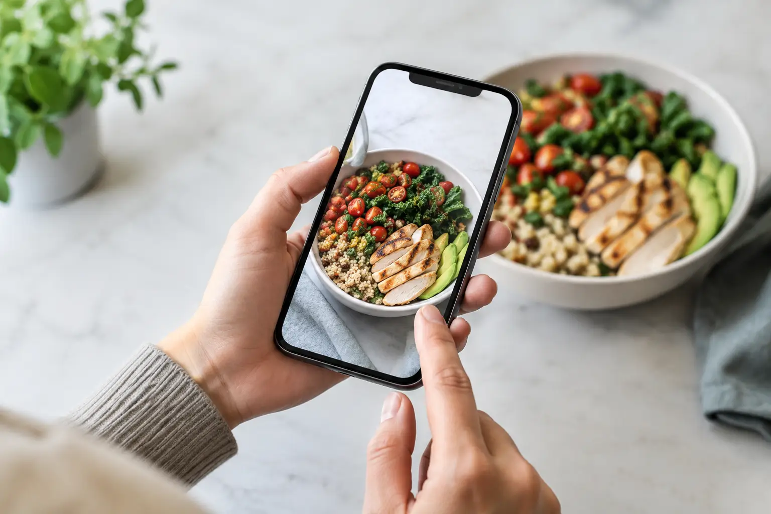
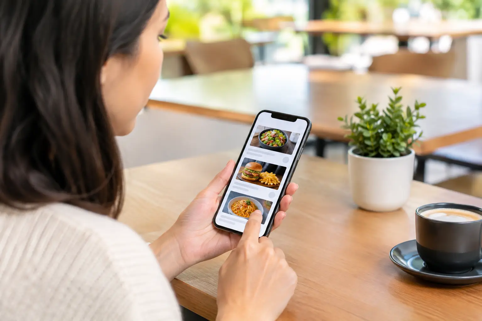
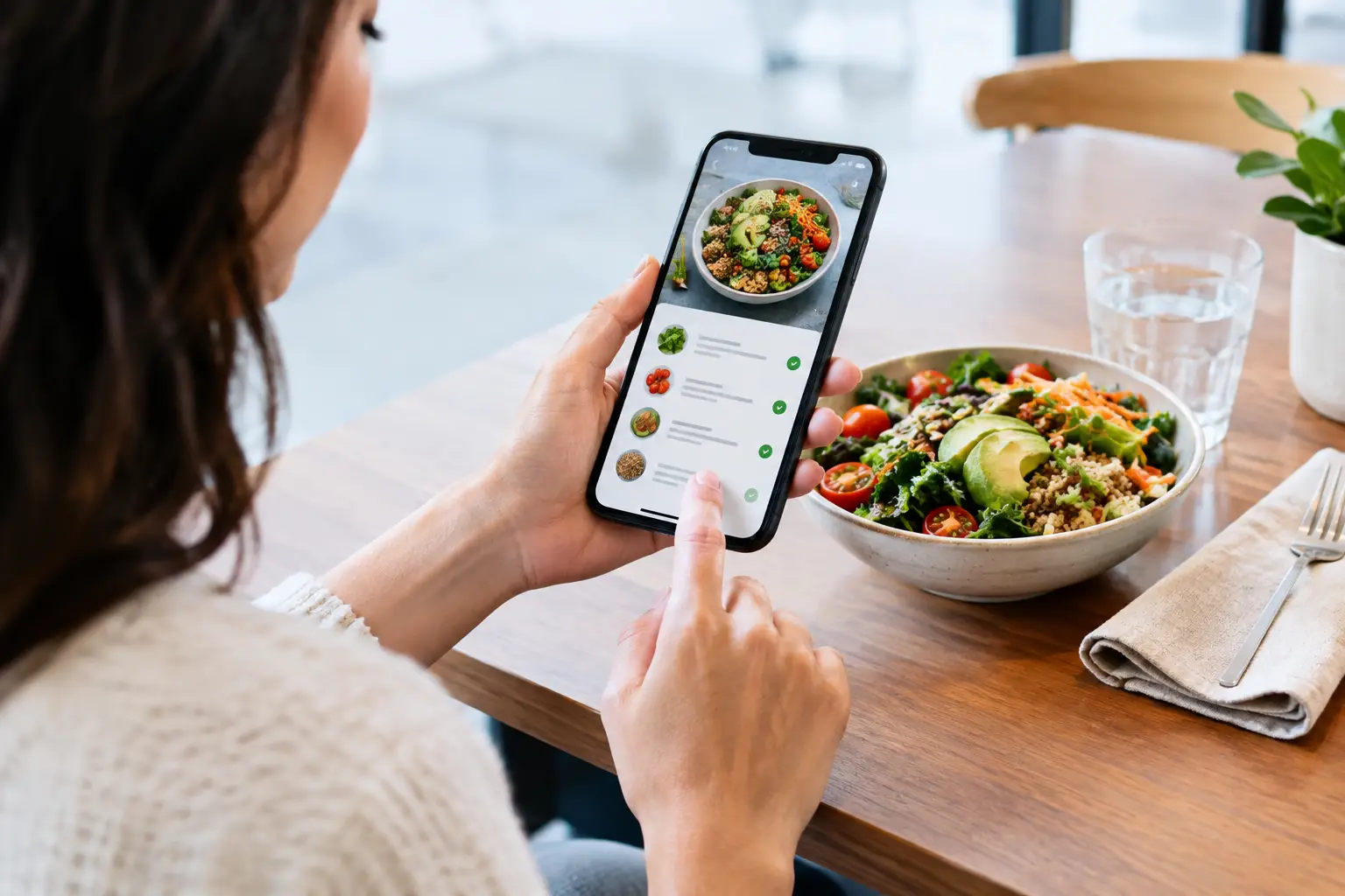
    You know the feeling: a menu description sounds great, the photo in your head looks even better, and then the plate shows up looking nothing like what you expected. If you’ve been wondering how to preview restaurant meals before you spend your money, the good news is that you do not have to rely on guesswork anymore. A better ordering experience starts with seeing what a dish actually looks like, not just what a menu says it is.

    That matters for almost everyone, but especially for people who deal with decision fatigue, visual impairments, dietary concerns, or plain old menu disappointment. Food is personal. Spending $18 on an entree you cannot really picture should not feel normal.

    Why previewing meals changes the whole ordering experience

    Most restaurant menus were built for speed, not clarity. They tell you ingredients, maybe a cooking style, and sometimes a few extras. What they usually do not tell you is portion size, plating, texture, toppings, side placement, or whether the dish looks heavy, fresh, messy, dry, shareable, or very different from what the name suggests.

    That gap is where bad orders happen. You think you are getting a crispy sandwich with a balanced side, and instead it arrives overloaded with sauce and a tiny handful of fries. Or you order a salad expecting something light and colorful, but it turns out to be mostly lettuce in a deep bowl.

    Previewing meals helps close that gap. It gives you confidence before checkout, helps you compare dishes faster, and cuts down on the stress that comes from choosing blindly. It is also an accessibility issue. When menus depend too heavily on text, they leave too much open to interpretation.

    How to preview restaurant meals in real life

    The fastest way to preview a meal is to look for real customer-uploaded photos instead of polished promo shots. Marketing images can be useful, but they are usually styled, edited, and chosen to sell. What most diners actually need is something more honest – a clear image of the exact dish as it is typically served.

    That is why community-powered meal photos are so useful. They show what the burger bun really looks like, how much sauce is on the pasta, whether the tacos come packed or sparse, and how the side portions compare. You are not just seeing food. You are seeing context.

    When you preview restaurant meals, start by checking whether the image matches the specific menu item, not just the category. A generic pasta photo does not help much if you are deciding between vodka sauce and pesto chicken. The more exact the image, the more useful it becomes.

    Then look at the details people often miss. Is the dish stacked high or spread wide? Does it look easy to eat or awkward? Is the bread toasted lightly or deeply? Are toppings mixed in, placed on top, or served on the side? These small visual cues tell you a lot about what your actual experience will be.

    What to look for in a useful meal preview

    Not every photo helps. Some are too dark, too far away, or taken after half the plate is gone. A good meal preview gives you enough information to make a call.

    First, look for accuracy. The best preview is recent, clearly tied to the menu item, and unfiltered enough to show the dish honestly. Second, look for angle and scale. Photos taken from above or at table height can reveal portion size, thickness, and side layout. Third, look for consistency. If multiple photos of the same dish all look similar, that is a good sign the preview reflects reality.

    You should also pay attention to what is not in the description. Menus often skip things like garnish, sauce quantity, bread type, or whether ingredients are layered or mixed together. Photos fill in those blanks quickly.

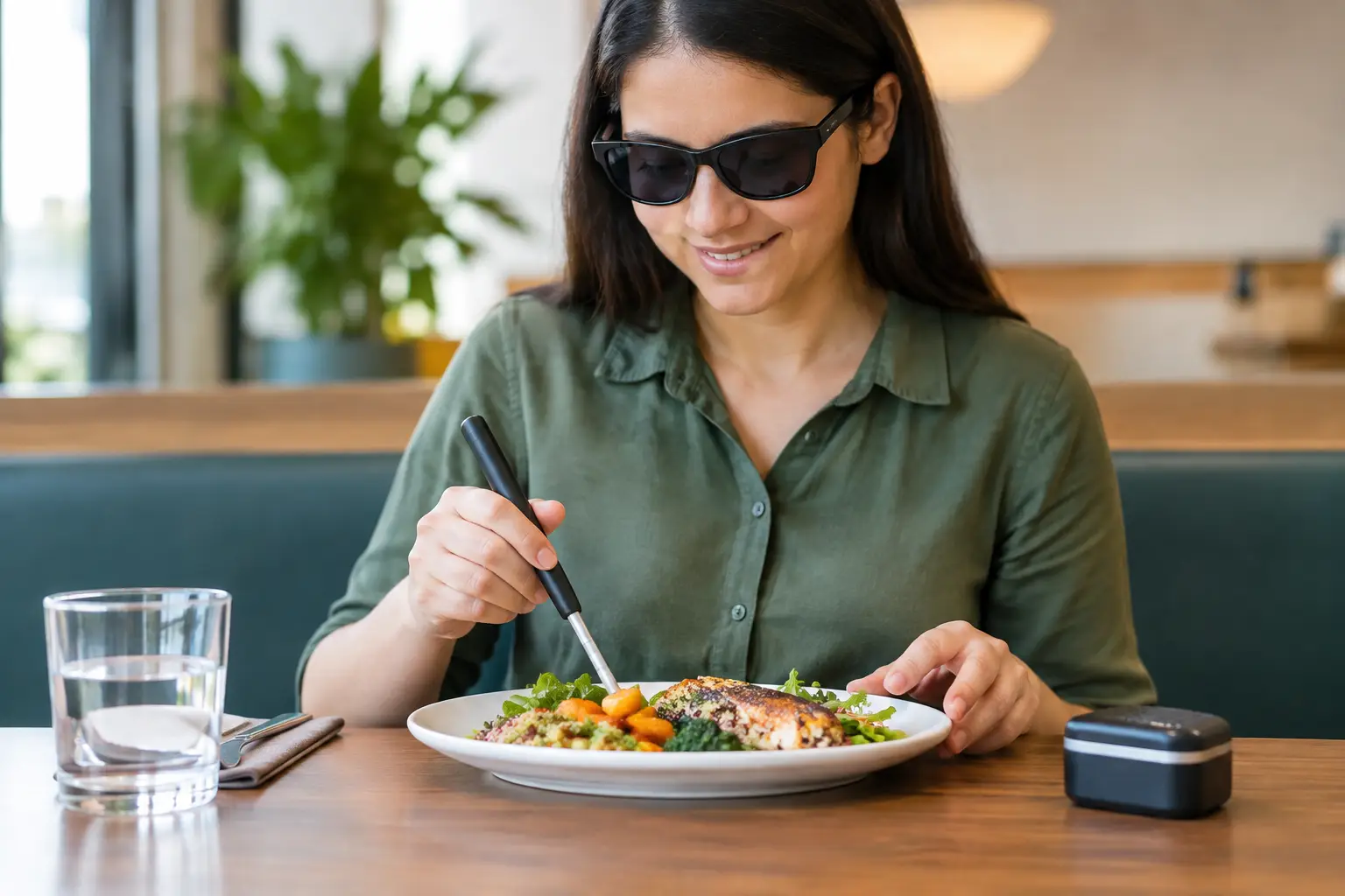
    For diners with accessibility needs, visual previews can do even more. They can reduce uncertainty around plate structure, color contrast, ingredient visibility, and overall presentation. That makes ordering feel less like a gamble and more like an informed choice.

    The difference between real photos and restaurant marketing shots

    There is nothing wrong with a well-shot restaurant photo. The problem is when that is your only reference. Promotional images are built to highlight the best-case version of a dish. They may use lighting, styling, substitutions, or plating adjustments that make the food look better on camera than it does in daily service.

    Real diner photos usually show the meal under normal conditions. That makes them more practical. They tell you what shows up on the table on a regular Tuesday night, not just what looked good in a photo studio or launch campaign.

    It depends on what you need. If you are choosing a restaurant for a celebration, marketing photos might help you get a sense of brand style. But if you are trying to decide whether the grilled chicken bowl actually looks filling, authentic user photos are far more useful.

    How to preview restaurant meals without wasting time

    The process does not have to be complicated. Start with the dish you are most likely to order, not the entire menu. Narrowing your focus saves time and avoids the scroll spiral that happens when every item starts to blur together.

    Next, compare two or three similar dishes visually. If one sandwich looks packed and balanced while another looks flat and sloppy, that visual comparison may tell you more than the menu copy does. If you are deciding between sides, photos can also reveal whether the upgrade is worth it.

    It helps to think in terms of dealbreakers. Some people care most about portion size. Others care about whether ingredients are visible, whether sauces are heavy, or whether a meal looks easy to customize. Once you know your dealbreakers, previewing gets much faster.

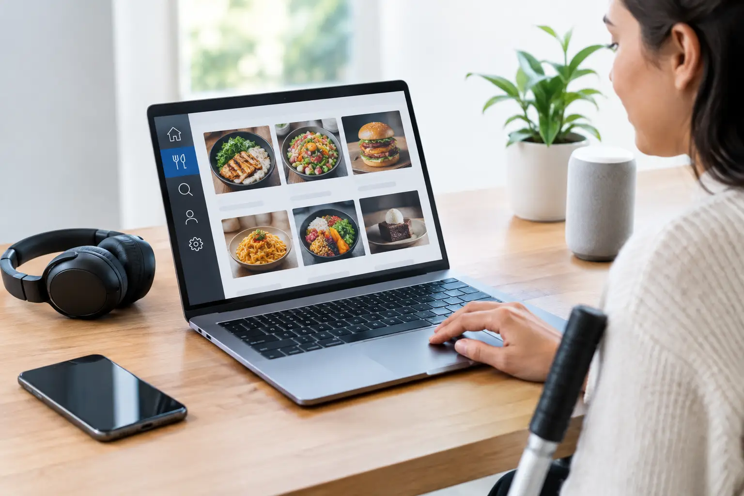
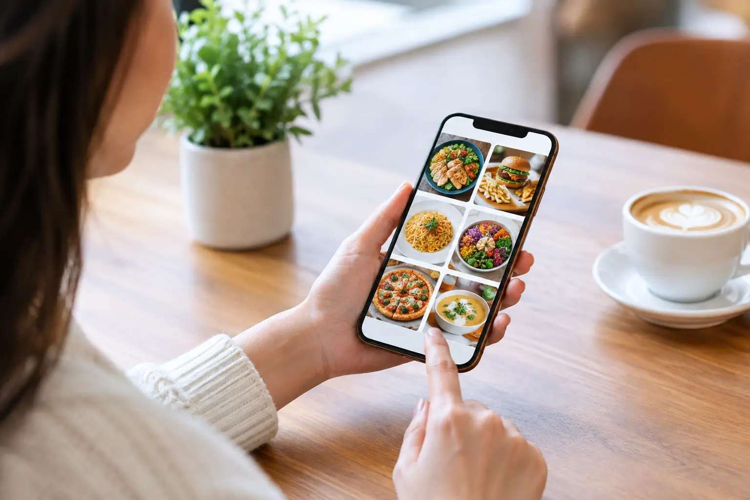
    This is also where a platform like Pic-ture That!™ makes a real difference. Instead of bouncing between random photo sources and hoping the image matches the dish, diners can use a visual menu discovery experience built around authentic meal photos and community contributions. That makes the preview process clearer, quicker, and more inclusive.

    When previews are especially valuable

    Meal previews are helpful any time, but they matter even more in a few common situations. Ordering delivery is a big one, because you cannot scan neighboring tables or ask quick visual questions before deciding. Trying a new restaurant is another. So is ordering for a group, when one wrong pick can turn into a frustrating and expensive mistake.

    They are also especially useful when menu language is vague. Words like loaded, crispy, house-style, signature, and deluxe can mean almost anything depending on the restaurant. A real photo keeps those labels honest.

    And for people who feel overwhelmed by long menus, previews can cut through the noise. Seeing a dish often helps you rule things in or out much faster than reading ten nearly identical descriptions.

    A smarter, more inclusive way to choose food

    When people talk about food transparency, they often think about ingredients or nutrition. Those things matter, but visual transparency matters too. Being able to preview a meal before ordering gives diners more control, fewer surprises, and a better shot at spending their money well.

    That is not just convenient. It is a more inclusive standard. It respects the fact that people make decisions differently and that text alone does not work for everyone equally well.

    If you want to know how to preview restaurant meals with more confidence, the answer is simple: look for real, specific, community-driven photos that show the dish as it actually arrives. The more honest the preview, the easier the choice becomes.

    Food ordering should feel clear, not uncertain. Seeing the meal first is a small shift that makes a big difference.

  • How to Find Authentic Menu Photos Fast

    How to Find Authentic Menu Photos Fast

    You know the feeling: a menu description sounds great, the promo photo looks polished, and then the actual dish shows up looking like a completely different order. That gap is exactly why more diners are asking how to find authentic menu photos before they spend money. When you can see what a dish really looks like, ordering gets easier, faster, and a lot less risky.

    For some people, this is about avoiding disappointment. For others, it is about accessibility, decision fatigue, dietary confidence, or simply not wasting money on something that was never going to match the description. Real menu photos do more than make food look good. They give people clearer information, which leads to better dining decisions.

    Why authentic menu photos matter

    Restaurant menus are often built around text first and visuals second. Even when photos are included, they may be professionally staged, outdated, or limited to a handful of bestselling items. That is useful for marketing, but it is not always useful for decision-making.

    Authentic menu photos help close that gap. They show portion size, plating, toppings, side items, color, and how a dish actually appears in regular lighting. That matters if you are comparing value, checking whether an item seems spicy or heavily sauced, or trying to figure out whether the food matches your expectations.

    This matters even more for diners who rely on visual information to feel confident. If you have low vision, if menu wording feels vague, or if too many options leave you stuck, a real photo can reduce friction right away. Seeing the dish before ordering is not a bonus feature. In many cases, it is the most useful piece of information on the menu.

    How to find authentic menu photos without getting fooled

    The easiest mistake is assuming that any photo attached to a menu item must be accurate. A nice image is not automatically a trustworthy one. If you want to know how to find authentic menu photos, start by looking for signs that the image came from a real diner experience instead of a polished ad campaign.

    Photos from actual customers usually have a few tells. Lighting is more natural. The angle is less staged. The table, tray, takeout container, or background often appears in frame. You may also notice variation across multiple uploads of the same dish, which is a good thing. Real food does not look identical every time.

    That does not mean professional images are useless. They can help you spot ingredients or understand how a signature dish is supposed to be presented. But if you are trying to set realistic expectations, user-submitted photos are often more reliable because they reflect what you are likely to receive.

    Start with platforms built for real diner photos

    If a platform is designed around community uploads, that is usually the strongest starting point. User-generated food photo libraries give you a better shot at seeing what people were actually served instead of what a restaurant wants to feature.

    The benefit is not just authenticity. It is volume. One polished image can make a dish look perfect. Five real photos from different diners can tell you whether that burger is consistently stacked high, whether the salad is smaller than expected, or whether the pasta tends to arrive with more sauce than the menu suggests.

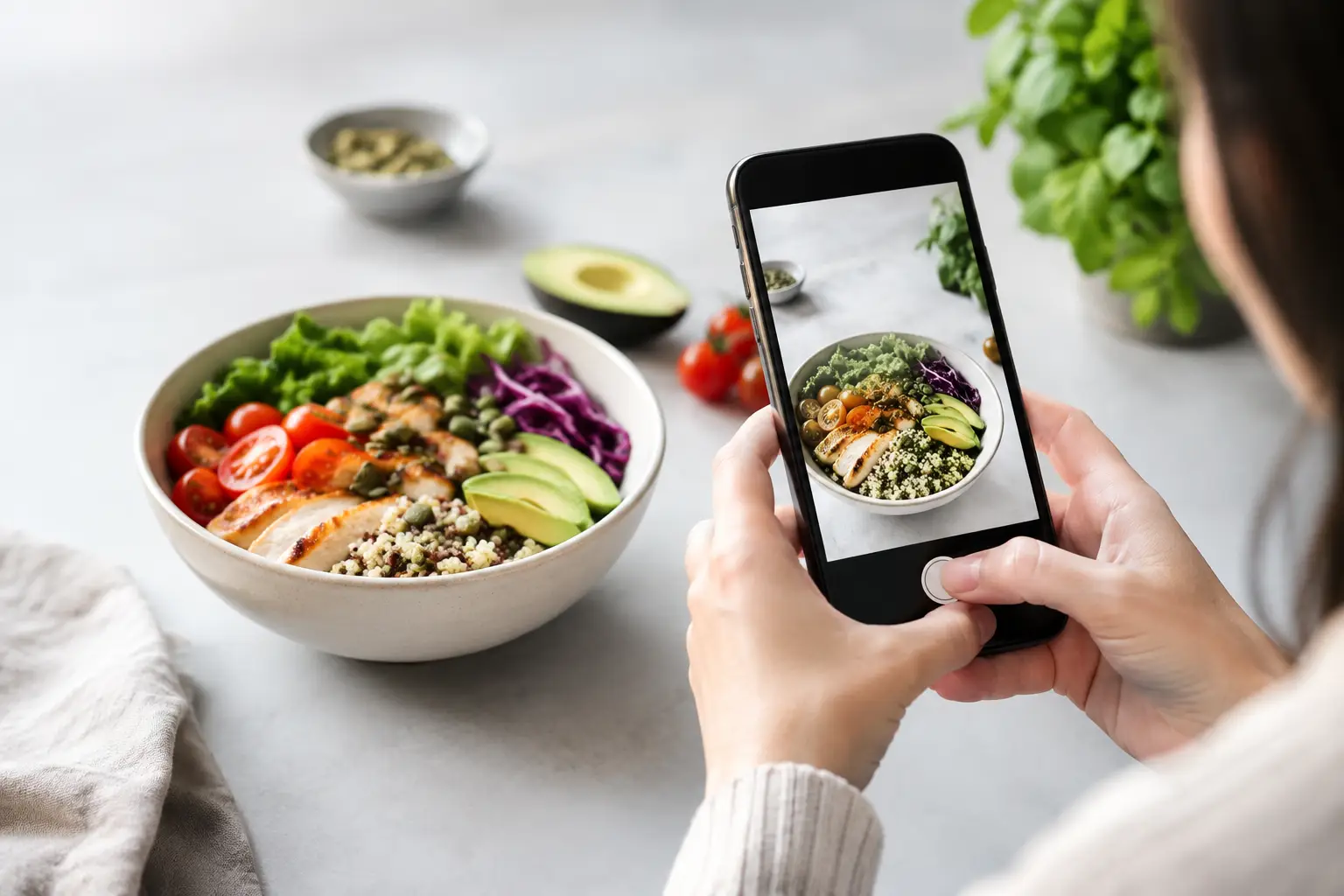
    This is where a platform like Pic-ture That!™ fits naturally. The value is not only that diners can see real food before ordering. It is that the photos come from a community helping build a more transparent, accessible menu experience. That kind of model gives people a clearer picture of what they are choosing, especially when text alone is not enough.

    Check for consistency, not perfection

    A single image can be misleading in either direction. Maybe the dish was photographed on an especially good day. Maybe it was rushed out during a busy dinner service and looked rough. What matters more is the pattern.

    When you look at authentic menu photos, ask a simple question: do these images generally agree with each other? If the same sandwich keeps showing up with the same bread, filling, and portion size across multiple photos, that is a strong signal. If every photo looks wildly different, the dish may be inconsistent, seasonal, customizable, or just hard to photograph clearly.

    Consistency does not mean the meal has to look glamorous. It means the visuals line up closely enough to help you make a more informed choice. Real food has variation. The goal is a trustworthy range, not studio-level perfection.

    Read the context around the photo

    A photo without context can still leave you guessing. Was it dine-in or takeout? Was the dish customized? Did it include extra toppings or a substituted side? Authentic menu photos become much more useful when they are paired with small bits of real-world detail.

    Look for captions, user notes, timestamps, and menu item names that match what you are about to order. If someone labels a photo clearly and mentions that the dish was ordered as listed, that gives the image more weight. If the photo is unlabeled or attached loosely to a restaurant profile, you may not know whether it matches the exact item.

    Timing matters too. A photo from three years ago might still be helpful, but restaurants change plating, suppliers, packaging, and portioning over time. More recent uploads usually give you the best picture of what to expect now.

    Watch for common red flags

    Some photos look real at first glance but do not actually help you order better. A heavily filtered image can distort color and texture. Extreme close-ups may hide portion size. Group table shots can make it hard to identify which dish is which. And a beautiful image that is not labeled clearly may be more confusing than useful.

    Another red flag is mismatch. If the menu says grilled chicken tacos and the photo shows breaded fish tacos, trust the mismatch, not the listing. Sometimes platforms pull images from general restaurant galleries rather than specific menu items. That is fine for atmosphere. It is not great for confidence.

    You should also be cautious with photos that appear overly polished compared with the rest of the listing. A restaurant hero shot next to several casual diner photos is not a problem by itself. But if the only image available looks like it belongs in an ad, it may not tell you much about the dish you will actually receive.

    Use authentic menu photos for more than looks

    Real menu photos are not only about presentation. They help answer practical questions that menu copy often skips. Is the bowl shallow or deep? Are the fries seasoned? Does the sandwich come with a pickle? Is the sauce poured on top or served on the side? Those details can change your order.

    For people managing sensory preferences, appetite, or food uncertainty, that information is even more valuable. A text description may say creamy, crispy, loaded, or spicy, but those words leave room for interpretation. A photo narrows the gap between what is promised and what is likely to arrive.

    That is why learning how to find authentic menu photos can save more than money. It can save energy. If ordering usually feels like a guessing game, clear visuals reduce one more layer of stress.

    What to do when photos are limited

    Not every restaurant has strong photo coverage, and not every menu item will have a perfect match. When that happens, the next best move is to look for adjacent clues. Check photos of similar dishes from the same restaurant, especially if the kitchen style seems consistent. A pasta photo may still help you estimate portion size for another pasta on the menu. A side-by-side image of an entree and drink can help you judge scale.

    You can also pay attention to repeat visual patterns. If multiple dishes are served in the same kind of container, bowl, or tray, that tells you something about presentation and serving size. It is not exact, but it is better than ordering blind.

    And sometimes the honest answer is that there is not enough visual information yet. That is not a failure. It is a reminder of why community photo sharing matters. Every real upload makes the next person’s decision easier.

    Better ordering starts with better visibility

    When people ask how to find authentic menu photos, what they are really asking is how to order with more confidence. They want fewer surprises, fewer disappointing meals, and fewer moments of wondering whether the dish on the table is what they thought they bought.

    The best authentic menu photos are not flawless. They are clear, recent, specific, and grounded in real diner experience. They help you compare options, set expectations, and choose what actually fits your needs. That kind of visibility makes dining more transparent and more inclusive for everyone.

    The next time a menu leaves too much to the imagination, trust your instinct and look for the real picture first. A better order often starts there.

  • Why a Visual Food Discovery App Matters

    Why a Visual Food Discovery App Matters

    You know the feeling. You open a menu, read a dish description twice, maybe three times, and still have no clear idea what will actually show up at the table. Is the pasta creamy or dry? Is the sandwich huge or snack-sized? Does the “crispy chicken bowl” look fresh and balanced or like something you would regret five minutes after it arrives? A visual food discovery app solves that gap by showing people real images of real menu items before they spend their money.

    That sounds simple, but it changes a lot.

    For many diners, seeing food before ordering is the difference between confidence and guesswork. For people with visual impairments, text-heavy menus can create another layer of friction. For anyone dealing with decision fatigue, long lists of dish names and vague descriptions can turn a basic lunch order into a draining task. When food discovery starts with clear visuals instead of just text, ordering becomes easier, faster, and more inclusive.

    What a visual food discovery app actually does

    At its best, a visual food discovery app is not just a gallery of pretty food photos. It is a decision tool. The goal is not to make every dish look glamorous. The goal is to help users understand what they are ordering in a way that feels honest, useful, and immediate.

    That distinction matters. Restaurant marketing photos often show an idealized version of a meal. Those images can be polished, staged, and disconnected from what a customer will actually receive. A visual menu platform built around authentic user-submitted images offers something different: transparency. It gives diners a more realistic picture of portion size, plating, ingredients, and overall appeal.

    That can prevent bad orders, reduce wasted money, and build trust. It can also help people try something new with less risk. If a dish looks great in real photos from other diners, the decision gets easier.

    Why visuals matter more than menu descriptions

    Food is visual. That seems obvious, but restaurant ordering still leans heavily on text. Menus describe flavor, ingredients, and preparation style, yet they often leave out what many people want most: What does it actually look like?

    Descriptions can only do so much. Words like loaded, house-style, signature, or artisan are common, but they are also vague. Even ingredient lists do not tell you whether a salad is generously portioned, whether the sauce is overwhelming, or whether a dessert looks worth the price.

    A visual-first experience closes that gap. It lets diners compare dishes quickly and make decisions with more certainty. That is especially helpful in mobile ordering, where people are often choosing fast, on a small screen, between meetings, in a carpool line, or late at night when they are tired and hungry. In those moments, clarity beats clever menu copy.

    A visual food discovery app is also an accessibility tool

    This is where the conversation gets bigger than convenience.

    A visual food discovery app can support dining accessibility in a meaningful way. People with visual impairments do not all interact with menus in the same way, and images alone are not a complete accessibility solution. Alt text, screen reader support, and thoughtful app design still matter. But food imagery can reduce uncertainty and add context that text-only menus often fail to provide.

    It can also support users who struggle with cognitive overload or decision fatigue. That includes people with disabilities, busy parents, neurodivergent users, and honestly anyone who has ever stared at a 60-item menu and felt their brain shut down. Seeing the dish can simplify the choice. Instead of decoding a wall of descriptions, users can respond to what feels clear and appealing.

    Accessibility is often treated like an extra feature. It should not be. Better menu transparency helps more people participate in dining with confidence. That is not niche value. That is better design.

    Why authenticity matters more than polished food photography

    There is nothing wrong with professional food photography. Restaurants need strong visuals, and good marketing images can absolutely help people discover new spots. But when the goal is informed ordering, authenticity matters more.

    Real customer photos tend to answer practical questions that studio images do not. How full is the container? How does the side dish compare in size to the main? What does the item look like in normal restaurant lighting? Does the burger really come stacked that high? Those details influence whether someone feels good about an order.

    There is a trade-off here. User-generated photos can vary in quality. Some will be better lit, better framed, or more helpful than others. A strong platform needs standards, moderation, and incentives that encourage useful contributions instead of random uploads. But that effort is worth it because authentic images build trust in a way polished brand imagery often cannot.

    When people feel like they are seeing the food as it actually arrives, they make better choices.

    Community is what makes the model work

    A food photo platform only becomes truly useful when it has broad, current menu coverage. That is where community participation matters.

    When users upload their own meal photos, they help build a shared library of visual menu information that benefits everyone else. One person’s lunch photo can help the next person avoid an expensive disappointment. Over time, that creates network effects. More contributors mean more dish coverage. More coverage makes the app more useful. More usefulness attracts more users, which brings in more contributors.

    That cycle is powerful because it turns diners into active participants, not just passive consumers. It also creates a more democratic version of food discovery. Instead of relying only on restaurants to present their menus, the community helps document what people are really being served.

    Rewards can help here too. Earning restaurant gift cards or other perks gives users a tangible reason to contribute. But the bigger motivator is often participation itself. People like helping others make better choices, especially when the action is easy and the impact is immediate.

    That community angle is a big part of what makes Pic-ture That! feel timely. It treats diners like collaborators in a more transparent food system, not just customers scrolling through ads.

    What diners gain from using it

    The most obvious benefit is confidence. You can see a meal before ordering it, which lowers the chance of surprise, disappointment, or wasted money.

    But there are smaller wins that add up. Ordering gets faster. Group decisions become easier because everyone can compare options visually. Trying a new restaurant feels less risky. People with specific preferences around ingredients, portion size, or presentation get more context before committing.

    There is also a trust benefit. When a platform centers real dish imagery, it respects the diner’s right to make an informed choice. That sounds basic, but it is still missing from a lot of restaurant experiences.

    Of course, it depends on the quality and freshness of the content. A visual platform is only as useful as its coverage. If a menu changes often or a restaurant has only one or two uploaded dishes, the experience may still feel incomplete. But even partial visibility can be better than none, especially when users know the library is growing.

    What restaurants gain, even if they are not taking the photos

    Restaurants may hear “user-generated food photos” and worry about losing control over presentation. That concern is understandable. Not every customer photo is flattering, and no brand wants to be misrepresented.

    Still, the upside is real. Transparent visuals can attract customers who would otherwise hesitate to order. They can reduce mismatched expectations and make diners feel more confident about higher-ticket items. They can also surface menu favorites in a way that feels credible because the endorsement comes from real people.

    For restaurants, this is less about perfection and more about trust. A business that is comfortable letting diners see what dishes actually look like sends a strong message. It says there is nothing to hide.

    Where this category is heading

    The demand for visual ordering is only going to grow. Mobile-first diners already expect to see products before buying them in retail, travel, and social commerce. Food should not be the exception.

    The next wave of restaurant discovery will likely be more visual, more community-powered, and more accessibility-aware. Not every app in this space will get the balance right. Some will lean too hard into aesthetics and forget usefulness. Others will treat accessibility like a checkbox instead of a core design principle. The platforms that stand out will be the ones that keep the mission clear: help people see what they are ordering, trust what they are seeing, and feel included in the process.

    That is bigger than food photos. It is about reducing friction in an everyday decision that should never feel harder than it needs to.

    If ordering from a menu has ever felt like guesswork, that is your sign that the old model is not enough. People deserve to see their options clearly, choose with confidence, and help build a dining experience that works better for everyone.