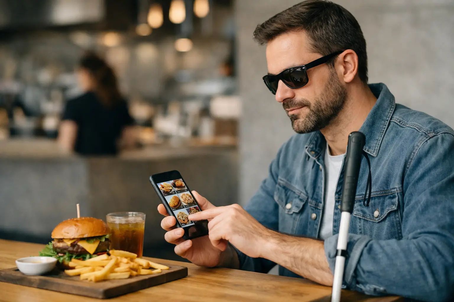
Ordering food should not feel like guessing with your wallet.
For many people, a food ordering app for visually impaired users is not a nice extra. It is the difference between choosing with confidence and hoping the meal that shows up matches a vague description. Menus often rely on short text, inconsistent labels, and polished marketing photos that do not reflect the real dish. That gap creates frustration fast, especially when accessibility needs and decision fatigue are already part of the experience.
At its best, a food app should do more than process a payment. It should help people understand what they are ordering, compare options without stress, and feel included in the same restaurant experiences everyone else gets. That is where accessibility and transparency start to matter in a very real way.
What a food ordering app for visually impaired users should actually solve
Most restaurant apps are built around speed. Tap, scroll, add to cart, checkout. That works only if the information is clear enough to support a real decision. For visually impaired users, the problem is usually not just one missing feature. It is a stack of small failures that add up.
A dish might have a name that sounds familiar but gives no clue about portion size, plating, texture, or what is actually included. The image might be decorative, unlabeled, or missing entirely. Screen reader navigation may work on one page and break on the next. Buttons can be hard to identify. Modifiers can be confusing. Even when an app is technically usable, it may still leave a user uncertain about the final order.
That uncertainty has a cost. It can mean wasted money, disappointing meals, extra back-and-forth with staff, or giving up and ordering the same safe item every time. Accessibility is not only about being able to complete a transaction. It is about being able to make an informed choice.
Why food photos matter more than many apps admit
The restaurant industry has treated photos as a marketing layer for years. For accessibility, they serve a much bigger purpose.
Real dish images can help users understand what text often fails to communicate. Is the pasta covered in a heavy cream sauce or lightly dressed? Does the sandwich come stacked so high it is hard to eat? Are the tacos generously filled or mostly garnish? Is the smoothie bowl bright and fruit-forward or dominated by granola? These details shape whether a meal feels worth the price, matches dietary preferences, or fits personal comfort.
For blind users, low vision users, and people who use assistive technology in different ways, image access depends on how those visuals are presented. Photos alone are not enough. They need meaningful labels, context, and integration with a well-structured app experience. But when handled well, food imagery supports decision-making in a way that text-only menus rarely can.
There is also a trust factor here. Studio-perfect photos can create false expectations. Authentic, accurate images from real diners often tell a more useful story. They show the portion, presentation, and variation that polished brand photography tends to smooth over. That kind of transparency is not just helpful. It is respectful.
The features that make a real difference
If an app claims to support accessibility, the standard should be higher than basic compliance. A strong experience usually starts with screen reader compatibility, clear heading structure, properly labeled buttons, and forms that are easy to move through without friction. Those are table stakes.
What separates a truly useful product is how it supports confidence before checkout. Detailed image descriptions matter. So does consistent menu organization, especially when restaurants offer lots of modifiers and add-ons. Search should be simple. Categories should be predictable. Price, portion cues, ingredients, and preparation style should be easy to find.
There is also a strong case for community-powered visuals. User-submitted photos can broaden menu coverage and reflect what dishes actually look like across locations and time. The trade-off is quality control. If an app opens the door to user content, it needs moderation standards so images stay relevant, clear, and trustworthy.
A good app should also recognize that accessibility is not one-size-fits-all. Some users want screen reader optimization first. Others want zoom support, strong color contrast, larger tap targets, or reduced visual clutter. Some are not visually impaired at all but still benefit from clearer menu presentation because decision fatigue is real. Better design helps more people than brands often assume.
Accessibility is not separate from convenience
There is a bad habit in tech product thinking: treating accessibility as a side lane while convenience gets the spotlight. In food ordering, those goals should be moving together.
When menu information is organized clearly, everyone orders faster. When photos match the actual dish, fewer people feel burned by a purchase. When the interface is easier to navigate, fewer users drop off before checkout. What helps visually impaired users often improves the experience for busy parents, tired commuters, and anyone trying to order dinner without overthinking it.
That is why accessibility should not be framed as a niche feature. It is part of good product design. It reduces friction. It builds trust. It gives people a better reason to come back.
Where many restaurant apps still fall short
Some apps do one thing well and stumble everywhere else. A menu may work with VoiceOver or TalkBack, but dish descriptions are thin. The photos may look appealing, but the alt text says almost nothing. The checkout flow may be accessible, but customization options become a maze.
There is also a gap between restaurant control and user reality. Restaurants often upload only their best images, and only for a few flagship items. That leaves large parts of the menu without visual context. Smaller businesses may not have the time or budget to maintain accurate photo libraries at all.
This is where platform thinking becomes useful. Instead of expecting every restaurant to solve the problem alone, an app can build a shared system around authentic dish photos, accessibility-focused design, and community contribution. That model creates better coverage over time, especially if users are rewarded for adding useful content and helping fill menu gaps.
Pic-ture That!™ is built around that idea: helping people see real meals before they order and making menu transparency more accessible through community-powered food photos.
Why community matters in a food ordering app for visually impaired diners
The strongest accessibility tools are often shaped by the people who actually use them. That is especially true in food ordering, where menu accuracy changes constantly and dish presentation can vary from one visit to the next.
A community-powered app can respond faster than a static restaurant menu. Users can upload recent photos, show portion differences, and make the ordering experience more grounded in reality. That helps other diners make smarter calls without relying on guesswork.
Still, community features need structure. Rewards can encourage participation, but incentives should support quality instead of quantity. Clear photo guidelines, review systems, and thoughtful moderation all matter. Without those pieces, an app can become noisy fast. With them, it becomes more useful every time someone contributes.
There is something bigger at play here too. When users help build a more accessible menu ecosystem, they are not just uploading pictures. They are making dining more equitable. They are closing a visibility gap that should not exist in the first place.
What diners should look for before trusting an app
If you are choosing a food ordering app and accessibility matters to you, it helps to be practical. Check whether dish photos appear across more than a handful of menu items. See whether image descriptions provide real context. Notice whether navigation feels consistent from browsing to checkout. If an app offers community photos, look at whether those images feel authentic and recent.
It is also fair to ask whether the app reduces uncertainty or simply adds more content to sort through. More information is not always better. Better information is better.
That standard matters because ordering food is personal. People are spending money, managing preferences, and trying to avoid disappointment in a part of daily life that should feel easy. No one should have to settle for mystery meals because product teams treated clarity as optional.
The future of restaurant ordering should look more honest, more inclusive, and more useful. Not just prettier. If a platform can help people understand what is actually on the menu, trust what they are buying, and contribute to a better experience for the next diner, that is more than a feature set. That is progress worth building together.
Leave a Reply