Category: Ordering Tips

  • How to Avoid Menu Regret Before You Order

    How to Avoid Menu Regret Before You Order

    You know the feeling. Your food arrives, and within five seconds you realize you picked the wrong thing. Maybe the portion is tiny. Maybe the “crispy” sandwich is soggy. Maybe the dish sounded great on the menu but looks nothing like what you pictured. If you’ve ever wondered how to avoid menu regret, the good news is that it usually comes down to better information before you order.

    Menu regret is not just annoying. It wastes money, turns a meal into a letdown, and makes ordering feel harder than it should. For plenty of diners, especially people dealing with decision fatigue or limited menu visibility, it can also make eating out feel stressful instead of fun. That is exactly why more people want a clearer, more visual way to choose.

    Why menu regret happens so often

    Most menus ask you to make a decision with incomplete information. You get a dish name, a short description, maybe a few ingredients, and a price. But that still leaves out the details people actually care about: portion size, plating, texture, toppings, side dishes, and whether the meal looks appealing in real life.

    Restaurants are not always trying to be vague. Menus have limited space, and food language can only do so much. “House sauce,” “chef’s style,” or “market vegetables” may sound nice, but those phrases do not help much if you are trying to picture what is actually coming to the table.

    There is also the expectation gap. A dish can be technically accurate to the menu description and still be disappointing. You may imagine a thick burger and get a thin patty. You may expect a fresh, bright salad and get a bowl heavy on dressing. Menu regret lives in that gap between what you thought you were buying and what shows up.

    How to avoid menu regret with better clues

    If you want to know how to avoid menu regret, start by treating ordering like a quick decision process instead of a guess. The goal is not to overthink dinner. It is to replace uncertainty with a few reliable clues.

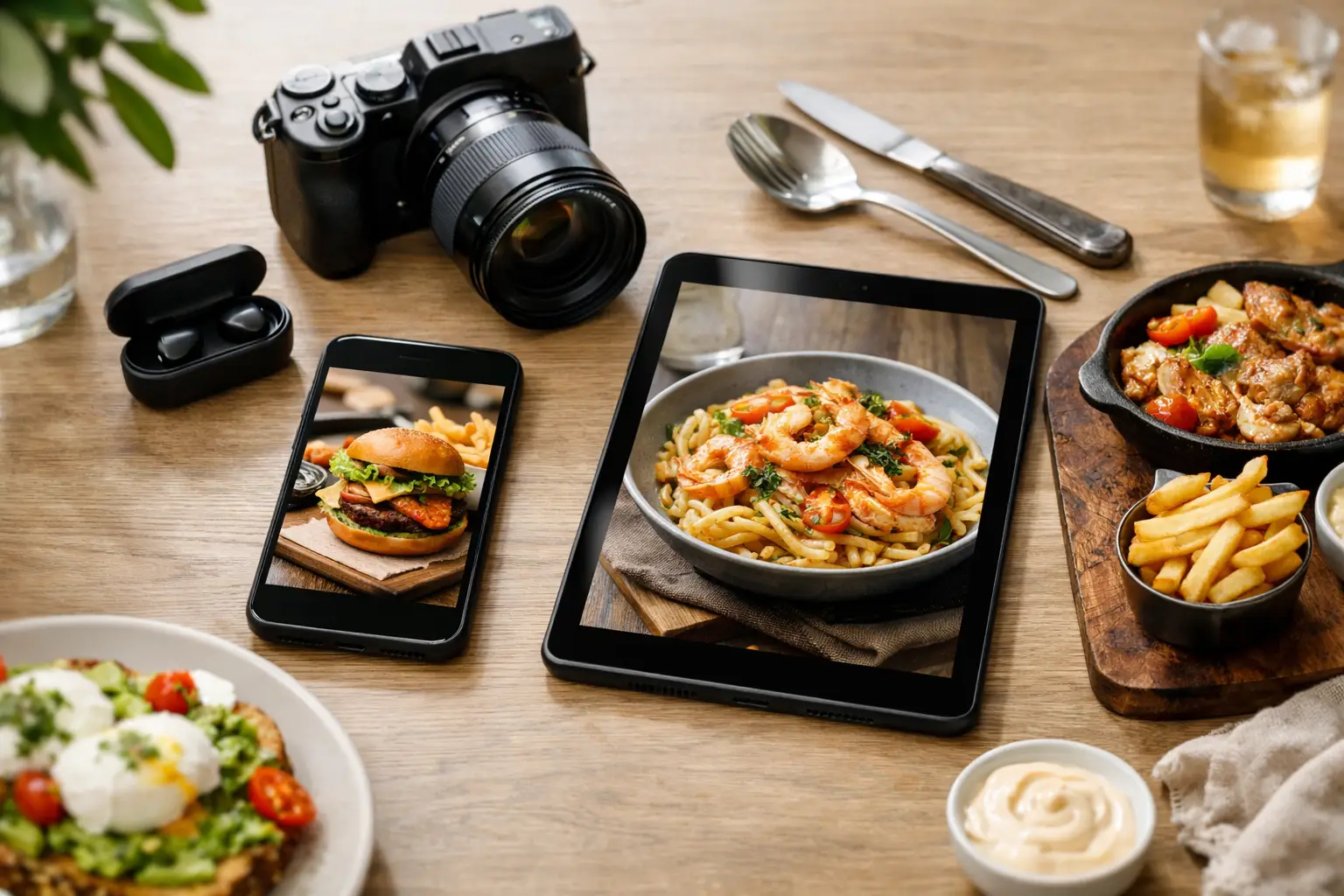
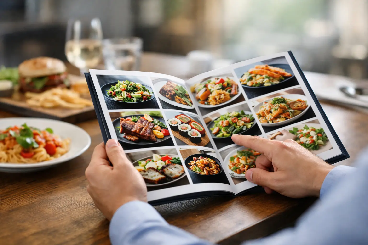
    The best clue is simple: see the food before you buy it. Real dish photos give context that text never can. You can spot whether a pasta looks creamy or dry, whether tacos come loaded or minimal, and whether a dessert is worth the price. A real image can answer questions you did not even know you had.

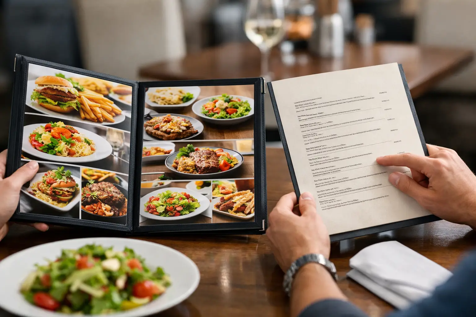
    That matters for every diner, but it matters even more when accessibility is part of the experience. If text-heavy menus are difficult to navigate, or if too many similar options create instant mental overload, visual information can reduce friction fast. It is easier to choose when the dish is visible, not just described.

    What to check before you commit

    A smart order usually comes from checking three things: what the dish actually looks like, how it fits your mood, and whether the price matches the likely payoff.

    Start with appearance. Ask yourself if the meal looks like something you genuinely want right now. This sounds obvious, but many bad orders happen because people buy the best-written description instead of the dish that fits the moment. A rich pasta may sound amazing until you realize you wanted something lighter. A giant fried entrée may not be ideal if you need a quick lunch that will not slow you down.

    Next, think about portion and balance. Is the plate mostly carbs? Does the protein portion look smaller than expected? Are the sides substantial or just decorative? Photos help here because they reveal scale in a way menu copy rarely does.

    Finally, consider risk. Some meals are dependable. Others are a gamble. If a dish has a vague description, a premium price, and no visual reference, your chances of disappointment go up. That does not mean never order anything new. It means recognize when you are making a blind pick.

    The hidden role of decision fatigue

    Not every disappointing order is about the food itself. Sometimes the problem is that you were already tired of deciding.

    Decision fatigue shows up when you have too many options, too little information, and not enough energy to compare everything. At that point, people often rush, default to a random choice, or order what sounds familiar even if it is not what they really want. Then the food arrives, and the regret kicks in.

    This is one reason visual discovery changes the experience. Looking through real dish images can narrow choices faster than reading long menu sections line by line. It reduces the mental load. Instead of trying to imagine twelve different entrées from text alone, you can quickly rule out what does not appeal to you and focus on what does.

    That is not about making dining superficial. It is about making it clearer. When people can see what they are choosing, they make more confident decisions.

    Why real photos matter more than polished marketing shots

    There is a big difference between a stylized promotional image and a real customer photo. Marketing images are designed to sell. Real photos are designed to show. If your goal is to avoid menu regret, accuracy beats perfection.

    A polished studio shot might make every burger look huge and every dessert look flawless. But a real-world image tells you what will likely land in front of you. It shows the bun size, the fry portion, the sauce level, and the plating. That kind of honesty builds trust.

    This is where community-powered food photos are especially useful. When diners share authentic images, they help the next person order with less guesswork. That makes the menu more transparent and more accessible at the same time. It is not just helpful content. It is practical dining equity.

    Pic-ture That!™ is built around that idea: seeing real meals before ordering so people can choose with more confidence, less uncertainty, and a better shot at getting what they actually want.

    How to avoid menu regret when trying something new

    Trying a new dish should feel exciting, not risky. But there is always a trade-off. Familiar orders are safer. New orders can be better, but only if you have enough information to make a smart choice.

    If you are stepping outside your usual order, look for anchors. Choose something with visible ingredients you already like. Check whether the portion looks satisfying. Pay attention to whether the preparation seems aligned with your preferences. For example, if you know you do not love heavily sauced food, a photo can help you catch that before you spend money on it.

    It also helps to separate novelty from quality. A dish can be interesting without being right for you. Ordering the menu item with the most unusual name is not always adventurous. Sometimes it is just expensive confusion.

    Accessibility is part of a better ordering experience

    For some diners, menu regret is a minor frustration. For others, it reflects a bigger issue: menus often are not built for equal access.

    People with visual impairments may have limited ways to assess what a dish will actually be. People with cognitive overload or anxiety around decision-making may find long, text-only menus exhausting. And plenty of diners, with or without a formal accessibility need, simply do better with visual information.

    That is worth saying clearly: seeing food before ordering is not a luxury feature. It can be an accessibility tool. It supports confidence, independence, and a more inclusive dining experience. When restaurants and food platforms make menus more transparent, they are not just making things convenient. They are making them fairer.

    A smarter way to order every time

    The best ordering habit is not memorizing menu terms or always sticking to the same meal. It is building a simple filter. Can I see what this dish really looks like? Does it match what I want right now? Does the price feel justified based on what I can actually expect?

    When the answer is yes, regret drops fast. When the answer is no, pause before tapping checkout or telling the server your order. A little clarity upfront can save you from a very average lunch and a very annoying bill.

    Food should feel worth it. Not just edible, not just convenient, and definitely not disappointing because the menu left too much to the imagination. The next time you order, give yourself permission to ask for better information, trust what you can see, and choose the meal that feels clear before it ever reaches the table.
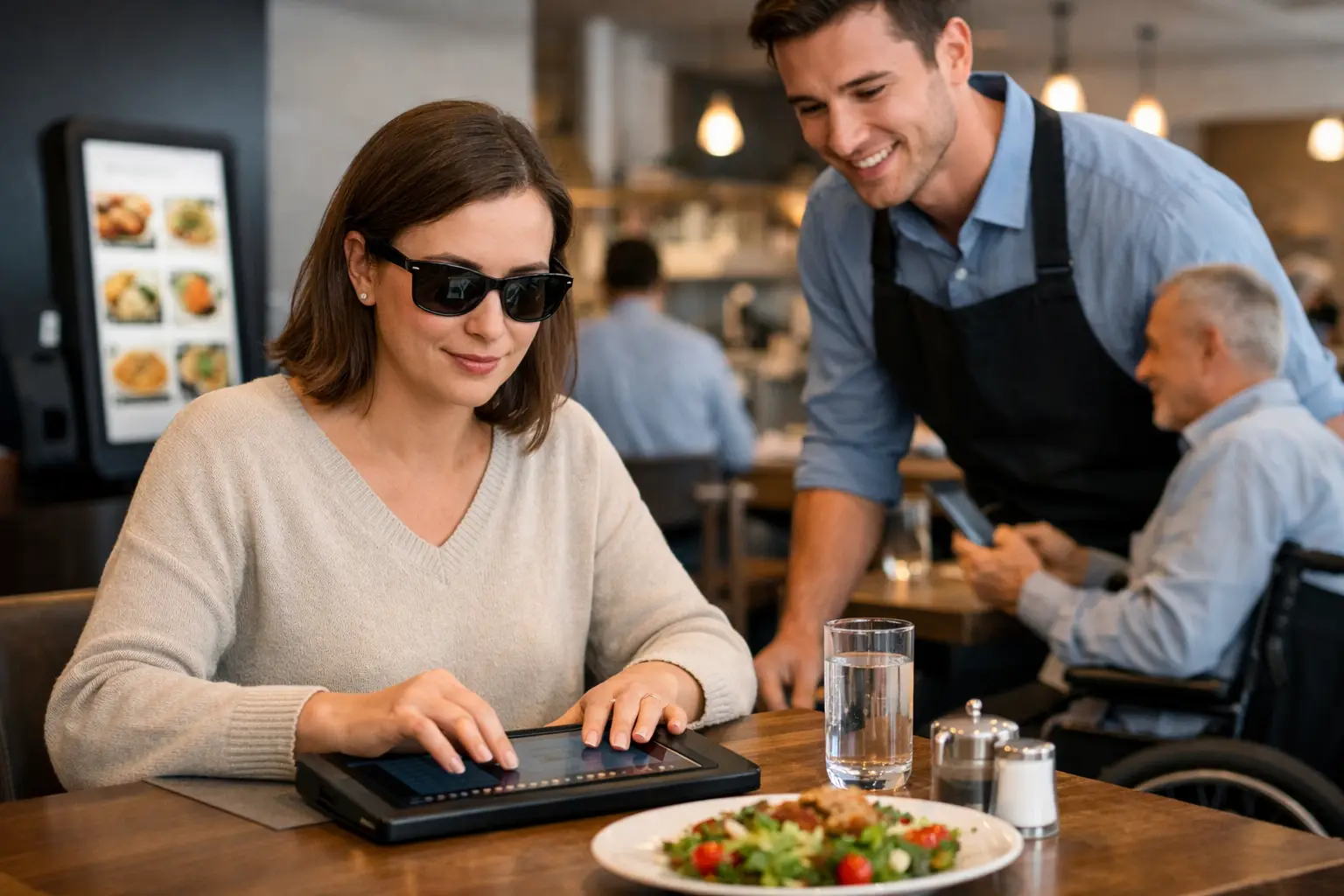
  • How to Order With Confidence Every Time

    How to Order With Confidence Every Time

    You know the feeling. A menu sounds great, the description seems close enough, and then your food arrives looking nothing like what you pictured. Maybe the portion is smaller, the sauce is heavier, or the dish includes something the menu barely mentioned. If you want to know how to order with confidence, the fix is not guessing better. It is getting better information before you spend.

    For a lot of diners, this is not a small annoyance. It is wasted money, decision fatigue, and the stress of choosing from words that leave too much out. For people with visual impairments, text-only menus can create an even bigger gap between what is described and what actually shows up at the table. Seeing real dishes before ordering changes that. It makes the process clearer, more accessible, and far less frustrating.

    What how to order with confidence really means

    Ordering with confidence is not about knowing every cuisine or becoming a menu expert. It means making a choice with enough clarity that you are not bracing for disappointment. You understand what the dish looks like, how it is likely prepared, and whether it matches what you want right now.

    That matters because restaurant menus are built for speed, not always for accuracy. Descriptions are often short. Terms like crispy, loaded, house-style, or spicy can mean very different things depending on the restaurant. Even honest menus leave out visual details that influence satisfaction, like portion size, topping distribution, texture, or plating.

    Confidence comes from closing that gap. The more your expectations match reality, the better your ordering decisions become.

    Why menu descriptions alone are not enough

    A menu can tell you ingredients, but it rarely tells you the whole experience of the dish. A sandwich might list avocado, but not show that there is only a thin spread. A pasta might mention cream sauce, but not make clear how rich or heavy it looks. A salad can sound fresh and balanced, then arrive packed with cheese, dressing, and extras.

    This is one reason people reorder the same safe items again and again. Familiar choices feel less risky than new ones. But that also limits the fun of eating out. When you can see authentic food images before ordering, trying something new feels less like a gamble.

    That is especially useful when you are hungry, rushed, splitting a bill, ordering for a group, or managing dietary preferences. In those moments, vague descriptions do not help much. Clear visuals do.

    How to order with confidence before you buy

    The best ordering habits start before checkout. First, pause and decide what you actually want from the meal. Are you looking for something light, comforting, filling, shareable, or easy to eat on the go? A lot of bad orders happen because the dish was not wrong. It just was not right for the moment.

    Next, look for real images of the exact menu item whenever possible. Not polished promo photography. Not a brand-perfect hero shot that may have been styled under studio lights. Real photos from actual diners are often more useful because they set realistic expectations. You can quickly judge portion size, toppings, side items, texture, and presentation.

    This is where a visual-first tool can make a genuine difference. Pic-ture That!™ was built around a simple idea: seeing what people really received helps you choose with more clarity. That matters for anyone who wants fewer ordering regrets, and it matters even more for accessibility.

    If you cannot find a photo, read the menu with a few practical questions in mind. What is the main ingredient? What is likely doing the heavy lifting in the flavor – sauce, seasoning, cheese, oil, or spice? Does the dish sound assembled or cooked to order? Does it include sides, or are those separate? These small checks will not replace an image, but they can make a text-only menu less vague.

    Use comparison, not perfection

    One underrated part of how to order with confidence is comparing dishes against each other instead of trying to predict one dish perfectly. If you are stuck between two burgers, two bowls, or two pasta options, compare what is easier to understand.

    One item may have a clearer ingredient list, a more familiar preparation style, or better visual references. That does not guarantee it will be better, but it does reduce uncertainty. Confidence often comes from choosing the option with fewer unknowns.

    This matters because ordering is rarely about finding a perfect meal. It is usually about making a satisfying choice with the information you have. Better comparison leads to better odds.

    Confidence looks different for different diners

    There is no single rule that works for everyone. Some people care most about portion size because they are stretching their budget. Others are trying to avoid texture surprises. Some need a clearer sense of what is on the plate because visual information makes the decision process more accessible and less exhausting.

    For diners with visual impairments, confidence may depend on detailed image support, reliable labeling, and a platform that treats food visibility as a real access need instead of a nice extra. For people who experience decision fatigue, confidence may come from narrowing options fast and seeing enough proof to stop second-guessing.

    That is why transparency matters. The more clearly a dish is shown, the more inclusive the ordering experience becomes.

    When reviews help and when they do not

    Reviews can support confident ordering, but only if you use them well. A review that says the tacos were amazing does not tell you whether they were tiny, messy, heavily sauced, or topped with onions. Opinions are useful, but visuals answer different questions.

    The strongest approach is to pair both. Use photos to understand what the dish is, then use reviews to learn whether it was consistent, flavorful, or worth the price. If the images look good but multiple reviews mention sogginess, missing ingredients, or uneven portions, that is worth paying attention to.

    At the same time, one bad review should not automatically scare you off. Restaurants have off days, and personal taste varies. Look for patterns, not isolated reactions.

    Build your own ordering filter

    If you order out often, it helps to create a personal filter for quick decisions. Think about the dishes you usually enjoy and the ones you regret. The pattern is often more obvious than you think.

    Maybe you are happiest with meals that have visible components rather than mixed-together ingredients. Maybe you prefer grilled foods over fried ones, or bowls over wraps, or dishes where the sauce comes on the side. Once you know your own preferences, menus become easier to read and images become easier to judge.

    This also helps with group ordering. When everyone is hungry and moving fast, having a clear sense of your own baseline makes the process less stressful. You do not need endless debate. You just need enough clarity to make a choice that fits you.

    The role of community in ordering better

    Confident ordering gets easier when people share what they actually received. That is the value of community-powered food photos. Each upload helps the next person make a clearer choice, avoid disappointment, and spend more wisely.

    That community effect is bigger than convenience. It supports transparency in an industry where visuals often lag behind reality. It also creates a more inclusive food experience by giving diners access to practical information that menus alone do not provide.

    When people contribute authentic meal photos, they are not just posting food. They are making restaurant discovery more useful for everyone.

    How to order with confidence without overthinking it

    There is a balance here. Confidence should reduce stress, not create a whole new research project every time you want lunch. You do not need to analyze every menu item in detail. You just need enough evidence to feel good about your choice.

    Start simple. Look for a real image. Check whether the dish matches your mood, appetite, and budget. Notice any obvious red flags in reviews. If the information still feels too thin, pick the option with fewer unknowns.

    That approach works because it respects real life. Sometimes you have time to compare. Sometimes you do not. The goal is not perfect certainty. It is less risk, more clarity, and a better shot at getting what you actually want.

    A better food experience starts before the first bite. When diners can see more, they can choose better, and that makes every order feel a little more fair, a little more accessible, and a lot more satisfying.

  • Why Accessible Dining Technology Matters

    Why Accessible Dining Technology Matters

    A menu shouldn’t feel like a guessing game, especially when you’re spending real money on a meal. Accessible dining technology is changing that by giving people clearer, more useful ways to understand what they’re ordering before they commit. For some diners, that means convenience. For others, it means independence, less stress, and a much more equitable dining experience.

    Restaurants have spent years improving online ordering, mobile payments, and delivery speed. But speed is not the same thing as access. If a menu is text-heavy, vague, poorly structured, or missing visual context, plenty of people are still left making low-confidence decisions. That gap matters more than many businesses realize.

    What accessible dining technology actually means

    Accessible dining technology includes the digital tools that make restaurant discovery, ordering, and decision-making easier for more people. That can include screen reader-friendly menu layouts, alt text, readable fonts, smart contrast, voice support, and ordering flows that reduce friction. It also includes something the industry often overlooks: accurate, real-world food imagery that helps people understand what a dish actually looks like.

    That last piece is bigger than it sounds. Menus are often built around short descriptions, inconsistent naming, and marketing language. “House special pasta” or “loaded bowl” may sound appealing, but those labels do not tell every diner what they need to know. Portion size, ingredients, presentation, toppings, and texture can all influence whether a meal feels like a good choice.

    When dining technology adds visual clarity, it becomes more than a convenience feature. It becomes an accessibility tool.

    Why accessible dining technology matters in real life

    A lot of restaurant tech is built around efficiency for the business. Faster checkout. Higher ticket sizes. Easier upsells. Those goals are understandable, but they do not automatically create a better experience for diners.

    Accessible dining technology starts from a different question: what does the customer need to feel informed and confident? That shift changes the whole experience.

    For diners with visual impairments, accessible design can support better navigation, compatibility with assistive tools, and a stronger sense of control. For diners with decision fatigue, clearer information can reduce mental load. For anyone ordering from a new place, authentic visuals can lower the risk of disappointment. Even people without a formal accessibility need benefit when restaurant information is easier to interpret.

    That broad usefulness is part of the point. Accessibility is not a niche upgrade. It improves the baseline experience for a wide range of people.

    Confidence is part of access

    One of the most overlooked barriers in dining is uncertainty. If you can’t tell what a dish really looks like, how large it is, or whether the description matches your preferences, you are not making a fully informed decision. You are estimating.

    That uncertainty can be frustrating for anyone, but it hits harder when dining out already requires extra effort. If someone relies on assistive technology, manages sensory preferences, or simply gets overwhelmed by too many unclear choices, low-quality menu information creates another layer of work.

    Accessible dining technology helps remove that layer. It gives diners more than access to a menu. It gives them access to confidence.

    The problem with text-only menus

    Text matters, but text alone has limits. Restaurant descriptions are often short because menus need to stay compact. They can also be inconsistent because every restaurant writes differently. One place says “crispy chicken sandwich,” another says “signature fried stack,” and neither tells you much about thickness, toppings, bread type, or plating.

    Photos fill in some of those gaps, but only if they are accurate. Polished marketing shots can help with promotion, yet they do not always help people make realistic decisions. Diners want to know what they are actually going to receive, not just what looked best under studio lighting.

    That is where community-powered visuals can make a real difference. Real photos from real diners can add transparency that menu copy alone cannot provide. They can also help set expectations in a way that feels useful instead of salesy.

    Accessible dining technology and food photos

    If food imagery sounds like a branding feature, think again. In the right context, it is part of accessible dining technology because it supports comprehension.

    Seeing a dish before ordering can help a diner assess portion size, ingredient mix, presentation, and whether the item matches what they had in mind. That matters for people who process information visually, for people who need to reduce uncertainty, and for people who want to spend their money more carefully.

    There is a trade-off, of course. Images only help when they are current, relevant, and easy to interpret. If a platform is full of outdated photos, poor angles, or mismatched items, visual content can create confusion instead of reducing it. Accessibility is not just about having more information. It is about having better information.

    That is why authenticity matters so much. Clear, accurate images are not fluff. They are useful decision support.

    What restaurants often miss

    Many restaurants care about hospitality, but their digital experience does not always reflect that. A dining room can be welcoming while the online menu is cluttered, hard to navigate, or vague. As more ordering happens on phones, that disconnect becomes harder to ignore.

    Mobile-first diners expect clarity. They want to browse quickly, compare options, and feel sure about what they are buying. If the digital menu makes that harder, the restaurant creates friction before the meal even starts.

    This is also where accessibility and business value overlap. Better menu visibility can reduce abandoned orders, increase trust, and encourage repeat visits. People are more likely to order when they feel informed. They are also more likely to come back when what arrives matches what they expected.

    Accessible dining technology is good for inclusion, and it can also be good for conversion. Those goals do not compete.

    Community plays a bigger role than people think

    Restaurants cannot always keep every dish photo updated across every platform. Menus change. Specials rotate. Presentation varies by location. That is one reason user-generated content has such strong potential in this space.

    When diners share real meal photos, they help build a more transparent food ecosystem. They are not just posting for fun. They are making restaurant choices easier for the next person.

    That community layer matters because accessibility works best when it grows with actual user behavior. A platform shaped by diner contributions can surface the details people really care about, instead of guessing from the top down. In that sense, accessible dining technology is not only a product category. It is also a participation model.

    Pic-ture That!™ fits naturally into that shift by treating food photos as a decision-making tool, not just a nice extra. That approach meets people where they already are: on their phones, comparing options, trying to order with more confidence.

    Where accessible dining technology still has room to improve

    The category is moving in the right direction, but there is still work to do. Many restaurant apps and ordering systems remain inconsistent in how they support assistive technology. Visual design can also create problems when readability gets sacrificed for branding.

    There is also the challenge of standardization. One platform may offer clean images and better menu structure, while another still relies on dense text blocks and confusing navigation. For users, that means the experience can vary a lot from one restaurant to the next.

    Another issue is assuming one solution works for everyone. Some diners need better compatibility with screen readers. Others benefit most from authentic dish images. Others need simpler menu architecture to reduce cognitive overload. Accessible dining technology works best when it recognizes that access is not one-size-fits-all.

    What the future should look like

    The best restaurant tech should help people feel informed before they order, not just processed after they click. That means building menus and discovery tools that are readable, visual when helpful, mobile-friendly, and grounded in real customer needs.

    It also means treating transparency as part of hospitality. Showing people what a dish actually looks like, making the menu easier to navigate, and reducing decision stress should not be seen as bonus features. They are part of what makes dining more inclusive.

    As diners keep expecting more clarity from restaurants, accessible dining technology will only become more relevant. Not because it is trendy, but because it solves a real problem people deal with every day.

    The next time a menu helps someone order with less stress and more certainty, that is not a small upgrade. That is what access looks like when it finally reaches the table.

  • 7 Best Apps for Menu Photos Right Now

    7 Best Apps for Menu Photos Right Now

    A menu says “crispy,” “loaded,” or “house favorite.” Your wallet hears “take a chance.” That is exactly why people keep searching for the best apps for menu photos – because guessing what a dish looks like is a bad way to order food.

    For plenty of diners, this is more than curiosity. It is about avoiding wasted money, bad surprises, and the stress of choosing from text alone. For people with visual impairments or decision fatigue, real dish photos can make the ordering experience feel far more accessible and manageable. The right app does not just show pretty food. It helps you make a clearer decision.

    What makes the best apps for menu photos actually useful?

    A lot of food apps include images, but not all of them help in the same way. Some are built to market restaurants. Others are built to help people decide what to order. That difference matters.

    The best apps for menu photos tend to do four things well. They show real food, not just polished promo shots. They connect images to specific menu items. They make photos easy to browse on mobile. And they give you enough context to trust what you are seeing.

    That last point is where many apps fall short. A beautiful plate photo is nice, but if you cannot tell whether it matches the current dish, portion size, or restaurant location, it stops being helpful fast. Authenticity beats perfection here.

    The 7 best apps for menu photos

    1. Pic-ture That!

    If your goal is to see what menu items actually look like before you order, Pic-ture That! stands out for a simple reason – it is built around that exact problem.

    Instead of treating food photos like a side feature, the platform centers visual menu discovery. That means users can browse real images of restaurant dishes to order with more confidence, especially when menu descriptions are vague or overly optimistic. The community-powered model also makes the experience feel more honest. Photos come from real diners, not just marketing teams.

    What makes it especially meaningful is the accessibility angle. For users with visual impairments, uncertainty around food ordering is not a minor inconvenience. It can be a real barrier. The app approaches menu photos as a transparency and dining equity issue, which is still rare in this category. It also gives contributors a reason to participate by rewarding uploads with gift card opportunities.

    The trade-off is coverage. Since community-driven platforms grow city by city and restaurant by restaurant, some menus may still be building out. But if you care about authentic dish images and helping create a more accessible dining experience, this is one of the strongest options available.

    2. Yelp

    Yelp remains one of the most familiar places people check before trying a restaurant, and menu photos are a big reason why. Users often upload a wide range of dish shots, which can help you get a rough sense of portion size, plating, and consistency.

    Its biggest strength is volume. Popular restaurants usually have plenty of user photos, and you can often match dishes to reviews for added context. That can help when you are deciding between two menu items or trying to figure out whether a dish looks worth the price.

    The downside is organization. Photos are not always tied neatly to exact menu listings, and quality can vary a lot. You may find ten burger photos and none of the pasta you actually want. Yelp is useful, but it often feels more like crowd-sourced restaurant browsing than true visual menu navigation.

    3. Google Maps

    Google Maps is not a menu-photo app first, but people use it that way all the time. Restaurant listings often include customer-uploaded images of dishes, menus, interiors, and counters, all in one place.

    That convenience matters. If you are already checking hours, reviews, and directions, seeing food photos in the same app can speed up the decision process. For quick searches like “What do the tacos here actually look like?” it works surprisingly well.

    Still, it is hit or miss. Images are usually not labeled carefully, and there is not much structure around menu-item discovery. Google Maps is best for fast restaurant vetting, not for precise ordering confidence.

    4. Instagram

    Instagram can be helpful when you want to see how food looks in real life, especially at trendy or highly photographed restaurants. Between customer posts, tagged photos, and restaurant accounts, there is often no shortage of visual content.

    The catch is that Instagram is built for social sharing, not menu clarity. Photos may be edited heavily, older than the current menu, or disconnected from the dish name entirely. You might see a gorgeous plate and still have no idea what it was called, whether it is still available, or how much it costs.

    It is a strong source of visual inspiration. It is a weaker tool for accurate menu decisions.

    5. TripAdvisor

    TripAdvisor works best for travel dining, but it can also help with menu photos, especially in tourist-heavy areas where restaurants attract a high volume of reviews and uploads.

    Like Yelp, it benefits from user-generated images. You can often see what dishes look like across multiple visits, which helps paint a more realistic picture than a single branded photo. That can be useful if you are traveling and want fewer ordering surprises.

    The trade-off is that TripAdvisor is not especially streamlined for menu-specific browsing. It is more restaurant-first than dish-first. Good for context, less ideal if you want to quickly compare actual menu items.

    6. DoorDash

    DoorDash has become more visual over time, and many restaurant listings now include item photos directly inside the ordering flow. That is a big plus when you want to make a fast, informed decision without jumping between apps.

    When the photos are present and accurate, the experience is smooth. You can compare dishes, prices, and add-ons in one place. For mobile-first diners, that convenience is hard to beat.

    But coverage depends heavily on the restaurant. Some menus are packed with images, while others have none. And because restaurants often control what gets uploaded, you may be seeing more polished brand photography than everyday reality. Helpful, yes. Always trustworthy, not quite.

    7. Uber Eats

    Uber Eats offers a similar advantage. It puts menu photos close to the point of purchase, which reduces friction when you are hungry and trying to decide quickly. If your priority is speed, this can be one of the easiest ways to preview a dish before ordering.

    The challenge is the same as with many delivery apps. Photos can be uneven across restaurants, and heavily staged images may not reflect what arrives at your door. That does not make them useless. It just means they are best treated as a starting point, not the final word.

    Which app is best depends on what you need

    If you want a broad look at a restaurant before visiting, Google Maps and Yelp are practical choices. If you are ordering delivery right now, DoorDash and Uber Eats may be the fastest route. If you want social proof and lots of visual browsing, Instagram can fill in some gaps.

    But if your real goal is menu transparency – seeing actual dishes, reducing uncertainty, and making ordering feel more accessible – a platform built specifically around authentic menu photos will usually serve you better.

    That is the key distinction in this space. Some apps happen to contain food photos. Others are trying to solve the confidence problem that comes from text-only menus.

    What to look for before trusting a menu photo app

    Before you rely on any app, ask a few simple questions. Are the photos user-generated or brand-provided? Are images connected to specific dishes? Do you see multiple uploads for the same item? And does the app help you decide, or just help you scroll?

    Those details shape the experience more than flashy design ever will. A smaller app with honest, clearly matched dish photos can be more useful than a massive app full of random food shots.

    Accessibility matters here too. For some users, menu photos are not extra content. They are decision support. They reduce stress, improve confidence, and make dining feel more inclusive. That should not be treated like a niche feature.

    Restaurants have spent years telling people what food is supposed to be. Diners are increasingly asking to see it for themselves. That shift is a good one.

    The best menu photo apps are not just helping people pick lunch. They are making ordering more transparent, more informed, and more equitable. If an app can help you spend with confidence and avoid a disappointing plate, it is doing real work. And if it lets people contribute to that clarity for others, even better.

    Next time a menu gives you three adjectives and zero answers, do not settle for the guess. Find the photo, trust your eyes, and order like you actually know what is coming.

  • How to Choose Dishes Visually

    How to Choose Dishes Visually

    You know the feeling: a menu sounds great, you order fast, and then a plate shows up that is way heavier, smaller, messier, or stranger than you expected. That gap is exactly why learning how to choose dishes visually matters. When you can actually see a dish before you buy it, you make better decisions, waste less money, and walk into the meal with more confidence.

    For some people, that confidence is just convenient. For others, it is an accessibility issue. Text-only menus can leave too much room for guessing, especially when dish names are vague, descriptions are incomplete, or decision fatigue kicks in after the third “crispy,” “loaded,” or “chef-inspired” option. Visual context helps close that gap.

    Why visual choice beats menu guesswork

    A menu description tells you ingredients. A real photo tells you proportion, texture, color, layering, and whether the dish looks like something you actually want to eat. That difference sounds small until you are deciding between spending $18 on a salad that is mostly greens or $18 on a bowl that actually looks filling.

    Choosing visually is also more honest. Restaurant descriptions are written to sell. Photos, especially authentic ones from real diners, often show what arrives on the table without the polish. That is useful. You are not just asking, “What is in this?” You are asking, “What am I really getting?”

    This matters even more if you have specific needs. Maybe you avoid certain textures. Maybe you want to know whether a sandwich is stacked so high it is impossible to eat neatly. Maybe low lighting, tiny font menus, or vague descriptions make ordering stressful. Visual information reduces friction. It makes dining feel more accessible, not more complicated.

    How to choose dishes visually without overthinking it

    The goal is not to inspect every meal like a food critic. It is to build a fast, practical filter. When you look at a dish photo, start by asking whether it matches the kind of meal you actually want right now.

    That means looking beyond whether the food is “pretty.” A photogenic plate is not always the right order. A glossy sauce and perfect garnish can distract from what matters more, like portion size, balance, or whether the dish looks too rich for lunch. Instead of judging the styling first, judge the eating experience.

    Start with portion reality

    One of the biggest advantages of visual ordering is portion awareness. Descriptions rarely tell you whether a pasta is an appetizer-sized swirl or a dinner-sized bowl. Photos can.

    Look for scale clues. A burger next to fries, a taco beside a lime wedge, or a bowl in relation to the table can tell you a lot. If every photo of the dish looks small, that is a signal. If it looks oversized and heavy, that is also useful. Neither is bad by itself. It depends on whether you want a quick bite, a shareable plate, or a full meal.

    Check texture, not just ingredients

    Menus often flatten texture into generic words like crispy, creamy, or tender. Photos give you better clues. Is the breading thick or light? Does the pasta look silky or dry? Are the vegetables fresh and crisp or soft and overcooked?

    This is where visual choice becomes surprisingly personal. Two dishes with nearly identical ingredients can feel completely different because of texture. If you are sensitive to mushy foods, overly sauced meals, or mixed textures, a good image can save you from an order you will regret halfway through.

    Look at the build of the dish

    A dish is more than its parts. It is also how those parts come together. Are toppings piled on top where they stay crisp, or buried under sauce where they turn soggy? Is a grain bowl actually balanced, or is it mostly rice with three small toppings? Does the protein look like the star, or like an afterthought?

    Build matters because it affects both flavor and function. A sandwich can sound perfect on paper and still be impossible to eat cleanly. Nachos can look generous until you realize only the top layer has toppings. A dish photo often reveals these practical details instantly.

    What good food photos should tell you

    If you are trying to figure out how to choose dishes visually, not all photos are equally helpful. The best ones are clear, realistic, and show the dish from an angle that reveals shape and volume. You should be able to answer simple questions within seconds: What is the main item? How much food is there? What looks crispy, soft, saucy, or stacked? Does it resemble the menu description?

    The most useful photos are usually the least theatrical. Real lighting, real plating, and real table context make a dish easier to judge. Overedited images can hide portion issues, exaggerate color, or make a dish look fresher than it arrives. That is why authentic, community-shared photos are often more helpful than polished promotional shots.

    This is where a platform like Pic-ture That!™ fits naturally into the ordering experience. The value is not just seeing food. It is seeing food clearly, accurately, and in a way that helps more people make informed choices.

    Red flags to notice before you order

    Visual choice is not only about spotting what looks good. It is also about catching warning signs. If a dish photo looks wildly different across uploads, consistency may be an issue. If the sauce overwhelms everything, the balance may be off. If a salad looks limp, a fried item looks greasy, or a dessert looks collapsed instead of plated, that tells you something too.

    Presentation is not everything, but it often hints at execution. A messy plate does not always mean bad food. Some of the best meals are not camera-ready. Still, there is a difference between rustic and careless. The more you compare image patterns, the easier it gets to spot that difference.

    Another red flag is visual ambiguity. If you cannot tell what the dish actually is from the photo, the menu description may be doing too much work. That may be fine if you like surprises. If you do not, move on.

    How visual ordering helps with decision fatigue

    Some people love scrolling through menus. Some hit a wall after five options. If that is you, visual cues can make ordering dramatically easier.

    Photos reduce the mental load of translation. You do not have to turn vague adjectives into imagined meals. You do not have to guess whether “house style” means spicy, creamy, or overloaded. You can scan, compare, and narrow down quickly.

    A simple approach works well: choose the two or three dishes that visually match your appetite, then compare details like price, ingredients, and sides. That flips the process. Instead of reading twenty descriptions and hoping one feels right, you begin with what looks appealing and confirm the fit from there.

    This is also more inclusive. People with visual impairments, cognitive fatigue, or menu anxiety often need clearer decision support, not more marketing language. Better food imagery makes ordering more equitable because it gives more people access to the same practical information.

    When visuals can mislead you

    It depends on the source. One photo is never the whole story. Lighting can flatten color. Camera angles can distort size. Toppings can be added for the shot and missing in real life. Even authentic diner photos vary depending on timing and skill.

    That is why patterns matter more than a single image. If multiple photos show the same thick-cut fries, you can trust that more. If one image shows a loaded burrito and three others show a much smaller one, adjust your expectations.

    It also helps to separate personal preference from quality. A dish can be well made and still not be for you. Maybe the ramen looks rich and glossy, but you wanted something lighter. Maybe the pizza looks excellent, but the crust is thicker than you like. Visual choice works best when you use photos to match your taste, not just chase whatever looks most impressive.

    Make your next order easier

    The next time you are staring at a menu and second-guessing yourself, stop reading for a second and look. Ask what the dish actually seems like to eat, not just what it claims to be. Look for portion clues, texture, balance, and build. Compare a few real images if you can. Trust patterns over hype.

    Learning how to choose dishes visually is really about giving yourself better information before you spend money. It is a small shift, but it changes the whole ordering experience. Less guessing. Less disappointment. More meals that actually match what you wanted when you tapped order.

  • Photo Menus vs Text Menus: What Works Best?

    Photo Menus vs Text Menus: What Works Best?

    Picture this: you are hungry, scrolling a menu, and trying to guess what “house special pasta” actually means. Is it creamy? Spicy? A tiny appetizer pretending to be dinner? That gap between description and reality is exactly why photo menus vs text menus is not a small design choice. It shapes how confident people feel, how accessible a restaurant experience becomes, and how often an order turns out right the first time.

    For diners, this is about more than convenience. It is about clarity. For people with visual impairments, decision fatigue, dietary concerns, or just a limited lunch break, the way a menu presents information can make ordering feel simple or frustrating. And for restaurants, the difference between photo menus and text menus can affect trust, conversions, and customer satisfaction.

    Photo menus vs text menus: the real difference

    Text menus are built around description. They rely on words to explain ingredients, cooking style, portion cues, and flavor. When they are written well, they can be elegant and efficient. They also leave room for imagination, which some restaurants prefer.

    Photo menus work differently. They reduce guesswork by showing the dish itself. A strong photo can answer the questions diners usually have before ordering: What does it look like? How is it plated? Is the sauce heavy? Are the fries seasoned? Is this sandwich stacked high or kept simple?

    That visual layer matters because food is not an abstract purchase. People eat with their eyes first, and they spend real money on whether that expectation matches reality.

    The better question is not whether one format should completely replace the other. It is which job each format does best.

    Where text menus still do a good job

    Text menus are fast, flexible, and cheap to update. If a restaurant rotates ingredients, changes pricing often, or adds seasonal specials, text is easy to manage. It can also communicate details that a photo cannot, such as ingredients, allergens, spice level, and sourcing.

    A well-written text menu can guide a diner beautifully. It can make a dish sound distinctive, explain cultural context, and help someone compare options quickly. In fine dining or chef-driven concepts, text also supports brand identity. The menu becomes part of the experience.

    But text has limits. Descriptions are subjective. “Crispy” means different things to different people. “Large portion” does not tell you whether a bowl will actually fill you up. And vague menu language can push diners into taking a gamble when what they really want is confidence.

    That uncertainty can be especially frustrating when money is tight, dietary needs are specific, or someone simply does not have the energy to decode a menu full of clever wording.

    Why photo menus create faster confidence

    Photos answer questions instantly. That is their biggest strength.

    When diners can see a real dish, they are better equipped to decide whether it matches their preferences. A photo reveals portion size, texture, toppings, color, and presentation in seconds. It can also reduce the mental load of comparing multiple items because visual cues are processed faster than long descriptions.

    This is one reason photo menus often feel more accessible in practice. They support people who struggle with decision fatigue, people ordering in a rush, and anyone who has ever been disappointed by a menu description that oversold the meal.

    Photos also make menu transparency feel real. A restaurant is not just telling you what the dish is. It is showing you. That creates a stronger sense of trust, especially when the image is authentic and closely reflects what actually arrives at the table.

    For mobile-first diners, this matters even more. On a phone screen, long menu descriptions can feel dense. A clear image paired with concise text helps users decide faster and with less friction.

    The accessibility case is bigger than people think

    When people talk about menus, accessibility is often treated like an extra feature. It is not. It is a core part of whether people can order with confidence and independence.

    Text menus can support accessibility when they are formatted well and compatible with screen readers. That matters. But accessibility is broader than technical compliance. It also includes reducing uncertainty and making information easier to understand.

    For many diners, especially those with decision fatigue or cognitive overload, photos can make the process more manageable. Seeing a dish instead of relying only on a written description can lower stress and support quicker, more confident choices.

    For users with visual impairments, the answer is more nuanced. Photos alone are not enough. An image without alt text or descriptive context can exclude people just as easily as a vague text-only menu can. The most inclusive approach is not photo versus text in isolation. It is thoughtful use of both, supported by accessible design.

    That is where the conversation should move. Not toward replacing one with the other, but toward building menus that recognize different people need different forms of clarity.

    Photo menus vs text menus in the real world

    In practice, diners are rarely choosing between a pure photo menu and a pure text menu. They are navigating a mix of both, and the quality of that mix makes all the difference.

    A text-heavy menu may work for a regular customer who already knows the restaurant. It works less well for a first-time diner, a tourist, someone ordering delivery, or anyone trying to avoid wasting money on the wrong dish.

    A photo-heavy menu can be incredibly helpful, but only if the images are accurate. Stock-style images, overly edited shots, or photos from years ago can create the opposite of trust. They raise expectations that the meal may not meet.

    That is why authenticity matters so much. Real food photos, taken from actual meals, are often more useful than polished marketing photography. They show what a customer is likely to receive, not just what a styling team created under perfect lighting.

    That kind of transparency is practical, not cosmetic. It helps people order smarter.

    What restaurants should consider

    Restaurants do not need to turn every menu into a gallery. But they should think carefully about where images create the most value.

    Visuals are especially useful for signature dishes, new menu items, customizable meals, and categories where descriptions tend to blur together. Think burgers, tacos, rice bowls, sushi rolls, and desserts. If diners often ask, “What does this actually look like?” that dish probably benefits from a photo.

    Text remains essential for detail. Ingredients, allergens, dietary labels, portion notes, and preparation methods still need to be spelled out clearly. A photo can spark interest, but text finishes the job.

    The strongest menus usually combine the two. They use photos to reduce uncertainty and text to add precision. That balance respects how people really make decisions.

    It also respects that not every diner is coming in with the same needs. Some want a fast visual cue. Others need ingredient detail. Some need both.

    What diners actually want from menus

    Most people are not looking for a perfect menu. They are looking for enough information to feel good about spending their money.

    That means they want fewer surprises, clearer expectations, and a better sense of what they are ordering before checkout. In that context, the debate around photo menus vs text menus becomes less theoretical. It is about whether the menu helps people make a choice they will be happy with.

    A strong menu does not force diners to guess. It helps them feel informed.

    That is also why community-powered food photos are so promising. When real diners share real images, menus become more useful over time. They reflect what food actually looks like across locations, seasons, and visits. That kind of living visual library can support better ordering decisions in a way static menu descriptions often cannot. It is one reason platforms like Pic-ture That! are pushing this conversation forward.

    So which works best?

    If the goal is speed, flexibility, and detail, text menus still matter. If the goal is confidence, transparency, and easier decision-making, photo menus have a clear edge.

    But the most honest answer is that text tells and photos prove.

    That is why the best menu experience is rarely an either-or choice. It is a clearer, more inclusive blend of both – one that gives diners the words they need and the visuals they trust.

    When restaurants show people what they are ordering, they are not just improving design. They are reducing friction, respecting different access needs, and making dining feel more fair. That is a better standard for menus, and it is one worth expecting every time you order.

  • How to Avoid Disappointing Restaurant Orders

    How to Avoid Disappointing Restaurant Orders

    You know the feeling. The menu sounded great, the price wasn’t small, and then the plate shows up looking nothing like what you pictured. Maybe it’s smaller than expected, buried in sauce, missing the texture you wanted, or loaded with ingredients the description barely mentioned. If you’ve ever searched for how to avoid disappointing restaurant orders, the fix usually starts before you tap checkout or flag down your server.

    Restaurant disappointment is rarely about being “too picky.” Most of the time, it comes from a basic information gap. Menus rely on short descriptions, and short descriptions leave a lot out. That gap matters for everyone, but especially for people who are making fast choices on their phone, managing dietary needs, dealing with decision fatigue, or navigating a visual impairment. Better ordering starts with better visibility.

    Why restaurant orders go wrong so often

    A menu description can only do so much. Words like crispy, house-made, spicy, or signature sound helpful, but they don’t tell you the portion size, the plating, the actual color, or whether the dish leans creamy, oily, dry, or overloaded. Even ingredient lists can be incomplete in practice. A sandwich might arrive stacked twice as high as expected. A salad might be mostly lettuce with a tiny scoop of protein. A pasta described as garlic-forward might actually taste sweet.

    There’s also the photo problem. Many restaurants either don’t show images at all or use polished marketing shots that don’t reflect what ends up in a takeout box on a busy Friday night. That makes ordering feel like a gamble when it should feel informed.

    And then there’s context. A dish that works beautifully in the dining room may not survive delivery. Fries get soft. Sauces separate. Crunch disappears. If you’re ordering off a text-only menu, you’re being asked to imagine both the dish and how it travels. That’s a lot of guesswork for something you’re paying real money for.

    How to avoid disappointing restaurant orders before you buy

    The best approach is simple: slow down just enough to replace assumptions with evidence. That doesn’t mean turning every meal into a research project. It means knowing what to check so you can order with more confidence.

    Start with the visual, not just the description. If you can see a real photo of the dish, you immediately learn things the menu didn’t tell you. You can spot portion size, topping balance, side items, sauce levels, bun-to-filling ratio, and whether the dish actually looks appealing to you. For many people, that one step prevents the biggest ordering mistakes.

    Authentic photos matter more than polished ones. A studio-perfect burger can look amazing and still tell you nothing about what arrives from your local location. Community-shared food photos are often more useful because they show the dish as people actually receive it. That kind of transparency helps you decide whether the item matches your expectations, appetite, and budget.

    If there isn’t a reliable image available, read menu language carefully. Look for specifics, not hype. “Blackened chicken with roasted corn salsa and chipotle crema” gives you much more to work with than “chef’s favorite chicken bowl.” The more concrete the description, the lower the risk. Vague items can still be good, but they require more trust.

    Use a quick decision filter

    When you’re hungry, rushed, or overwhelmed by choices, it helps to have a short mental checklist. Before ordering, ask yourself four things: Do I know what this actually looks like? Do I understand the portion and ingredients? Will this travel well if it’s takeout or delivery? Does the price feel fair for what I’m likely to get?

    If the answer is no to two or more of those, that’s usually a sign to keep looking. This small pause can save you from the very common trap of ordering the best-sounding item instead of the best-fit item.

    This matters even more for decision fatigue. Too many menu options can push people into random choices, not confident ones. A visual-first approach narrows the field faster and makes the process less draining. Instead of comparing twenty descriptions, you can react to what actually looks good, practical, and worth your money.

    Pay attention to dishes that often disappoint

    Some foods are naturally riskier than others. Fried items are high-risk for delivery because texture drops fast. Layered dishes like nachos can arrive soggy or unevenly built. Trendy “loaded” menu items often photograph better than they eat, especially when toppings overwhelm the base. Large mixed plates can also be misleading because descriptions make everything sound balanced, while the real dish may heavily favor one component.

    Build-your-own meals can go either way. They offer control, which is great, but they also create more room for mismatch if the portions aren’t clear. If you’re paying extra for add-ons, a real image helps you see whether those upgrades actually change the meal in a meaningful way.

    Daily specials and seasonal items can be worth trying, but they come with less predictability. If you’re in the mood to experiment, great. If you’re trying to avoid disappointment, your safest choice is often a dish with enough visual proof or customer familiarity behind it.

    How to avoid disappointing restaurant orders when ordering online

    Online ordering adds convenience and removes context at the same time. You can’t glance around the room to see what other people received, and you can’t easily ask follow-up questions unless the platform supports it well. That makes visuals even more important.

    When ordering online, compare the menu wording with any available images and reviews. If all the photos show a dish looking drastically different from the official listing, take that seriously. Consistency is a good sign. If one person’s bowl is packed and another’s looks half-full, the item may be less dependable than it seems.

    Think about timing too. Some dishes are great at noon and disappointing at 9 p.m. after a long wait and a delivery ride. Foods that hold heat, structure, and moisture tend to travel better. Rice bowls, pasta with stable sauces, wraps, and many baked dishes often outperform anything that depends on crunch.

    Customization can reduce risk, but only if you use it strategically. Removing one ingredient you know you dislike is smart. Rebuilding the entire dish from scratch often creates something the kitchen didn’t design to taste balanced. There’s a trade-off between personalization and predictability.

    Accessibility is part of better ordering

    Transparent ordering is not a luxury feature. It’s part of making dining more equitable. For people with visual impairments, text-only menus can create a major barrier to independent choice. For people with decision fatigue, vague menus turn a basic task into a stressful one. For anyone watching their budget, uncertainty can mean wasting money on meals that miss the mark.

    That’s why real food imagery matters beyond aesthetics. It supports confidence, autonomy, and clearer expectations. Seeing what you’re ordering should be normal, not rare.

    This is also where community can make a real difference. When diners share authentic photos of what they received, they help the next person order with more clarity. That creates a more inclusive restaurant experience for everyone. Pic-ture That!™ is built around exactly that idea – helping people see real dishes before they order, so fewer meals end in regret and more choices feel informed.

    Build better ordering habits over time

    The goal isn’t to eliminate every bad order forever. Restaurants vary, kitchens get busy, and personal taste is still personal taste. But a few habits can shift the odds strongly in your favor.

    Notice which places are consistent with portions and presentation. Notice which menu descriptions tend to oversell. Save the dishes that worked, not just the restaurants that worked. A great restaurant can still have one weak item, and an average-looking menu can still hide a standout dish. Precision helps.

    It also helps to be honest about what usually disappoints you. If you regularly regret ordering novelty items, stop treating them as your default. If texture matters more to you than flavor experimentation, prioritize dishes you know will hold up. The smartest order is not always the most exciting one. Sometimes it’s the one that matches the experience you actually want.

    The best restaurant order is the one that feels clear before it arrives. When you can see the food, understand what you’re paying for, and choose based on real information instead of hopeful imagination, ordering gets easier, more accessible, and a lot more satisfying.

  • How to Get Gift Cards for Restaurant Photos

    How to Get Gift Cards for Restaurant Photos

    You already take a photo when the food hits the table. The difference is that now that habit can do something useful. If you want to get gift cards for restaurant photos, the best approach is not posting random food shots – it is sharing clear, honest images that help other people decide what to order before they spend money.

    That matters more than it sounds. Restaurant menus are still packed with vague descriptions, flattering marketing language, and not nearly enough visual context. For plenty of diners, that is annoying. For people with visual impairments, sensory preferences, dietary concerns, or decision fatigue, it can be a real barrier. A good restaurant photo is not just content. It is information.

    Why people get gift cards for restaurant photos

    The basic idea is simple. Restaurants and food discovery platforms need real images of actual menu items. Users need a better way to see what a dish looks like before ordering. When diners contribute those photos, everyone gets something valuable out of the exchange.

    You get rewarded for something you are already doing. Other diners get more confidence and less guesswork. And the platform builds a more honest, more accessible view of restaurant food than a text-only menu ever could.

    That last point is worth pausing on. A polished marketing image can be useful, but it does not always reflect what shows up at your table. User-submitted restaurant photos help close that gap. They show portion size, plating, sides, toppings, texture, and presentation in a way descriptions rarely can.

    What kind of photos actually earn rewards

    Not every food picture is equally helpful. If a platform lets users get gift cards for restaurant photos, it is usually rewarding photos that improve decision-making, not just photos that look trendy on social media.

    The most useful images are straightforward. They show the whole dish clearly, with enough lighting and framing for someone to understand what they are ordering. You do not need studio quality. You do need accuracy.

    A strong restaurant photo usually does a few things well. It shows the item from an angle that makes the size and ingredients easy to understand. It avoids heavy filters that change the color or texture of the food. It captures what was actually served, not a staged bite after half the plate is gone. And it is attached to the right menu item so other users can trust what they are seeing.

    There is a trade-off here. Perfectly styled photos may look great, but overly edited images can make a dish less useful to someone deciding whether to buy it. On the other hand, a dark, blurry photo may be authentic but still fail to help anyone. The sweet spot is simple: real, visible, and accurate.

    How to get gift cards for restaurant photos without wasting effort

    If your goal is to earn rewards, consistency matters more than luck. The easiest way to miss out is to upload images that are hard to use, incomplete, or disconnected from the actual menu item.

    Start before you eat. Once the plate arrives, take a quick second to capture the dish while it still looks complete. Use natural lighting if you can, and keep the frame clean. You do not need a ring light at brunch. Usually, moving the plate closer to a window or avoiding harsh overhead glare is enough.

    Take one photo that shows the full dish and, if needed, a second angle that helps explain it better. That extra image can be especially helpful for stacked sandwiches, bowls with layers, or meals where sides and add-ons matter. If the menu item includes options like sauce choice or protein swap, make sure the image reflects what was actually ordered.

    Accuracy is where many people fall off. A beautiful photo loses value fast if it is uploaded under the wrong item name. Double-check the dish title, and if the platform allows notes, use them to add context that helps others understand what they are seeing.

    You should also think beyond aesthetics. Ask yourself one practical question: would this photo help someone decide yes or no? If the answer is yes, you are probably contributing something worth rewarding.

    The best restaurant photos are useful, not flashy

    Social media trained a lot of people to chase dramatic angles, moody lighting, and heavy edits. That style has its place, but reward-based restaurant photo platforms usually need something different.

    They need trust.

    When someone is deciding whether a pasta dish looks too saucy, whether a burger seems large enough for the price, or whether a dessert is actually what the menu description suggests, they are not looking for artistic mystery. They want a clear answer.

    That is why the most effective contributors tend to keep things simple. Their photos are bright enough to read. The framing is steady. The food is centered. Nothing important is cropped out. They are documenting the meal, not turning it into a lifestyle shoot.

    This is also where accessibility comes in. Clear visual information reduces friction. It helps people compare options faster and with less stress. It gives more independence to users who rely on images to make informed ordering decisions. That is a much bigger value than collecting likes.

    Where this model makes the biggest difference

    Some restaurant categories benefit from user photos more than others. Build-your-own meals are a great example because the final dish can vary a lot from the menu description. Combo meals, sushi rolls, regional dishes, desserts, and seasonal specials also tend to benefit from real customer images.

    Chain restaurants matter too, but not only for the reason people assume. Yes, chains have wide reach. But they also rely heavily on standardized menu descriptions that can feel detached from what arrives at the table. Real photos add context, especially when portions or presentation differ by location.

    Local spots may benefit even more. Independent restaurants often have limited photography resources, and some have no visual menu support at all. In those cases, a single accurate user photo can make a dish far more approachable for future customers.

    Why reward programs are more than a nice perk

    Gift cards are a strong incentive, but they are not just about paying users to upload pictures. They help create a participation loop that can improve menu transparency at scale.

    The better the rewards, the more likely people are to contribute regularly. The more they contribute, the stronger the photo library becomes. The stronger the library becomes, the easier it is for other diners to order with confidence. That means less disappointment, fewer surprise meals, and a better dining experience overall.

    It also creates a more community-driven alternative to polished restaurant advertising. Instead of relying only on brand-approved visuals, diners get to see what food looks like in real life, from real people, across more menu items.

    That is part of what makes this model feel timely. People are tired of guessing. They want proof, not just promises.

    A few mistakes that can cost you rewards

    If you want to get gift cards for restaurant photos consistently, avoid the habits that make submissions less useful. The big ones are blur, poor lighting, extreme editing, missing item names, and photos taken after the dish has been significantly altered.

    Another common issue is submitting images that focus more on the table setting than the food. The cocktail, candle, and corner booth might look great, but if the dish is tiny in the frame, it does not help much.

    It is also smart to avoid assumptions. If you are not sure what variation of the dish you received, confirm before uploading. Accuracy builds trust, and trust is the whole point.

    What makes this worth doing

    The obvious answer is the reward. Restaurant gift cards are useful, flexible, and easy to appreciate if you already eat out or order in. But for many contributors, that is only part of the appeal.

    There is also a sense of helping the next person make a better call. Maybe they are trying a new place and do not want to waste money. Maybe they have accessibility needs that make visual information essential. Maybe they are just tired of ordering based on a description that could mean almost anything.

    Contributing restaurant photos gives those people something concrete to work with. It turns a personal moment – your meal – into shared guidance.

    That is why this kind of platform can feel bigger than a standard rewards app. It is not only about earning something back. It is about making restaurant ordering more transparent, more inclusive, and less frustrating for everyone.

    If you are already the person who snaps a quick pic before the first bite, you may be sitting on a surprisingly useful habit. With the right platform, that one photo can help someone order with confidence – and put your next gift card a little closer too.

  • How to Earn Rewards Uploading Food Photos

    How to Earn Rewards Uploading Food Photos

    You already take a photo before the first bite when a dish looks especially good – or especially confusing. The difference is that now, those photos can do more than sit in your camera roll. You can earn rewards uploading food photos while helping other people see what a menu item actually looks like before they spend money on it.

    That matters more than it sounds. A menu description can be vague, outdated, or just plain optimistic. “Crispy chicken bowl” does not tell you portion size, sauce coverage, plating, or whether the ingredients look fresh. Real food photos fill in that gap. They make ordering easier, more accessible, and a lot less frustrating for people who want clarity before they commit.

    Why earn rewards uploading food photos matters

    Most restaurant ordering still depends on text. That works fine until it doesn’t. If you have decision fatigue, dietary concerns, low vision, or simply no patience for guessing games, text-only menus can turn a quick meal into a chore.

    Real user photos change that. They show what arrives at the table, not what was promised in a polished promo shot three years ago. That kind of transparency helps people order with more confidence. It also helps restaurants set better expectations, which can mean fewer disappointed customers and fewer abandoned carts.

    When users earn rewards for contributing those photos, everyone benefits. Diners get visibility. Contributors get something tangible back. And the platform grows into a more useful, more inclusive tool for the next person trying to decide between two dishes that sound nearly identical on paper.

    What kinds of rewards can you earn?

    If you want to earn rewards uploading food photos, the exact reward depends on the platform. In many cases, users can receive points, app credits, contest entries, or restaurant gift cards. The strongest reward systems are simple: upload useful photos, meet the quality standards, and earn based on approved contributions.

    That last part matters. Not every photo will qualify, and that is a good thing. If a platform is serious about helping diners make informed choices, it needs images that are clear, accurate, and actually helpful. A blurry shot taken in near darkness may be authentic, but it may not be usable.

    This is where the mission matters. On a platform built around visual menu transparency, rewards are not just a gimmick. They are a way to recognize the time and effort users put into making restaurant choices easier for everyone else.

    How to earn rewards uploading food photos successfully

    The easiest way to earn rewards uploading food photos is to think like the next diner. What would help someone decide whether this dish is worth ordering? That mindset leads to better uploads than chasing “foodie” perfection.

    Start with accuracy. Take a photo of the meal as it was served, before you move things around too much. Natural lighting helps, but the real goal is clarity. People want to see portion size, toppings, sides, color, texture, and presentation. They are not looking for a dramatic restaurant ad. They are looking for an honest preview.

    Framing matters too. Try to capture the full plate or container. If the dish has important details – like dressing on the side, spice labels, or a surprising ingredient – a second angle can make the upload far more useful. Keep the background simple when you can, but do not stress about perfection. Helpful beats polished.

    It also helps to upload promptly. A photo tied to the correct restaurant and menu item is far more valuable when details are still fresh in your mind. If a platform asks for dish names, modifications, or notes, fill them in carefully. A great image with sloppy labeling creates confusion instead of clarity.

    What makes a food photo actually useful

    A useful food photo answers questions fast. Is the sandwich huge or snack-sized? Does the pasta come swimming in sauce or barely coated? Are the fries seasoned? Is the “loaded” baked potato actually loaded?

    That is why authenticity matters more than styling. A real diner wants to know what is likely to show up on their own table. Photos that are too filtered, too cropped, or too staged can hide the exact details users came to see.

    There is also an accessibility angle here that often gets overlooked. For users with visual impairments, clear and consistent images can support better menu navigation when paired with strong labeling and app structure. For users with decision fatigue, visuals reduce the mental load of comparing options described in nearly identical language. Seeing the meal can shorten the path to a confident choice.

    The trade-off between speed and quality

    If you are trying to contribute often, you may feel pressure to upload quickly and move on. That can work, but quality still needs to be high enough to help someone else. There is a balance.

    You do not need professional equipment. A phone photo is enough. But you do need focus, decent lighting, and a clear subject. Fast uploads are great when they stay readable. If your shot is too dark to show what the food looks like, it probably will not help you earn much or help other users at all.

    The same goes for volume. More uploads can mean more rewards, but only if the platform values approved, relevant contributions over raw quantity. A smaller number of strong photos will usually do more for your results than dumping a batch of unusable ones.

    How community-powered food photos build something bigger

    This is bigger than earning a gift card here and there. Every useful upload helps create a more transparent food ordering experience. Over time, that builds a visual menu library shaped by real people, not just restaurant marketing teams.

    That kind of community data is especially powerful in restaurants that have little or no visual information available online. A local spot may have excellent food and almost no accurate images of its current menu. User uploads can close that gap quickly.

    That is part of what makes this model exciting. Instead of waiting for restaurants to update their own listings, everyday diners can help build a practical resource together. Pic-ture That!™ is built around exactly that idea – real food photos that help people order with more confidence while giving contributors a reason to keep participating.

    Tips to improve your chances of earning more rewards

    A few habits can make a big difference. Check that the dish name matches the item you ordered. Avoid heavy editing. Keep the food centered and visible. If the portion size is a major selling point, include a little table context so scale is easier to judge.

    It is also smart to focus on menu items that are underrepresented. If a platform already has ten clear photos of the same burger, your eleventh may be less valuable than a good image of a salad, dessert, or seasonal special with no coverage yet. Some systems may reward scarcity or usefulness more than repetition.

    Consistency helps too. Regular contributors often learn what gets approved and what gets skipped. Once you understand the platform’s standards, earning becomes less random and more predictable.

    Who benefits most from this model?

    Plenty of people can benefit, but a few groups stand out. Frequent takeout customers get a better sense of what they are paying for. People trying unfamiliar restaurants can reduce the risk of disappointment. Users with visual impairments get more image-based support in a space that often relies too heavily on text. And people who get overwhelmed by long menus can narrow choices faster when real photos are available.

    There is also something satisfying about contributing to a system that makes dining more inclusive. You are not just posting food pics for likes. You are helping someone else make a more informed, less stressful decision.

    That is what makes the reward feel earned. The photo is not valuable because it is pretty. It is valuable because it is useful.

    Is it worth it?

    It depends on what you want. If you are looking for a full-time income, no. Uploading meal photos is not a replacement for a job. But if you already eat out, already take photos, and like the idea of getting rewarded for something you are doing anyway, it can absolutely be worth it.

    The bigger payoff is practical. You help build a more honest picture of what restaurants actually serve. You support accessibility. You make ordering less of a gamble. And yes, you can earn rewards uploading food photos while doing it.

    Next time your meal hits the table, take the extra few seconds to capture it clearly. Someone else may order with more confidence because you did.