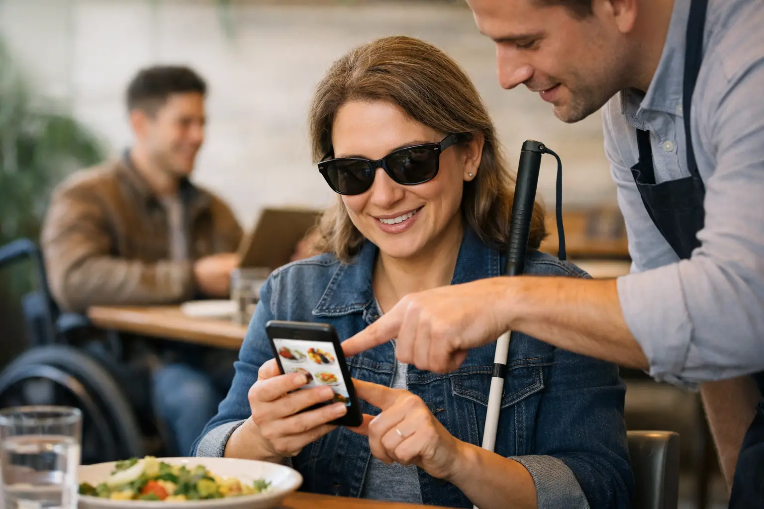
You know the moment: you are hungry, the menu looks promising, and then the guessing starts. Is the portion tiny or huge? Is the “spicy chicken bowl” bright red with sauce or lightly seasoned? Is the dessert plated beautifully or just sounding good on paper? An accessible restaurant ordering app changes that moment by replacing guesswork with clarity.
For many diners, that clarity is convenient. For others, it is access. If you live with a visual impairment, decision fatigue, anxiety around ordering, or a limited budget that makes every food choice matter, text-only menus can turn a simple meal into a frustrating call. Seeing real dishes before you buy is not extra. It is useful information that helps people order with confidence.
What makes an accessible restaurant ordering app actually accessible?
Accessibility in food ordering is often treated too narrowly. People hear the word and think only about screen readers, font size, or color contrast. Those things matter, and any app that ignores them is missing the basics. But restaurant ordering has another layer: diners also need clear, trustworthy information about what the food is.
That is where visual access matters. A dish description can tell you ingredients, but it rarely tells you how the meal looks in real life. It may not show portion size, sauce amount, side placement, toppings, texture, or whether the food matches your dietary expectations. An accessible restaurant ordering app should help users understand what they are ordering before they spend money.
In practice, that means accessibility is both technical and practical. The app should work well with assistive technology, but it should also reduce uncertainty. Those are different jobs, and the best experiences do both.
Why restaurant photos are more than a nice feature
A lot of restaurant apps use polished food imagery as marketing. That is not the same thing as accessibility. Marketing photos are designed to sell. Accessibility-focused visuals are designed to inform.
That difference matters. A studio photo taken months ago may not help someone decide whether a dish looks manageable, appealing, or worth the price right now. Real, accurate food photos do. They give diners a more honest preview of the meal they are about to order.
This is especially helpful for people who rely on visual cues to make decisions quickly. Some users need a better sense of structure and presentation. Others simply want to avoid wasting money on meals that arrive looking nothing like what they imagined. An app built around authentic dish imagery supports both groups without forcing either one into a separate experience.
That is part of what makes visual transparency so powerful. It improves ordering for everyone while directly supporting people who need more than text alone.
The real problems this solves
When people talk about food ordering friction, they usually focus on speed. But for many diners, the bigger issue is uncertainty.
A vague menu can create decision fatigue fast. You scroll, compare, second-guess, and still end up choosing something you are not excited about. If you have accessibility needs, that friction can be even heavier. You may need to spend more time interpreting descriptions, searching elsewhere for photos, or taking a risk on an order that may disappoint you.
An accessible restaurant ordering app can reduce that burden in a few important ways. First, it can make dish selection more intuitive by pairing menu items with real images. Second, it can help users compare similar dishes without relying on guesswork. Third, it can lower the emotional cost of ordering by making the experience feel more predictable.
That predictability is not a small benefit. It can mean fewer disappointing meals, less wasted money, and more confidence trying new restaurants.
What diners should expect from an accessible restaurant ordering app
Not every food app that includes images is doing accessibility well. If the goal is informed ordering, the details matter.
Clear, high-quality photos are the obvious starting point, but quality is not just about resolution. Images should reflect the actual dish people can expect to receive. Multiple angles can help. Accurate labeling matters too, especially when a menu item has common variations.
The app experience itself also needs to support different users smoothly. That includes readable text, logical navigation, strong contrast, alt text where appropriate, and compatibility with assistive tools. If visual content is central, the app should also present that content in a way that does not exclude users who interact differently.
There is also a trust question. Diners need to know whether the photos are authentic, recent, and relevant to the menu item shown. Community-powered photo libraries can work extremely well here because they reflect what customers actually receive, not just what a brand wants to highlight. The trade-off is consistency. User-submitted images can vary in lighting and framing, so the platform needs standards that keep the experience useful.
That balance between authenticity and clarity is where good product design shows up.
Community content can make food ordering more inclusive
Restaurant menus change constantly. Seasonal specials appear, plating shifts, ingredients get swapped, and not every business has the time or budget to photograph every dish well. That is one reason community-driven photo libraries are so promising.
When diners upload real meal photos, they help build a more accurate picture of what restaurants are actually serving. They also help future users make better choices. That kind of contribution turns a solo ordering decision into something bigger: a shared accessibility resource.
For a platform like Pic-ture That!™, that community piece is not an add-on. It is part of the mission. When users contribute dish photos and earn rewards, they are not just posting food content. They are helping create a more transparent dining experience for other people, including users with visual impairments and those who feel overwhelmed by text-heavy menus.
There are limits, of course. Community systems need moderation, smart categorization, and enough participation to cover menus broadly. Early on, some restaurants will have fuller image coverage than others. But that is still better than the all-or-nothing model diners often face now, where many menu items have no visual reference at all.
Accessibility and confidence go hand in hand
The best ordering experiences do not make users work hard for certainty. They give people enough information to feel comfortable making a choice.
That matters beyond accessibility in the formal sense. Plenty of diners do not identify as disabled but still benefit from lower-friction decisions. Maybe they are ordering for a group, navigating dietary preferences, trying not to overspend, or just too tired to decode another vague menu. Better visual information helps them too.
This is why accessible design tends to have a wider impact. Features created to support people with specific needs often improve the experience for everyone else. Curb cuts helped wheelchair users and parents with strollers. Captions help deaf users and anyone watching videos on mute. Real dish photos can support visually impaired diners while also helping every customer avoid a disappointing order.
That is what inclusive product thinking looks like in practice. It does not separate people into “special cases.” It builds better tools from the start.
Where restaurant ordering apps still fall short
Many apps still treat accessibility like a compliance box instead of a user need. They may add basic interface improvements while ignoring the deeper issue that menus are often incomplete, vague, or visually unhelpful.
Others overload the experience with glossy images that look great but do not reflect reality. That creates a different kind of frustration. Diners are not looking for fantasy. They want an honest preview.
There is also the challenge of standardization. Restaurants describe similar dishes in wildly different ways, and image quality varies from one location to another. No app can solve every mismatch overnight. But a strong accessibility-first platform can narrow the gap by prioritizing authentic visuals, useful structure, and feedback loops from real users.
That last part is key. The people using the app should help shape it. Accessibility works best when it is informed by lived experience, not assumptions.
Why this shift matters now
Mobile ordering is not a niche behavior anymore. It is how a huge number of people choose meals, compare options, and spend money. If that process lacks clarity, the cost adds up fast in bad orders, wasted time, and avoidable frustration.
An accessible restaurant ordering app is a practical response to that problem. It gives diners a clearer view of what they are buying and a better shot at enjoying it. It also pushes the restaurant tech space toward something more honest and more inclusive.
That is a shift worth paying attention to. When people can see their options more clearly, they make choices with more confidence. And when a dining tool is built around access, transparency, and community, ordering food starts to feel less like a gamble and more like what it should be: simple, informed, and a lot more satisfying.
The future of food ordering does not need more hype. It needs better visibility, so more people can order with confidence and actually get what they were hoping for.
Leave a Reply