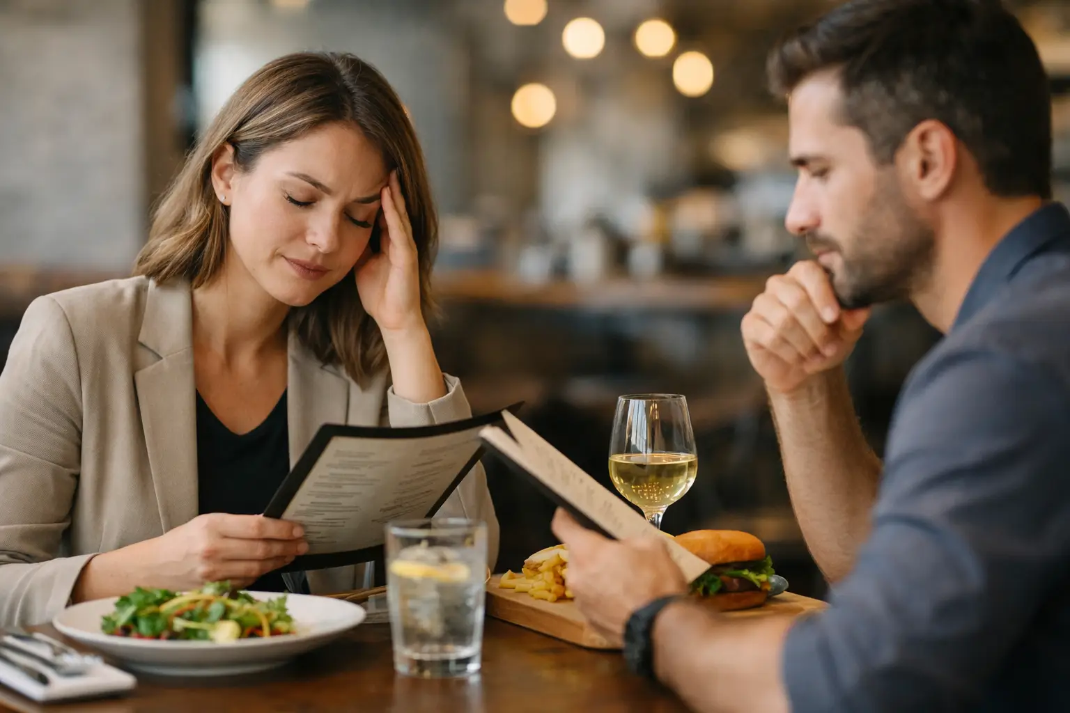
You open a menu, scroll past twenty burgers, twelve bowls, six kinds of fries, and suddenly ordering lunch feels harder than your actual workday. That is exactly where restaurant decision fatigue help matters. When every option sounds vaguely good but nothing feels clear, the problem usually is not hunger. It is uncertainty.
For a lot of diners, text-only menus create more friction than restaurants realize. A short description can leave out portion size, presentation, toppings, texture, or what makes one dish different from the next. If you live with decision fatigue, ADHD, visual impairment, anxiety around spending money on the wrong meal, or just plain menu overload, that missing information adds up fast.
Why restaurant choices get so draining
Decision fatigue is what happens when your brain has to make too many calls in a row. By the time you reach the restaurant app or menu board, your mental energy may already be low. If the menu is long, inconsistent, or vague, your brain has to work even harder to compare options.
This gets worse when the stakes feel personal. Maybe you are trying to stay on budget. Maybe you have food preferences that are hard to judge from a written description. Maybe you have ordered something before that looked nothing like what you expected. That kind of disappointment sticks, and it makes the next decision feel heavier.
Restaurants often assume more choice is always better. Sometimes it is. But for many people, more choice without more clarity just means more stress.
What restaurant decision fatigue help actually looks like
Real restaurant decision fatigue help is not about forcing people to choose faster. It is about making the decision easier to trust.
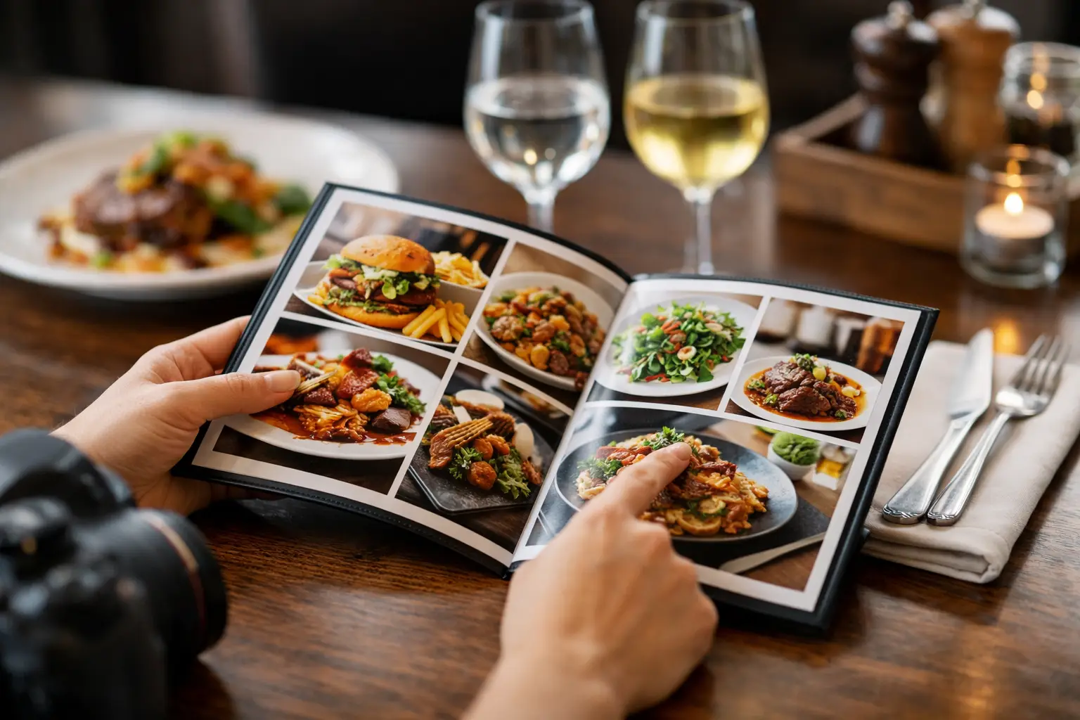
That usually starts with better visual context. Seeing an actual dish can answer several questions instantly. Is the pasta creamy or light? Is the sandwich stacked high or pretty small? Do the tacos come packed with toppings or mostly tortilla? A photo does not solve everything, but it removes a lot of guesswork in seconds.
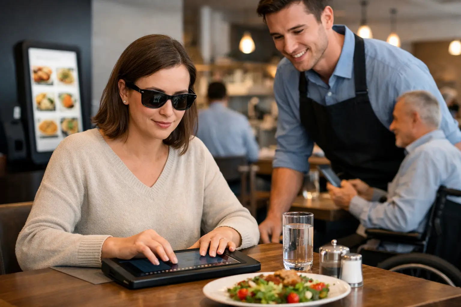
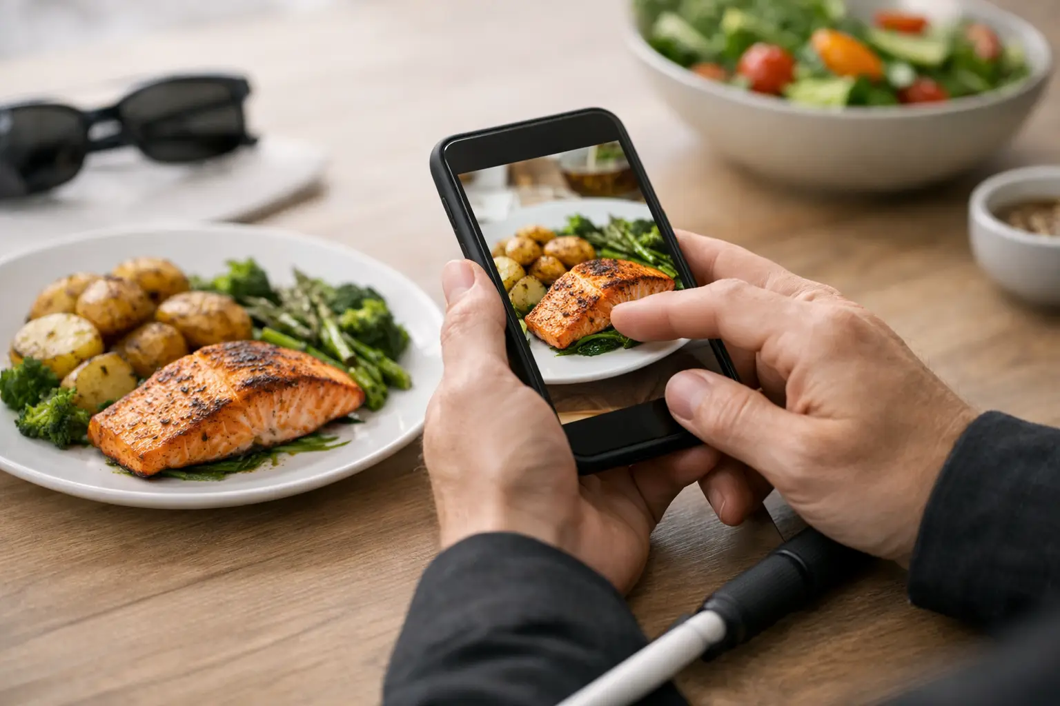
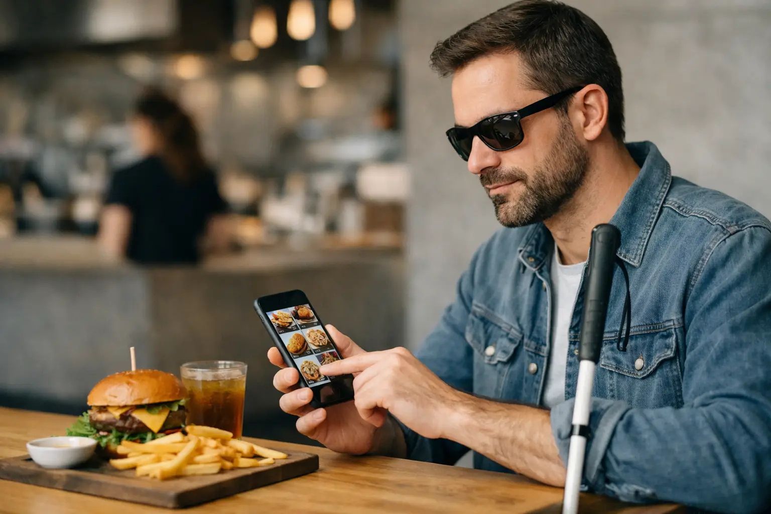
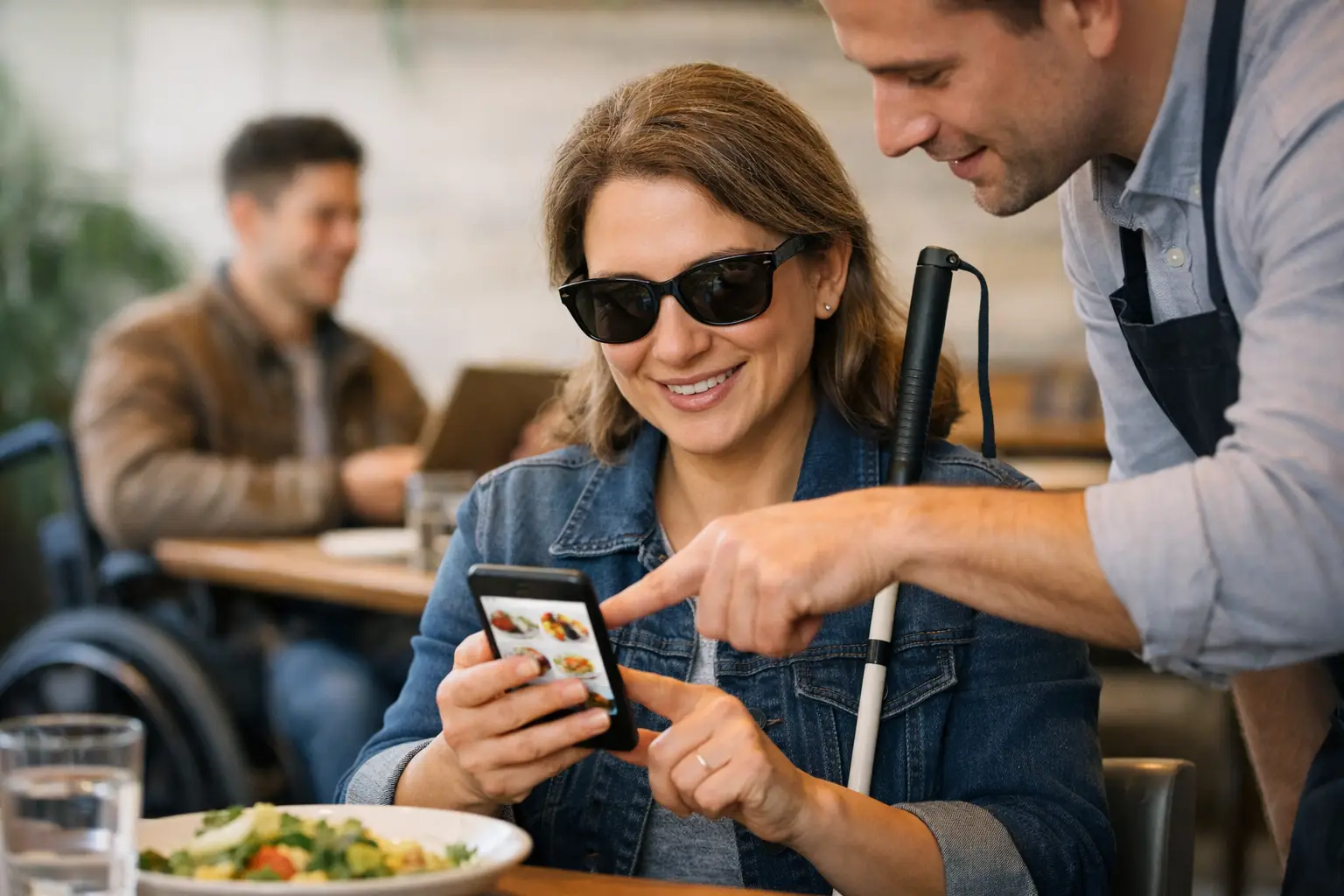
That matters for accessibility too. For diners with visual impairments, low vision, cognitive overload, or information-processing challenges, a menu that depends only on text can be limiting. Food photos are not just nice to have. They can be part of a more inclusive ordering experience.
When people can quickly compare real meals, they spend less energy decoding and more energy deciding. That is a big difference.
Why photos reduce menu stress
There is a reason people ask, “What does it actually look like?” before they order. Visual information helps the brain sort choices faster than long descriptions do.
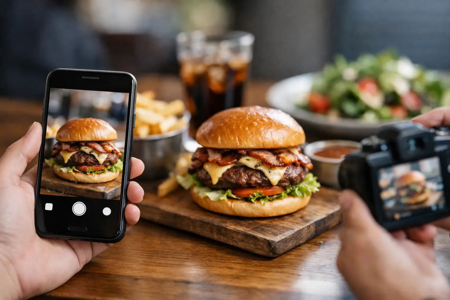
A good photo can communicate portion size, ingredients, texture, color, and plating all at once. That reduces the mental load of building a picture from words alone. Instead of reading five similar menu items and trying to imagine each one, you can narrow the field quickly.
It also builds confidence. If you know what you are getting, you are less likely to second-guess the order after checkout. That confidence matters for everyday diners, but it matters even more for people who find restaurant ordering exhausting in the first place.
There is a trade-off, of course. Not every photo is useful. Highly edited marketing images can create a different kind of uncertainty if the dish arrives looking nothing like the picture. Authentic, accurate images are what help. Real meals, real portions, real expectations.
Restaurant decision fatigue help is also an accessibility issue
This topic is often treated like a productivity problem, but for many users it is bigger than that. It touches equity.
If one diner can glance at a dish and understand it while another has to piece together clues from a sparse description, those are not equal experiences. If someone with decision fatigue leaves a food app feeling drained before they even order, that is a design problem, not a personal failure.
Accessibility in dining should include more than wheelchair ramps and allergy notes. It should also include how clearly food is presented before someone spends money. Visual menu discovery gives more people a fair shot at choosing with confidence.
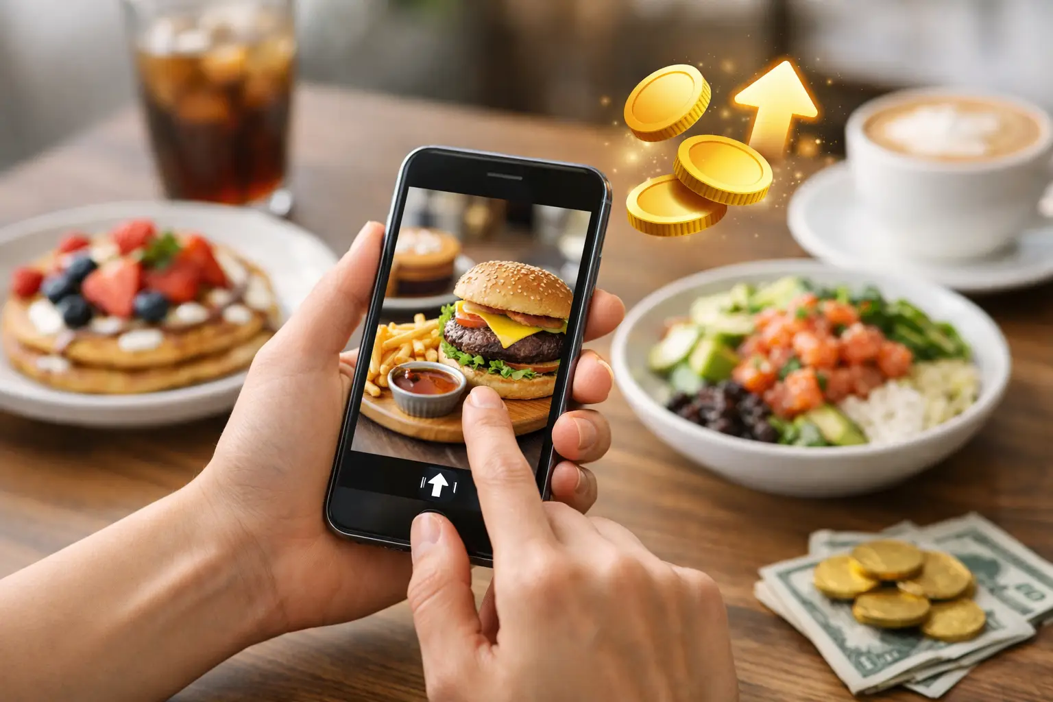
That is one reason platforms built around real dish photos can make such a meaningful difference. Pic-ture That!™ is part of that shift, showing diners what menu items actually look like before they order and helping turn menu transparency into something practical, not theoretical.
How to make restaurant ordering easier on yourself
If menus tend to wear you out, a few small habits can lower the pressure.
Start by shrinking the decision. Instead of reviewing the entire menu, pick a category first. Maybe you only compare sandwiches, or only look at entrees under a certain price. Fewer active choices means less cognitive load.
Next, look for visual proof whenever possible. If a dish has a real photo, use that to eliminate options that do not match what you want. You are not trying to find the perfect meal from every item listed. You are trying to find a solid choice without burning through your energy.
It also helps to choose your top priority before you browse. Some days that priority is comfort. Other days it is protein, price, portion size, or something easy to eat on the go. When you know your filter, the menu becomes easier to sort.
If you order from the same places often, build a short list of reliable favorites. This is not boring. It is efficient. You can still try something new when you want to, but having three or four trusted options removes the pressure to reinvent lunch every time.
And if you feel your brain shutting down mid-scroll, pause. Decision fatigue tends to get worse when you push through it. A short break can be better than forcing a choice you will regret.
What restaurants and food apps should do better
The burden should not fall only on diners. Restaurants and food platforms can make ordering easier by reducing ambiguity.
The first fix is simple: show the food clearly. Not stylized campaigns. Not one hero shot for an entire category. Actual dish-level images that reflect what customers can expect.
The second is consistency. Menus should describe items in a predictable way so users are not decoding a different style of writing on every line. If one burger lists all toppings and another just says “house style,” comparison gets harder.
The third is restraint. Huge menus can attract broad interest, but they can also create friction. Sometimes a tighter menu with clearer visuals helps more people order with less stress.
There is also real value in community-powered photo libraries. Diners trust other diners. User-submitted food photos can fill in the gaps where restaurant menus fall short, especially when they are authentic and tied to specific dishes.
The emotional side of choosing food
People often talk about menu decisions as if they are low stakes. But food is tied to money, mood, time, health, and comfort. When an order disappoints, it is not just annoying. It can feel like wasted energy on top of wasted cash.
That is why restaurant decision fatigue help matters so much. Better choice support does more than speed up checkout. It helps people feel calmer, more included, and more certain in a part of daily life that should not be this hard.
And yes, some diners genuinely enjoy browsing a giant menu. That is fine. More information and better visuals do not take choice away. They make choice usable for more people.
A clearer path to better orders
The best restaurant experiences start before the food arrives. They start when ordering feels understandable instead of overwhelming.
When diners can see real dishes, compare options quickly, and trust what they are choosing, the whole process changes. Less second-guessing. Less stress. Fewer disappointing orders. More confidence from the first tap.
If restaurant ordering has ever felt weirdly exhausting, you are not overthinking it. You are responding to a system that often asks people to decide without enough clarity. Better visuals, better accessibility, and more honest menu discovery can change that – and that is a future worth building together.