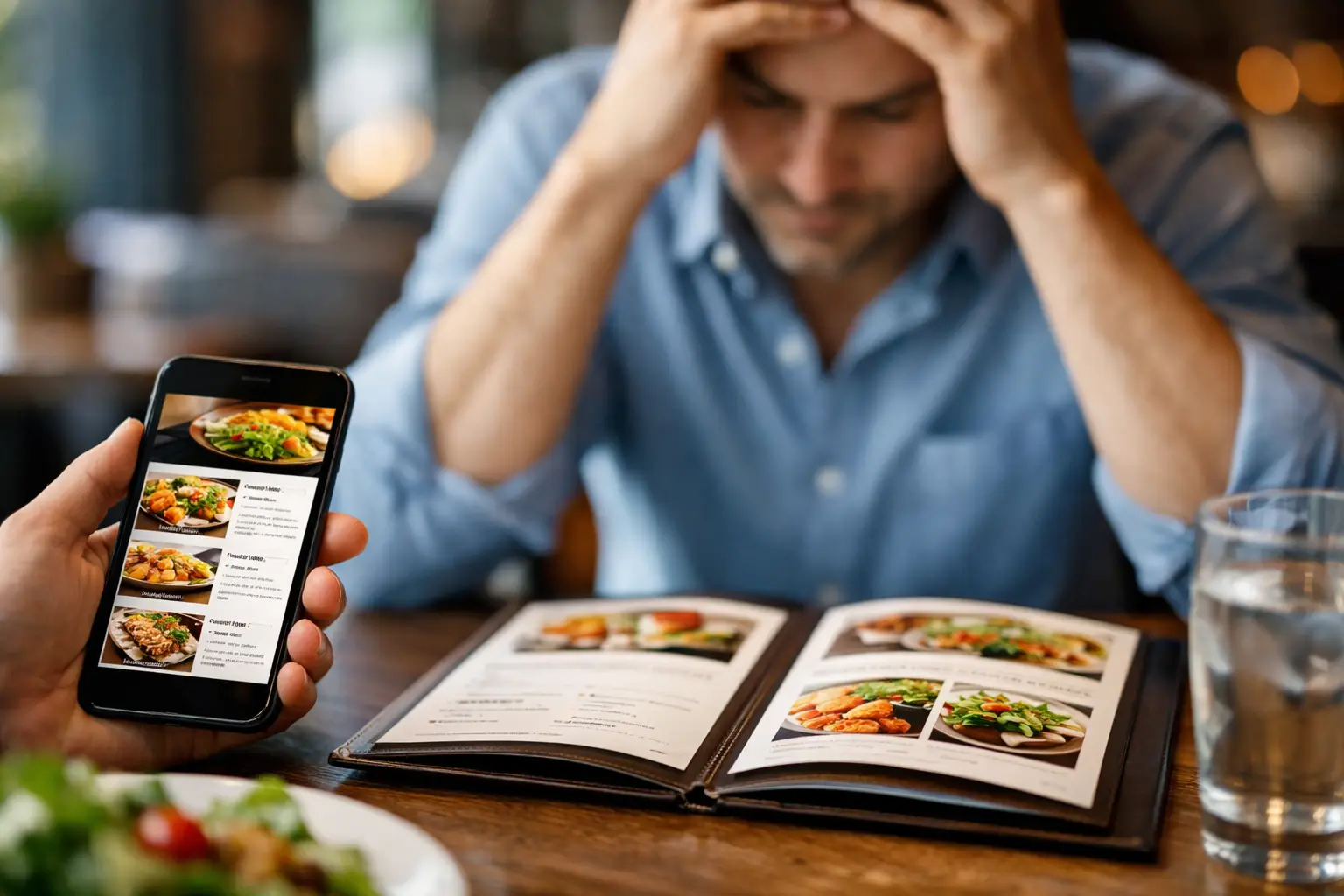
You open the menu, scroll past twelve burgers, eight pasta dishes, three kinds of fries, and a wall of vague descriptions like house style, signature sauce, and chef’s favorite. Ten minutes later, you’re still stuck. A restaurant menu app for decision fatigue changes that moment by replacing guesswork with something much easier to process – real visuals, clearer expectations, and faster choices.
For a lot of diners, decision fatigue at restaurants is not a small annoyance. It can turn a simple lunch order into an exhausting mental task. That is especially true when menus are crowded, descriptions are inconsistent, dietary details are hard to spot, or every option starts sounding the same. Add hunger, a busy day, social pressure, or accessibility needs, and the experience gets harder fast.
Why restaurant menus drain people so quickly
Decision fatigue happens when your brain has to make too many choices with too little clarity. Restaurant menus are built in a way that often makes this worse. They ask people to compare unfamiliar dishes, estimate portion size, imagine presentation, judge value, and guess whether something will actually match their taste.
Text-only menus put a lot of pressure on the customer to fill in the blanks. What does loaded mean in this case? Is the chicken sandwich lightly breaded or huge and heavy? Is the pasta creamy, oily, or spicy? Even confident diners can hesitate when the menu leaves too much open to interpretation.
For people with visual impairments, cognitive overload, anxiety, ADHD, or general decision fatigue, that uncertainty is more than inconvenient. It can create a real barrier to ordering comfortably and independently. Accessibility in dining is not only about entering the restaurant or reading the menu. It is also about being able to make a choice with confidence.
What a restaurant menu app for decision fatigue should actually do
Not every menu app solves the same problem. Some focus on online ordering logistics. Some are basically digital copies of printed menus. A true restaurant menu app for decision fatigue should reduce mental load, not just move the same confusing experience onto a phone screen.
The most helpful version starts with real food photos. Not polished ad images that look nothing like the actual plate, but authentic photos that show what people are really getting. That single shift matters more than it may seem. When users can see the dish, they spend less energy imagining it.
Visual confirmation helps answer the questions that menu text often cannot. You can spot whether a salad looks filling, whether tacos are messy or neat, whether a dessert looks worth the price, or whether a dish appears too rich for what you want that day. Pictures narrow the field quickly.
A strong app should also support clarity around portion expectations, ingredients, and dish style. It should feel easy to scan, not like one more crowded platform demanding attention. If the app adds too many filters, pop-ups, or competing calls to action, it can create a new kind of fatigue. Good design is not just attractive. It helps people choose.
Why photos reduce decision fatigue better than descriptions alone
The brain processes images faster than dense text. That matters when someone is hungry, distracted, tired, or already mentally overloaded. A photo gives instant context. Instead of parsing adjectives, you get a direct sense of what the meal looks like.
That speed can make dining feel more accessible and more fair. Too often, people are expected to spend their money based on vague wording and a little hope. Real dish imagery gives diners better information before they commit. It reduces the chances of disappointment and helps people feel more in control of their order.
There is also an emotional side to this. Decision fatigue is not just about time. It is about stress. When a person can quickly say, yes, that looks good, the whole ordering experience gets lighter. Confidence replaces second-guessing.
This is where Pic-ture That!™ fits naturally into the conversation. Its model centers on helping people see actual menu items before ordering, which supports both confidence and accessibility. That is a practical benefit for any diner, but it is especially meaningful for people who need more certainty to make a comfortable decision.
The accessibility case is bigger than most restaurants realize
Restaurants often think of accessibility in narrow terms, but menu transparency matters too. If a person cannot easily understand what they are ordering, the dining experience is already less equal.
A visual-first menu app can support users with visual impairments by improving how food information is presented and paired with clearer context. It can also help people who struggle with abstract descriptions, information overload, or anxiety around choosing the wrong thing. That includes a lot of people who may never formally identify as having an accessibility need but still feel overwhelmed by menus.
There is no single app feature that works for everyone. Some users want photos first and minimal text. Others want photos plus short, clear labels and community input. Some need help narrowing choices quickly. Others need reassurance that the item will look and feel like what they expect. The best tools respect that different users process decisions differently.
Community photos build trust in a way branded images often cannot
There is a trade-off with restaurant imagery. Professionally shot photos can look clean and appealing, but they are often selective, heavily styled, or outdated. Community-submitted photos tend to be less polished, but they can be far more useful.
When diners see authentic images from other customers, they get a more honest read on presentation, portion size, toppings, sides, and consistency. That transparency builds trust. It also supports better decisions because users are comparing real outcomes, not idealized marketing.
A community-powered system has another advantage. It can grow faster across more restaurants and menu items than traditional image collection alone. That matters because menu coverage is everything. A decision-support app is only useful when people can find the dishes they are actually considering.
Of course, community content needs quality standards. If photos are blurry, misleading, or poorly labeled, they can create confusion instead of reducing it. So the best experience balances authenticity with moderation, organization, and a clear focus on helping people decide.
What diners should look for before using a menu decision app
If you are trying to find a tool that genuinely helps with menu overload, start with one simple question: does this app make choosing easier, or does it just give me more to sort through?
Look for real dish photos, simple browsing, and information that feels quick to absorb. If an app helps you eliminate options faster, that is a good sign. If it makes you open five tabs, compare too many fields, or read long descriptions to get basic clarity, it may not solve the core problem.
It also helps to think about when your fatigue shows up. Some people need support before they arrive, so they can decide in advance. Others need help in the moment while sitting at the table. A mobile-first experience works best when it supports both.
Rewards and community features can be useful too, especially when they motivate users to upload photos and improve coverage. But they should support the mission, not distract from it. The main job of the app is still simple: help people feel sure about what they are ordering.
The bigger shift: dining with more confidence
A restaurant menu app for decision fatigue is not just about convenience. It reflects a better standard for how food choices should work. Diners should not have to guess their way through a purchase. They should be able to see, assess, and choose with confidence.
That shift benefits everyone. It helps the person who is too tired to decode a massive menu after work. It helps the customer with accessibility needs who wants more independence. It helps the diner trying not to waste money on something that sounded better than it looked. And it helps create a restaurant experience that feels more transparent from the start.
The best dining decisions are not always about having more options. Sometimes they come from having clearer ones, and that starts with being able to see what is actually on the table.
Leave a Reply