Category: Food Photo Tips

  • What Makes Dish Photos Accurate?

    What Makes Dish Photos Accurate?

    You know the feeling: the menu photo looked stacked, colorful, and generously plated, then your order arrives looking like a distant cousin. That gap is exactly why understanding what makes dish photos accurate matters. Accurate food photos do more than look good – they help people order with confidence, reduce wasted money, and make restaurant choices clearer for everyone.

    For some diners, that clarity is a nice-to-have. For others, it is access. If you have low vision, decision fatigue, dietary concerns, or you simply do not want to gamble on a $19 lunch, a photo should help you understand what you are getting. Not sell you a fantasy.

    What makes dish photos accurate in real life?

    An accurate dish photo shows the food as it is actually served. That sounds obvious, but a lot can distort reality between the kitchen and the camera. Lighting can shift colors. Camera angles can exaggerate size. Heavy editing can make sauces glossier, greens brighter, and textures cleaner than they are in person.

    Accuracy starts with a basic question: if this dish arrived at the table right now, would it look recognizably like the photo? Not identical to the pixel, because food is made by humans and varies slightly from plate to plate. But the core experience should match.

    That means the photo should reflect the real portion, the typical plating, the actual ingredients, and the way the dish usually appears under normal dining conditions. If a burrito bowl is usually packed to the rim, the image should show that. If it often comes with dressing on the side, that should be visible too. Small details shape expectations.

    Accuracy is more than aesthetics

    There is nothing wrong with a dish photo being appealing. Restaurants want food to look appetizing, and diners want to know whether something looks fresh and worth ordering. But appealing and accurate are not the same thing.

    A beautiful image can still be misleading if it hides scale, overstates color, or leaves out key components. A burger shot from a low angle may look huge, even if it is fairly average in person. A pasta dish photographed tightly from above may conceal that it is served in a shallow bowl. A dessert can appear dense and rich in one image, then arrive smaller or lighter than expected.

    That difference matters because people do not order photos. They order meals. When the image sets the wrong expectation, the problem is not just disappointment. It can affect budget, satisfaction, nutrition planning, and trust.

    The biggest factors that make dish photos accurate

    Real lighting, not trick lighting

    Lighting changes everything in food photography. Warm light can make fries look more golden. Cool light can make a soup look flat. Harsh overhead light can wash out details or create shadows that hide texture.

    The most accurate dish photos use lighting that stays close to how the food actually appears in a restaurant or natural daylight. That does not mean the image has to be dark or dull. It means the colors should feel honest. The tomato sauce should look like tomato sauce, not neon red. The mashed potatoes should not be edited into a perfectly white cloud.

    True-to-life color

    Color is one of the fastest ways a photo can mislead. Saturation boosts can make vegetables look fresher, meats look richer, and desserts look more dramatic. This is common in polished food marketing, but it can create a mismatch when the meal arrives.

    Accurate photos keep color correction minimal and realistic. If the avocado is slightly darker in person, the photo should reflect that. If the curry is more brown-gold than bright yellow, that matters. For diners making choices based on freshness, ripeness, or ingredient balance, realistic color is useful information.

    Portion size you can trust

    One of the clearest signs of accuracy is whether the photo gives a fair sense of size. Portion confusion is a huge reason people regret orders. A dish can look abundant in a close crop and turn out to be a small plate. The reverse can happen too.

    Photos are more accurate when they include visual cues for scale. A plate edge, a utensil, a to-go container, or even the table setting can help. These cues give your brain context. Without them, almost any dish can look larger or smaller than it really is.

    The actual ingredients on the actual plate

    Some food images show idealized versions of a dish – extra toppings, more garnish, or ingredients styled for the camera that are not consistently included in service. That may work as advertising, but it does not help someone decide what to order.

    An accurate photo shows what normally comes with the meal. If onions are optional, they should not be presented as standard unless they usually are. If the protein sits under the rice, the image should not rearrange the whole dish just to make every ingredient visible. There is always a trade-off between clarity and realism, and the best photos balance both.

    Minimal editing

    Editing is not the enemy. Every photo benefits from slight adjustments for brightness, sharpness, or white balance. The problem starts when editing changes the food itself.

    Over-editing smooths textures, boosts shine, deepens color, and removes imperfections that would naturally be there. A real slice of pizza has uneven cheese. A sandwich might shift a bit in its wrapper. A salad is not arranged like a catalog unless someone actively styles it. Accurate photos keep those real-world details intact.

    What makes dish photos accurate for accessibility

    Accessibility changes the standard in a useful way. If a photo helps someone make a decision clearly, it is probably doing its job well.

    For diners with visual impairments, overly dramatic angles, cluttered backgrounds, or heavy filters can make images harder to interpret. A photo that is technically pretty but visually confusing is not very helpful. Accuracy includes legibility.

    That means clear framing, enough contrast to distinguish ingredients, and a view that shows the overall dish without hiding key details. It also means avoiding visual noise. If the table is crowded with drinks, decor, and props, the meal itself becomes harder to parse.

    This is one reason community-powered food photos can be so valuable. When people photograph what they are actually served, the result is often more useful than a polished promo shot. It shows the meal in the context diners will really experience.

    Why restaurant marketing photos often miss the mark

    Marketing photos are built to persuade. That is their job. They are often taken with professional lighting, styling tweaks, and ideal plating. Sometimes they represent the dish well. Sometimes they represent the dish on its very best day, from its very best angle, under its very best conditions.

    That does not make them dishonest by default. But it does mean they may not answer the question diners are really asking: what will I get if I order this right now?

    There is a place for polished images. They can communicate cuisine, brand feel, and menu variety. But when people need confidence before they spend money, authentic, user-generated photos fill a different need. They bring expectations closer to reality.

    A good dish photo is honest about variation

    Food is not manufactured to identical specs every time. A handmade taco may be fuller one day and lighter the next. Pancakes may stack slightly differently depending on the cook. A noodle dish may settle during delivery and look less structured than it did at the pass.

    So accuracy does not mean pretending every plate is a clone. It means showing the typical version of the dish and being honest about normal variation. This is especially important with takeout and delivery, where presentation changes during transport.

    That is why one photo is helpful, but multiple real photos are better. Patterns matter. If several diners upload images of the same item and they all look broadly similar, trust goes up. You are no longer relying on a single best-case image.

    What diners should look for before trusting a dish photo

    If you are trying to judge whether a photo is useful, ask a few simple questions. Does the dish look naturally lit? Can you tell how big it is? Are the ingredients visible without looking artificially arranged? Does the image feel like something a person would actually receive at a table or in a takeout bag?

    Also pay attention to what is missing. If every photo is cropped tightly, edited heavily, or avoids showing the full plate, that may be a sign the image is optimized for appeal over accuracy. The most trustworthy photos usually feel straightforward. They are clear, not theatrical.

    That is the bigger idea behind transparency-first food imagery. People deserve to see what they are buying. And when they can, ordering becomes less stressful, more inclusive, and a lot more satisfying.

    At Pic-ture That!™, we believe accurate dish photos help turn menus into something people can actually use – with more confidence, more clarity, and fewer unpleasant surprises.
  • Why Authentic Restaurant Dish Images Matter

    Why Authentic Restaurant Dish Images Matter

    You know the feeling: the menu sounds great, the photo on a delivery app looks polished, and then the dish shows up looking like a completely different meal. That gap is exactly why authentic restaurant dish images matter. They do more than make food look appealing. They help people order with confidence, spend more wisely, and navigate menus with a lot less guesswork.

    For a lot of diners, this is not a minor convenience. It is the difference between feeling sure about an order and feeling stuck. If you live with a visual impairment, deal with decision fatigue, have sensory preferences, or just want to avoid wasting money on something that is not what you expected, real dish photos change the experience in a meaningful way.

    What authentic restaurant dish images actually do

    A menu description can only carry so much weight. Words like crispy, hearty, spicy, loaded, or house-style sound helpful until you realize they mean different things at different restaurants. One person reads “light sauce” and pictures a drizzle. Another gets a bowl swimming in cream. A photo grounded in reality closes that gap fast.

    Authentic restaurant dish images show portion size, plating, ingredient balance, and how a meal actually tends to arrive. That last part matters. The goal is not perfection. The goal is accuracy. Diners are not asking for studio fantasy. They want to know whether the burger is stacked high, whether the salad is mostly greens or mostly toppings, whether the taco plate is full or surprisingly small, and whether the “crispy” fries look fresh or limp.

    That kind of visual context supports better choices. It also creates a more transparent relationship between restaurants and customers. When people can see what they are ordering, they are less likely to feel misled, and more likely to feel good about the purchase they just made.

    Why authenticity beats polished marketing photos

    Professional food photography has a place. Restaurants need attractive visuals for websites, ads, and promotions. But marketing photos and decision photos are not always the same thing. A promotional image is designed to sell the ideal version of a dish. An authentic image is designed to show the real one.

    That difference matters most at the moment of purchase. If someone is deciding between two pasta dishes, they are not just looking for something pretty. They want evidence. Which one looks heavier? Which one has more sauce? Which one appears to have actual vegetables instead of a garnish placed for the camera?

    Polished photos can still be useful, but they often leave out the details diners care about most. Lighting is optimized. Portion size can be hard to judge. Ingredients may be arranged for style rather than realism. None of that makes a restaurant dishonest by default, but it does make decision-making harder when a customer wants clarity, not advertising.

    Authenticity is especially valuable because food is personal. People order based on hunger level, budget, texture preferences, dietary needs, and expectations. A beautiful image that oversells a dish can create disappointment. A real image that sets the right expectation can create trust.

    Authentic restaurant dish images and accessibility

    This is where the conversation gets bigger than convenience. Authentic restaurant dish images are also an accessibility tool.

    Menus are often built around text, and text has limits. A dish description may mention ingredients but still fail to communicate what the meal looks like as a whole. That can make ordering harder for people with visual impairments, cognitive overload, sensory sensitivities, or anyone who struggles to picture a dish from written language alone.

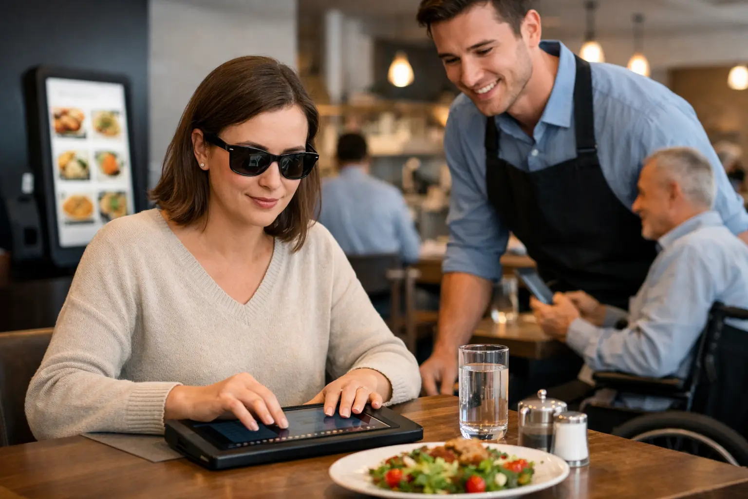
    Real images offer another path to understanding. They reduce the mental work required to interpret a menu. They can help someone compare options faster, spot foods they know they like, and avoid ingredients or formats that do not work for them. In that sense, visual transparency is not extra polish. It is part of a more inclusive dining experience.

    That is one reason this space matters so much. When restaurants and platforms treat photos as a flashy add-on, they miss the point. Accurate food imagery helps people participate more fully in everyday dining decisions. It supports independence. It reduces uncertainty. It gives people more control over what they spend money on and what ends up on their table.

    Better ordering starts with better expectations

    Most bad food orders are not caused by bad food. They are caused by bad expectations.

    A sandwich can be perfectly fine and still disappoint if you expected a hot pressed panini and got a cold deli-style sub. A curry can taste great and still feel wrong if the portion is much smaller than you thought. A dessert can be delicious and still miss the mark if the menu implied one thing and the plate delivered another.

    This is where authentic images quietly improve the whole dining process. They help diners calibrate expectations before they buy. That means fewer regretted orders, fewer frustrated reviews, and fewer moments where someone feels like they took a gamble and lost.

    It also helps with comparison. When multiple dishes sound similar, real photos can reveal meaningful differences in seconds. One burrito bowl may be rice-heavy. Another may lean protein-forward. One ramen may look rich and creamy. Another may look lighter and brothier. That kind of clarity supports smarter, faster choices.

    Community-powered images make the experience stronger

    There is another layer here that matters: who takes the photo.

    When real diners upload meal photos, the result is often more useful than a brand-managed image library alone. Community-powered images show dishes in normal conditions, from normal angles, on normal tables. They reflect what food actually looks like when it arrives for lunch, dinner, takeout, or delivery.

    That does not mean every user photo is automatically helpful. Quality still matters. A blurry image with poor lighting can create confusion instead of clarity. But when a platform encourages clear, honest, high-quality uploads, the community becomes a powerful source of menu transparency.

    That model also builds trust differently. People tend to recognize when a photo feels real because it carries the texture of an actual dining experience. It is not trying too hard. It is just showing the meal. For diners, that can feel more credible than a highly styled shot with perfect garnish placement and controlled lighting.

    For a platform like Pic-ture That!™, that community role is part of the mission. It is not just about collecting food photos. It is about giving people the visual information they need while inviting them to help build a more accessible, more transparent dining ecosystem.

    What makes a dish image truly useful

    Not every authentic image is equally helpful. The most useful ones answer practical questions quickly.

    A strong dish photo usually shows the full plate or container, includes enough context to suggest scale, and captures the food in lighting that reflects reality without making it look dull or distorted. The angle should make key ingredients visible. If the dish includes sides, sauces, or toppings, those details should be easy to spot.

    There is a balance here. Images should be honest, but still clear enough to support decision-making. If a photo is technically authentic but too dark, too close, or cropped in a way that hides the portion, it loses value. Accuracy and usability need to work together.

    The best authentic food images are not trying to impress. They are trying to inform. That difference changes how people use them.

    Why this matters for restaurants too

    Transparency helps diners, but it also helps restaurants in the long run.

    When guests know what to expect, they tend to order more confidently. That can reduce friction, lower disappointment, and improve satisfaction. It may even lead people to try dishes they would have skipped if they only had a vague text description to go on.

    There is a trade-off, of course. Some restaurants worry that real-world images will look less flattering than professional photos. Sometimes that is true. But a less polished image that accurately represents the dish can build more trust than a stunning image that overpromises. And trust is what brings people back.

    The bigger opportunity is alignment. If the dish consistently looks good in authentic photos, that is a strong signal that the restaurant is delivering a reliable product. If the images vary wildly, that may reveal an operations issue worth fixing. Either way, honest visuals tell a useful story.

    The future of menu transparency

    Menus have stayed text-heavy for a long time, even though ordering is deeply visual. That gap is starting to look outdated.

    As more diners expect real-world information before they buy, authentic restaurant dish images will become less of a nice extra and more of a baseline expectation. Not because people want endless content, but because they want less uncertainty. They want to see the meal, trust the choice, and move on with confidence.

    That shift is good for everyone. It makes ordering more accessible. It makes dining decisions less stressful. It rewards honesty over hype. And it gives communities a real role in making food discovery better.

    If a menu tells you what a dish is, a real photo helps you decide whether it is actually for you. That is a small change on the surface, but for a lot of people, it makes eating out feel clearer, fairer, and a lot more worth it.

  • Why Accessible Dining Technology Matters

    Why Accessible Dining Technology Matters

    A menu shouldn’t feel like a guessing game, especially when you’re spending real money on a meal. Accessible dining technology is changing that by giving people clearer, more useful ways to understand what they’re ordering before they commit. For some diners, that means convenience. For others, it means independence, less stress, and a much more equitable dining experience.

    Restaurants have spent years improving online ordering, mobile payments, and delivery speed. But speed is not the same thing as access. If a menu is text-heavy, vague, poorly structured, or missing visual context, plenty of people are still left making low-confidence decisions. That gap matters more than many businesses realize.

    What accessible dining technology actually means

    Accessible dining technology includes the digital tools that make restaurant discovery, ordering, and decision-making easier for more people. That can include screen reader-friendly menu layouts, alt text, readable fonts, smart contrast, voice support, and ordering flows that reduce friction. It also includes something the industry often overlooks: accurate, real-world food imagery that helps people understand what a dish actually looks like.

    That last piece is bigger than it sounds. Menus are often built around short descriptions, inconsistent naming, and marketing language. “House special pasta” or “loaded bowl” may sound appealing, but those labels do not tell every diner what they need to know. Portion size, ingredients, presentation, toppings, and texture can all influence whether a meal feels like a good choice.

    When dining technology adds visual clarity, it becomes more than a convenience feature. It becomes an accessibility tool.

    Why accessible dining technology matters in real life

    A lot of restaurant tech is built around efficiency for the business. Faster checkout. Higher ticket sizes. Easier upsells. Those goals are understandable, but they do not automatically create a better experience for diners.

    Accessible dining technology starts from a different question: what does the customer need to feel informed and confident? That shift changes the whole experience.

    For diners with visual impairments, accessible design can support better navigation, compatibility with assistive tools, and a stronger sense of control. For diners with decision fatigue, clearer information can reduce mental load. For anyone ordering from a new place, authentic visuals can lower the risk of disappointment. Even people without a formal accessibility need benefit when restaurant information is easier to interpret.

    That broad usefulness is part of the point. Accessibility is not a niche upgrade. It improves the baseline experience for a wide range of people.

    Confidence is part of access

    One of the most overlooked barriers in dining is uncertainty. If you can’t tell what a dish really looks like, how large it is, or whether the description matches your preferences, you are not making a fully informed decision. You are estimating.

    That uncertainty can be frustrating for anyone, but it hits harder when dining out already requires extra effort. If someone relies on assistive technology, manages sensory preferences, or simply gets overwhelmed by too many unclear choices, low-quality menu information creates another layer of work.

    Accessible dining technology helps remove that layer. It gives diners more than access to a menu. It gives them access to confidence.

    The problem with text-only menus

    Text matters, but text alone has limits. Restaurant descriptions are often short because menus need to stay compact. They can also be inconsistent because every restaurant writes differently. One place says “crispy chicken sandwich,” another says “signature fried stack,” and neither tells you much about thickness, toppings, bread type, or plating.

    Photos fill in some of those gaps, but only if they are accurate. Polished marketing shots can help with promotion, yet they do not always help people make realistic decisions. Diners want to know what they are actually going to receive, not just what looked best under studio lighting.

    That is where community-powered visuals can make a real difference. Real photos from real diners can add transparency that menu copy alone cannot provide. They can also help set expectations in a way that feels useful instead of salesy.

    Accessible dining technology and food photos

    If food imagery sounds like a branding feature, think again. In the right context, it is part of accessible dining technology because it supports comprehension.

    Seeing a dish before ordering can help a diner assess portion size, ingredient mix, presentation, and whether the item matches what they had in mind. That matters for people who process information visually, for people who need to reduce uncertainty, and for people who want to spend their money more carefully.

    There is a trade-off, of course. Images only help when they are current, relevant, and easy to interpret. If a platform is full of outdated photos, poor angles, or mismatched items, visual content can create confusion instead of reducing it. Accessibility is not just about having more information. It is about having better information.

    That is why authenticity matters so much. Clear, accurate images are not fluff. They are useful decision support.

    What restaurants often miss

    Many restaurants care about hospitality, but their digital experience does not always reflect that. A dining room can be welcoming while the online menu is cluttered, hard to navigate, or vague. As more ordering happens on phones, that disconnect becomes harder to ignore.

    Mobile-first diners expect clarity. They want to browse quickly, compare options, and feel sure about what they are buying. If the digital menu makes that harder, the restaurant creates friction before the meal even starts.

    This is also where accessibility and business value overlap. Better menu visibility can reduce abandoned orders, increase trust, and encourage repeat visits. People are more likely to order when they feel informed. They are also more likely to come back when what arrives matches what they expected.

    Accessible dining technology is good for inclusion, and it can also be good for conversion. Those goals do not compete.

    Community plays a bigger role than people think

    Restaurants cannot always keep every dish photo updated across every platform. Menus change. Specials rotate. Presentation varies by location. That is one reason user-generated content has such strong potential in this space.

    When diners share real meal photos, they help build a more transparent food ecosystem. They are not just posting for fun. They are making restaurant choices easier for the next person.

    That community layer matters because accessibility works best when it grows with actual user behavior. A platform shaped by diner contributions can surface the details people really care about, instead of guessing from the top down. In that sense, accessible dining technology is not only a product category. It is also a participation model.

    Pic-ture That!™ fits naturally into that shift by treating food photos as a decision-making tool, not just a nice extra. That approach meets people where they already are: on their phones, comparing options, trying to order with more confidence.

    Where accessible dining technology still has room to improve

    The category is moving in the right direction, but there is still work to do. Many restaurant apps and ordering systems remain inconsistent in how they support assistive technology. Visual design can also create problems when readability gets sacrificed for branding.

    There is also the challenge of standardization. One platform may offer clean images and better menu structure, while another still relies on dense text blocks and confusing navigation. For users, that means the experience can vary a lot from one restaurant to the next.

    Another issue is assuming one solution works for everyone. Some diners need better compatibility with screen readers. Others benefit most from authentic dish images. Others need simpler menu architecture to reduce cognitive overload. Accessible dining technology works best when it recognizes that access is not one-size-fits-all.

    What the future should look like

    The best restaurant tech should help people feel informed before they order, not just processed after they click. That means building menus and discovery tools that are readable, visual when helpful, mobile-friendly, and grounded in real customer needs.

    It also means treating transparency as part of hospitality. Showing people what a dish actually looks like, making the menu easier to navigate, and reducing decision stress should not be seen as bonus features. They are part of what makes dining more inclusive.

    As diners keep expecting more clarity from restaurants, accessible dining technology will only become more relevant. Not because it is trendy, but because it solves a real problem people deal with every day.

    The next time a menu helps someone order with less stress and more certainty, that is not a small upgrade. That is what access looks like when it finally reaches the table.

  • 7 Best Apps for Menu Photos Right Now

    7 Best Apps for Menu Photos Right Now

    A menu says “crispy,” “loaded,” or “house favorite.” Your wallet hears “take a chance.” That is exactly why people keep searching for the best apps for menu photos – because guessing what a dish looks like is a bad way to order food.

    For plenty of diners, this is more than curiosity. It is about avoiding wasted money, bad surprises, and the stress of choosing from text alone. For people with visual impairments or decision fatigue, real dish photos can make the ordering experience feel far more accessible and manageable. The right app does not just show pretty food. It helps you make a clearer decision.

    What makes the best apps for menu photos actually useful?

    A lot of food apps include images, but not all of them help in the same way. Some are built to market restaurants. Others are built to help people decide what to order. That difference matters.

    The best apps for menu photos tend to do four things well. They show real food, not just polished promo shots. They connect images to specific menu items. They make photos easy to browse on mobile. And they give you enough context to trust what you are seeing.

    That last point is where many apps fall short. A beautiful plate photo is nice, but if you cannot tell whether it matches the current dish, portion size, or restaurant location, it stops being helpful fast. Authenticity beats perfection here.

    The 7 best apps for menu photos

    1. Pic-ture That!

    If your goal is to see what menu items actually look like before you order, Pic-ture That! stands out for a simple reason – it is built around that exact problem.

    Instead of treating food photos like a side feature, the platform centers visual menu discovery. That means users can browse real images of restaurant dishes to order with more confidence, especially when menu descriptions are vague or overly optimistic. The community-powered model also makes the experience feel more honest. Photos come from real diners, not just marketing teams.

    What makes it especially meaningful is the accessibility angle. For users with visual impairments, uncertainty around food ordering is not a minor inconvenience. It can be a real barrier. The app approaches menu photos as a transparency and dining equity issue, which is still rare in this category. It also gives contributors a reason to participate by rewarding uploads with gift card opportunities.

    The trade-off is coverage. Since community-driven platforms grow city by city and restaurant by restaurant, some menus may still be building out. But if you care about authentic dish images and helping create a more accessible dining experience, this is one of the strongest options available.

    2. Yelp

    Yelp remains one of the most familiar places people check before trying a restaurant, and menu photos are a big reason why. Users often upload a wide range of dish shots, which can help you get a rough sense of portion size, plating, and consistency.

    Its biggest strength is volume. Popular restaurants usually have plenty of user photos, and you can often match dishes to reviews for added context. That can help when you are deciding between two menu items or trying to figure out whether a dish looks worth the price.

    The downside is organization. Photos are not always tied neatly to exact menu listings, and quality can vary a lot. You may find ten burger photos and none of the pasta you actually want. Yelp is useful, but it often feels more like crowd-sourced restaurant browsing than true visual menu navigation.

    3. Google Maps

    Google Maps is not a menu-photo app first, but people use it that way all the time. Restaurant listings often include customer-uploaded images of dishes, menus, interiors, and counters, all in one place.

    That convenience matters. If you are already checking hours, reviews, and directions, seeing food photos in the same app can speed up the decision process. For quick searches like “What do the tacos here actually look like?” it works surprisingly well.

    Still, it is hit or miss. Images are usually not labeled carefully, and there is not much structure around menu-item discovery. Google Maps is best for fast restaurant vetting, not for precise ordering confidence.

    4. Instagram

    Instagram can be helpful when you want to see how food looks in real life, especially at trendy or highly photographed restaurants. Between customer posts, tagged photos, and restaurant accounts, there is often no shortage of visual content.

    The catch is that Instagram is built for social sharing, not menu clarity. Photos may be edited heavily, older than the current menu, or disconnected from the dish name entirely. You might see a gorgeous plate and still have no idea what it was called, whether it is still available, or how much it costs.

    It is a strong source of visual inspiration. It is a weaker tool for accurate menu decisions.

    5. TripAdvisor

    TripAdvisor works best for travel dining, but it can also help with menu photos, especially in tourist-heavy areas where restaurants attract a high volume of reviews and uploads.

    Like Yelp, it benefits from user-generated images. You can often see what dishes look like across multiple visits, which helps paint a more realistic picture than a single branded photo. That can be useful if you are traveling and want fewer ordering surprises.

    The trade-off is that TripAdvisor is not especially streamlined for menu-specific browsing. It is more restaurant-first than dish-first. Good for context, less ideal if you want to quickly compare actual menu items.

    6. DoorDash

    DoorDash has become more visual over time, and many restaurant listings now include item photos directly inside the ordering flow. That is a big plus when you want to make a fast, informed decision without jumping between apps.

    When the photos are present and accurate, the experience is smooth. You can compare dishes, prices, and add-ons in one place. For mobile-first diners, that convenience is hard to beat.

    But coverage depends heavily on the restaurant. Some menus are packed with images, while others have none. And because restaurants often control what gets uploaded, you may be seeing more polished brand photography than everyday reality. Helpful, yes. Always trustworthy, not quite.

    7. Uber Eats

    Uber Eats offers a similar advantage. It puts menu photos close to the point of purchase, which reduces friction when you are hungry and trying to decide quickly. If your priority is speed, this can be one of the easiest ways to preview a dish before ordering.

    The challenge is the same as with many delivery apps. Photos can be uneven across restaurants, and heavily staged images may not reflect what arrives at your door. That does not make them useless. It just means they are best treated as a starting point, not the final word.

    Which app is best depends on what you need

    If you want a broad look at a restaurant before visiting, Google Maps and Yelp are practical choices. If you are ordering delivery right now, DoorDash and Uber Eats may be the fastest route. If you want social proof and lots of visual browsing, Instagram can fill in some gaps.

    But if your real goal is menu transparency – seeing actual dishes, reducing uncertainty, and making ordering feel more accessible – a platform built specifically around authentic menu photos will usually serve you better.

    That is the key distinction in this space. Some apps happen to contain food photos. Others are trying to solve the confidence problem that comes from text-only menus.

    What to look for before trusting a menu photo app

    Before you rely on any app, ask a few simple questions. Are the photos user-generated or brand-provided? Are images connected to specific dishes? Do you see multiple uploads for the same item? And does the app help you decide, or just help you scroll?

    Those details shape the experience more than flashy design ever will. A smaller app with honest, clearly matched dish photos can be more useful than a massive app full of random food shots.

    Accessibility matters here too. For some users, menu photos are not extra content. They are decision support. They reduce stress, improve confidence, and make dining feel more inclusive. That should not be treated like a niche feature.

    Restaurants have spent years telling people what food is supposed to be. Diners are increasingly asking to see it for themselves. That shift is a good one.

    The best menu photo apps are not just helping people pick lunch. They are making ordering more transparent, more informed, and more equitable. If an app can help you spend with confidence and avoid a disappointing plate, it is doing real work. And if it lets people contribute to that clarity for others, even better.

    Next time a menu gives you three adjectives and zero answers, do not settle for the guess. Find the photo, trust your eyes, and order like you actually know what is coming.

  • A Clear Guide to Restaurant Menu Photos

    A Clear Guide to Restaurant Menu Photos

    A menu says “crispy,” “loaded,” or “house favorite.” Then your order shows up looking nothing like the description you built in your head. That gap is exactly why a guide to restaurant menu photos matters. Good food photos do more than make dishes look appealing – they help people order with confidence, compare options faster, and avoid the frustration of spending money on the wrong meal.

    For a lot of diners, this is about convenience. For others, it is about access. If you live with low vision, decision fatigue, sensory preferences, or dietary caution, seeing the actual dish before you order can change the whole experience. A better photo is not just a marketing extra. It is useful information.

    Why a guide to restaurant menu photos matters

    Restaurant menus have leaned on text for a long time. That works up to a point, but words leave room for guesswork. Is the pasta portion small or huge? Does the sandwich come stacked high or neatly pressed? Is the sauce spread across the plate or served on the side? Those details shape what people choose, and they are hard to judge from copy alone.

    Photos reduce uncertainty. They help people understand portion size, plating, ingredients, texture, and presentation at a glance. That is especially helpful when a menu uses vague language, unfamiliar dish names, or inconsistent descriptions. A strong visual can answer questions in seconds that a paragraph still might not resolve.

    There is also a trust factor. Diners are getting smarter about staged food photography. If every image looks overly edited, tiny details disappear, and colors seem exaggerated, people start to wonder what the real plate looks like. The best menu photos are not always the glossiest. Often, they are the clearest and most honest.

    What makes restaurant menu photos actually useful

    A useful photo is accurate first and attractive second. That order matters. If an image wins attention but misrepresents the dish, it sets the diner up for disappointment.

    The strongest menu photos show a dish in realistic lighting with visible ingredients and true-to-life color. You should be able to tell whether the fries are thin or thick, whether the ramen broth is creamy or clear, whether the salad is heavily dressed or lightly finished. Small clues matter because they shape expectations.

    Angle matters too. Overhead shots work well for pizzas, grain bowls, and spreads where the full composition matters. Slightly angled shots tend to work better for burgers, stacked sandwiches, pancakes, and layered desserts because height is part of the appeal. A close crop can highlight texture, but if it is too tight, diners lose context on portion size and sides.

    Authenticity is another big piece. A photo taken in a real restaurant setting can be more useful than a polished studio image if it better reflects what the diner will actually receive. There is a trade-off here. Studio photography can be cleaner and easier to scan, while real-world images can offer better transparency. The right choice depends on the goal. If the purpose is helping people decide what to order, realism usually wins.

    The difference between marketing photos and decision-making photos

    Not every food image serves the same purpose. Restaurants often use hero images to sell a brand feeling – rich lighting, perfect styling, dramatic steam, and a carefully controlled background. Those photos can work for ads and homepage banners, but they are not always the best tool for menu decision-making.

    Decision-making photos should answer practical questions. What comes with the entree? How much sauce is there? Is the taco stuffed full or lightly filled? Does the drink arrive in a tall glass, a can, or a bottle? These are the details diners look for when they are choosing between two similar options.

    That is why community-powered image libraries matter. When real diners share what they actually received, the photo becomes less about selling a fantasy and more about giving the next person confidence. That kind of transparency helps everyone, especially people who need clearer visual cues before ordering.

    A good guide to restaurant menu photos starts with accessibility

    Accessibility should not be treated like an afterthought in food discovery. For many users, restaurant photos are part of making menus easier to understand. Visual access supports more independent decisions, especially when menu wording is unclear or inconsistent.

    At the same time, photos alone are not enough. Images work best when they are paired with clear dish names and simple descriptions. A diner with low vision may rely on zoom, screen magnification, or image context, while another person may use photos to reduce the mental load of comparing multiple similar items. Different people use visual information differently.

    That means the best menu-photo experience is built around clarity, not clutter. Images should load cleanly, stay consistent in format, and focus on the food instead of decorative backgrounds or heavy filters. If the goal is informed choice, then accessibility and transparency should shape how images are selected and displayed.

    What diners should look for when judging menu photos

    When you are deciding whether a restaurant photo is helpful, ask a few basic questions. Does the image look like a real serving, or does it feel overly styled? Can you clearly identify the main ingredients? Is there enough context to understand the portion? Does the photo match the written menu item, or does it leave you guessing?

    If the answer is no, the image may still be attractive, but it is not doing the job diners need it to do. This is especially common with combo meals, customizable dishes, and regional items that vary by location. One photo can be misleading if it shows add-ons or upgrades that are not standard.

    Photos are also less reliable for items that change often. Daily specials, seasonal bowls, and rotating desserts may look different each visit. In those cases, a photo is still helpful, but it should be treated as a general reference rather than a guarantee.

    Why user-generated photos are changing the standard

    The old standard for restaurant visuals was controlled perfection. The new standard is useful honesty. That shift matters because people are tired of guessing. They want to know what they are paying for before they tap order.

    User-generated photos help fill gaps that restaurants often leave open. A menu may include one image for a category but not for every dish. A diner photo can show the exact plate, sides, packaging, or presentation in normal conditions. That creates a fuller picture of the menu over time.

    There are trade-offs, of course. Community photos can vary in quality. Some are dim, rushed, or framed poorly. But even then, a slightly imperfect real photo may be more informative than a heavily styled promotional one. The sweet spot is a platform that encourages clear, authentic uploads and rewards people for contributing useful images.

    That is part of what makes Pic-ture That!™ feel timely. It treats food photos as a tool for confidence and dining equity, not just visual decoration. That distinction is a big deal for users who want fewer surprises and better information before they spend.

    How restaurants and platforms can do this better

    If the goal is a better menu experience, more photos alone will not solve it. The right photos have to be organized in a way that supports decision-making. That means matching each image to the correct dish, keeping visuals current, and avoiding misleading edits.

    Consistency helps a lot. When images follow a similar style, diners can compare dishes more easily. When platforms allow multiple photos per item, users get a better sense of what is standard and what varies. One clean image may be enough for a simple dish, but more complex items often benefit from a second angle or a real-world customer photo.

    Context also matters. A plate photographed next to a drink, utensil, or takeout container can quietly communicate scale. That is often more helpful than trying to guess portion size from a tightly cropped image. The trick is balance. Too much background becomes distracting, while too little can make every dish look oddly abstract.

    The future of menu transparency is visual

    Restaurant discovery is moving toward clearer, more visual decision-making because that is how people actually choose. They compare, scan, hesitate, and look for reassurance. A strong image answers uncertainty fast.

    That does not mean every photo has to be perfect. It means every photo should be useful. Accurate color, visible texture, realistic portions, and honest presentation go further than dramatic styling ever will when someone is trying to decide what to eat.

    The best guide to restaurant menu photos is simple: show the food clearly, show it honestly, and make it easier for people to choose what works for them. When restaurants and communities do that well, ordering becomes less stressful, more accessible, and a lot more satisfying.

    Next time you look at a menu, pay attention to which photos actually help you decide. Those are the images worth building around.

  • Real Dish Photos vs Stock Photos

    Real Dish Photos vs Stock Photos

    You know the feeling: a menu photo looks perfect, you order with confidence, and what arrives is… not that. That gap is exactly why real dish photos vs stock photos matters so much. For diners, it is not a small branding choice. It affects trust, accessibility, expectations, and whether ordering feels easy or like another gamble.

    Restaurants have used polished food imagery for years because it sells. Bright lighting, careful styling, and ideal angles can make almost anything look irresistible. But diners are getting smarter, and they are asking a more useful question: does this photo actually show what I am going to get?

    That question matters even more when you’re ordering from a phone, moving fast, managing decision fatigue, or relying on visual information to make a comfortable choice. A menu description can only do so much. Seeing the actual dish closes the gap between guessing and knowing.

    Why real dish photos vs stock photos matters

    At a glance, stock photos and real dish photos may seem like two versions of the same thing. They are not. They create very different experiences before a customer ever taps “order.”

    Stock photos are usually created for broad marketing use. They are clean, attractive, and controlled. Sometimes they represent a type of dish rather than the exact version served by a specific restaurant. That can help a menu look more polished, but it can also create confusion. If the burger in the image has a towering brioche bun, thick-cut tomatoes, and a side of crispy fries, diners naturally expect something close to that.

    Real dish photos work differently. They show what people actually receive. Maybe the pasta comes in a shallower bowl than expected. Maybe the taco plate is larger than the description suggests. Maybe the “spicy chicken sandwich” has a sauce-heavy look that helps someone decide yes or no in seconds. That kind of visual honesty gives diners useful information, not just appetite appeal.

    This is where transparency becomes practical. Real photos do not need to be perfect to be valuable. They need to be accurate enough to help someone make a better decision.

    The trust gap: polished marketing vs accurate expectation

    Trust is fragile in food ordering. Once someone feels misled, they remember it. Maybe they spent $18 on an entree that looked nothing like the photo. Maybe the portion felt smaller. Maybe the texture or toppings were different enough that the meal became a disappointment before the first bite.

    Stock photos can create that trust gap when they are used as stand-ins for actual menu items. Even when there is no bad intent, the result can still feel misleading. Diners do not experience the image as a generic example. They experience it as a promise.

    Real dish photos tend to reduce that problem because they set more realistic expectations. They show portion size, plating style, ingredient visibility, and sometimes even packaging. If a rice bowl arrives compact and sauce-heavy, that is helpful to know. If a salad is loaded with toppings rather than mostly greens, that matters too.

    This does not mean every real photo will flatter the food. Some will be dimmer, less styled, or taken from awkward angles. That is the trade-off. A stock image may look better, while a real dish photo may be more useful. For diners trying to spend wisely and avoid regret, useful usually wins.

    Accessibility changes the conversation

    The usual debate around food photos focuses on marketing performance. But real dish photos vs stock photos is also an accessibility issue.

    For diners with visual impairments, image quality and image accuracy both matter. A vague or decorative image does not provide the same value as a clear, representative photo of the actual dish. For people who depend on visual cues to understand portion, texture, arrangement, or visible ingredients, authenticity can make ordering far more manageable.

    The same goes for people dealing with decision fatigue. Text-heavy menus can be exhausting. Descriptions like “chef’s special aioli,” “seasonal garnish,” or “house style preparation” often leave too much to interpretation. A real dish photo removes some of that mental load. It helps people decide faster and with more confidence.

    That is a big shift in how food imagery should be understood. It is not only about making food look good. It is about making menus easier to use.

    When stock photos still have a role

    To be fair, stock photos are not automatically bad. They can be useful in the right context.

    If a restaurant is promoting a general cuisine category, seasonal campaign, or homepage banner, stock imagery can help create a polished visual identity. It can also help new businesses fill an early content gap when they do not yet have high-quality photography. For some brands, that visual consistency matters.

    The problem starts when those photos blur into menu-item representation. If the image suggests, “this is the dish,” but the dish is noticeably different, the photo stops being helpful. It becomes aspirational advertising in a place where diners need practical information.

    There is also a middle ground. Restaurants can use professional photography of their actual dishes. That gives them stronger quality control without losing accuracy. But even then, the most helpful ecosystem often includes customer-taken images too, because those show what arrives in real ordering conditions, not just in a staged shoot.

    What diners actually want from food photos

    Most people are not looking for editorial-quality food styling when they open a menu app. They want fast answers.

    They want to know whether the serving looks worth the price. They want to see how much sauce comes on the noodles, whether the sandwich is stacked or flat, and whether the dessert is large enough to share. They want fewer surprises.

    This is especially true in delivery and pickup, where there is no server nearby to clarify details. The photo becomes part of the decision-making process. If it is accurate, it helps. If it is generic, it adds friction.

    That is why community-powered photo libraries are so compelling. They create a broader, more realistic view of what a menu item looks like across time and orders. One professional image might show the ideal version of a burrito bowl. Multiple real-user photos can show consistency, variation, packaging, and portion reality. That is a lot closer to how people actually choose.

    Real dish photos vs stock photos in the mobile ordering era

    Mobile ordering changed the stakes. On a small screen, people make quick judgments with limited context. They are often scrolling between restaurants, comparing prices, and deciding in minutes. In that environment, visuals carry more weight.

    A stock photo may catch attention, but a real dish photo can close the confidence gap. That difference matters because confidence drives action. When diners feel more certain, they are more likely to complete the order and feel better about it afterward.

    This is not only good for consumers. It can be good for restaurants too. Better expectation-setting can mean fewer disappointed customers, fewer complaints, and a stronger sense of trust over time. A photo that is slightly less glamorous but more honest can create a better long-term relationship than one that oversells.

    For platforms built around real menu discovery, this is where the value becomes obvious. Showing what food really looks like before someone spends money is not a cosmetic feature. It is practical transparency.

    So which is better?

    If the goal is broad brand marketing, stock photos can still serve a purpose. If the goal is helping someone choose a specific meal with confidence, real dish photos are usually better.

    That “usually” matters. Image quality still counts. A dark, blurry photo may not help much, even if it is authentic. The best outcome is clear, representative imagery that reflects the actual dish. That can come from restaurants, diners, or both. Accuracy and clarity should work together.

    For everyday ordering, though, authenticity has the edge. Real photos support trust. They support accessibility. They reduce guesswork. And they treat diners like people making real decisions, not just targets for a marketing campaign.

    That is the bigger shift behind this conversation. People do not just want food to look appealing. They want menus to feel honest, usable, and inclusive. Pic-ture That!™ is built around that idea because seeing the real dish before ordering should not be a bonus. It should be part of a better dining experience.

    The next time a menu photo catches your eye, the better question is not “does this look good?” It is “does this show me what I am actually getting?” That one question can save money, lower stress, and make ordering feel a whole lot better.

  • Photo Menus vs Text Menus: What Works Best?

    Photo Menus vs Text Menus: What Works Best?

    Picture this: you are hungry, scrolling a menu, and trying to guess what “house special pasta” actually means. Is it creamy? Spicy? A tiny appetizer pretending to be dinner? That gap between description and reality is exactly why photo menus vs text menus is not a small design choice. It shapes how confident people feel, how accessible a restaurant experience becomes, and how often an order turns out right the first time.

    For diners, this is about more than convenience. It is about clarity. For people with visual impairments, decision fatigue, dietary concerns, or just a limited lunch break, the way a menu presents information can make ordering feel simple or frustrating. And for restaurants, the difference between photo menus and text menus can affect trust, conversions, and customer satisfaction.

    Photo menus vs text menus: the real difference

    Text menus are built around description. They rely on words to explain ingredients, cooking style, portion cues, and flavor. When they are written well, they can be elegant and efficient. They also leave room for imagination, which some restaurants prefer.

    Photo menus work differently. They reduce guesswork by showing the dish itself. A strong photo can answer the questions diners usually have before ordering: What does it look like? How is it plated? Is the sauce heavy? Are the fries seasoned? Is this sandwich stacked high or kept simple?

    That visual layer matters because food is not an abstract purchase. People eat with their eyes first, and they spend real money on whether that expectation matches reality.

    The better question is not whether one format should completely replace the other. It is which job each format does best.

    Where text menus still do a good job

    Text menus are fast, flexible, and cheap to update. If a restaurant rotates ingredients, changes pricing often, or adds seasonal specials, text is easy to manage. It can also communicate details that a photo cannot, such as ingredients, allergens, spice level, and sourcing.

    A well-written text menu can guide a diner beautifully. It can make a dish sound distinctive, explain cultural context, and help someone compare options quickly. In fine dining or chef-driven concepts, text also supports brand identity. The menu becomes part of the experience.

    But text has limits. Descriptions are subjective. “Crispy” means different things to different people. “Large portion” does not tell you whether a bowl will actually fill you up. And vague menu language can push diners into taking a gamble when what they really want is confidence.

    That uncertainty can be especially frustrating when money is tight, dietary needs are specific, or someone simply does not have the energy to decode a menu full of clever wording.

    Why photo menus create faster confidence

    Photos answer questions instantly. That is their biggest strength.

    When diners can see a real dish, they are better equipped to decide whether it matches their preferences. A photo reveals portion size, texture, toppings, color, and presentation in seconds. It can also reduce the mental load of comparing multiple items because visual cues are processed faster than long descriptions.

    This is one reason photo menus often feel more accessible in practice. They support people who struggle with decision fatigue, people ordering in a rush, and anyone who has ever been disappointed by a menu description that oversold the meal.

    Photos also make menu transparency feel real. A restaurant is not just telling you what the dish is. It is showing you. That creates a stronger sense of trust, especially when the image is authentic and closely reflects what actually arrives at the table.

    For mobile-first diners, this matters even more. On a phone screen, long menu descriptions can feel dense. A clear image paired with concise text helps users decide faster and with less friction.

    The accessibility case is bigger than people think

    When people talk about menus, accessibility is often treated like an extra feature. It is not. It is a core part of whether people can order with confidence and independence.

    Text menus can support accessibility when they are formatted well and compatible with screen readers. That matters. But accessibility is broader than technical compliance. It also includes reducing uncertainty and making information easier to understand.

    For many diners, especially those with decision fatigue or cognitive overload, photos can make the process more manageable. Seeing a dish instead of relying only on a written description can lower stress and support quicker, more confident choices.

    For users with visual impairments, the answer is more nuanced. Photos alone are not enough. An image without alt text or descriptive context can exclude people just as easily as a vague text-only menu can. The most inclusive approach is not photo versus text in isolation. It is thoughtful use of both, supported by accessible design.

    That is where the conversation should move. Not toward replacing one with the other, but toward building menus that recognize different people need different forms of clarity.

    Photo menus vs text menus in the real world

    In practice, diners are rarely choosing between a pure photo menu and a pure text menu. They are navigating a mix of both, and the quality of that mix makes all the difference.

    A text-heavy menu may work for a regular customer who already knows the restaurant. It works less well for a first-time diner, a tourist, someone ordering delivery, or anyone trying to avoid wasting money on the wrong dish.

    A photo-heavy menu can be incredibly helpful, but only if the images are accurate. Stock-style images, overly edited shots, or photos from years ago can create the opposite of trust. They raise expectations that the meal may not meet.

    That is why authenticity matters so much. Real food photos, taken from actual meals, are often more useful than polished marketing photography. They show what a customer is likely to receive, not just what a styling team created under perfect lighting.

    That kind of transparency is practical, not cosmetic. It helps people order smarter.

    What restaurants should consider

    Restaurants do not need to turn every menu into a gallery. But they should think carefully about where images create the most value.

    Visuals are especially useful for signature dishes, new menu items, customizable meals, and categories where descriptions tend to blur together. Think burgers, tacos, rice bowls, sushi rolls, and desserts. If diners often ask, “What does this actually look like?” that dish probably benefits from a photo.

    Text remains essential for detail. Ingredients, allergens, dietary labels, portion notes, and preparation methods still need to be spelled out clearly. A photo can spark interest, but text finishes the job.

    The strongest menus usually combine the two. They use photos to reduce uncertainty and text to add precision. That balance respects how people really make decisions.

    It also respects that not every diner is coming in with the same needs. Some want a fast visual cue. Others need ingredient detail. Some need both.

    What diners actually want from menus

    Most people are not looking for a perfect menu. They are looking for enough information to feel good about spending their money.

    That means they want fewer surprises, clearer expectations, and a better sense of what they are ordering before checkout. In that context, the debate around photo menus vs text menus becomes less theoretical. It is about whether the menu helps people make a choice they will be happy with.

    A strong menu does not force diners to guess. It helps them feel informed.

    That is also why community-powered food photos are so promising. When real diners share real images, menus become more useful over time. They reflect what food actually looks like across locations, seasons, and visits. That kind of living visual library can support better ordering decisions in a way static menu descriptions often cannot. It is one reason platforms like Pic-ture That! are pushing this conversation forward.

    So which works best?

    If the goal is speed, flexibility, and detail, text menus still matter. If the goal is confidence, transparency, and easier decision-making, photo menus have a clear edge.

    But the most honest answer is that text tells and photos prove.

    That is why the best menu experience is rarely an either-or choice. It is a clearer, more inclusive blend of both – one that gives diners the words they need and the visuals they trust.

    When restaurants show people what they are ordering, they are not just improving design. They are reducing friction, respecting different access needs, and making dining feel more fair. That is a better standard for menus, and it is one worth expecting every time you order.

  • How to Get Gift Cards for Restaurant Photos

    How to Get Gift Cards for Restaurant Photos

    You already take a photo when the food hits the table. The difference is that now that habit can do something useful. If you want to get gift cards for restaurant photos, the best approach is not posting random food shots – it is sharing clear, honest images that help other people decide what to order before they spend money.

    That matters more than it sounds. Restaurant menus are still packed with vague descriptions, flattering marketing language, and not nearly enough visual context. For plenty of diners, that is annoying. For people with visual impairments, sensory preferences, dietary concerns, or decision fatigue, it can be a real barrier. A good restaurant photo is not just content. It is information.

    Why people get gift cards for restaurant photos

    The basic idea is simple. Restaurants and food discovery platforms need real images of actual menu items. Users need a better way to see what a dish looks like before ordering. When diners contribute those photos, everyone gets something valuable out of the exchange.

    You get rewarded for something you are already doing. Other diners get more confidence and less guesswork. And the platform builds a more honest, more accessible view of restaurant food than a text-only menu ever could.

    That last point is worth pausing on. A polished marketing image can be useful, but it does not always reflect what shows up at your table. User-submitted restaurant photos help close that gap. They show portion size, plating, sides, toppings, texture, and presentation in a way descriptions rarely can.

    What kind of photos actually earn rewards

    Not every food picture is equally helpful. If a platform lets users get gift cards for restaurant photos, it is usually rewarding photos that improve decision-making, not just photos that look trendy on social media.

    The most useful images are straightforward. They show the whole dish clearly, with enough lighting and framing for someone to understand what they are ordering. You do not need studio quality. You do need accuracy.

    A strong restaurant photo usually does a few things well. It shows the item from an angle that makes the size and ingredients easy to understand. It avoids heavy filters that change the color or texture of the food. It captures what was actually served, not a staged bite after half the plate is gone. And it is attached to the right menu item so other users can trust what they are seeing.

    There is a trade-off here. Perfectly styled photos may look great, but overly edited images can make a dish less useful to someone deciding whether to buy it. On the other hand, a dark, blurry photo may be authentic but still fail to help anyone. The sweet spot is simple: real, visible, and accurate.

    How to get gift cards for restaurant photos without wasting effort

    If your goal is to earn rewards, consistency matters more than luck. The easiest way to miss out is to upload images that are hard to use, incomplete, or disconnected from the actual menu item.

    Start before you eat. Once the plate arrives, take a quick second to capture the dish while it still looks complete. Use natural lighting if you can, and keep the frame clean. You do not need a ring light at brunch. Usually, moving the plate closer to a window or avoiding harsh overhead glare is enough.

    Take one photo that shows the full dish and, if needed, a second angle that helps explain it better. That extra image can be especially helpful for stacked sandwiches, bowls with layers, or meals where sides and add-ons matter. If the menu item includes options like sauce choice or protein swap, make sure the image reflects what was actually ordered.

    Accuracy is where many people fall off. A beautiful photo loses value fast if it is uploaded under the wrong item name. Double-check the dish title, and if the platform allows notes, use them to add context that helps others understand what they are seeing.

    You should also think beyond aesthetics. Ask yourself one practical question: would this photo help someone decide yes or no? If the answer is yes, you are probably contributing something worth rewarding.

    The best restaurant photos are useful, not flashy

    Social media trained a lot of people to chase dramatic angles, moody lighting, and heavy edits. That style has its place, but reward-based restaurant photo platforms usually need something different.

    They need trust.

    When someone is deciding whether a pasta dish looks too saucy, whether a burger seems large enough for the price, or whether a dessert is actually what the menu description suggests, they are not looking for artistic mystery. They want a clear answer.

    That is why the most effective contributors tend to keep things simple. Their photos are bright enough to read. The framing is steady. The food is centered. Nothing important is cropped out. They are documenting the meal, not turning it into a lifestyle shoot.

    This is also where accessibility comes in. Clear visual information reduces friction. It helps people compare options faster and with less stress. It gives more independence to users who rely on images to make informed ordering decisions. That is a much bigger value than collecting likes.

    Where this model makes the biggest difference

    Some restaurant categories benefit from user photos more than others. Build-your-own meals are a great example because the final dish can vary a lot from the menu description. Combo meals, sushi rolls, regional dishes, desserts, and seasonal specials also tend to benefit from real customer images.

    Chain restaurants matter too, but not only for the reason people assume. Yes, chains have wide reach. But they also rely heavily on standardized menu descriptions that can feel detached from what arrives at the table. Real photos add context, especially when portions or presentation differ by location.

    Local spots may benefit even more. Independent restaurants often have limited photography resources, and some have no visual menu support at all. In those cases, a single accurate user photo can make a dish far more approachable for future customers.

    Why reward programs are more than a nice perk

    Gift cards are a strong incentive, but they are not just about paying users to upload pictures. They help create a participation loop that can improve menu transparency at scale.

    The better the rewards, the more likely people are to contribute regularly. The more they contribute, the stronger the photo library becomes. The stronger the library becomes, the easier it is for other diners to order with confidence. That means less disappointment, fewer surprise meals, and a better dining experience overall.

    It also creates a more community-driven alternative to polished restaurant advertising. Instead of relying only on brand-approved visuals, diners get to see what food looks like in real life, from real people, across more menu items.

    That is part of what makes this model feel timely. People are tired of guessing. They want proof, not just promises.

    A few mistakes that can cost you rewards

    If you want to get gift cards for restaurant photos consistently, avoid the habits that make submissions less useful. The big ones are blur, poor lighting, extreme editing, missing item names, and photos taken after the dish has been significantly altered.

    Another common issue is submitting images that focus more on the table setting than the food. The cocktail, candle, and corner booth might look great, but if the dish is tiny in the frame, it does not help much.

    It is also smart to avoid assumptions. If you are not sure what variation of the dish you received, confirm before uploading. Accuracy builds trust, and trust is the whole point.

    What makes this worth doing

    The obvious answer is the reward. Restaurant gift cards are useful, flexible, and easy to appreciate if you already eat out or order in. But for many contributors, that is only part of the appeal.

    There is also a sense of helping the next person make a better call. Maybe they are trying a new place and do not want to waste money. Maybe they have accessibility needs that make visual information essential. Maybe they are just tired of ordering based on a description that could mean almost anything.

    Contributing restaurant photos gives those people something concrete to work with. It turns a personal moment – your meal – into shared guidance.

    That is why this kind of platform can feel bigger than a standard rewards app. It is not only about earning something back. It is about making restaurant ordering more transparent, more inclusive, and less frustrating for everyone.

    If you are already the person who snaps a quick pic before the first bite, you may be sitting on a surprisingly useful habit. With the right platform, that one photo can help someone order with confidence – and put your next gift card a little closer too.

  • Restaurant App With User Submitted Photos

    Restaurant App With User Submitted Photos

    You know the feeling: you order the dish that sounded perfect, then the plate shows up looking nothing like what you pictured. Maybe the portion is smaller than expected. Maybe the sauce covers everything. Maybe the texture is clearly not for you. A restaurant app with user submitted photos changes that moment before it happens by showing real dishes, from real diners, before you spend your money.

    That idea sounds simple, but it solves a bigger problem than most restaurant tech does. Menus are usually built around text, and text leaves a lot open to interpretation. Words like crispy, hearty, spicy, house-style, and chef’s favorite do not tell you what the meal actually looks like. For many people, that is a mild annoyance. For others, especially people with visual impairments or decision fatigue, it can turn ordering into a frustrating guessing game.

    Why a restaurant app with user submitted photos matters

    Most food apps focus on delivery speed, discounts, or polished marketing images. Those things can be useful, but they do not always help you make a confident choice. Studio photos are often limited, heavily styled, or only available for a small part of the menu. They can also set expectations that the actual dish does not meet.

    User-submitted photos offer something different: proof. They show how a dish looks when it is actually ordered, plated, packed, and served. That can help diners understand portion size, toppings, side items, presentation, and even consistency across visits. It is less about selling the fantasy of a meal and more about showing the reality of it.

    That shift matters because better information leads to better choices. When diners can see what they are ordering, they are more likely to feel good about the purchase. They are less likely to end up with food they did not want, less likely to waste money, and more likely to trust the platform they used to decide.

    The real value is accessibility, not just convenience

    A lot of restaurant products talk about convenience. That is part of the story, but it is not the full story here. A restaurant app with user submitted photos can also make dining more accessible.

    If you live with a visual impairment, a text-only menu may not provide enough context to make a comfortable decision, even with screen reader support. If you deal with decision fatigue, vague menu descriptions can make ordering feel exhausting instead of enjoyable. If you have texture preferences, sensory sensitivities, or strong expectations around ingredients and presentation, seeing a real image can remove a surprising amount of stress.

    This is where food transparency becomes more than a nice extra. It becomes a tool for confidence and independence. Seeing what a meal actually looks like helps people order on their own terms. That is a meaningful difference.

    What makes user-submitted food photos more useful than restaurant images

    Restaurant-provided images usually serve a marketing goal. They are designed to look polished, and there is nothing wrong with that. But polished is not always informative.

    User photos tend to answer more practical questions. Is the burger actually stacked that high? How much rice comes with the bowl? Are the fries thick-cut or shoestring? Does the pasta arrive heavy on sauce or lightly coated? Is the salad mostly greens, or is it loaded with toppings?

    Those details shape whether a meal feels worth ordering. They also help set honest expectations. Of course, user-submitted content is not perfect. Lighting varies. Angles vary. Photo quality varies. One person’s upload may not capture every detail another diner cares about. Still, a collection of real photos often gives a more trustworthy picture than one professionally styled image.

    The best experience usually combines authenticity with quality standards. That means encouraging clear photos, organizing them by menu item, and building enough volume that diners can see more than one version of the dish. It is community content, but it works best when it is thoughtfully structured.

    What diners want from a restaurant app with user submitted photos

    People are not just looking for a photo gallery. They want clarity that helps them decide fast.

    A useful app should make it easy to search for a restaurant, find a menu item, and quickly view real images tied to that exact dish. It should reduce uncertainty, not add more noise. If users have to guess whether a photo matches the current menu item or scroll through random uploads with no context, the benefit drops fast.

    Trust also matters. Diners want to know the photos are recent enough to be relevant and accurate enough to be helpful. Menus change. Restaurants update plating. Limited-time items come and go. A strong platform needs enough community activity to keep the photo library fresh.

    That is why participation matters so much. The more people contribute, the more useful the app becomes for everyone else. One upload helps the next diner. Ten uploads turn a menu item into something you can actually evaluate.

    Why rewards help the model work

    User-generated platforms often depend on a simple truth: people are more likely to contribute when the value is clear. In a food app, that value can be social, practical, and tangible at the same time.

    Some users enjoy sharing what they ordered and helping others avoid bad picks. Others like being part of a growing community that improves dining transparency. And for many people, rewards add the extra push that turns good intentions into action. Earning restaurant gift cards or similar perks for uploading meal photos gives users a reason to keep contributing.

    That approach is not just about growth. It is about building coverage where coverage does not exist yet. New platforms need early contributors to fill in menu gaps, surface useful feedback, and create momentum. Rewards can speed that up without losing the community-centered feel.

    The trade-offs are real, and they can be managed

    A restaurant app built around user-submitted photos is powerful, but it is not magic. Coverage starts uneven. Popular chains may fill up quickly while local spots take longer. Some dishes photograph well, while others are harder to capture accurately. A photo can show portion size, but it cannot tell you if the food is underseasoned.

    There is also the quality question. If anyone can upload anything, the platform needs moderation standards. Blurry images, wrong dish labels, duplicates, or outdated menu items can weaken trust. The answer is not to remove the community element. It is to support it with smart review systems, clear upload guidelines, and product design that prioritizes accuracy.

    It also depends on what the diner needs most. If someone just wants the cheapest lunch nearby, photos may not matter much. If someone wants confidence in what they are buying, they matter a lot. The strongest case for this kind of app is not that it replaces every other restaurant tool. It is that it solves a specific problem other tools usually leave behind.

    A better dining decision starts before checkout

    The most frustrating part of a disappointing meal is that it was often avoidable. Not because the dish was bad, but because the expectation was wrong. When diners can see real food before ordering, they make decisions with less guesswork and more confidence.

    That is why this category has real staying power. A restaurant app with user submitted photos does more than add visual appeal to menus. It brings transparency to a part of dining that has stayed oddly opaque for too long. It helps people order with more certainty, supports accessibility in a practical way, and turns everyday diners into contributors who improve the experience for others.

    That is the kind of food tech worth paying attention to. Not because it makes ordering flashy, but because it makes ordering clearer. Pic-ture That!™ is part of that shift, and the bigger idea is easy to get behind: if people are spending real money on real meals, they should be able to see what they are choosing first.

    The next time a menu leaves too much to the imagination, that gap is your reminder that better dining decisions usually start with one simple thing – an honest photo.