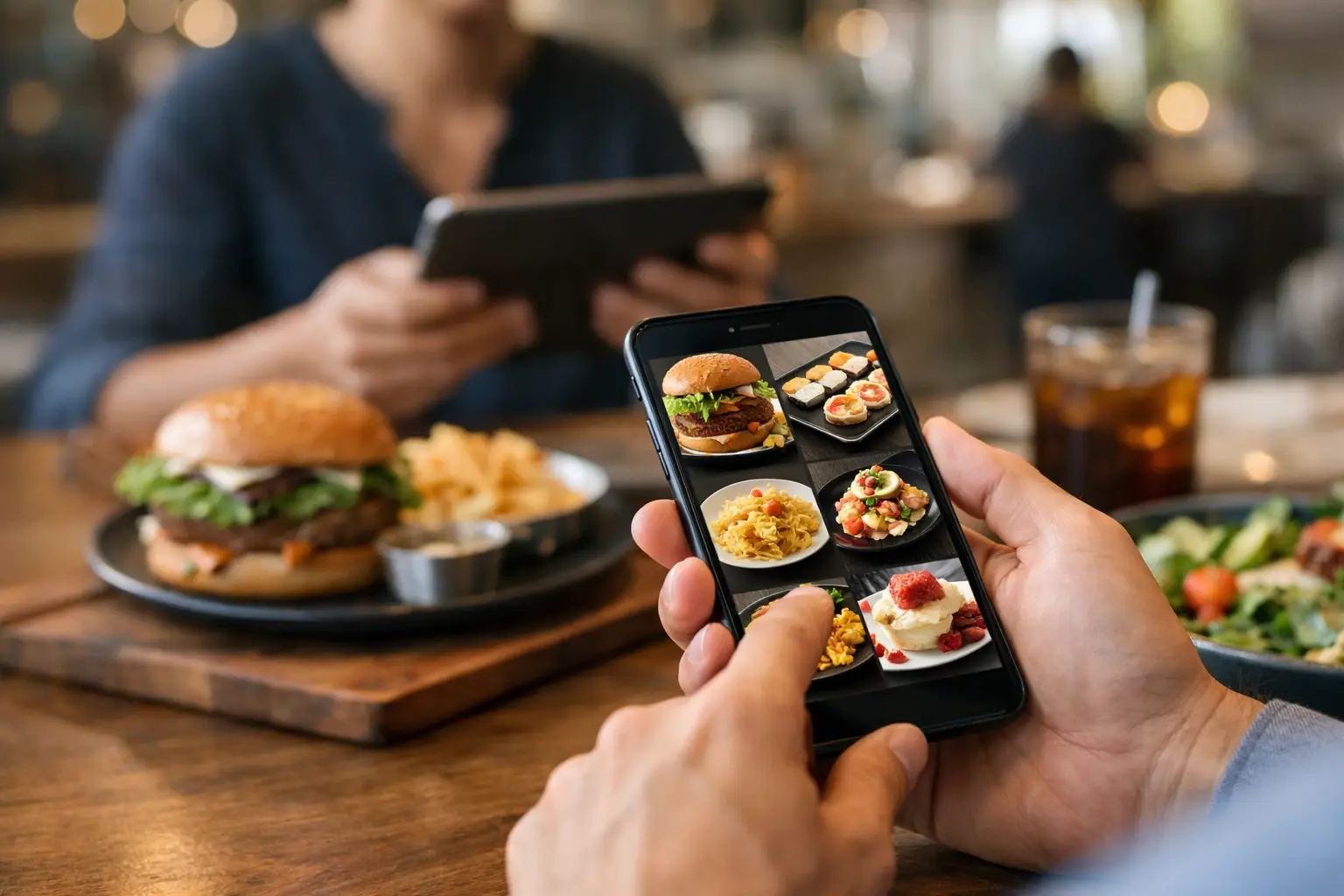
You know the feeling. You open a menu, read a dish description twice, maybe three times, and still have no real idea what is about to show up at your table or doorstep. A visual menu app changes that moment completely by replacing guesswork with actual food photos, so ordering feels more informed, more accessible, and a lot less frustrating.
That shift matters more than most restaurant tech conversations admit. For some people, seeing a real image of a dish is a nice bonus. For others, it is the difference between ordering with confidence and avoiding ordering altogether. When menus rely on text alone, they leave too much room for uncertainty around portion size, ingredients, plating, and even whether a meal looks appealing enough to spend money on.
What a visual menu app really solves
Most menu problems are not about a lack of options. They are about a lack of clarity. A dish can sound amazing on paper and still arrive looking nothing like what a customer expected. That disconnect costs people money, wastes food, and chips away at trust.
A visual menu app addresses the gap between description and reality. Instead of asking users to imagine what “crispy tossed chicken with house sauce” means, it shows them the meal. That sounds simple, but it has a big effect on decision-making. People move faster when they can see what they are choosing, and they feel better about spending when the product matches their expectations.
There is also an accessibility layer that should not be treated as an afterthought. Text-heavy menus can create friction for users with visual impairments, cognitive overload, or decision fatigue. Food photos do not solve every accessibility issue on their own, but they can reduce ambiguity in a way that written descriptions often do not. More context means fewer mental leaps.
Why photos matter more than polished marketing
Restaurants have used food photography for years, but that does not automatically make menus transparent. Carefully staged promotional images can help sell a dish, yet they may not help diners understand what they will actually receive. That is where authenticity matters.
The strongest visual menu experience is built around real, accurate, useful images. Diners are not just asking, “Does this look delicious?” They are asking, “Is this what I am really ordering?” Those are two different questions.
That difference is especially important for people managing dietary preferences, sensory sensitivities, or simple budget concerns. If a grain bowl is mostly lettuce, if the pasta portion is smaller than expected, or if the sandwich comes piled with ingredients not obvious from the description, a real photo can set expectations early. That is good for customers, and it is good for restaurants that want fewer disappointed orders.
A visual menu app and dining confidence
Confidence is one of the most underrated parts of the ordering experience. Most people do not want to feel like they are taking a gamble every time they try a new restaurant or menu item. They want enough information to make a smart choice without overthinking it.
That is where a visual menu app earns its place. It shortens the gap between curiosity and decision. Instead of scrolling through vague dish names and hoping for the best, users can quickly compare what meals actually look like. For people ordering on a lunch break, feeding a family, or managing a tight budget, that efficiency matters.
It also helps with repeat behavior. When diners trust what they see, they are more likely to try something new instead of defaulting to the same safe order every time. Better visibility can increase confidence, and confidence can lead to more satisfying choices.
Accessibility is not a side feature
Too often, accessibility gets framed as an add-on instead of a core design principle. Food ordering should not work well only for people who can easily parse dense text menus, interpret vague wording, or tolerate a high level of uncertainty.
A visual-first experience creates a more inclusive path for more people. Users with visual impairments may benefit from image-supported decision-making alongside other accessibility features. Users with decision fatigue may find it easier to narrow choices when they can compare meals visually. Users who are unfamiliar with certain cuisines can understand dishes faster when they have a reference point.
This is not about making dining flashy. It is about making dining clearer. When people can see what they are buying before they spend money, the experience becomes more equitable.
Community makes the app better
The challenge with restaurant menus is scale. Menus change. Specials rotate. New dishes appear. A static photo library can get outdated fast. That is why community participation makes so much sense in this category.
When users contribute real dish photos, the app becomes more current, more representative, and more useful. It also creates a better kind of trust. People are often more interested in seeing what a meal looked like for another diner than in seeing a studio-shot version from a marketing campaign.
There is a practical upside too. Community-powered content helps expand menu coverage faster than relying on restaurants alone. It creates a feedback loop where every upload improves the experience for the next person. That kind of participation can turn a simple utility into a shared resource.
For a platform like Pic-ture That!™, that community model is especially meaningful because it ties transparency to action. Users are not just browsing. They are helping build a better, more accessible way to order.
Where a visual menu app works best
Not every dining situation needs the same level of visual support. Some users only want photos when trying a new restaurant. Others want them every time they order. It depends on context.
The value is highest when uncertainty is high. Think first-time orders, unfamiliar cuisines, menu items with vague descriptions, combo meals, customizable dishes, and delivery orders where the customer cannot ask follow-up questions in person. In those cases, photos reduce hesitation.
There are trade-offs, though. A visual menu app is only as good as the quality and relevance of its images. If photos are outdated, misleading, or poorly matched to menu items, the trust breaks quickly. The goal is not just more images. It is better images with enough context to be genuinely helpful.
That is why curation matters. The best platforms do not treat every photo as equally useful. They focus on accuracy, authenticity, and practical decision support.
What diners should expect from a good visual menu app
A strong app should make ordering easier within seconds. Users should be able to search restaurants or dishes, view clear food photos, and understand whether the image reflects a real customer experience. If the app includes community uploads, it should reward contributions without sacrificing quality.
The experience should also feel built for everyday life, not just food enthusiasts. That means mobile-first design, quick browsing, and minimal friction between discovery and decision. If an app makes users work too hard to find a dish image, it loses its advantage.
Trust signals matter here. Real photos, useful labeling, and a growing menu database all help. So does a clear mission. Diners are more likely to engage when the platform is not just chasing clicks but actually trying to make food ordering more transparent and inclusive.
Why this matters for restaurants too
A lot of the conversation around menu visuals focuses on what diners want, but restaurants benefit when expectations are clearer. Better-informed customers tend to feel better about their choices. That can mean fewer complaints, fewer mismatched assumptions, and more confidence in trying featured items.
There is also a reputation factor. Restaurants that appear accurately and consistently in a visual menu environment may earn more trust than those hiding behind vague descriptions. That does not mean every dish needs perfect styling. It means honesty becomes part of the customer experience.
Some operators may worry that real-world images are less flattering than polished promotional shots. Sometimes that is true. But authenticity usually wins over overpromising. If the goal is long-term trust, realistic visuals are a smarter bet than a photo that sets the wrong expectation.
The bigger shift behind visual ordering
At its core, this is not just about food photos. It is about decision support. People want tools that help them make better choices with less friction. They want to know what they are getting, especially when prices are up and patience is down.
A visual menu app meets that need in a direct, human way. It gives people something menus have often failed to provide: clarity. Not hype, not guesswork, not vague language. Just a clearer picture of what is actually on offer.
And that kind of clarity tends to spread. When more diners expect visual transparency, the entire ordering experience gets pushed in a better direction – one that is more accessible, more honest, and more useful for real life.
The next time a menu leaves you squinting at adjectives and hoping for the best, that is the real case for doing things differently: people deserve to see what they are ordering before they commit.
Leave a Reply