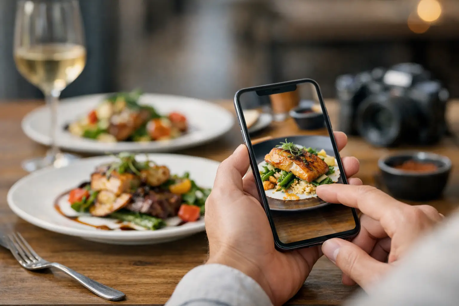
You know the feeling: a menu description sounds great, the photo in your head looks even better, and then the plate shows up looking nothing like what you expected. If you’ve been wondering how to preview restaurant meals before you spend your money, the good news is that you do not have to rely on guesswork anymore. A better ordering experience starts with seeing what a dish actually looks like, not just what a menu says it is.
That matters for almost everyone, but especially for people who deal with decision fatigue, visual impairments, dietary concerns, or plain old menu disappointment. Food is personal. Spending $18 on an entree you cannot really picture should not feel normal.
Why previewing meals changes the whole ordering experience
Most restaurant menus were built for speed, not clarity. They tell you ingredients, maybe a cooking style, and sometimes a few extras. What they usually do not tell you is portion size, plating, texture, toppings, side placement, or whether the dish looks heavy, fresh, messy, dry, shareable, or very different from what the name suggests.
That gap is where bad orders happen. You think you are getting a crispy sandwich with a balanced side, and instead it arrives overloaded with sauce and a tiny handful of fries. Or you order a salad expecting something light and colorful, but it turns out to be mostly lettuce in a deep bowl.
Previewing meals helps close that gap. It gives you confidence before checkout, helps you compare dishes faster, and cuts down on the stress that comes from choosing blindly. It is also an accessibility issue. When menus depend too heavily on text, they leave too much open to interpretation.
How to preview restaurant meals in real life
The fastest way to preview a meal is to look for real customer-uploaded photos instead of polished promo shots. Marketing images can be useful, but they are usually styled, edited, and chosen to sell. What most diners actually need is something more honest – a clear image of the exact dish as it is typically served.
That is why community-powered meal photos are so useful. They show what the burger bun really looks like, how much sauce is on the pasta, whether the tacos come packed or sparse, and how the side portions compare. You are not just seeing food. You are seeing context.
When you preview restaurant meals, start by checking whether the image matches the specific menu item, not just the category. A generic pasta photo does not help much if you are deciding between vodka sauce and pesto chicken. The more exact the image, the more useful it becomes.
Then look at the details people often miss. Is the dish stacked high or spread wide? Does it look easy to eat or awkward? Is the bread toasted lightly or deeply? Are toppings mixed in, placed on top, or served on the side? These small visual cues tell you a lot about what your actual experience will be.
What to look for in a useful meal preview
Not every photo helps. Some are too dark, too far away, or taken after half the plate is gone. A good meal preview gives you enough information to make a call.
First, look for accuracy. The best preview is recent, clearly tied to the menu item, and unfiltered enough to show the dish honestly. Second, look for angle and scale. Photos taken from above or at table height can reveal portion size, thickness, and side layout. Third, look for consistency. If multiple photos of the same dish all look similar, that is a good sign the preview reflects reality.
You should also pay attention to what is not in the description. Menus often skip things like garnish, sauce quantity, bread type, or whether ingredients are layered or mixed together. Photos fill in those blanks quickly.
For diners with accessibility needs, visual previews can do even more. They can reduce uncertainty around plate structure, color contrast, ingredient visibility, and overall presentation. That makes ordering feel less like a gamble and more like an informed choice.
The difference between real photos and restaurant marketing shots
There is nothing wrong with a well-shot restaurant photo. The problem is when that is your only reference. Promotional images are built to highlight the best-case version of a dish. They may use lighting, styling, substitutions, or plating adjustments that make the food look better on camera than it does in daily service.
Real diner photos usually show the meal under normal conditions. That makes them more practical. They tell you what shows up on the table on a regular Tuesday night, not just what looked good in a photo studio or launch campaign.
It depends on what you need. If you are choosing a restaurant for a celebration, marketing photos might help you get a sense of brand style. But if you are trying to decide whether the grilled chicken bowl actually looks filling, authentic user photos are far more useful.
How to preview restaurant meals without wasting time
The process does not have to be complicated. Start with the dish you are most likely to order, not the entire menu. Narrowing your focus saves time and avoids the scroll spiral that happens when every item starts to blur together.
Next, compare two or three similar dishes visually. If one sandwich looks packed and balanced while another looks flat and sloppy, that visual comparison may tell you more than the menu copy does. If you are deciding between sides, photos can also reveal whether the upgrade is worth it.
It helps to think in terms of dealbreakers. Some people care most about portion size. Others care about whether ingredients are visible, whether sauces are heavy, or whether a meal looks easy to customize. Once you know your dealbreakers, previewing gets much faster.
This is also where a platform like Pic-ture That!™ makes a real difference. Instead of bouncing between random photo sources and hoping the image matches the dish, diners can use a visual menu discovery experience built around authentic meal photos and community contributions. That makes the preview process clearer, quicker, and more inclusive.
When previews are especially valuable
Meal previews are helpful any time, but they matter even more in a few common situations. Ordering delivery is a big one, because you cannot scan neighboring tables or ask quick visual questions before deciding. Trying a new restaurant is another. So is ordering for a group, when one wrong pick can turn into a frustrating and expensive mistake.
They are also especially useful when menu language is vague. Words like loaded, crispy, house-style, signature, and deluxe can mean almost anything depending on the restaurant. A real photo keeps those labels honest.
And for people who feel overwhelmed by long menus, previews can cut through the noise. Seeing a dish often helps you rule things in or out much faster than reading ten nearly identical descriptions.
A smarter, more inclusive way to choose food
When people talk about food transparency, they often think about ingredients or nutrition. Those things matter, but visual transparency matters too. Being able to preview a meal before ordering gives diners more control, fewer surprises, and a better shot at spending their money well.
That is not just convenient. It is a more inclusive standard. It respects the fact that people make decisions differently and that text alone does not work for everyone equally well.
If you want to know how to preview restaurant meals with more confidence, the answer is simple: look for real, specific, community-driven photos that show the dish as it actually arrives. The more honest the preview, the easier the choice becomes.
Food ordering should feel clear, not uncertain. Seeing the meal first is a small shift that makes a big difference.
Leave a Reply