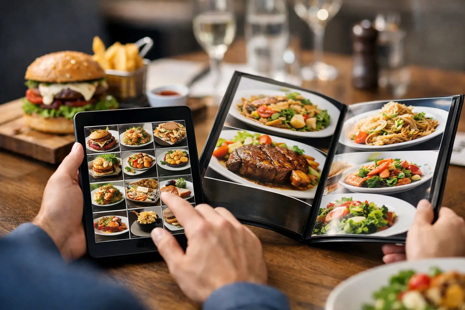
You know the feeling. A menu sounds great, you order fast, and then the plate arrives looking nothing like what you pictured. Maybe the portion is smaller, the sauce is heavier, or the dish turns out to be built around an ingredient you were hoping to avoid. That gap is exactly why do menu photos matter to so many diners. They turn a guess into a decision you can actually feel good about.
For a lot of people, photos are not a nice extra. They are the missing piece that makes a menu usable. A written description can tell you what is in a dish, but it often cannot show scale, texture, toppings, plating, or how ingredients are really combined. When restaurants leave that part to imagination, diners are left filling in the blanks. Sometimes that works. Often, it does not.
Why do menu photos matter for real ordering decisions?
Most food purchases happen quickly. You are hungry, comparing options on your phone, trying to stay on budget, and making a call in minutes. In that moment, a photo does something text alone cannot. It gives you immediate clarity.
That clarity matters because menu language is often inconsistent. One restaurant’s “crispy chicken sandwich” could mean a thick hand-breaded filet on a brioche bun. Another could mean a thinner patty with lots of sauce and shredded lettuce. Both descriptions are technically true. Neither tells the full story. A photo closes that gap.
It also reduces the risk of disappointment. When diners can see the actual meal before they order, they are less likely to end up with something that feels off. That saves money, time, and frustration. It also helps people feel more confident trying something new, because they are not choosing blindly.
There is a business side to this too. Clear visuals can lead to better-fit orders and fewer surprises. But for diners, the bigger point is simple: seeing the food helps people choose the food.
Photos make menus more accessible
This is where the conversation needs to get more honest. Menu photos are often treated like a marketing feature, but they also function as an accessibility tool.
For diners with visual impairments, the issue is not just whether a menu exists. It is whether the menu communicates enough useful information to support an informed choice. Text descriptions vary wildly in quality. Some are detailed. Many are vague. A strong photo paired with clear labeling can add another layer of understanding that helps users build a more complete picture of the dish.
For people with decision fatigue, menu photos can also reduce mental load. Sorting through a long list of similarly worded items can be exhausting, especially when every option starts to blur together. Images create faster recognition. They help people narrow choices without having to decode every line.
That does not mean photos replace good descriptions. They do not. Accessibility works best when information is layered, not when one format is expected to do everything. A menu should be easier to use, not easier only for one kind of user. Photos are part of that broader goal.
What photos reveal that descriptions miss
A menu description usually focuses on ingredients. Diners also care about presentation, proportion, and context.
A photo shows whether the salad is mostly greens or loaded with extras. It shows whether the pasta is creamy or lightly dressed. It shows whether the tacos are packed or sparse, whether the side portion is substantial, and whether the “spicy” ramen looks rich and heavy or brothy and clean.
Those details matter because people do not order ingredients in isolation. They order experiences, portions, textures, and combinations. Two burgers with nearly identical descriptions can feel completely different once you see the bun, thickness, toppings, and size.
Photos can also set expectations around quality and consistency. If the visual looks authentic and current, it helps diners trust that the restaurant knows what it is serving. If the image looks overly stylized or clearly disconnected from reality, that trust can drop fast. People are good at spotting when a food photo feels more like advertising than information.
Authentic photos build trust faster than polished ones
This is one of the biggest trade-offs in menu imagery. Professionally staged photos can look beautiful, but they are not always the most helpful. If lighting, editing, and styling make a dish look dramatically better than it appears in real life, the photo can create the exact problem it was supposed to solve.
Authentic photos often do more for trust. They show what a dish actually looks like when it reaches the table. That includes the imperfect but useful details diners care about: portion size, side placement, sauce amount, garnish, and real-world presentation.
That is why community-powered menu photos matter so much. Real diners capture real meals in real settings. The result is often more practical than a perfect studio image. It gives other users a better sense of what they are actually buying.
There is still a balance to strike. Photos should be clear, accurate, and well-lit enough to be useful. Grainy, dark images can create confusion too. The goal is not polished fantasy. It is reliable visibility.
Menu photos reduce wasted orders
Nobody likes spending money on a meal that misses the mark. Maybe the serving is much smaller than expected. Maybe the dish arrives covered in onions when the menu barely mentioned them. Maybe the entree looks much heavier than the description suggested.
Photos help cut down on these mismatches. When diners can see the dish before ordering, they make choices that better align with their appetite, preferences, and expectations. That can mean fewer abandoned meals, fewer regret orders, and less food waste.
This matters even more in delivery and pickup. Once the order is placed, there is less room to fix a mismatch. You are not standing in the restaurant asking questions. You are relying on the menu to carry the full decision. In that context, visual information becomes even more valuable.
It also helps with budget decisions. If you are comparing two dishes at similar price points, a photo can reveal which one feels more satisfying or more aligned with what you want. That is a practical win, not just a visual one.
Why do menu photos matter in a mobile-first world?
Because most ordering now happens on small screens, under time pressure, with limited patience.
Mobile users scan. They compare quickly. They make snap decisions between tabs, apps, and delivery platforms. Long descriptions are easy to skip. Photos communicate faster. They help people sort options, notice differences, and move forward with more confidence.
This is especially true when someone is ordering in a group, multitasking, or trying to choose from a large menu. The easier it is to recognize what a dish actually is, the easier it is to order without second-guessing every choice.
That speed matters, but accuracy matters more. A fast decision only feels good if it turns out to be the right one.
Not every dish needs a photo, but the right ones really help
There is some nuance here. Not every single menu item needs an image to be useful. Some dishes are already familiar enough that a photo adds less value. Others vary so much by location or customization that one image may only tell part of the story.
Still, some categories benefit a lot from visuals: specialty drinks, combination plates, build-your-own items, desserts, and dishes with unclear names or house-specific presentation. These are the moments where a photo can answer questions a description leaves open.
The same goes for first-time orders. If someone already knows a restaurant well, they may need fewer visuals. New customers usually need more help. Photos make that first experience less uncertain, which can be the difference between trying a place once and coming back again.
For platforms built around real dish discovery, this is where the value becomes bigger than convenience. It becomes transparency. Seeing actual food before you buy it gives diners more agency. It shifts ordering from hopeful guesswork to informed choice.
That is a better experience for people who want confidence, for people who need clearer information, and for people who are tired of spending money on meals that do not match the menu in their head. It is also why platforms like Pic-ture That! are tapping into something much bigger than food photos alone.
A menu should help people choose well. When it shows the food clearly, it finally does.
Leave a Reply