Category: Ordering Tips

  • Why Menu Photos Before You Order Matter

    Why Menu Photos Before You Order Matter

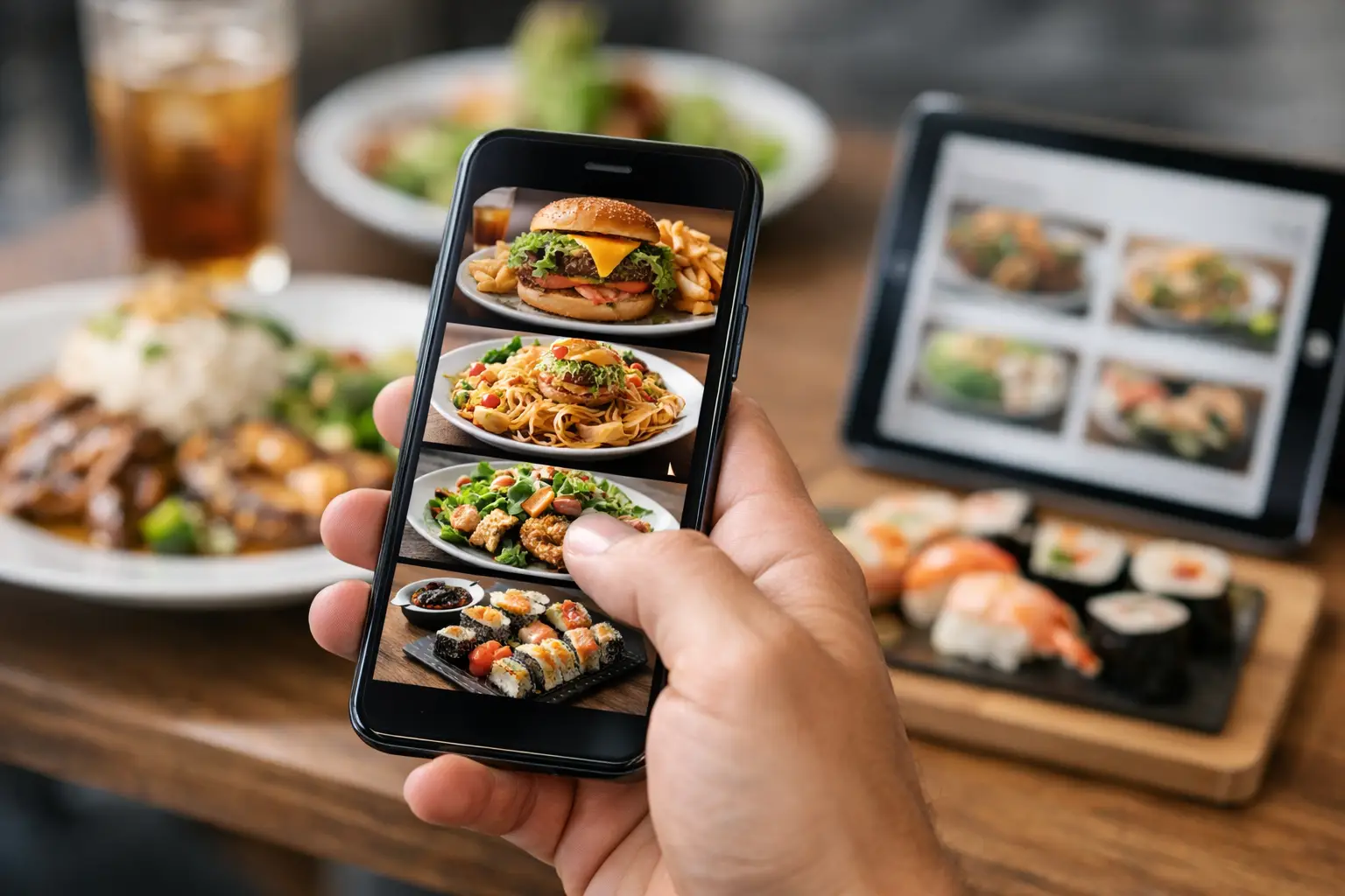
    You know the feeling. You scan a menu, land on a dish that sounds amazing, place the order, and then the plate arrives looking nothing like what you pictured. Maybe the portion is smaller than expected. Maybe the sauce covers everything. Maybe the “crispy” item is actually soft, or the bowl that sounded fresh and balanced turns out heavy and bland. Menu photos before you order can change that entire experience.

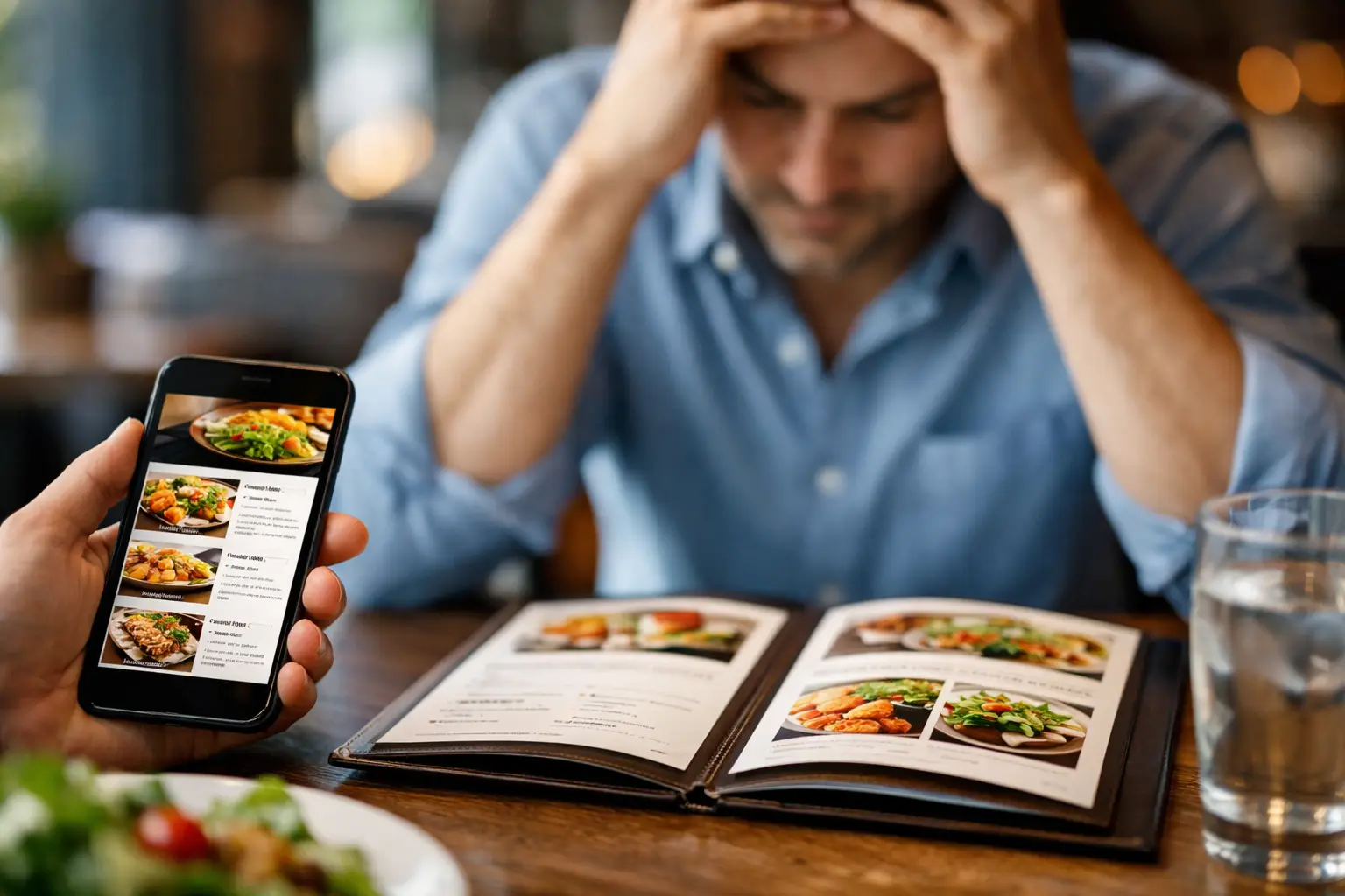
    For a lot of diners, this is not a small convenience. It is the difference between ordering with confidence and spending money on a meal that misses the mark. And for people with visual impairments, decision fatigue, dietary concerns, or plain old ordering burnout, real food images are not extra. They are useful information.

    The real problem with text-only menus

    Most menus were built around description first. That works up to a point. A restaurant can tell you a sandwich includes grilled chicken, pepper jack, avocado, aioli, and brioche. What it cannot easily tell you is whether that sandwich is stacked high, lightly dressed, messy, tiny, over-toasted, or served with a side that changes the whole value of the meal.

    That gap matters because food is visual. People do not just buy ingredients. They buy expectations – portion size, presentation, texture, freshness, and even whether a dish feels worth the price. When that visual information is missing, people fill in the blanks themselves. Sometimes they guess right. A lot of the time, they do not.

    This is where menu photos before you order become more than a nice feature. They help close the gap between menu language and the actual plate. That means fewer disappointing surprises and better decisions before money is spent.

    Why menu photos before you order matter

    The biggest benefit is clarity. Seeing a real image of a dish helps diners understand what they are actually getting, not what they hope the description means. That can save time, reduce stress, and cut down on the all-too-common regret of ordering the wrong thing.

    There is also a trust factor. Stock photography and polished restaurant marketing shots can create unrealistic expectations. Real menu photos, especially community-contributed ones, tend to be more honest. They show the dish as it usually appears, in normal lighting, on a real table. That kind of transparency helps people make smarter choices.

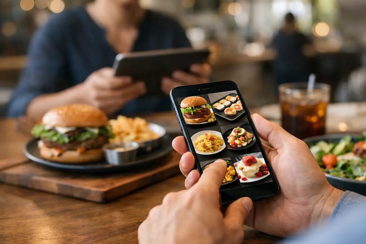
    It also changes how people interact with menus. Instead of decoding vague phrases like “house style” or “chef’s favorite,” diners can quickly compare actual dishes and decide what looks appealing. For mobile-first users ordering on the go, that speed matters.

    Accessibility is a real part of this conversation

    Food photos are often treated as a marketing extra. That misses the point.

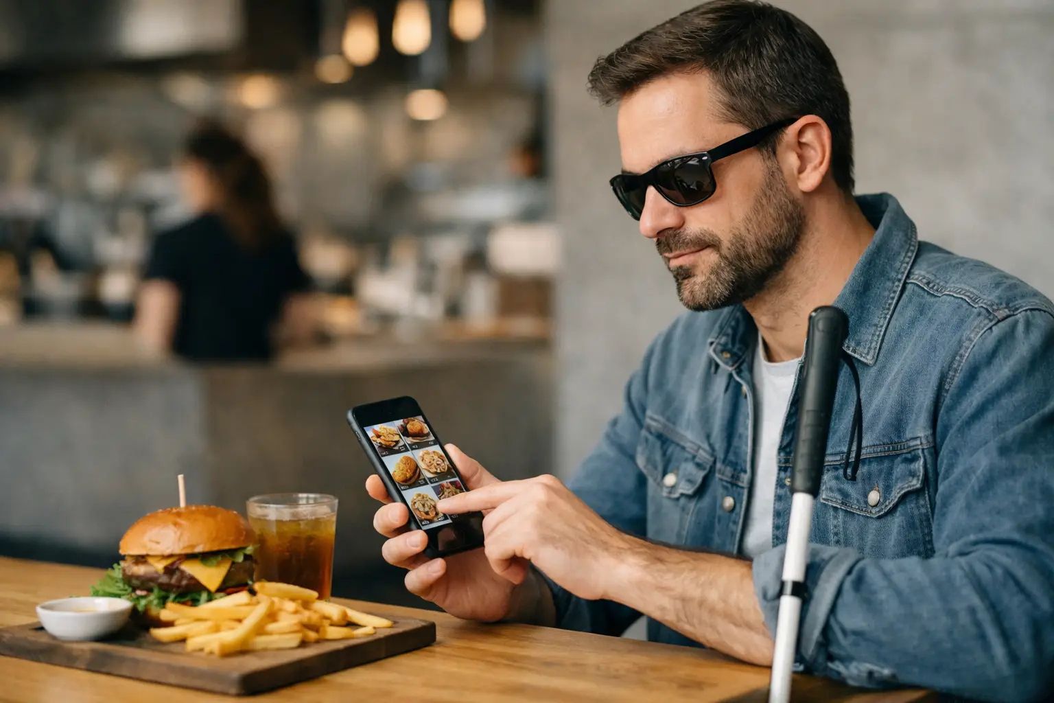
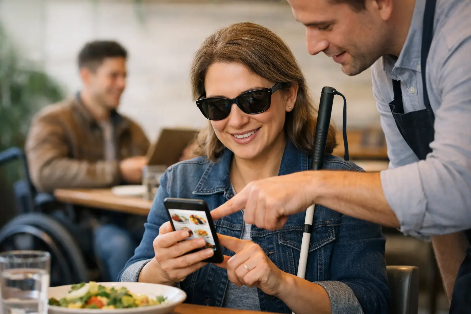
    For many users, visual menu discovery supports accessibility. A person with a visual impairment may use image descriptions, screen reader support, or shared decision-making tools alongside food photos to better understand a menu. Someone with cognitive overload or decision fatigue may find it easier to choose between dishes when they can compare visuals instead of sorting through blocks of text.

    That does not mean photos solve every accessibility challenge on their own. They need thoughtful design around them. Image quality matters. Organization matters. Labeling matters. But when visual information is added intentionally, ordering becomes more inclusive.

    That is a big shift. It frames menu photos before you order as a tool for dining confidence, not just a way to tempt people into adding fries.

    Better choices, fewer disappointing orders

    There is a simple reason people look for dish photos before buying food: they want fewer misses.

    A menu description rarely tells the full story on spice level, topping amount, bread thickness, plating style, or whether a dish looks fresh and balanced. It may not show if a salad is mostly lettuce, if a pasta is extra creamy, or if a breakfast plate feels light or heavy. Photos help answer those questions fast.

    That matters even more when prices keep climbing. People are less willing to gamble on a $17 lunch or a $28 dinner entree. They want evidence. They want to know if the burger looks worth it, if the sushi roll looks neatly made, or if the dessert is shareable.

    It depends, of course, on the photo. One blurry image taken in a dark booth is not always enough. But a growing library of real meal photos gives diners something menus alone often cannot: confidence.

    Authentic photos beat polished guesswork

    There is a place for professional food photography. Restaurants need clean, appealing visuals. But polished images can also create distance from reality.

    The most useful menu photos are often the authentic ones. They show what a dish looks like when it is actually served, not when it is styled for a campaign shoot. That honesty matters because people are trying to answer practical questions. Is the soup thick or brothy? Are the tacos packed or skimpy? Does the smoothie bowl actually look loaded with fruit, or mostly granola?

    Community-powered photo libraries are especially strong here. When multiple diners upload images of the same item, patterns emerge. Users can see consistency, portion changes, or how a dish appears across visits. That is more helpful than a single perfect image with ideal lighting.

    The social side matters too

    Dining is personal, but it is also shared. People ask friends what to order. They scroll reviews. They look up tagged photos before trying a new spot. That behavior is already part of how people eat.

    Menu photos before you order simply make that process more direct and more useful. Instead of piecing together random social content, diners can browse dish-specific images built for decision-making. That is a better experience for the person ordering and a better signal for the restaurant too.

    It also creates a sense of participation. When users upload meal photos, they are not just posting for attention. They are helping the next person order with more confidence. That community effect is powerful, especially when contributors are rewarded and the goal is bigger than aesthetics.

    What diners should look for in menu photo platforms

    Not every food photo tool is equally helpful. The best ones focus on clarity over hype.

    First, the images should be tied to specific menu items. Random restaurant gallery shots are less useful than seeing the exact burger, bowl, or dessert you are considering. Second, the photos should feel recent and authentic. Third, the platform should make it easy to compare dishes quickly, especially on mobile.

    Accessibility features also matter. Clear labels, simple navigation, and thoughtful organization make a big difference. A platform that treats visual food discovery as part of a more inclusive ordering experience will usually be more useful than one built only for promotion.

    This is where a brand like Pic-ture That!™ fits naturally. The mission is not just to make food look good. It is to help people see what they are ordering, contribute real images, and make dining more transparent for everyone.

    Why restaurants should pay attention

    This is not just a diner issue. Restaurants benefit when guests know what to expect.

    Clearer expectations can lead to better satisfaction, fewer complaints, and more confident orders. A customer who sees the dish beforehand is less likely to be surprised by portion, presentation, or style. That does not eliminate every mismatch, but it can reduce friction.

    There is a trade-off here. Some restaurants worry that authentic user photos are less flattering than professional ones. Sometimes that is true. But transparency tends to build trust over time. If a dish consistently looks good in real customer photos, that is powerful proof. If it does not, that is useful feedback.

    The future of ordering is more visual and more honest

    People are already used to seeing products before they buy them. Food should not be the exception.

    As digital ordering becomes more common, visual menu discovery will feel less like a bonus and more like a baseline expectation. Not because people are picky, but because they are informed. They want fewer surprises, better value, and a clearer sense of what they are saying yes to.

    And the strongest version of that future is not built on polished advertising alone. It is built on community, accessibility, and real-world transparency. When diners can see meals before they order, they gain something simple but powerful: the chance to choose with confidence.

    That is a better experience for everyone at the table.
  • Best Restaurant Dishes With Pictures App

    Best Restaurant Dishes With Pictures App

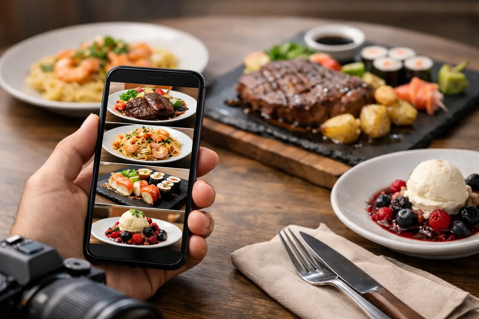
    You know the feeling. You scan a menu, land on a dish with a promising name, and still have no real idea what will show up at the table. Is it a light lunch or a huge plate? Is the sauce poured over everything? Does it actually look fresh, spicy, crispy, or worth the price? A restaurant dishes with pictures app fixes that gap by showing people what they are ordering before they spend money.

    That sounds simple, but it changes a lot. Seeing real food photos is not just a nice extra for curious diners. It can make ordering easier, faster, and more accessible. It can reduce decision fatigue, cut down on disappointing orders, and give people more confidence when they are trying a new restaurant, navigating dietary preferences, or ordering with limited menu detail.

    Why a restaurant dishes with pictures app matters

    Most restaurant menus still ask customers to make a visual decision without visual information. You get a dish name, maybe a short description, and sometimes a few ingredients. That might work if you already know the cuisine well. It works a lot less well when the wording is vague, the portion size is unclear, or the dish is unfamiliar.

    A restaurant dishes with pictures app brings transparency to that moment. Instead of guessing, users can compare dishes visually and make a more informed choice. That matters for anyone who wants fewer surprises, but it matters even more for people who rely on visual cues to understand what they are ordering.

    For diners with visual impairments, that need can look different. Some may use assistive technology to navigate text but still benefit from structured image descriptions, consistent photo labeling, or a more accessible way to identify dishes. For people with decision fatigue, the value is just as real. A clear image can shorten the mental back-and-forth that often comes with ordering from a long or poorly explained menu.

    This is where food photos stop being just marketing and start becoming a practical tool. They help people choose with more clarity, which makes dining feel more inclusive.

    What makes a good restaurant dishes with pictures app

    Not every food photo experience is equally useful. A polished promotional image on a restaurant website can look great, but it does not always help someone decide what they will actually receive. The best apps focus on authenticity, consistency, and ease of use.

    Real customer photos usually tell a more helpful story than staged shots. They show plating, portion size, side items, toppings, and the little details that affect whether a dish feels satisfying. They also set more realistic expectations. If the goal is confidence, accuracy matters more than perfection.

    A strong app also needs clear organization. Users should be able to search by restaurant, browse by dish, and quickly match images to actual menu items. If the photo library is messy or incomplete, people are back to guessing. Good structure is part of accessibility.

    Speed matters too. If someone is standing in line, ordering takeout, or scrolling delivery options on a phone, they are not looking for a complicated experience. They want an app that helps them answer a basic question fast: What does this food really look like?

    Real benefits for everyday ordering

    The appeal of a visual food app is easy to understand once you think about how often people order with incomplete information. That happens at sit-down restaurants, fast casual spots, takeout counters, food halls, and delivery apps. In each case, a photo can remove friction.

    One obvious benefit is avoiding bad orders. When people can see a dish before buying it, they are less likely to order something that is too small, too messy, too heavily dressed, or simply not what they expected. That means fewer regrets and less wasted money.

    Another benefit is speed. Menus can be overwhelming, especially when every item sounds similar or uses unfamiliar terms. Images narrow the field quickly. Instead of reading ten descriptions twice, users can spot what looks right and decide with less effort.

    There is also a social side to this. Group ordering gets easier when everyone can see options instead of debating vague menu wording. That can be especially helpful for families, friend groups, and anyone sharing food across different tastes and needs.

    Accessibility is not a side feature

    A lot of restaurant tech treats accessibility like a box to check later. That approach misses the point. For many people, seeing accurate representations of dishes or accessing image-supported menu information is part of making dining more equitable.

    Text-only menus often assume that a short description is enough. It usually is not. Words like crispy, house-style, loaded, or classic do not tell users how a dish appears in real life. They do not communicate spacing, texture, layering, garnish, or serving size very well either.

    A restaurant dishes with pictures app can help close that gap when it is built thoughtfully. That means pairing visual content with clean labels, logical navigation, and a community that values useful contributions over random uploads. The goal is not just to add more images. The goal is to make menu choices easier to understand for more people.

    That is one reason this kind of app has a bigger role than simple food inspiration. It supports confidence. It supports informed decisions. And it treats visual clarity as something diners deserve, not something they should hope for.

    Why community-powered photos work so well

    Restaurant menus change constantly. New specials appear, plating shifts, side options rotate, and locations vary. That makes it hard for any static library to stay accurate on its own. A community-powered model solves part of that problem by letting diners contribute fresh photos over time.

    This approach creates a more realistic picture of what restaurants are serving now, not just what they promoted months ago. It also scales in a way that traditional menu photography does not. The more people participate, the more coverage the app can build across cities, chains, and neighborhood favorites.

    There is a trust factor here too. User-submitted photos often feel more believable because they reflect actual ordering experiences. They are not trying to sell a fantasy. They are helping the next person make a better choice.

    When contributors are rewarded, participation becomes even stronger. That gives people a reason to upload helpful photos after a meal and turns the app into a shared resource instead of a one-way platform. Pic-ture That!™ leans into that idea by connecting photo contributions with community value and practical rewards.

    Where the trade-offs come in

    Of course, no app solves every menu problem perfectly. Photo coverage may be strong in some areas and thin in others, especially in early-stage platforms. Some dishes will have multiple images, while others may not have any yet. That is normal for a growing photo library.

    User-generated content also needs moderation. If photos are mislabeled, outdated, or low quality, they can create confusion instead of clarity. The best platforms handle this with smart review systems, clearer upload guidance, and a focus on matching photos to the right menu items.

    There is also the question of expectations. A real diner photo is usually more helpful than a stylized promo shot, but it may not be perfectly lit or beautifully framed. That is a trade-off worth making if the goal is honesty. Most users do not need food to look glamorous. They need it to look real.

    What to look for before downloading one

    If you are comparing apps in this space, focus on usefulness over hype. Check whether the app shows real dish-level photos rather than just restaurant interiors or generic food shots. Look for clear restaurant matching, easy mobile browsing, and a growing library that feels active rather than abandoned.

    It also helps to look at the app’s mission. Some food platforms use images mainly to drive engagement. Others are built around transparency and accessibility from the start. That difference shows up in how the product feels. An app designed to reduce uncertainty tends to be more practical, more inclusive, and more respectful of the decision-making moment.

    And if you like contributing as much as browsing, see whether the platform makes it easy to upload photos and rewards users for helping expand coverage. That turns everyday dining into something useful for the next person too.

    Restaurant ordering should not feel like a blind bet. A good restaurant dishes with pictures app gives people a clearer view of what they are choosing, and that small shift can make dining feel a lot more confident, accessible, and fair. If more of us help build that kind of menu transparency, everyone gets a better shot at ordering something they actually want.

  • Why a Real Food Photos Menu App Matters

    Why a Real Food Photos Menu App Matters

    You know the feeling: you’re staring at a menu, trying to decode a vague dish name, and wondering whether the photo in your head matches what will actually show up. A real food photos menu app changes that moment. Instead of guessing from a description, you can see real dishes, make a clearer choice, and order with more confidence.

    That sounds simple, but it solves a bigger problem than most people realize. Restaurant menus often assume everyone can picture a dish the same way, parse every ingredient the same way, and feel equally comfortable taking a risk. That is not how real dining decisions work. For many people, text-only menus create friction, uncertainty, and wasted money.

    What a real food photos menu app actually solves

    Most menu frustration comes down to one thing: missing context. A dish might sound great on paper, but names and descriptions leave out the details people care about. How big is it? Is the sauce heavy or light? Does the dish look fresh, messy, packed, plain, or completely different from what you expected?

    A real food photos menu app fills in that gap with authentic images of actual meals. Not polished ad shots. Not stock photography. Real photos that help diners understand what they are about to buy.

    That matters for everyday convenience, but it also matters for access. If a person has a visual impairment, relies on visual references, or experiences decision fatigue, traditional menus can feel harder than they should. Ordering food should not require guesswork, stress, or a leap of faith.

    Real food photos menu app benefits go beyond convenience

    Seeing food before you order is often treated like a nice extra. It is more than that. It supports better decisions, reduces disappointment, and makes dining feel more inclusive.

    For some users, photos help compare options faster. For others, they reduce the anxiety of choosing something unfamiliar. A person might avoid wasting money on a dish that looks nothing like what they wanted. Someone else might finally feel comfortable trying a new restaurant because the menu is easier to understand visually.

    There is also a trust factor. Real dish photos create transparency. They show what restaurants are actually serving, not just what marketing teams want people to imagine. That kind of honesty builds confidence, especially when dining costs are high and people want to feel good about what they ordered.

    Why authenticity matters more than polished food marketing

    There is a big difference between promotional food imagery and useful food imagery. Restaurants have every reason to present dishes in the best possible light. That is normal. But a heavily styled image does not always help diners decide whether a meal is right for them.

    Authentic photos tell a more practical story. They show portion size, plating, texture, toppings, sides, and visual details that menu copy often misses. That makes them more helpful for real decision-making.

    Of course, authenticity comes with trade-offs. User-submitted photos may vary in lighting, angle, or quality. But that is often a fair exchange if the image is honest and current. Most diners would rather see a real plate taken on a phone than a perfect photo that sets the wrong expectation.

    This is where community-powered platforms become powerful. When many people contribute real meal photos, the menu becomes more representative over time. One image can help. A photo library from actual diners can change how people order.

    Accessibility is not a side benefit

    Food discovery is often discussed as a convenience issue, but for many users, it is also an accessibility issue. A real food photos menu app can support people who need more than text to navigate choices with confidence.

    That includes users with visual impairments who benefit from image-based context paired with accessible app design. It also includes people with cognitive overload or decision fatigue who need a faster, clearer way to narrow down options. When menus rely only on text, they can create an unnecessary barrier.

    Visual clarity helps make dining more equitable. It gives more people the ability to assess options on their own terms. That is not about adding a flashy feature. It is about reducing friction in a decision people make every day.

    An inclusive dining experience starts before the food arrives. It starts at the moment of choice.

    The community piece makes the model stronger

    A useful menu photo platform does not need every restaurant to build and maintain perfect image libraries on day one. In fact, one of the smartest ways to grow coverage is through the people already eating the food.

    When diners upload real meal photos, they help other users make better decisions. They also help build a more transparent restaurant experience overall. This kind of participation turns the app into more than a browsing tool. It becomes a shared resource.

    That community angle matters because restaurant menus change, dishes vary, and local coverage takes time. A user-generated model can adapt faster than a top-down system alone. It also creates a stronger sense of ownership. People are not just consuming content. They are improving the experience for everyone else.

    Rewards can help, too. Earning restaurant gift cards or similar perks gives contributors a reason to keep uploading. But the bigger value is that each photo removes a little more uncertainty for the next person.

    What users should expect from a good real food photos menu app

    Not every food photo app will be equally helpful. Some focus more on aesthetics than utility. Others may have limited coverage or inconsistent image quality. The strongest platforms usually get a few core things right.

    First, the photos need to be tied clearly to actual menu items. That sounds obvious, but accuracy matters. A beautiful image is not useful if it is mislabeled or out of date.

    Second, the experience should be fast and mobile-friendly. Most users are checking menus while on the go, standing in line, deciding on takeout, or debating what to order with friends. If the app is clunky, the value drops quickly.

    Third, accessibility should be built into the product, not added later. Clear navigation, readable design, and thoughtful user experience make a real difference.

    Finally, the platform should encourage fresh contributions. Restaurants evolve, and menu transparency only works when the visuals reflect what people are actually being served.

    Why this matters now

    Dining has become more digital, but menus still leave too much unsaid. People order from their phones, compare options in seconds, and spend real money without a clear picture of what they are getting. That gap feels increasingly outdated.

    A real food photos menu app meets people where they already are: on mobile, looking for clarity, and trying to avoid bad orders. It fits the way people actually make decisions now.

    It also reflects a bigger shift in consumer expectations. People want transparency. They want proof, not just promises. They want to feel included in experiences that were often designed around assumptions. Food is no exception.

    This is one reason the idea behind Pic-ture That!™ resonates. It treats real food imagery as a practical tool for confidence, access, and better choices, not just a visual extra.

    The bigger picture behind better menu visibility

    When people can see their options clearly, they make more informed decisions. That leads to fewer disappointing orders, less wasted money, and a better restaurant experience overall. But the impact goes beyond individual meals.

    Better menu visibility can help set a new standard for transparency in dining. It can encourage restaurants to think more carefully about how their food is presented and understood. It can also give users a stronger voice in shaping how food information is shared.

    Will every dish photo answer every question? No. Some foods still vary by location, timing, or preparation. And some users will always want ingredient details, allergy information, or reviews alongside images. That is fair. Photos are not the whole solution.

    But they are a meaningful part of it. They make menus more human, more usable, and more honest.

    If ordering food has ever felt like a gamble, that is exactly why this category matters. People deserve to see what they are paying for before they tap order, and the more we build around that idea, the better dining gets for everyone.

  • Why a Visual Menu App Changes Ordering

    Why a Visual Menu App Changes Ordering

    You know the feeling. You open a menu, read a dish description twice, maybe three times, and still have no real idea what is about to show up at your table or doorstep. A visual menu app changes that moment completely by replacing guesswork with actual food photos, so ordering feels more informed, more accessible, and a lot less frustrating.

    That shift matters more than most restaurant tech conversations admit. For some people, seeing a real image of a dish is a nice bonus. For others, it is the difference between ordering with confidence and avoiding ordering altogether. When menus rely on text alone, they leave too much room for uncertainty around portion size, ingredients, plating, and even whether a meal looks appealing enough to spend money on.

    What a visual menu app really solves

    Most menu problems are not about a lack of options. They are about a lack of clarity. A dish can sound amazing on paper and still arrive looking nothing like what a customer expected. That disconnect costs people money, wastes food, and chips away at trust.

    A visual menu app addresses the gap between description and reality. Instead of asking users to imagine what “crispy tossed chicken with house sauce” means, it shows them the meal. That sounds simple, but it has a big effect on decision-making. People move faster when they can see what they are choosing, and they feel better about spending when the product matches their expectations.

    There is also an accessibility layer that should not be treated as an afterthought. Text-heavy menus can create friction for users with visual impairments, cognitive overload, or decision fatigue. Food photos do not solve every accessibility issue on their own, but they can reduce ambiguity in a way that written descriptions often do not. More context means fewer mental leaps.

    Why photos matter more than polished marketing

    Restaurants have used food photography for years, but that does not automatically make menus transparent. Carefully staged promotional images can help sell a dish, yet they may not help diners understand what they will actually receive. That is where authenticity matters.

    The strongest visual menu experience is built around real, accurate, useful images. Diners are not just asking, “Does this look delicious?” They are asking, “Is this what I am really ordering?” Those are two different questions.

    That difference is especially important for people managing dietary preferences, sensory sensitivities, or simple budget concerns. If a grain bowl is mostly lettuce, if the pasta portion is smaller than expected, or if the sandwich comes piled with ingredients not obvious from the description, a real photo can set expectations early. That is good for customers, and it is good for restaurants that want fewer disappointed orders.

    A visual menu app and dining confidence

    Confidence is one of the most underrated parts of the ordering experience. Most people do not want to feel like they are taking a gamble every time they try a new restaurant or menu item. They want enough information to make a smart choice without overthinking it.

    That is where a visual menu app earns its place. It shortens the gap between curiosity and decision. Instead of scrolling through vague dish names and hoping for the best, users can quickly compare what meals actually look like. For people ordering on a lunch break, feeding a family, or managing a tight budget, that efficiency matters.

    It also helps with repeat behavior. When diners trust what they see, they are more likely to try something new instead of defaulting to the same safe order every time. Better visibility can increase confidence, and confidence can lead to more satisfying choices.

    Accessibility is not a side feature

    Too often, accessibility gets framed as an add-on instead of a core design principle. Food ordering should not work well only for people who can easily parse dense text menus, interpret vague wording, or tolerate a high level of uncertainty.

    A visual-first experience creates a more inclusive path for more people. Users with visual impairments may benefit from image-supported decision-making alongside other accessibility features. Users with decision fatigue may find it easier to narrow choices when they can compare meals visually. Users who are unfamiliar with certain cuisines can understand dishes faster when they have a reference point.

    This is not about making dining flashy. It is about making dining clearer. When people can see what they are buying before they spend money, the experience becomes more equitable.

    Community makes the app better

    The challenge with restaurant menus is scale. Menus change. Specials rotate. New dishes appear. A static photo library can get outdated fast. That is why community participation makes so much sense in this category.

    When users contribute real dish photos, the app becomes more current, more representative, and more useful. It also creates a better kind of trust. People are often more interested in seeing what a meal looked like for another diner than in seeing a studio-shot version from a marketing campaign.

    There is a practical upside too. Community-powered content helps expand menu coverage faster than relying on restaurants alone. It creates a feedback loop where every upload improves the experience for the next person. That kind of participation can turn a simple utility into a shared resource.

    For a platform like Pic-ture That!™, that community model is especially meaningful because it ties transparency to action. Users are not just browsing. They are helping build a better, more accessible way to order.

    Where a visual menu app works best

    Not every dining situation needs the same level of visual support. Some users only want photos when trying a new restaurant. Others want them every time they order. It depends on context.

    The value is highest when uncertainty is high. Think first-time orders, unfamiliar cuisines, menu items with vague descriptions, combo meals, customizable dishes, and delivery orders where the customer cannot ask follow-up questions in person. In those cases, photos reduce hesitation.

    There are trade-offs, though. A visual menu app is only as good as the quality and relevance of its images. If photos are outdated, misleading, or poorly matched to menu items, the trust breaks quickly. The goal is not just more images. It is better images with enough context to be genuinely helpful.

    That is why curation matters. The best platforms do not treat every photo as equally useful. They focus on accuracy, authenticity, and practical decision support.

    What diners should expect from a good visual menu app

    A strong app should make ordering easier within seconds. Users should be able to search restaurants or dishes, view clear food photos, and understand whether the image reflects a real customer experience. If the app includes community uploads, it should reward contributions without sacrificing quality.

    The experience should also feel built for everyday life, not just food enthusiasts. That means mobile-first design, quick browsing, and minimal friction between discovery and decision. If an app makes users work too hard to find a dish image, it loses its advantage.

    Trust signals matter here. Real photos, useful labeling, and a growing menu database all help. So does a clear mission. Diners are more likely to engage when the platform is not just chasing clicks but actually trying to make food ordering more transparent and inclusive.

    Why this matters for restaurants too

    A lot of the conversation around menu visuals focuses on what diners want, but restaurants benefit when expectations are clearer. Better-informed customers tend to feel better about their choices. That can mean fewer complaints, fewer mismatched assumptions, and more confidence in trying featured items.

    There is also a reputation factor. Restaurants that appear accurately and consistently in a visual menu environment may earn more trust than those hiding behind vague descriptions. That does not mean every dish needs perfect styling. It means honesty becomes part of the customer experience.

    Some operators may worry that real-world images are less flattering than polished promotional shots. Sometimes that is true. But authenticity usually wins over overpromising. If the goal is long-term trust, realistic visuals are a smarter bet than a photo that sets the wrong expectation.

    The bigger shift behind visual ordering

    At its core, this is not just about food photos. It is about decision support. People want tools that help them make better choices with less friction. They want to know what they are getting, especially when prices are up and patience is down.

    A visual menu app meets that need in a direct, human way. It gives people something menus have often failed to provide: clarity. Not hype, not guesswork, not vague language. Just a clearer picture of what is actually on offer.

    And that kind of clarity tends to spread. When more diners expect visual transparency, the entire ordering experience gets pushed in a better direction – one that is more accessible, more honest, and more useful for real life.

    The next time a menu leaves you squinting at adjectives and hoping for the best, that is the real case for doing things differently: people deserve to see what they are ordering before they commit.

  • Restaurant Menu App for Decision Fatigue

    Restaurant Menu App for Decision Fatigue

    You open the menu, scroll past twelve burgers, eight pasta dishes, three kinds of fries, and a wall of vague descriptions like house style, signature sauce, and chef’s favorite. Ten minutes later, you’re still stuck. A restaurant menu app for decision fatigue changes that moment by replacing guesswork with something much easier to process – real visuals, clearer expectations, and faster choices.

    For a lot of diners, decision fatigue at restaurants is not a small annoyance. It can turn a simple lunch order into an exhausting mental task. That is especially true when menus are crowded, descriptions are inconsistent, dietary details are hard to spot, or every option starts sounding the same. Add hunger, a busy day, social pressure, or accessibility needs, and the experience gets harder fast.

    Why restaurant menus drain people so quickly

    Decision fatigue happens when your brain has to make too many choices with too little clarity. Restaurant menus are built in a way that often makes this worse. They ask people to compare unfamiliar dishes, estimate portion size, imagine presentation, judge value, and guess whether something will actually match their taste.

    Text-only menus put a lot of pressure on the customer to fill in the blanks. What does loaded mean in this case? Is the chicken sandwich lightly breaded or huge and heavy? Is the pasta creamy, oily, or spicy? Even confident diners can hesitate when the menu leaves too much open to interpretation.

    For people with visual impairments, cognitive overload, anxiety, ADHD, or general decision fatigue, that uncertainty is more than inconvenient. It can create a real barrier to ordering comfortably and independently. Accessibility in dining is not only about entering the restaurant or reading the menu. It is also about being able to make a choice with confidence.

    What a restaurant menu app for decision fatigue should actually do

    Not every menu app solves the same problem. Some focus on online ordering logistics. Some are basically digital copies of printed menus. A true restaurant menu app for decision fatigue should reduce mental load, not just move the same confusing experience onto a phone screen.

    The most helpful version starts with real food photos. Not polished ad images that look nothing like the actual plate, but authentic photos that show what people are really getting. That single shift matters more than it may seem. When users can see the dish, they spend less energy imagining it.

    Visual confirmation helps answer the questions that menu text often cannot. You can spot whether a salad looks filling, whether tacos are messy or neat, whether a dessert looks worth the price, or whether a dish appears too rich for what you want that day. Pictures narrow the field quickly.

    A strong app should also support clarity around portion expectations, ingredients, and dish style. It should feel easy to scan, not like one more crowded platform demanding attention. If the app adds too many filters, pop-ups, or competing calls to action, it can create a new kind of fatigue. Good design is not just attractive. It helps people choose.

    Why photos reduce decision fatigue better than descriptions alone

    The brain processes images faster than dense text. That matters when someone is hungry, distracted, tired, or already mentally overloaded. A photo gives instant context. Instead of parsing adjectives, you get a direct sense of what the meal looks like.

    That speed can make dining feel more accessible and more fair. Too often, people are expected to spend their money based on vague wording and a little hope. Real dish imagery gives diners better information before they commit. It reduces the chances of disappointment and helps people feel more in control of their order.

    There is also an emotional side to this. Decision fatigue is not just about time. It is about stress. When a person can quickly say, yes, that looks good, the whole ordering experience gets lighter. Confidence replaces second-guessing.

    This is where Pic-ture That!™ fits naturally into the conversation. Its model centers on helping people see actual menu items before ordering, which supports both confidence and accessibility. That is a practical benefit for any diner, but it is especially meaningful for people who need more certainty to make a comfortable decision.

    The accessibility case is bigger than most restaurants realize

    Restaurants often think of accessibility in narrow terms, but menu transparency matters too. If a person cannot easily understand what they are ordering, the dining experience is already less equal.

    A visual-first menu app can support users with visual impairments by improving how food information is presented and paired with clearer context. It can also help people who struggle with abstract descriptions, information overload, or anxiety around choosing the wrong thing. That includes a lot of people who may never formally identify as having an accessibility need but still feel overwhelmed by menus.

    There is no single app feature that works for everyone. Some users want photos first and minimal text. Others want photos plus short, clear labels and community input. Some need help narrowing choices quickly. Others need reassurance that the item will look and feel like what they expect. The best tools respect that different users process decisions differently.

    Community photos build trust in a way branded images often cannot

    There is a trade-off with restaurant imagery. Professionally shot photos can look clean and appealing, but they are often selective, heavily styled, or outdated. Community-submitted photos tend to be less polished, but they can be far more useful.

    When diners see authentic images from other customers, they get a more honest read on presentation, portion size, toppings, sides, and consistency. That transparency builds trust. It also supports better decisions because users are comparing real outcomes, not idealized marketing.

    A community-powered system has another advantage. It can grow faster across more restaurants and menu items than traditional image collection alone. That matters because menu coverage is everything. A decision-support app is only useful when people can find the dishes they are actually considering.

    Of course, community content needs quality standards. If photos are blurry, misleading, or poorly labeled, they can create confusion instead of reducing it. So the best experience balances authenticity with moderation, organization, and a clear focus on helping people decide.

    What diners should look for before using a menu decision app

    If you are trying to find a tool that genuinely helps with menu overload, start with one simple question: does this app make choosing easier, or does it just give me more to sort through?

    Look for real dish photos, simple browsing, and information that feels quick to absorb. If an app helps you eliminate options faster, that is a good sign. If it makes you open five tabs, compare too many fields, or read long descriptions to get basic clarity, it may not solve the core problem.

    It also helps to think about when your fatigue shows up. Some people need support before they arrive, so they can decide in advance. Others need help in the moment while sitting at the table. A mobile-first experience works best when it supports both.

    Rewards and community features can be useful too, especially when they motivate users to upload photos and improve coverage. But they should support the mission, not distract from it. The main job of the app is still simple: help people feel sure about what they are ordering.

    The bigger shift: dining with more confidence

    A restaurant menu app for decision fatigue is not just about convenience. It reflects a better standard for how food choices should work. Diners should not have to guess their way through a purchase. They should be able to see, assess, and choose with confidence.

    That shift benefits everyone. It helps the person who is too tired to decode a massive menu after work. It helps the customer with accessibility needs who wants more independence. It helps the diner trying not to waste money on something that sounded better than it looked. And it helps create a restaurant experience that feels more transparent from the start.

    The best dining decisions are not always about having more options. Sometimes they come from having clearer ones, and that starts with being able to see what is actually on the table.

  • Food Ordering App for Visually Impaired Users

    Food Ordering App for Visually Impaired Users

    Ordering food should not feel like guessing with your wallet.

    For many people, a food ordering app for visually impaired users is not a nice extra. It is the difference between choosing with confidence and hoping the meal that shows up matches a vague description. Menus often rely on short text, inconsistent labels, and polished marketing photos that do not reflect the real dish. That gap creates frustration fast, especially when accessibility needs and decision fatigue are already part of the experience.

    At its best, a food app should do more than process a payment. It should help people understand what they are ordering, compare options without stress, and feel included in the same restaurant experiences everyone else gets. That is where accessibility and transparency start to matter in a very real way.

    What a food ordering app for visually impaired users should actually solve

    Most restaurant apps are built around speed. Tap, scroll, add to cart, checkout. That works only if the information is clear enough to support a real decision. For visually impaired users, the problem is usually not just one missing feature. It is a stack of small failures that add up.

    A dish might have a name that sounds familiar but gives no clue about portion size, plating, texture, or what is actually included. The image might be decorative, unlabeled, or missing entirely. Screen reader navigation may work on one page and break on the next. Buttons can be hard to identify. Modifiers can be confusing. Even when an app is technically usable, it may still leave a user uncertain about the final order.

    That uncertainty has a cost. It can mean wasted money, disappointing meals, extra back-and-forth with staff, or giving up and ordering the same safe item every time. Accessibility is not only about being able to complete a transaction. It is about being able to make an informed choice.

    Why food photos matter more than many apps admit

    The restaurant industry has treated photos as a marketing layer for years. For accessibility, they serve a much bigger purpose.

    Real dish images can help users understand what text often fails to communicate. Is the pasta covered in a heavy cream sauce or lightly dressed? Does the sandwich come stacked so high it is hard to eat? Are the tacos generously filled or mostly garnish? Is the smoothie bowl bright and fruit-forward or dominated by granola? These details shape whether a meal feels worth the price, matches dietary preferences, or fits personal comfort.

    For blind users, low vision users, and people who use assistive technology in different ways, image access depends on how those visuals are presented. Photos alone are not enough. They need meaningful labels, context, and integration with a well-structured app experience. But when handled well, food imagery supports decision-making in a way that text-only menus rarely can.

    There is also a trust factor here. Studio-perfect photos can create false expectations. Authentic, accurate images from real diners often tell a more useful story. They show the portion, presentation, and variation that polished brand photography tends to smooth over. That kind of transparency is not just helpful. It is respectful.

    The features that make a real difference

    If an app claims to support accessibility, the standard should be higher than basic compliance. A strong experience usually starts with screen reader compatibility, clear heading structure, properly labeled buttons, and forms that are easy to move through without friction. Those are table stakes.

    What separates a truly useful product is how it supports confidence before checkout. Detailed image descriptions matter. So does consistent menu organization, especially when restaurants offer lots of modifiers and add-ons. Search should be simple. Categories should be predictable. Price, portion cues, ingredients, and preparation style should be easy to find.

    There is also a strong case for community-powered visuals. User-submitted photos can broaden menu coverage and reflect what dishes actually look like across locations and time. The trade-off is quality control. If an app opens the door to user content, it needs moderation standards so images stay relevant, clear, and trustworthy.

    A good app should also recognize that accessibility is not one-size-fits-all. Some users want screen reader optimization first. Others want zoom support, strong color contrast, larger tap targets, or reduced visual clutter. Some are not visually impaired at all but still benefit from clearer menu presentation because decision fatigue is real. Better design helps more people than brands often assume.

    Accessibility is not separate from convenience

    There is a bad habit in tech product thinking: treating accessibility as a side lane while convenience gets the spotlight. In food ordering, those goals should be moving together.

    When menu information is organized clearly, everyone orders faster. When photos match the actual dish, fewer people feel burned by a purchase. When the interface is easier to navigate, fewer users drop off before checkout. What helps visually impaired users often improves the experience for busy parents, tired commuters, and anyone trying to order dinner without overthinking it.

    That is why accessibility should not be framed as a niche feature. It is part of good product design. It reduces friction. It builds trust. It gives people a better reason to come back.

    Where many restaurant apps still fall short

    Some apps do one thing well and stumble everywhere else. A menu may work with VoiceOver or TalkBack, but dish descriptions are thin. The photos may look appealing, but the alt text says almost nothing. The checkout flow may be accessible, but customization options become a maze.

    There is also a gap between restaurant control and user reality. Restaurants often upload only their best images, and only for a few flagship items. That leaves large parts of the menu without visual context. Smaller businesses may not have the time or budget to maintain accurate photo libraries at all.

    This is where platform thinking becomes useful. Instead of expecting every restaurant to solve the problem alone, an app can build a shared system around authentic dish photos, accessibility-focused design, and community contribution. That model creates better coverage over time, especially if users are rewarded for adding useful content and helping fill menu gaps.

    Pic-ture That!™ is built around that idea: helping people see real meals before they order and making menu transparency more accessible through community-powered food photos.

    Why community matters in a food ordering app for visually impaired diners

    The strongest accessibility tools are often shaped by the people who actually use them. That is especially true in food ordering, where menu accuracy changes constantly and dish presentation can vary from one visit to the next.

    A community-powered app can respond faster than a static restaurant menu. Users can upload recent photos, show portion differences, and make the ordering experience more grounded in reality. That helps other diners make smarter calls without relying on guesswork.

    Still, community features need structure. Rewards can encourage participation, but incentives should support quality instead of quantity. Clear photo guidelines, review systems, and thoughtful moderation all matter. Without those pieces, an app can become noisy fast. With them, it becomes more useful every time someone contributes.

    There is something bigger at play here too. When users help build a more accessible menu ecosystem, they are not just uploading pictures. They are making dining more equitable. They are closing a visibility gap that should not exist in the first place.

    What diners should look for before trusting an app

    If you are choosing a food ordering app and accessibility matters to you, it helps to be practical. Check whether dish photos appear across more than a handful of menu items. See whether image descriptions provide real context. Notice whether navigation feels consistent from browsing to checkout. If an app offers community photos, look at whether those images feel authentic and recent.

    It is also fair to ask whether the app reduces uncertainty or simply adds more content to sort through. More information is not always better. Better information is better.

    That standard matters because ordering food is personal. People are spending money, managing preferences, and trying to avoid disappointment in a part of daily life that should feel easy. No one should have to settle for mystery meals because product teams treated clarity as optional.

    The future of restaurant ordering should look more honest, more inclusive, and more useful. Not just prettier. If a platform can help people understand what is actually on the menu, trust what they are buying, and contribute to a better experience for the next diner, that is more than a feature set. That is progress worth building together.

  • Why an Accessible Restaurant Ordering App Matters

    Why an Accessible Restaurant Ordering App Matters

    You know the moment: you are hungry, the menu looks promising, and then the guessing starts. Is the portion tiny or huge? Is the “spicy chicken bowl” bright red with sauce or lightly seasoned? Is the dessert plated beautifully or just sounding good on paper? An accessible restaurant ordering app changes that moment by replacing guesswork with clarity.

    For many diners, that clarity is convenient. For others, it is access. If you live with a visual impairment, decision fatigue, anxiety around ordering, or a limited budget that makes every food choice matter, text-only menus can turn a simple meal into a frustrating call. Seeing real dishes before you buy is not extra. It is useful information that helps people order with confidence.

    What makes an accessible restaurant ordering app actually accessible?

    Accessibility in food ordering is often treated too narrowly. People hear the word and think only about screen readers, font size, or color contrast. Those things matter, and any app that ignores them is missing the basics. But restaurant ordering has another layer: diners also need clear, trustworthy information about what the food is.

    That is where visual access matters. A dish description can tell you ingredients, but it rarely tells you how the meal looks in real life. It may not show portion size, sauce amount, side placement, toppings, texture, or whether the food matches your dietary expectations. An accessible restaurant ordering app should help users understand what they are ordering before they spend money.

    In practice, that means accessibility is both technical and practical. The app should work well with assistive technology, but it should also reduce uncertainty. Those are different jobs, and the best experiences do both.

    Why restaurant photos are more than a nice feature

    A lot of restaurant apps use polished food imagery as marketing. That is not the same thing as accessibility. Marketing photos are designed to sell. Accessibility-focused visuals are designed to inform.

    That difference matters. A studio photo taken months ago may not help someone decide whether a dish looks manageable, appealing, or worth the price right now. Real, accurate food photos do. They give diners a more honest preview of the meal they are about to order.

    This is especially helpful for people who rely on visual cues to make decisions quickly. Some users need a better sense of structure and presentation. Others simply want to avoid wasting money on meals that arrive looking nothing like what they imagined. An app built around authentic dish imagery supports both groups without forcing either one into a separate experience.

    That is part of what makes visual transparency so powerful. It improves ordering for everyone while directly supporting people who need more than text alone.

    The real problems this solves

    When people talk about food ordering friction, they usually focus on speed. But for many diners, the bigger issue is uncertainty.

    A vague menu can create decision fatigue fast. You scroll, compare, second-guess, and still end up choosing something you are not excited about. If you have accessibility needs, that friction can be even heavier. You may need to spend more time interpreting descriptions, searching elsewhere for photos, or taking a risk on an order that may disappoint you.

    An accessible restaurant ordering app can reduce that burden in a few important ways. First, it can make dish selection more intuitive by pairing menu items with real images. Second, it can help users compare similar dishes without relying on guesswork. Third, it can lower the emotional cost of ordering by making the experience feel more predictable.

    That predictability is not a small benefit. It can mean fewer disappointing meals, less wasted money, and more confidence trying new restaurants.

    What diners should expect from an accessible restaurant ordering app

    Not every food app that includes images is doing accessibility well. If the goal is informed ordering, the details matter.

    Clear, high-quality photos are the obvious starting point, but quality is not just about resolution. Images should reflect the actual dish people can expect to receive. Multiple angles can help. Accurate labeling matters too, especially when a menu item has common variations.

    The app experience itself also needs to support different users smoothly. That includes readable text, logical navigation, strong contrast, alt text where appropriate, and compatibility with assistive tools. If visual content is central, the app should also present that content in a way that does not exclude users who interact differently.

    There is also a trust question. Diners need to know whether the photos are authentic, recent, and relevant to the menu item shown. Community-powered photo libraries can work extremely well here because they reflect what customers actually receive, not just what a brand wants to highlight. The trade-off is consistency. User-submitted images can vary in lighting and framing, so the platform needs standards that keep the experience useful.

    That balance between authenticity and clarity is where good product design shows up.

    Community content can make food ordering more inclusive

    Restaurant menus change constantly. Seasonal specials appear, plating shifts, ingredients get swapped, and not every business has the time or budget to photograph every dish well. That is one reason community-driven photo libraries are so promising.

    When diners upload real meal photos, they help build a more accurate picture of what restaurants are actually serving. They also help future users make better choices. That kind of contribution turns a solo ordering decision into something bigger: a shared accessibility resource.

    For a platform like Pic-ture That!™, that community piece is not an add-on. It is part of the mission. When users contribute dish photos and earn rewards, they are not just posting food content. They are helping create a more transparent dining experience for other people, including users with visual impairments and those who feel overwhelmed by text-heavy menus.

    There are limits, of course. Community systems need moderation, smart categorization, and enough participation to cover menus broadly. Early on, some restaurants will have fuller image coverage than others. But that is still better than the all-or-nothing model diners often face now, where many menu items have no visual reference at all.

    Accessibility and confidence go hand in hand

    The best ordering experiences do not make users work hard for certainty. They give people enough information to feel comfortable making a choice.

    That matters beyond accessibility in the formal sense. Plenty of diners do not identify as disabled but still benefit from lower-friction decisions. Maybe they are ordering for a group, navigating dietary preferences, trying not to overspend, or just too tired to decode another vague menu. Better visual information helps them too.

    This is why accessible design tends to have a wider impact. Features created to support people with specific needs often improve the experience for everyone else. Curb cuts helped wheelchair users and parents with strollers. Captions help deaf users and anyone watching videos on mute. Real dish photos can support visually impaired diners while also helping every customer avoid a disappointing order.

    That is what inclusive product thinking looks like in practice. It does not separate people into “special cases.” It builds better tools from the start.

    Where restaurant ordering apps still fall short

    Many apps still treat accessibility like a compliance box instead of a user need. They may add basic interface improvements while ignoring the deeper issue that menus are often incomplete, vague, or visually unhelpful.

    Others overload the experience with glossy images that look great but do not reflect reality. That creates a different kind of frustration. Diners are not looking for fantasy. They want an honest preview.

    There is also the challenge of standardization. Restaurants describe similar dishes in wildly different ways, and image quality varies from one location to another. No app can solve every mismatch overnight. But a strong accessibility-first platform can narrow the gap by prioritizing authentic visuals, useful structure, and feedback loops from real users.

    That last part is key. The people using the app should help shape it. Accessibility works best when it is informed by lived experience, not assumptions.

    Why this shift matters now

    Mobile ordering is not a niche behavior anymore. It is how a huge number of people choose meals, compare options, and spend money. If that process lacks clarity, the cost adds up fast in bad orders, wasted time, and avoidable frustration.

    An accessible restaurant ordering app is a practical response to that problem. It gives diners a clearer view of what they are buying and a better shot at enjoying it. It also pushes the restaurant tech space toward something more honest and more inclusive.

    That is a shift worth paying attention to. When people can see their options more clearly, they make choices with more confidence. And when a dining tool is built around access, transparency, and community, ordering food starts to feel less like a gamble and more like what it should be: simple, informed, and a lot more satisfying.

    The future of food ordering does not need more hype. It needs better visibility, so more people can order with confidence and actually get what they were hoping for.

  • How to Know What a Restaurant Dish Looks Like

    How to Know What a Restaurant Dish Looks Like

    Ordering should not feel like a gamble.

    If you have ever stared at a menu and wondered how to know what a restaurant dish looks like before spending your money, you are not alone. A name, a short description, and maybe a few ingredients rarely tell the whole story. Portion size, plating, toppings, sauce placement, side dishes, and even color can change whether a meal feels like a great pick or a letdown.

    That gap matters more than people admit. For some diners, it is a mild annoyance. For others, it is an accessibility issue, a decision-fatigue issue, or a budget issue. When menus stay text-only, people are asked to make a purchase without enough information. That is not just inconvenient. It is avoidable.

    Why menus still leave people guessing

    Restaurant menus are built to describe, not necessarily to show. A dish might be listed as crispy chicken sandwich with house sauce and slaw, but that still leaves real questions unanswered. Is it heavily breaded or lightly crisped? Is the slaw piled on top or served on the side? Are the fries included? Is the sauce drenched across the bun or tucked underneath?

    Even well-written menus can miss what diners actually need to know. This is especially true when you are ordering from a new restaurant, trying a cuisine you do not know well, managing sensory preferences, or making a quick decision on your phone. Words can help, but they do not replace a real image.

    There is also the issue of expectation. Promotional food photos on restaurant websites or delivery apps can be polished to the point of being aspirational. They may show one version of the dish, but not the one most customers receive. If your goal is confidence, authenticity matters more than perfection.

    How to know what a restaurant dish looks like before you order

    The most reliable approach is to look for real customer-taken photos of the exact dish, not just brand marketing images or generic menu thumbnails. Authentic food photos show what arrives at the table in normal lighting, normal portions, and normal packaging. They give you context that text descriptions cannot.

    Start with the dish name and the restaurant name together. That sounds obvious, but it helps narrow out random food photos that look similar without actually matching the menu item. Be careful with chains and common dish names, since a buffalo chicken wrap at one place can look completely different somewhere else.

    Next, compare more than one image when you can. A single photo can be misleading because of angle, lighting, or seasonal variation. Two or three real photos usually tell a clearer story. You will start to notice the things that stay consistent, like portion size, garnish, bread type, or whether a bowl is mostly rice versus mostly protein.

    It also helps to look for context clues around the plate. Does the image show a hand, a drink, a fork, a takeout container, or another dish nearby? Those details help you judge scale. A pasta plate may look generous until you realize it is being served in a shallow lunch bowl. On the other hand, a taco order may seem small until you notice the tortillas are oversized.

    If the dish comes with options, treat every photo as partial evidence. A burger with no onions, added bacon, and a side salad will not look the same as the standard build with fries. In those cases, focus on the base dish structure. You are trying to answer the practical question: what usually shows up?

    Where real dish photos help most

    Some menu items are easy to imagine. Others are not.

    Bowls, sandwiches, specialty drinks, desserts, mixed platters, and chef-named entrees benefit a lot from photos because descriptions are often broad. A seasonal grain bowl can mean anything from mostly lettuce to mostly rice. A loaded fries dish might be lightly topped or completely buried. A house-style cheesecake might be a clean slice, a jar dessert, or something in between.

    Photos also matter when ingredients affect comfort or accessibility. If you dislike soggy textures, want sauces on the side, avoid certain garnishes, or need to understand food layout, visuals can save you from a frustrating order. For diners with visual impairments, a trustworthy image paired with clear labeling can make menu exploration feel far more independent and informed.

    That is one reason community photo libraries are so useful. They are not just about making food look good. They are about making dining information more complete.

    What to watch out for when using food photos

    Not every image answers the right question.

    Some photos are outdated. Restaurants change buns, bowls, sides, portioning, plating, and suppliers all the time. A photo from three years ago may still be helpful, but it should not be treated like a guarantee. Recent images usually reflect the current experience better.

    Some are too filtered to be useful. If the lighting is dramatic and the colors look exaggerated, you may be seeing a prettier version of reality. That does not make the image worthless, but it does mean you should read it carefully. Focus on shape, build, and size more than color saturation.

    There is also the issue of mislabeled photos. Sometimes people upload the right picture with the wrong dish name, or they post a combo meal without making clear what came standard. That is why consistency matters. If several users show similar versions of the same item, you can trust the pattern more.

    How to tell if a photo is actually useful

    A useful dish photo is clear, recent, and tied to the exact menu item. It does not need to be fancy. In fact, everyday photos are often better because they show the meal as it really appears.

    Look for these signs. The dish is easy to identify, the angle shows the full plate or container, and key toppings or sides are visible. If there are multiple photos, the same elements appear across them. If the image includes a short note about substitutions or packaging, even better.

    The best photos reduce uncertainty. After seeing them, you should have a better sense of whether the dish looks filling, messy, sauce-heavy, spicy-looking, heavily garnished, or different from what the menu wording suggested.

    Why this is bigger than convenience

    Knowing what a restaurant dish looks like is often framed as a nice extra. It is more than that.

    For many people, visuals support confident choices, better budgeting, and fewer disappointing orders. If you only get one lunch break, one treat meal, or one chance to order for the family, guessing is expensive. If you deal with low vision or decision fatigue, a text-only menu can create real friction. Food transparency should not be a premium feature.

    That is why authentic, user-shared restaurant imagery matters. It shifts food discovery from guesswork to informed choice. It makes ordering more inclusive. It gives diners a clearer picture of what they are actually paying for.

    Platforms built around real menu photos, including community-driven tools like Pic-ture That!™, reflect that shift. The goal is not polished fantasy. The goal is helping people see the meal before they commit to it.

    A better way to approach menu uncertainty

    When you cannot picture a dish, pause before ordering. Look for real photos, compare a few versions, and pay attention to portion, build, and presentation instead of just styling. If you still cannot tell what the dish is likely to look like, that uncertainty is useful information too. It may be a sign to choose something with better visual proof.

    Restaurants ask diners to trust short descriptions every day. Diners deserve more clarity than that. Seeing the food first is not picky. It is practical, accessible, and often the difference between ordering with confidence and hoping for the best.

    The next time a menu leaves too much unsaid, trust your instinct. If you want to know what is really coming to the table, a real photo can tell you what the description never will.

  • Why You Need an App for Real Restaurant Food Photos

    Why You Need an App for Real Restaurant Food Photos

    You know the feeling. The menu says crispy, loaded, house-made, chef-inspired – and then the plate arrives looking nothing like what you pictured. That gap is exactly why an app for real restaurant food photos matters. When you can see what a dish actually looks like before you order it, you make better choices, waste less money, and walk into the meal with a lot more confidence.

    For a lot of diners, this is more than curiosity. It is about accessibility, certainty, and not having to gamble on a meal from a few vague words. Real food photos help people compare portion sizes, spot ingredients, understand presentation, and avoid the frustration of ordering blind. That shift sounds simple, but it changes the entire restaurant experience.

    What an app for real restaurant food photos actually solves

    Most restaurant menus still rely on text descriptions that leave too much open to interpretation. A dish can sound spicy but be mild, look large on paper but arrive tiny, or include ingredients that were never obvious from the menu wording. Professional marketing photos do not always fix that problem either. They are often polished to sell, not to inform.

    An app built around real restaurant food photos solves a different problem. It gives diners authentic, user-shared images that reflect what comes out of the kitchen in real life. That means less guesswork and fewer disappointing orders.

    This is especially valuable for people who need visual information to make confident dining decisions. If you have low vision, decision fatigue, sensory preferences, dietary concerns, or just a limited budget, seeing the actual dish first can make ordering feel much more manageable. A better photo library does not just help people choose faster. It helps them choose with less stress.

    Why real photos matter more than polished restaurant images

    There is nothing wrong with a restaurant wanting to present food well. The issue is that staged imagery and real-world ordering are not the same thing. Lighting, plating, editing, and portion styling can all create expectations that the everyday version of the dish does not meet.

    Real photos give you context. You can see whether the burger is stacked high or flat, whether the pasta is heavy on sauce, whether the salad is mostly greens or topped generously, and whether the dessert is worth the splurge. You also get clues that matter to actual diners, like how a side is served, how ingredients are distributed, or whether a dish looks easy to eat on the go.

    That kind of transparency builds trust. It respects the fact that ordering food is a purchase decision, not a guessing game.

    The best app for real restaurant food photos should do more than show pretty pictures

    If an app is going to be truly useful, it cannot just collect random snapshots. It needs to help people make decisions quickly and confidently. That starts with image quality, but it also depends on how the photos are organized and how much context comes with them.

    The best experience is one where you can search by restaurant, find the specific menu item, and view photos that are clear, current, and relevant. You should not have to scroll through unrelated dishes or wonder whether the image is from three years ago and a totally different menu.

    It also helps when the platform is built with accessibility in mind. That means a clean mobile experience, thoughtful labeling, and a design that supports people who rely on visual context in different ways. An app like this is not just another restaurant discovery tool. It is part of a more inclusive dining experience.

    Community-powered photos make the platform stronger

    The smartest model for real restaurant food photos is community-powered. Restaurants change menus, portions vary, and new dishes appear all the time. No single business can manually photograph every plate in every location at scale. A user-powered photo library solves that coverage problem while making the platform more authentic.

    When diners upload what they actually ordered, everyone benefits. Future customers get a clearer picture of what to expect, and contributors help build a more transparent food ecosystem. That creates a useful loop – the more people share, the better the app gets. The better the app gets, the more people want to use it and contribute.

    There is also something bigger happening here. Community photo sharing turns everyday restaurant visits into helpful signals for other diners. It shifts food photos from social flexing to practical value. Instead of posting just to show where you ate, you are helping someone else order with more confidence.

    Why this matters for accessibility and dining equity

    Food photos are often treated like a bonus feature. They are not. For many people, they are essential information.

    Text-only menus can create barriers. Descriptions vary wildly in quality, restaurant staff may not have time to answer detailed questions, and some diners do not want to ask for extra clarification every time they order. That can be frustrating, exhausting, and exclusionary.

    An app for real restaurant food photos helps close that gap. It gives people another way to access menu information and make independent choices. For users with visual impairments, support needs will vary, and photos alone are not a complete accessibility solution. But paired with thoughtful app design and clear organization, they can still provide meaningful context and support better decision-making. For users dealing with decision fatigue, real images reduce cognitive load. Seeing the dish often answers the question faster than reading five menu descriptions ever could.

    That is what makes this kind of platform feel different. It is not just about food discovery. It is about giving more people a fair shot at ordering with confidence.

    Real restaurant food photos also help people spend smarter

    Dining out is expensive enough without rolling the dice on every order. When you can preview a dish, you are less likely to end up with something that feels overpriced, underwhelming, or just wrong for your taste.

    This does not mean photos guarantee a perfect meal. Taste is still personal, and presentation is only one part of the experience. But visuals do help with the most immediate questions people have before ordering. Does this look filling? Is it heavy or light? Does the portion match the price? Is this something I actually want?

    Those are practical questions, and they matter. A good app helps answer them before your money is gone.

    What to look for before you trust a food photo app

    Not every photo platform will be equally helpful. Some lean too hard into aesthetic content and lose the practical value. Others may have limited restaurant coverage or inconsistent uploads. The trade-off is usually between quantity and usefulness.

    A trustworthy app should prioritize authenticity over perfection. You want real photos from real diners, but you also want enough structure to make the library useful. Clear dish names, restaurant-level organization, recent uploads, and a straightforward mobile interface all matter. So does community moderation, because mislabeled or low-quality images can quickly erode trust.

    Rewards can also play a smart role. If users earn perks for contributing quality photos, the platform has a better chance of growing coverage while keeping people engaged. That model works best when the reward system supports consistency instead of encouraging random uploads just to chase points.

    Why this category is growing now

    Diners are more visual, more mobile, and more intentional with their spending than they were a few years ago. People check reviews before they order, compare menus across apps, and expect more transparency from the brands they buy from. Real food photos fit naturally into that shift.

    At the same time, there is growing awareness that accessibility is not a niche feature. It is part of good product design. When a restaurant discovery app helps people see what they are ordering in a clearer, more useful way, that is not extra. That is better.

    This is why the idea has staying power. An app like Pic-ture That!™ is not trying to replace the restaurant experience. It is making the path to that experience more transparent, more inclusive, and a lot less hit-or-miss.

    The future of restaurant ordering should be easier to see

    Menus will always matter, but words alone are not enough for many real-world decisions. People want clearer signals before they spend money, commit to a meal, or try something new. Real restaurant food photos meet that need in a way that feels immediate and practical.

    The best part is that this gets better as more diners participate. Every uploaded plate helps the next person order with a little more certainty. That is a small action with a real payoff – less guesswork, better choices, and a dining experience that feels more open to everyone.

    If ordering food has ever felt like a gamble, clearer visuals are not a luxury. They are a better way forward.