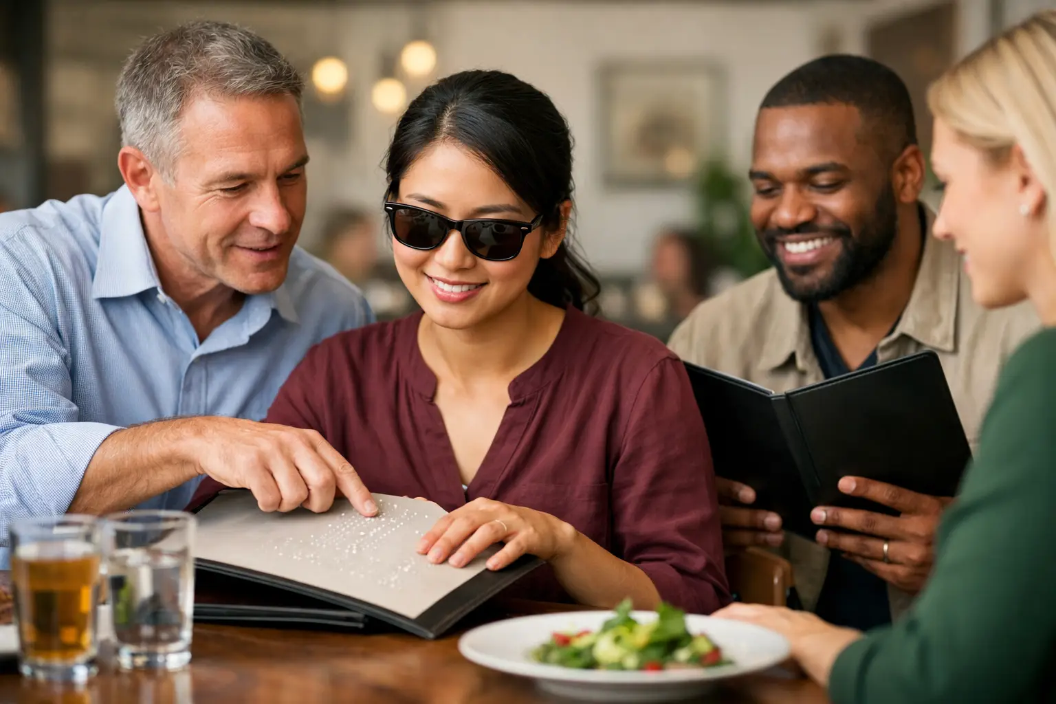
A menu can turn a simple dinner into a high-stakes guess. You are hungry, watching your budget, managing an allergy, or trying not to choose another disappointing meal – and the description says only “market fish” or “chef’s special.” Menu accessibility is about removing that uncertainty so more people can decide what to order with confidence.
For some diners, that means a screen reader can clearly announce every item and modifier. For others, it means plain-language descriptions, readable type, allergen details, or real photos that show what a dish actually looks like. The goal is not to make every menu identical. It is to make the information people need available, understandable, and useful before they spend their money.
Why Menu Accessibility Is a Dining Equity Issue
Restaurants often treat menus as branding tools first. The typography is stylish, the names are clever, and the descriptions are short enough to fit a small printed card or mobile screen. But when a diner cannot interpret that menu easily, the experience stops feeling welcoming.
A person who is blind or has low vision may need a menu that works reliably with assistive technology. Someone with cognitive disabilities, ADHD, anxiety, or decision fatigue may need clearer categories and fewer vague phrases. A diner who is unfamiliar with a cuisine may need context beyond an ingredient list. And almost everyone has felt the frustration of ordering something that sounded great but arrived looking nothing like they expected.
That is why accessibility is bigger than compliance. It is about dignity, independence, and being able to make an informed choice without having to flag down a server for every detail. Helpful staff matters, but no diner should have to depend on another person to access the same basic information available to everyone else.
What an Accessible Menu Actually Includes
There is no single feature that solves menu accessibility. A beautiful food photo alone is not enough, just as a text-only menu is not enough for every diner. Strong menus offer information in more than one useful format.
Clear, specific descriptions
“House pasta” may sound appealing, but it leaves major questions unanswered. Is it creamy or tomato-based? Does it include meat? Is the portion light or filling? Is it spicy? A better description gives diners a practical picture: the main ingredients, preparation style, flavor profile, and notable toppings.
Plain language does not mean stripping away personality. A restaurant can still celebrate its story and cuisine while explaining what a dish is. If a traditional name may be unfamiliar to some guests, pair it with a concise explanation rather than forcing people to search online or guess at the table.
Readable digital and printed design
Small text, low contrast, busy backgrounds, and menus built entirely as image files create real barriers. On a phone, those barriers get worse. Diners may need to zoom repeatedly, rotate their device, or abandon the menu altogether.
Readable menus use clear type, strong color contrast, logical headings, and enough spacing between items. Digital menus should be navigable by keyboard and compatible with screen readers. The text should be actual text, not a photograph of text trapped inside a PDF or graphic. These choices also help anyone ordering quickly between meetings, on a dim patio, or with a cracked phone screen.
Reliable dietary information
Allergens, dietary preferences, and ingredient questions deserve more than tiny icons that are hard to decode. Clear labels for common allergens, vegetarian and vegan options, spice level, and possible modifications help diners narrow choices without feeling like an inconvenience.
There is a trade-off here: menus cannot promise a dish is safe for every medical need unless the restaurant can truly support that claim. Transparency is better than overpromising. A straightforward note about shared equipment or ingredients that may change is more useful than a vague symbol with no explanation.
Authentic visuals with context
Real dish photos can be a powerful accessibility tool because food is visual. A photo helps diners understand portion size, plating, texture, ingredients, and whether a dish is closer to what they want. It can reduce decision fatigue for someone faced with a long menu full of unfamiliar descriptions.
But photos must be accurate. Over-styled advertising images, old photos, or pictures that show add-ons not included with the dish can create a new kind of confusion. The best visual menus use current, honest images and pair them with useful text. For blind and low-vision diners, photos also need meaningful alternative text that explains the dish, not empty labels such as “image 12.”
Photos Help, but They Cannot Carry the Whole Menu
Visual discovery makes ordering more confident, especially when diners can see meals as they are actually served. That is part of the mission behind Pic-ture That!™: helping people see real restaurant dishes before they order, while building a community-powered library of useful food photos.
Still, menu accessibility should never assume every diner accesses information visually. A photo might show a vibrant bowl of noodles, but it cannot reliably tell someone whether it contains shellfish, whether the sauce is spicy, or whether a substitution is possible. It also cannot replace a well-written description for someone using a screen reader.
The strongest experience combines both. A diner should be able to hear, read, or see a dish clearly, then choose the format that helps them decide. That is inclusive design in practice: not one “right” way to use a menu, but multiple paths to the same information.
How Restaurants Can Make Meaningful Progress
Menu improvements do not have to begin with a total redesign. Start with the points where diners are most likely to get stuck: confusing item names, inaccessible QR-code menus, missing allergen information, and visual expectations that do not match reality.
First, review the menu on a phone without zooming. Can a person quickly find appetizers, entrées, prices, and dietary details? Then test it with a screen reader or ask someone who uses assistive technology to share candid feedback. Technical checks matter, but lived experience reveals friction that a checklist can miss.
Next, improve descriptions one category at a time. Add the details that influence a purchase decision: protein, base, sauce, major ingredients, spice, and portion cues. If an item is seasonal or variable, say so. Clear wording builds trust because diners know what can change.
Finally, build an honest photo process. Encourage guests or staff to contribute current images, verify that photos match the listed dish, and remove images when a recipe or presentation changes substantially. Community content can be incredibly valuable, but quality standards keep it useful. A blurry shot may still help show portion size; a misleading photo does not help anyone.
The Business Case Is Human, Too
Accessible menus can reduce hesitation at the moment of purchase. When people understand what they are ordering, they are more likely to try something new, feel good about the cost, and return to a restaurant that made them feel considered.
They can also reduce repetitive questions for staff during busy service. That does not mean replacing hospitality with a screen. It means giving staff a clearer foundation so they can spend more time offering genuine recommendations and handling the questions that need a human answer.
Most importantly, accessible menu design signals that a restaurant expects a wide range of people at its tables. That message is felt long before the first bite. It shows up in whether the menu can be read, understood, and trusted.
The next time a dish catches your eye, ask a simple question: could someone else access enough information to feel just as confident choosing it? Every clear description, accurate photo, and thoughtful design choice brings that answer closer to yes.
Leave a Reply