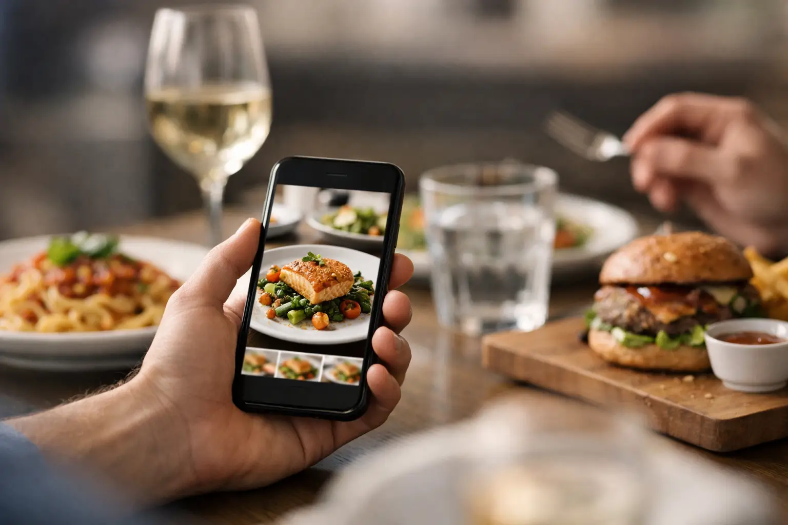
Ordering should not feel like a gamble.
If you have ever stared at a menu and wondered how to know what a restaurant dish looks like before spending your money, you are not alone. A name, a short description, and maybe a few ingredients rarely tell the whole story. Portion size, plating, toppings, sauce placement, side dishes, and even color can change whether a meal feels like a great pick or a letdown.
That gap matters more than people admit. For some diners, it is a mild annoyance. For others, it is an accessibility issue, a decision-fatigue issue, or a budget issue. When menus stay text-only, people are asked to make a purchase without enough information. That is not just inconvenient. It is avoidable.
Why menus still leave people guessing
Restaurant menus are built to describe, not necessarily to show. A dish might be listed as crispy chicken sandwich with house sauce and slaw, but that still leaves real questions unanswered. Is it heavily breaded or lightly crisped? Is the slaw piled on top or served on the side? Are the fries included? Is the sauce drenched across the bun or tucked underneath?
Even well-written menus can miss what diners actually need to know. This is especially true when you are ordering from a new restaurant, trying a cuisine you do not know well, managing sensory preferences, or making a quick decision on your phone. Words can help, but they do not replace a real image.
There is also the issue of expectation. Promotional food photos on restaurant websites or delivery apps can be polished to the point of being aspirational. They may show one version of the dish, but not the one most customers receive. If your goal is confidence, authenticity matters more than perfection.
How to know what a restaurant dish looks like before you order
The most reliable approach is to look for real customer-taken photos of the exact dish, not just brand marketing images or generic menu thumbnails. Authentic food photos show what arrives at the table in normal lighting, normal portions, and normal packaging. They give you context that text descriptions cannot.
Start with the dish name and the restaurant name together. That sounds obvious, but it helps narrow out random food photos that look similar without actually matching the menu item. Be careful with chains and common dish names, since a buffalo chicken wrap at one place can look completely different somewhere else.
Next, compare more than one image when you can. A single photo can be misleading because of angle, lighting, or seasonal variation. Two or three real photos usually tell a clearer story. You will start to notice the things that stay consistent, like portion size, garnish, bread type, or whether a bowl is mostly rice versus mostly protein.
It also helps to look for context clues around the plate. Does the image show a hand, a drink, a fork, a takeout container, or another dish nearby? Those details help you judge scale. A pasta plate may look generous until you realize it is being served in a shallow lunch bowl. On the other hand, a taco order may seem small until you notice the tortillas are oversized.
If the dish comes with options, treat every photo as partial evidence. A burger with no onions, added bacon, and a side salad will not look the same as the standard build with fries. In those cases, focus on the base dish structure. You are trying to answer the practical question: what usually shows up?
Where real dish photos help most
Some menu items are easy to imagine. Others are not.
Bowls, sandwiches, specialty drinks, desserts, mixed platters, and chef-named entrees benefit a lot from photos because descriptions are often broad. A seasonal grain bowl can mean anything from mostly lettuce to mostly rice. A loaded fries dish might be lightly topped or completely buried. A house-style cheesecake might be a clean slice, a jar dessert, or something in between.
Photos also matter when ingredients affect comfort or accessibility. If you dislike soggy textures, want sauces on the side, avoid certain garnishes, or need to understand food layout, visuals can save you from a frustrating order. For diners with visual impairments, a trustworthy image paired with clear labeling can make menu exploration feel far more independent and informed.
That is one reason community photo libraries are so useful. They are not just about making food look good. They are about making dining information more complete.
What to watch out for when using food photos
Not every image answers the right question.
Some photos are outdated. Restaurants change buns, bowls, sides, portioning, plating, and suppliers all the time. A photo from three years ago may still be helpful, but it should not be treated like a guarantee. Recent images usually reflect the current experience better.
Some are too filtered to be useful. If the lighting is dramatic and the colors look exaggerated, you may be seeing a prettier version of reality. That does not make the image worthless, but it does mean you should read it carefully. Focus on shape, build, and size more than color saturation.
There is also the issue of mislabeled photos. Sometimes people upload the right picture with the wrong dish name, or they post a combo meal without making clear what came standard. That is why consistency matters. If several users show similar versions of the same item, you can trust the pattern more.
How to tell if a photo is actually useful
A useful dish photo is clear, recent, and tied to the exact menu item. It does not need to be fancy. In fact, everyday photos are often better because they show the meal as it really appears.
Look for these signs. The dish is easy to identify, the angle shows the full plate or container, and key toppings or sides are visible. If there are multiple photos, the same elements appear across them. If the image includes a short note about substitutions or packaging, even better.
The best photos reduce uncertainty. After seeing them, you should have a better sense of whether the dish looks filling, messy, sauce-heavy, spicy-looking, heavily garnished, or different from what the menu wording suggested.
Why this is bigger than convenience
Knowing what a restaurant dish looks like is often framed as a nice extra. It is more than that.
For many people, visuals support confident choices, better budgeting, and fewer disappointing orders. If you only get one lunch break, one treat meal, or one chance to order for the family, guessing is expensive. If you deal with low vision or decision fatigue, a text-only menu can create real friction. Food transparency should not be a premium feature.
That is why authentic, user-shared restaurant imagery matters. It shifts food discovery from guesswork to informed choice. It makes ordering more inclusive. It gives diners a clearer picture of what they are actually paying for.
Platforms built around real menu photos, including community-driven tools like Pic-ture That!™, reflect that shift. The goal is not polished fantasy. The goal is helping people see the meal before they commit to it.
A better way to approach menu uncertainty
When you cannot picture a dish, pause before ordering. Look for real photos, compare a few versions, and pay attention to portion, build, and presentation instead of just styling. If you still cannot tell what the dish is likely to look like, that uncertainty is useful information too. It may be a sign to choose something with better visual proof.
Restaurants ask diners to trust short descriptions every day. Diners deserve more clarity than that. Seeing the food first is not picky. It is practical, accessible, and often the difference between ordering with confidence and hoping for the best.
The next time a menu leaves too much unsaid, trust your instinct. If you want to know what is really coming to the table, a real photo can tell you what the description never will.
Leave a Reply