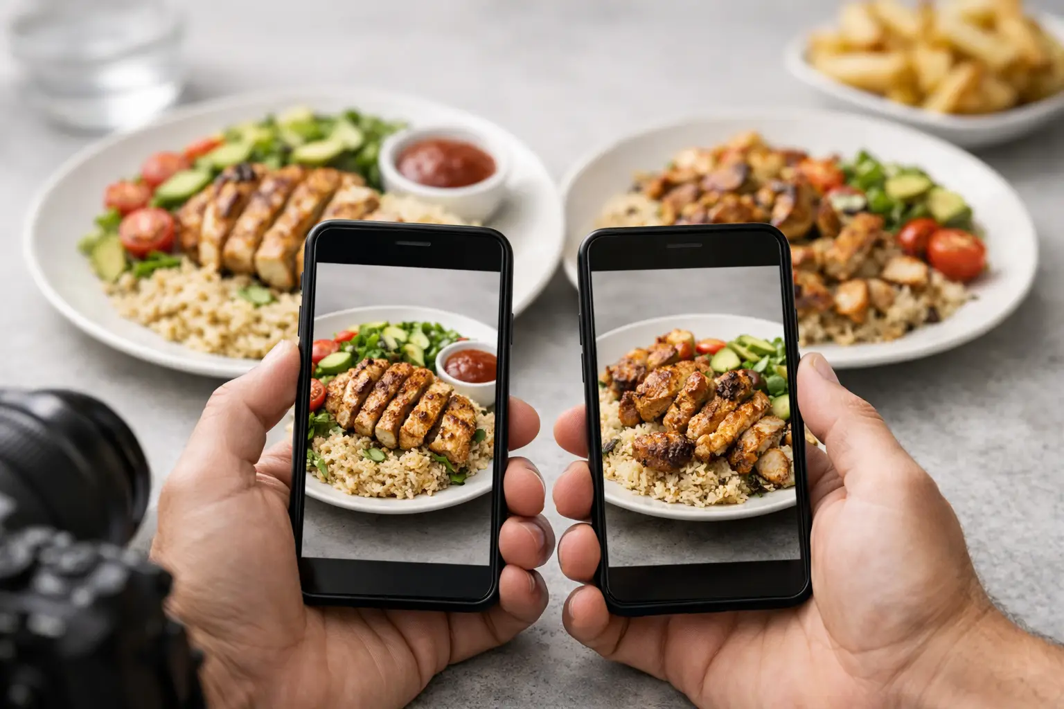
A menu can promise crispy chicken, creamy pasta, or a loaded bowl. But without a real image, you are still making a guess with your money. Dish photo accuracy turns that guess into a clearer decision by showing what a meal actually looked like when it reached the table.
That clarity matters whether you are choosing lunch between meetings, ordering dinner for the family, managing a food sensitivity, or simply trying not to spend $20 on something you will not enjoy. A photo is not a replacement for a menu description. It is the missing context that helps the description make sense.
What Dish Photo Accuracy Really Means
Accurate food photography is not about making every plate look flawless. It is about representing the dish honestly enough that a diner can make a fair choice before ordering. The photo should match the item on the current menu, reflect a realistic portion, and show the ingredients, toppings, sides, and presentation a customer can reasonably expect.
A useful image answers practical questions at a glance. Is the sandwich tall or thin? Does the salad come lightly dressed or covered in toppings? Is the sauce served on the side? How much rice comes with the entree? Is the “spicy” garnish just a few peppers or a full layer of chili oil?
Restaurant marketing photos can be beautiful, and they have a role. But a heavily styled image may use extra garnish, special lighting, or a larger-than-normal portion. Community photos add another kind of value: evidence of the real meal, in real restaurant conditions. The strongest visual menu experiences can make room for both, while clearly prioritizing relevance and transparency.
Why Accurate Food Photos Build Better Choices
Text menus leave room for interpretation. That can be fun when you are feeling adventurous, but it can also create unnecessary friction. Diners may order something too small, too messy, too heavily sauced, or simply different from what they imagined.
Seeing a real dish before ordering supports confidence. It lets people compare options based on what matters to them, from portion size and texture to plating and ingredient balance. For someone who dislikes certain foods touching, avoids visible onions, prefers a hearty meal, or wants to know whether a dessert is shareable, a photo can answer questions that a name and a short description cannot.
This is also about value. Restaurant meals cost more than they used to, and disappointment feels sharper when delivery fees, service charges, and tips are attached. Accurate images help diners spend with more intention and reduce the familiar regret of opening a takeout container and realizing the meal was not what they expected.
Accessibility Is Part of the Experience
Visual menu information is especially meaningful when it is designed with accessibility in mind. People with visual impairments may use assistive technology to navigate menu content, and clear image descriptions can provide details that vague menu language misses. A well-labeled photo, paired with useful alt text or an audio-friendly description, can communicate the dish’s structure, visible ingredients, and serving style.
Accuracy also supports people who experience decision fatigue. A long menu filled with unfamiliar names can be exhausting. Images reduce the mental work of translating descriptions into a picture, making it easier to narrow choices without feeling rushed or left out.
Accessible dining is not a niche extra. Everyone deserves the information needed to choose a meal with confidence.
The Details That Make a Photo Trustworthy
Not every food photo needs professional equipment. A clear smartphone image can be incredibly helpful if it is current, relevant, and easy to understand. The goal is not perfection. The goal is a useful representation of the order.
A trustworthy dish photo usually shows the full serving from an angle that makes the portion easy to judge. Natural or restaurant lighting is fine as long as the food is visible. It should avoid filters that dramatically change color, and it should not hide key parts of the meal behind hands, drinks, or clutter.
Context matters, too. If the dish was modified, that should be clear. A burger ordered without cheese is still a valuable contribution, but it should not be presented as the standard version. The same goes for added avocado, swapped sides, extra sauce, or a half-eaten plate. Honest labels protect the next diner from making the wrong assumption.
Freshness matters as menus change. Restaurants rotate specials, update recipes, and adjust portions. Older photos can still be useful, but a platform should make room for newer images and community feedback when an item no longer matches what is shown.
Community Photos Make Menus More Transparent
The people ordering the food are often the best source of practical menu insight. They see the actual serving, the packaging for takeout, the side dishes, and the details that polished promotional shots may leave out. When diners share photos, they help the next person order with less uncertainty.
That contribution has a ripple effect. One photo can help a first-time visitor choose a safe option. A collection of photos can reveal which dishes are consistently generous, which are built for sharing, and what a restaurant’s food looks like across different orders. Over time, a visual menu becomes more useful because it reflects a community, not just a brand campaign.
At Pic-ture That!™, that is the idea behind a community-powered photo library: help people see real meals before they commit, while giving contributors a chance to earn restaurant gift cards for sharing helpful photos. It is a practical way to make dining information more open, more inclusive, and more useful for everyone.
How to Share Photos That Help Other Diners
If you are contributing a meal photo, think like the person who is deciding between three menu items on a small phone screen. They do not need a food magazine cover. They need clarity.
Start with a photo taken before the first bite whenever possible. Include the full plate, bowl, tray, or takeout container so people can understand the portion. If there are important sides, toppings, sauces, or separate components, make sure they are visible.
Keep the image honest. Avoid extreme filters, heavy editing, or angles that make a small serving look huge. If you made changes to the order, say so. If the dish looks different from its menu description, that can be helpful information too, as long as it is shared fairly and without turning one unusual experience into a universal claim.
A short note can add the final bit of context: whether the portion felt filling, whether the meal traveled well, or whether a sauce came mixed in or on the side. Those small observations can save another diner from a disappointing surprise.
Accuracy Does Not Mean Every Plate Will Be Identical
There is a real trade-off in setting expectations. Restaurants are working kitchens, not factories. A dish may look slightly different depending on the location, season, available ingredients, chef, or order modifications. A photo should not create the false promise that every sesame seed will land in the same place.
What diners deserve is a realistic range. If a dish is typically a wide, saucy bowl of noodles with vegetables and a protein, the photo should communicate that. If it is a compact, lightly dressed salad, the image should not make it look like a family-size feast.
That distinction is where trust lives. Accurate photos respect both diners and restaurants by showing the meal as it is, not as an impossible ideal.
The next time you are stuck staring at a menu, look for the image that helps you picture the actual moment your food arrives. Then, when your own order lands on the table, consider sharing what you see. A clear photo can make someone else’s next meal feel less like a gamble and more like a choice they are happy to make.
Leave a Reply