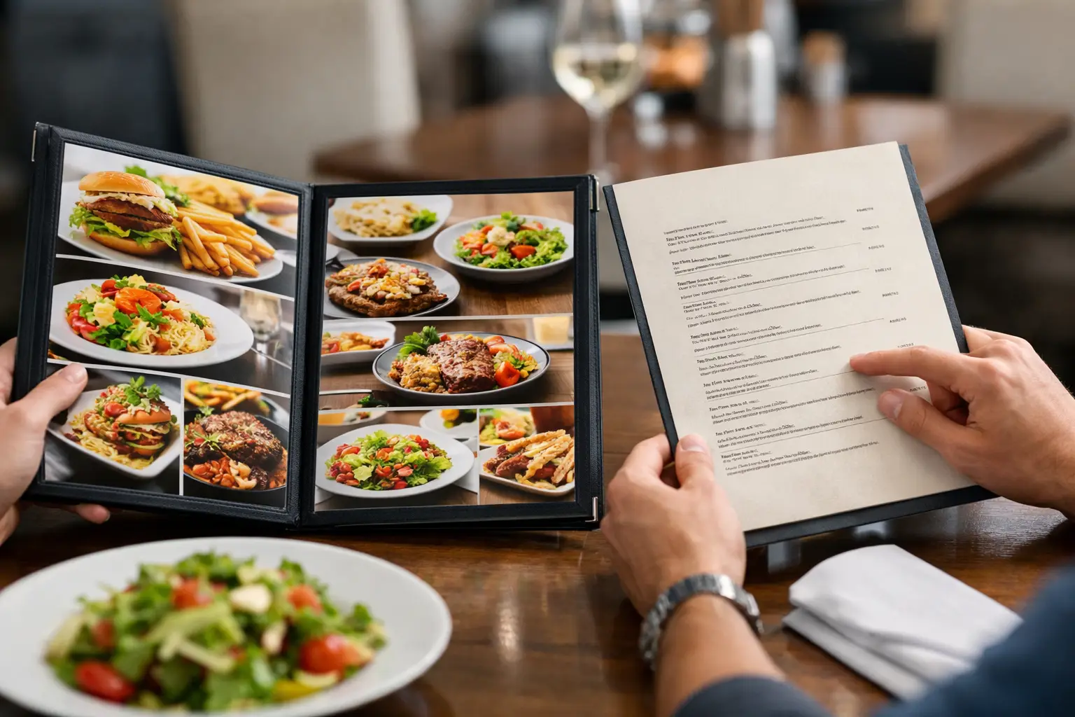
Picture this: you are hungry, scrolling a menu, and trying to guess what “house special pasta” actually means. Is it creamy? Spicy? A tiny appetizer pretending to be dinner? That gap between description and reality is exactly why photo menus vs text menus is not a small design choice. It shapes how confident people feel, how accessible a restaurant experience becomes, and how often an order turns out right the first time.
For diners, this is about more than convenience. It is about clarity. For people with visual impairments, decision fatigue, dietary concerns, or just a limited lunch break, the way a menu presents information can make ordering feel simple or frustrating. And for restaurants, the difference between photo menus and text menus can affect trust, conversions, and customer satisfaction.
Photo menus vs text menus: the real difference
Text menus are built around description. They rely on words to explain ingredients, cooking style, portion cues, and flavor. When they are written well, they can be elegant and efficient. They also leave room for imagination, which some restaurants prefer.
Photo menus work differently. They reduce guesswork by showing the dish itself. A strong photo can answer the questions diners usually have before ordering: What does it look like? How is it plated? Is the sauce heavy? Are the fries seasoned? Is this sandwich stacked high or kept simple?
That visual layer matters because food is not an abstract purchase. People eat with their eyes first, and they spend real money on whether that expectation matches reality.
The better question is not whether one format should completely replace the other. It is which job each format does best.
Where text menus still do a good job
Text menus are fast, flexible, and cheap to update. If a restaurant rotates ingredients, changes pricing often, or adds seasonal specials, text is easy to manage. It can also communicate details that a photo cannot, such as ingredients, allergens, spice level, and sourcing.
A well-written text menu can guide a diner beautifully. It can make a dish sound distinctive, explain cultural context, and help someone compare options quickly. In fine dining or chef-driven concepts, text also supports brand identity. The menu becomes part of the experience.
But text has limits. Descriptions are subjective. “Crispy” means different things to different people. “Large portion” does not tell you whether a bowl will actually fill you up. And vague menu language can push diners into taking a gamble when what they really want is confidence.
That uncertainty can be especially frustrating when money is tight, dietary needs are specific, or someone simply does not have the energy to decode a menu full of clever wording.
Why photo menus create faster confidence
Photos answer questions instantly. That is their biggest strength.
When diners can see a real dish, they are better equipped to decide whether it matches their preferences. A photo reveals portion size, texture, toppings, color, and presentation in seconds. It can also reduce the mental load of comparing multiple items because visual cues are processed faster than long descriptions.
This is one reason photo menus often feel more accessible in practice. They support people who struggle with decision fatigue, people ordering in a rush, and anyone who has ever been disappointed by a menu description that oversold the meal.
Photos also make menu transparency feel real. A restaurant is not just telling you what the dish is. It is showing you. That creates a stronger sense of trust, especially when the image is authentic and closely reflects what actually arrives at the table.
For mobile-first diners, this matters even more. On a phone screen, long menu descriptions can feel dense. A clear image paired with concise text helps users decide faster and with less friction.
The accessibility case is bigger than people think
When people talk about menus, accessibility is often treated like an extra feature. It is not. It is a core part of whether people can order with confidence and independence.
Text menus can support accessibility when they are formatted well and compatible with screen readers. That matters. But accessibility is broader than technical compliance. It also includes reducing uncertainty and making information easier to understand.
For many diners, especially those with decision fatigue or cognitive overload, photos can make the process more manageable. Seeing a dish instead of relying only on a written description can lower stress and support quicker, more confident choices.
For users with visual impairments, the answer is more nuanced. Photos alone are not enough. An image without alt text or descriptive context can exclude people just as easily as a vague text-only menu can. The most inclusive approach is not photo versus text in isolation. It is thoughtful use of both, supported by accessible design.
That is where the conversation should move. Not toward replacing one with the other, but toward building menus that recognize different people need different forms of clarity.
Photo menus vs text menus in the real world
In practice, diners are rarely choosing between a pure photo menu and a pure text menu. They are navigating a mix of both, and the quality of that mix makes all the difference.
A text-heavy menu may work for a regular customer who already knows the restaurant. It works less well for a first-time diner, a tourist, someone ordering delivery, or anyone trying to avoid wasting money on the wrong dish.
A photo-heavy menu can be incredibly helpful, but only if the images are accurate. Stock-style images, overly edited shots, or photos from years ago can create the opposite of trust. They raise expectations that the meal may not meet.
That is why authenticity matters so much. Real food photos, taken from actual meals, are often more useful than polished marketing photography. They show what a customer is likely to receive, not just what a styling team created under perfect lighting.
That kind of transparency is practical, not cosmetic. It helps people order smarter.
What restaurants should consider
Restaurants do not need to turn every menu into a gallery. But they should think carefully about where images create the most value.
Visuals are especially useful for signature dishes, new menu items, customizable meals, and categories where descriptions tend to blur together. Think burgers, tacos, rice bowls, sushi rolls, and desserts. If diners often ask, “What does this actually look like?” that dish probably benefits from a photo.
Text remains essential for detail. Ingredients, allergens, dietary labels, portion notes, and preparation methods still need to be spelled out clearly. A photo can spark interest, but text finishes the job.
The strongest menus usually combine the two. They use photos to reduce uncertainty and text to add precision. That balance respects how people really make decisions.
It also respects that not every diner is coming in with the same needs. Some want a fast visual cue. Others need ingredient detail. Some need both.
What diners actually want from menus
Most people are not looking for a perfect menu. They are looking for enough information to feel good about spending their money.
That means they want fewer surprises, clearer expectations, and a better sense of what they are ordering before checkout. In that context, the debate around photo menus vs text menus becomes less theoretical. It is about whether the menu helps people make a choice they will be happy with.
A strong menu does not force diners to guess. It helps them feel informed.
That is also why community-powered food photos are so promising. When real diners share real images, menus become more useful over time. They reflect what food actually looks like across locations, seasons, and visits. That kind of living visual library can support better ordering decisions in a way static menu descriptions often cannot. It is one reason platforms like Pic-ture That! are pushing this conversation forward.
So which works best?
If the goal is speed, flexibility, and detail, text menus still matter. If the goal is confidence, transparency, and easier decision-making, photo menus have a clear edge.
But the most honest answer is that text tells and photos prove.
That is why the best menu experience is rarely an either-or choice. It is a clearer, more inclusive blend of both – one that gives diners the words they need and the visuals they trust.
When restaurants show people what they are ordering, they are not just improving design. They are reducing friction, respecting different access needs, and making dining feel more fair. That is a better standard for menus, and it is one worth expecting every time you order.
Leave a Reply