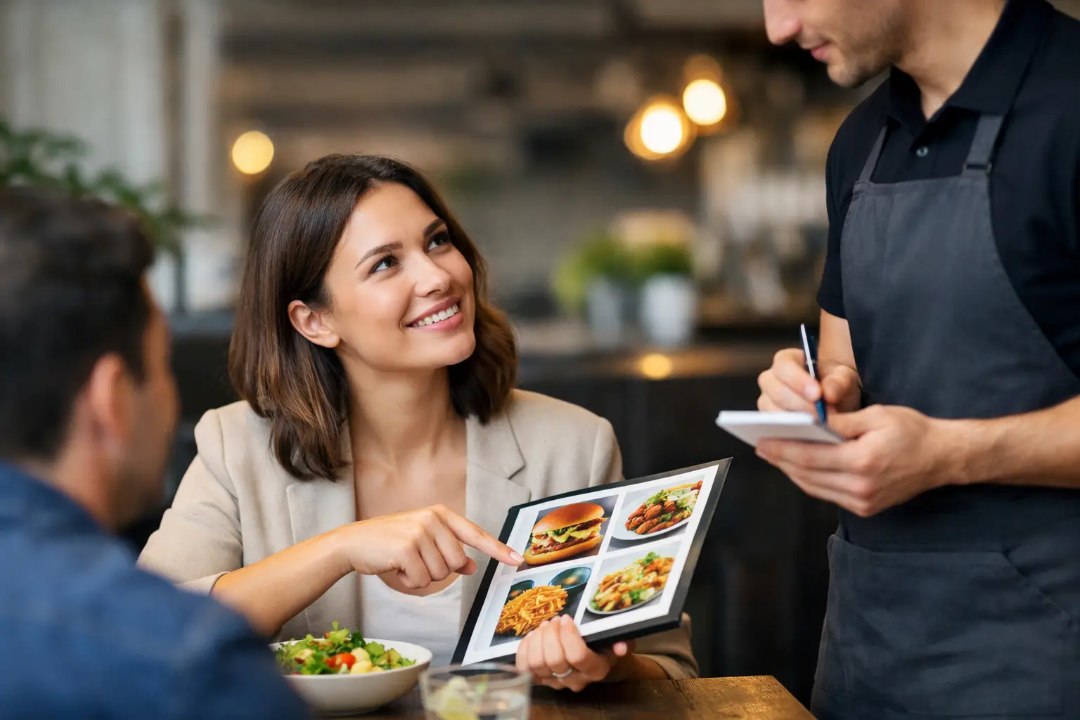
A menu says “crispy chicken sandwich.” But is it a thin fried cutlet or a thick, heavily breaded filet? Is the sauce drizzled on top or piled inside? Are the fries a full side or a few pieces tucked beside the sandwich? Those details can decide whether a meal feels worth the price.
Learning how to order with visual cues gives you more control before you spend. Photos, menu layout, portion clues, colors, and ingredient placement can help you move beyond a vague description and choose food that actually fits your appetite, preferences, access needs, and budget.
Start With the Dish, Not the Marketing Name
Restaurant names are designed to sound appealing, not necessarily precise. Words like “loaded,” “house-style,” “classic,” and “signature” can mean very different things from one restaurant to another. A visual cue helps translate the name into something more useful: what is actually on the plate?
When you can view a real photo of a dish, look first at the main component. Notice its size relative to the plate, bowl, utensils, or side dishes. A wide, shallow bowl may make a pasta serving look larger than it is. A stacked burger might photograph beautifully but still be difficult to eat. A salad may appear generous because of leafy greens while offering little protein or substance.
Then look at what takes up the most space. If rice, fries, bread, or noodles dominate the plate, that tells you something different than a meal centered on vegetables, seafood, or meat. There is no universally right choice. The point is to order what you actually want, with fewer surprises at the table.
How to Order With Visual Cues That Matter
A food photo is most helpful when you know what to scan for. Instead of judging a dish only by whether it looks delicious, use the image to answer a few practical questions.
Check portion and plate scale
Look for familiar objects: a fork, a beverage glass, a ramekin of sauce, or the edge of a standard dinner plate. These give context that a close-up image cannot. A single taco on a large plate may be a snack-sized order. Three generously filled tacos may be enough for a full meal.
Portion needs vary. You may be looking for leftovers, a light lunch, a shareable appetizer, or a meal that will keep you full through a long day. Visual information makes it easier to match the order to that moment.
Read the toppings and sauces
Menu descriptions often mention a sauce without explaining how much is used. A photo can show whether dressing is served on the side, lightly brushed over the food, or covering the entire dish. That matters for people avoiding certain ingredients, managing sensory preferences, or simply trying not to order something soggy or overly rich.
Pay attention to hidden layers, too. Cheese, mayo, pickled vegetables, slaw, and spicy sauces may be visible in a cross-section or spread throughout the dish. If the photo leaves questions, ask the restaurant directly. Visual cues should support your decision, not replace a needed ingredient or allergy conversation.
Notice texture before you order
Texture is one of the biggest reasons a meal can disappoint. A menu may call something “crunchy,” but a photo can reveal whether the coating looks crisp, heavily battered, or softened by sauce. You can often spot char marks, creamy textures, thick broths, toasted bread, fresh herbs, and the difference between a chunky salsa and a smooth puree.
This is especially useful if you have sensory preferences or decision fatigue. Choosing from a photo can feel more concrete than trying to build a mental image from a paragraph of menu language.
Compare similar dishes side by side
If you are choosing between two burgers, bowls, or entrées, compare the visuals instead of rereading both descriptions ten times. One bowl might have more vegetables, another might have more protein, and a third might be mostly grains with a small garnish. Similar prices do not always mean similar value for your needs.
Look at the balance of the plate, not just the hero ingredient. This is where authentic diner photos can be more useful than heavily styled promotional images. You want to see what is likely to arrive, not only the version created for an advertisement.
Use Visual Information Alongside Menu Details
Photos bring clarity, but they are only one part of an informed order. The strongest decisions combine what you can see with what the menu tells you and what you know about yourself.
For example, an image may show that a dish includes plenty of vegetables, while the written description confirms whether they are roasted, raw, or cooked with butter. A photo may show a large-looking bowl, while the price helps you decide whether it fits your plans. If you have a food allergy, dietary restriction, or medical requirement, written ingredient information and staff confirmation remain essential.
This matters for accessibility, too. Images are valuable for many diners, but images without useful descriptions can exclude people who use screen readers or have low vision. A truly accessible ordering experience offers more than a photo: it provides clear dish names, accurate descriptions, readable text, helpful contrast, and image descriptions that communicate the same key details.
If you are dining with someone who needs support, describe what is visually clear in practical terms. Instead of saying, “It looks good,” say, “The salmon is a full filet with roasted potatoes and green beans. The sauce is served over the fish.” Specific details give everyone a more equal chance to choose with confidence.
Know When a Photo Can Mislead You
Visual cues are powerful, but they are not perfect. Lighting can make food look brighter, crispier, or more colorful than it appears in person. A photo may feature extra garnishes, use a larger serving than the current restaurant portion, or show a dish before a recipe change.
Community photos can also vary in quality. That is not always a drawback. A slightly imperfect image from a real meal may tell you more about portion size and presentation than a polished studio shot. Still, compare multiple photos when possible, especially for a higher-priced meal or a dish you are ordering for the first time.
Timing matters as well. A photo of brunch from two years ago may not reflect today’s menu. Seasonal ingredients, new chefs, supply changes, and restaurant updates can all affect what arrives. Treat visual cues as evidence, not a guarantee.
Make Your Next Order More Confident
Before you add a dish to your cart or signal the server, pause for a quick reality check. Can you tell what the main ingredient is? Do you understand the likely portion? Can you see where the sauce, sides, and toppings are? Does the dish look like it will meet your hunger level and preferences?
If the answer is no, choose a different option, look for another image, or ask one clear question. “Is the sauce mixed in or on the side?” and “Is this enough for one person?” can save you from an expensive guess.
Apps such as Pic-ture That!™ are built around that simple idea: people deserve to see more clearly before they order. Real meal photos can reduce the uncertainty that text-only menus leave behind, while community contributions help the next diner make a better choice.
Share the Clarity When You Can
If you receive a meal that looks true to its photo, you have useful information. If it looks very different, that information matters too. Sharing an accurate picture of a dish can help someone decide whether the portion works for them, whether the ingredients match their preferences, or whether a restaurant is a good fit for their access needs.
The best visual cue is not the most dramatic photo. It is the honest one: clear enough to show the real meal, recent enough to be useful, and specific enough to help another person order with less uncertainty. That kind of transparency makes dining feel more welcoming, one plate at a time.
Leave a Reply