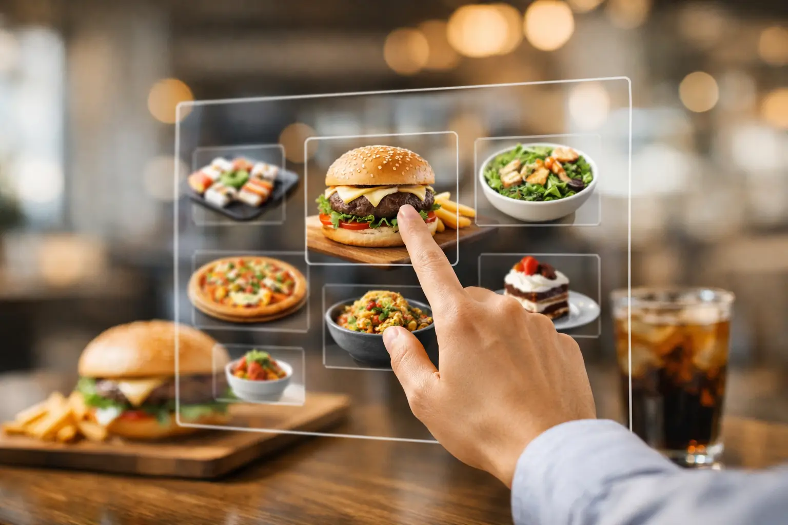
A menu can call something “crispy,” “loaded,” or “chef’s special” and still leave you guessing. Is the portion generous? Is the sauce on top or mixed in? Does “spicy” mean a little warmth or an order you regret after two bites? The future of visual food ordering is about replacing that uncertainty with something far more useful: a clear look at the food people are actually served.
For diners, this is not a nice extra. It is a better way to make a purchase decision. For people with visual impairments, decision fatigue, dietary questions, or a limited lunch budget, accurate dish imagery can make restaurant ordering more accessible, more transparent, and much less stressful.
The Future of Visual Food Ordering Starts With Proof
Restaurant menus were built for a text-first world. A short description had to do a lot of work: explain ingredients, signal flavor, justify price, and make a dish sound appealing. But text alone cannot show whether a burrito is packed or skimpy, whether a salad has enough toppings to feel like a meal, or whether the pancakes are the fluffy stack you had in mind.
Real photos add context before money changes hands. They help diners compare portion size, presentation, ingredient balance, garnish, texture, and even the practical question of whether a dish looks like something they will enjoy. That matters whether someone is picking up dinner for a family, ordering from a new spot, or trying to avoid wasting $18 on a meal that misses the mark.
The strongest visual menus will not rely on one polished promotional image taken years ago. They will offer current, accurate images that reflect the dish customers receive now. Menus change. Portions change. Packaging changes. A useful food photo library has to change with them.
Food Photos Are Becoming an Accessibility Feature
Visual ordering is often discussed as a way to make food more tempting. That is true, but it misses the bigger opportunity. Images can reduce barriers that make dining decisions harder than they need to be.
A person managing decision fatigue may struggle to process a menu with 40 similar options and vague descriptions. A quick visual scan can narrow the field faster. Someone who is unfamiliar with a cuisine can get a clearer sense of what a dish includes. A diner with sensory preferences may want to see whether ingredients are blended, layered, heavily sauced, or served separately.
For diners with visual impairments, the promise requires care. A photo without meaningful text is not accessible. The future is not simply more images on screens. It is images paired with clear dish names, useful descriptions, alt text, screen-reader-friendly navigation, and details that do not force people to guess. Visual information should expand choice, not create a new barrier for people who cannot access it in the same way.
That is why accessibility and transparency belong together. Every diner deserves enough information to order with confidence, using the format that works best for them.
Authenticity Will Matter More Than Perfect Styling
There is a difference between food photography designed to sell a fantasy and food photography designed to help someone decide. The first may be beautifully lit, heavily styled, and edited to perfection. The second needs to be honest.
A real image does not have to be unflattering or low quality. It should be clear, well framed, and useful. But it also should not hide what the customer receives. If a dish comes in a takeout container, that can be valuable context. If the entree is smaller than the plate makes it look, an image from a normal diner’s perspective may tell the truth better than a studio shot.
This is where community contributions can change the experience. When diners share photos of their actual meals, they build a more complete view of a menu. One image may show a dish at the restaurant. Another may show how it travels for delivery. A third may reveal a useful detail, such as how much dressing comes with a salad.
Community content needs standards, of course. Blurry images, outdated dishes, wrong menu labels, and misleading uploads do not help anyone. The best platforms will make it easy to identify the restaurant and dish, flag inaccurate content, and reward contributors for photos that are clear and genuinely useful. Pic-ture That!™ is built around that idea: people helping other people see what they are ordering, while earning rewards for adding valuable menu coverage.
AI Can Help Organize, But It Cannot Replace Reality
Artificial intelligence will have a role in visual food ordering. It can help sort images, identify duplicate uploads, suggest dish matches, improve search, and make large photo libraries easier to navigate. A diner may be able to search for “saucy pasta,” “vegetarian lunch,” or “crispy chicken” and find relevant, real menu items faster.
But AI-generated food images are a poor substitute for proof. A generated image may look appetizing while showing a portion, topping, or presentation the restaurant does not actually offer. That creates the exact disappointment visual ordering is meant to prevent.
There is a practical line to draw. Use technology to organize and describe real-world information. Do not use it to invent what customers should expect. When an image is illustrative rather than an actual photo of the dish, that should be clearly labeled. Trust disappears quickly when the meal in hand does not match the image on the screen.
Restaurants Have Something to Gain, Too
Some restaurants may worry that more transparency invites comparison. It does. But customers already compare meals through delivery apps, social posts, reviews, and photos from friends. The difference is whether the restaurant helps shape that information with accuracy.
Clear visuals can help set expectations before an order is placed. That can mean fewer disappointed customers, fewer avoidable complaints, and more confidence from people trying a restaurant for the first time. It can also help smaller restaurants compete on the actual appeal of their food instead of relying on menu copy alone.
The trade-off is that restaurants need to keep information current. If a plate changes, the photo should change. If an ingredient is substituted regularly, text should say so. If a customer photo is outdated, it should not remain the main representation of the dish forever. Transparency is not a one-time upload. It is an ongoing practice.
Ordering Will Become More Personal, Not More Complicated
The best visual food tools will reduce cognitive load rather than add another feed to scroll. A person should be able to move from “I want something filling” to a handful of realistic options without sorting through hundreds of irrelevant pictures.
That may look different depending on the diner. One person may prioritize portion size and price. Another may want a visual way to filter for plant-based options. Someone ordering for a child may want to see exactly what comes with a kids’ meal. A user with low vision may rely more on detailed descriptions and accessible controls than on imagery itself.
There is no single ideal ordering flow. The meaningful improvement is choice: let people use photos, text, filters, community feedback, and accessibility settings together instead of forcing everyone through the same menu experience.
A Better Food Decision Is a Shared One
The future of visual food ordering will be built meal by meal. Restaurants can provide accurate starting points. Technology can organize information. But diners create the living record of what food looks like across neighborhoods, menus, seasons, and delivery orders.
That shared record can make eating out feel less like a gamble. It can save people money, reduce the frustration of disappointing orders, and give more diners a fair chance to choose food they are excited to eat.
Before your next order, pause at the moment that usually causes the most hesitation. What would help you decide: a clearer photo, a better description, or both? The answer is a reminder that better food ordering starts with better information.
Leave a Reply