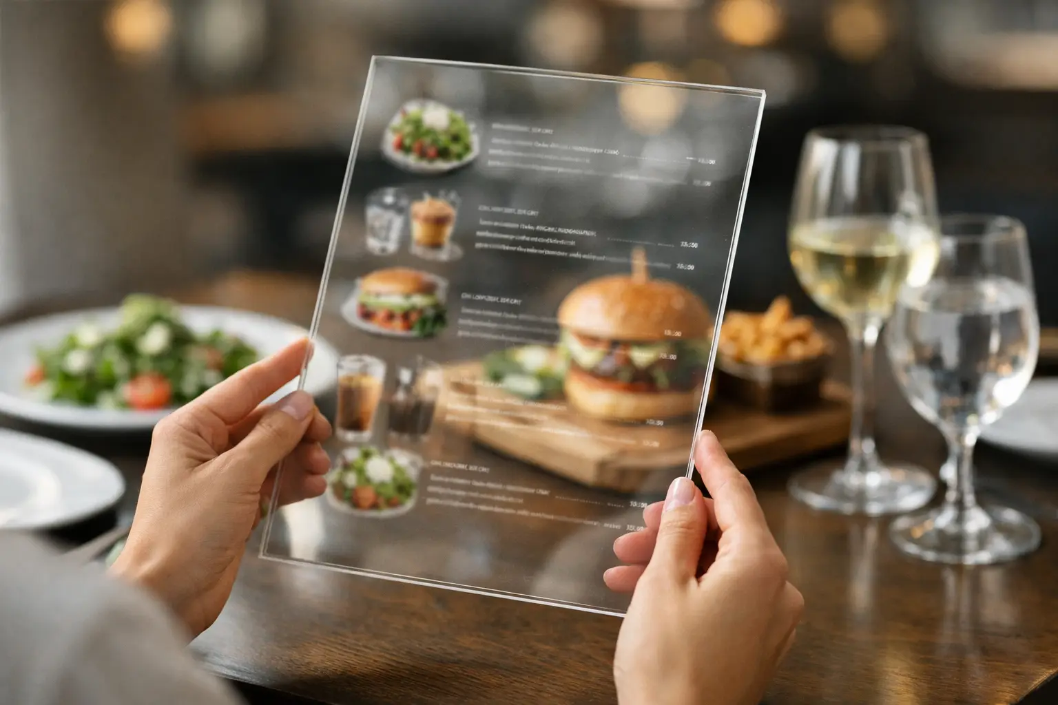
A menu can call something a “loaded” burger, a “generous” pasta, or a “house favorite” – and still leave diners guessing. The best examples of transparent restaurant menus replace that guesswork with useful details people can actually use before they spend money: what the dish looks like, what comes with it, how much it costs, and whether it fits their needs.
Transparency is not about turning every menu into a wall of fine print. It is about giving diners a clearer, fairer view of what they are choosing. For someone managing an allergy, a tight budget, low vision, or plain old decision fatigue, that clarity can change the entire dining experience.
What makes a restaurant menu transparent?
A transparent menu makes the real ordering decision easier. It does not rely on vague language, tiny disclaimers, heavily edited food images, or surprise charges at checkout. Instead, it sets honest expectations before the order is placed.
The strongest menus usually make several things clear at once: current price, portion or serving context, key ingredients, dietary information, preparation choices, and accurate visuals where possible. Not every restaurant needs the same level of detail. A coffee shop menu and a tasting-menu restaurant serve different decisions. But both can be upfront about what a guest will receive.
That matters because text alone asks diners to fill in a lot of blanks. Is the salad a full meal or a small side? Does “spicy” mean a little heat or a dish that will overwhelm the table? Is the photo from the actual restaurant, or a stock image that bears little resemblance to the plate? A transparent menu answers more of those questions before disappointment has a chance to arrive.
5 examples of transparent restaurant menus
1. A menu that pairs dish names with real, current photos
A clear food photo can communicate details that a description misses: plating, sauce level, visible ingredients, side dishes, portion scale, and texture. For many diners, seeing the actual meal is the quickest way to decide whether it is worth ordering.
The key word is real. A transparent visual menu uses images of the dish customers are likely to receive, not a stylized ad concept that sets unrealistic expectations. Photos can vary slightly as seasonal ingredients and presentation change, so restaurants should refresh them when recipes or portions materially shift.
Visual transparency has an accessibility dimension, too. Photos should be supported by readable dish names and useful descriptions rather than treated as a replacement for text. A photo-only menu can exclude diners who use screen readers or who need more context than an image provides. The goal is more ways to understand a dish, not a new barrier.
2. A menu that shows the full price before checkout
One of the simplest examples is also one of the most valuable: a menu that displays the actual price a diner can expect to pay. That includes clear upcharges for substitutions, premium add-ons, size changes, and service formats that affect the total.
There is a difference between offering customization and hiding the cost of customization. If avocado adds $3, say so next to the option. If a base price applies only to a smaller serving, label the serving size clearly. If a mandatory service charge or packaging fee applies, it should appear before the customer reaches the final checkout screen.
Taxes can be difficult to show as a precise total because they vary by location, but that is not a reason to hide other known fees. Transparent pricing respects diners’ budgets and reduces the frustration of a total that jumps at the last second.
3. A menu that describes portions and what is included
“Chicken tacos” can mean two tacos with chips, three tacos with rice and beans, or a single taco ordered individually. A transparent menu does not make customers decode the setup after their food arrives.
Useful portion information can be brief. A restaurant might say “three tacos,” “served with rice and black beans,” “12-ounce bowl,” or “shareable for two.” This is especially helpful for side dishes, family meals, prix fixe offerings, tasting menus, and items with names that do not reveal their scale.
Restaurants do not need to promise that every plate will weigh exactly the same. Food is prepared by people, and ingredient sizes vary. But diners deserve a realistic indication of whether they are ordering a snack, a full entree, or something designed for the table. That small detail helps reduce waste, over-ordering, and the familiar regret of paying entree prices for a portion that feels like an appetizer.
4. A menu that names ingredients and dietary risks plainly
A transparent menu goes beyond broad labels such as “vegetarian,” “gluten-friendly,” or “contains nuts.” It names the key ingredients that shape the dish and uses dietary language carefully.
For example, “crispy cauliflower with tahini, pomegranate, parsley, and sesame” tells a diner far more than “Mediterranean cauliflower.” A notation such as “contains dairy and sesame” is more useful than an icon with no legend. When cross-contact is possible, restaurants should explain that clearly instead of implying a guarantee they cannot safely make.
This is where nuance matters. A restaurant may be able to offer a gluten-free recipe but not a dedicated gluten-free kitchen. It may offer a plant-based dish that shares a fryer with animal products. Honest wording lets diners assess their own comfort level and make decisions that fit their health, ethics, and preferences.
5. A menu that is honest about availability and substitutions
Nothing deflates confidence faster than ordering a menu item that has been unavailable for hours. Transparent restaurants update sold-out dishes, seasonal changes, and limited-time offerings as close to real time as they can.
They also explain substitutions before the plate reaches the table. If the menu says broccolini but the kitchen is serving green beans that evening, a quick note or confirmation gives diners a choice. The same is true for seafood market prices, rotating pastries, and chef’s specials. Variability is normal. Surprise is optional.
For digital ordering, this should be built into the experience. An unavailable item should not remain selectable, and a substitution should never be silently applied when a customer has paid for something specific. A short confirmation protects trust better than a polished apology later.
Transparency is more than a design trend
Restaurants sometimes worry that too much detail will clutter the menu or slow down ordering. That can happen when information is poorly organized. The answer is not less transparency. It is better hierarchy.
Lead with the dish name, price, a plain-language description, and an authentic image when available. Let diners tap or scan for ingredients, allergens, nutrition, sourcing notes, and customization details. In print, use a clean icon system with a visible key and train staff to answer follow-up questions consistently.
The trade-off is real: maintaining accurate photos, prices, and allergy details takes effort. Yet inaccurate information costs something too. It can lead to returned plates, support requests, negative reviews, food waste, and diners who decide not to come back. Clear menus set a better expectation from the start.
Why real dish photos belong in the conversation
Food photography is often treated as decoration. For transparent restaurant menus, it is practical decision support. A real image can help a diner recognize unfamiliar ingredients, compare portion sizes, identify a sauce-heavy dish, or avoid ordering a texture they know they dislike.
That is particularly meaningful for people with visual impairments when images are paired with strong text alternatives and accessible app design. It also matters for anyone whose brain gets tired after comparing ten nearly identical menu descriptions. Seeing the food can shorten the path from uncertainty to a confident choice.
Community-powered photo libraries can help fill the gap when restaurants do not have images for every item. Pic-ture That!™ is built around that idea: helping diners see authentic meals before ordering while inviting contributors to make menus clearer for the next person. The standard should remain accuracy, not perfection. A well-lit phone photo of the real dish is often more useful than a flawless image of a meal nobody receives.
A better question to ask before ordering
Instead of asking whether a menu looks polished, ask whether it helps a real person make a confident choice. Can they tell what the meal is, what it costs, what comes with it, and whether it works for them? Can they access that information in the format they need?
The next time you browse a restaurant menu, notice what is missing. Then choose the places that make room for clarity – and, when you can, share an accurate photo that helps another diner order with confidence.
Leave a Reply