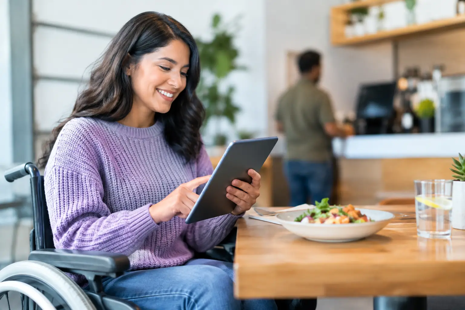
A menu can tell you a dish includes roasted vegetables, a creamy sauce, or a spicy glaze. But that still leaves big questions unanswered: How large is the portion? Is the sauce heavy or light? Does the meal look fresh, filling, or worth the price? For many diners, those gaps create real uncertainty. Dining accessibility trends are changing that by pushing restaurants and food apps to make the decision process more visual, more flexible, and more inclusive.
This is bigger than convenience. When people can access clear information in the format that works for them, they can choose meals with more confidence. That matters for a first date, a quick lunch between meetings, a family dinner, or a delivery order where getting it wrong means wasted money and a disappointing meal.
Dining accessibility trends are moving beyond the printed menu
For years, accessibility in restaurants was often discussed in terms of physical space: ramps, restroom access, table spacing, and service animals. Those needs remain essential. But diners also need access to information before they ever reach the table.
A text-only menu can be difficult for people with visual impairments, cognitive differences, language barriers, food anxieties, or decision fatigue. Even diners without a diagnosed accessibility need know the feeling of scrolling through a delivery app, comparing unfamiliar descriptions, and still not knowing what will arrive at the door.
The new expectation is simple: restaurants should help people understand what they are ordering, not make them guess. Accessible dining now includes readable digital menus, thoughtful dietary details, clear allergen communication, visual references, and ordering experiences that work with assistive technology.
The best changes do not separate one group of diners from everyone else. A clear photo, a well-written description, and an easy-to-navigate menu can support someone using a screen reader while also helping a tired parent make a fast choice. Inclusion often improves the experience for the whole table.
Visual menus are becoming a practical accessibility tool
Food photography has traditionally been treated as marketing. A glossy image might encourage an order, but it was not always expected to help someone make an informed decision. That is changing.
Authentic dish photos give diners details that words often miss. They can show plating, portion size, ingredients, texture, color, toppings, and the actual relationship between a side dish and an entree. For someone who struggles to visualize menu language, that context can turn a stressful choice into a manageable one.
Visual information can be especially helpful when dishes are unfamiliar. “Birria,” “bento,” “arepa,” or “tikka masala” may be clear to regular diners but not to someone trying a cuisine for the first time. A photo does not replace a useful description, especially for allergens or ingredients, but it adds another layer of clarity.
There is a trade-off, though. Restaurant marketing images can be heavily styled, outdated, or unlike the meal a customer receives. The most useful visual menus prioritize accurate, current images of real dishes. That is why community-powered photo libraries have momentum: diners can see what people actually ordered, not only what appeared in a campaign shoot.
Pic-ture That!™ is built around this idea. By helping people view real meal photos before ordering, it treats food imagery as a tool for confidence, transparency, and more equitable dining decisions.
Better digital access starts with the basics
A beautiful menu is not accessible if someone cannot use it. Restaurants are paying more attention to the mechanics behind their websites, ordering platforms, and QR-code menus.
That means building pages that work with screen readers, using meaningful image descriptions, maintaining strong color contrast, allowing text to resize, and avoiding menu designs that rely on tiny type or hard-to-read scripts. It also means making sure a customer can complete an order without fighting pop-ups, auto-playing content, or confusing checkout steps.
QR codes deserve a more thoughtful approach, too. They can be fast and useful, but they should not become the only path to a menu. Not every guest has a charged smartphone, reliable data, comfort with mobile technology, or the ability to scan a code independently. Offering a printed menu, a staff-supported alternative, or an accessible web menu gives diners options rather than forcing a single experience.
Restaurants do not need to solve every problem with one feature. The goal is choice. Some people want a printed menu. Some prefer large text on their phone. Some need a screen reader-compatible page. Some simply want to see the dish before committing to it. A flexible experience respects all of those needs.
Decision fatigue is finally part of the conversation
Accessibility is not always visible. For many people, the hardest part of ordering is processing too many options, vague descriptions, modifications, prices, and dietary concerns at once.
Decision fatigue can affect anyone, but it can be particularly disruptive for people with anxiety, ADHD, sensory sensitivities, cognitive disabilities, or a busy schedule that leaves little mental energy for sorting through a 12-page menu. Restaurants and ordering platforms can ease that burden by organizing menus clearly and reducing unnecessary friction.
Helpful design includes categories that make sense, plain-language descriptions, consistent labels, ingredient callouts, useful filters, and photos that match the dish. It may also include favorites, reorder options, portion guidance, and a small set of staff or community recommendations. The point is not to remove choice. It is to make choices easier to understand.
This is where visual discovery can make a meaningful difference. Seeing several real examples of a dish can help a diner quickly rule it in or out. Instead of interpreting “hand-breaded chicken with house slaw and comeback sauce,” they can see the sandwich, assess its size, and decide whether it fits the moment.
Dietary transparency is becoming a baseline expectation
More diners are looking for ingredient information before they order, whether they manage allergies, follow a specific diet, avoid certain foods for religious reasons, or simply want to know what is in their meal. Vague labels such as “vegetarian-friendly” or “made with fresh ingredients” are no longer enough on their own.
Clear dietary information should be specific without making promises a kitchen cannot safely keep. A restaurant can identify common allergens, note when cross-contact is possible, explain customizable components, and encourage guests with serious allergies to speak with staff. Accuracy matters more than overconfident claims.
Photos can support this transparency, but they cannot carry it alone. A photo may reveal visible cheese or a sauce on the side, yet it cannot confirm ingredients hidden in a marinade. The strongest dining experiences pair images with clear descriptions and direct ways to ask questions.
Community is shaping more honest restaurant discovery
One of the most exciting dining accessibility trends is the shift from polished, one-way restaurant content to shared, real-world information. Diners are already taking food photos, posting reviews, and sending friends recommendations. Platforms that organize this community knowledge can make it more useful for everyone.
A real customer photo can answer practical questions that a menu cannot: Does the salad arrive dressed? Is the bowl mostly rice? How generous are the tacos? Does the dessert look like the photo? Over time, a collection of authentic images can help diners approach unfamiliar restaurants with less risk.
For restaurants, this can feel vulnerable. Customer photos are not always perfectly lit, and no business wants inaccurate content attached to its menu. The answer is not to avoid transparency. It is to create systems that encourage quality, flag outdated dishes, and give restaurants a way to keep information current. Honest visibility builds more trust than a perfect image that does not match the plate.
What diners should expect next
The future of accessible dining is not one universal menu format. It is a restaurant experience that recognizes people process information differently and deserve enough context to make a choice that feels good.
Expect more menus that combine text, visual references, dietary details, and accessible design. Expect customer-generated images to carry more weight, especially as diners look for proof that a dish is worth the cost. And expect accessibility to become part of everyday product design rather than an afterthought added after launch.
The next time a menu leaves you guessing, treat that frustration as useful feedback. You deserve to know more than a dish name before you spend your money. Share a helpful meal photo, ask for clearer information, and support restaurants that make every diner feel welcome at the table.
Leave a Reply