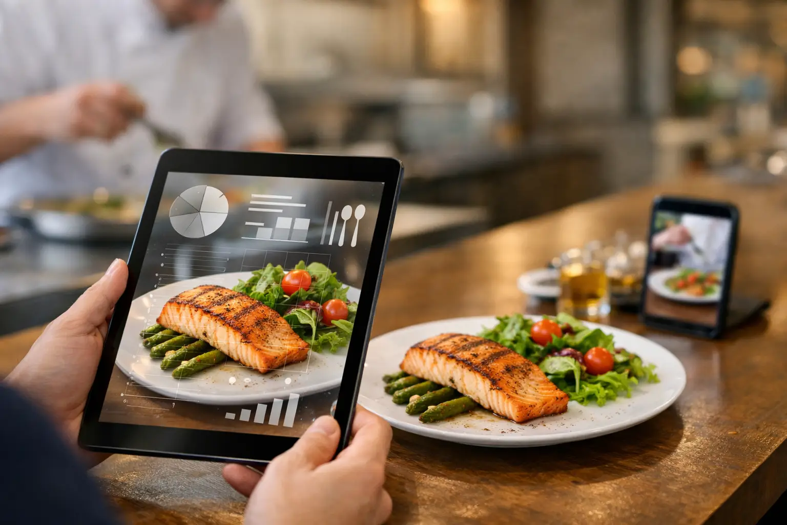
A menu can call something “crispy,” “loaded,” or “chef’s special” and still leave you guessing. How big is it? What does the sauce actually look like? Is that $18 bowl going to feel satisfying or disappointing? Restaurant transparency tools make those answers easier to find before your money leaves your wallet.
For diners, this is not about making every restaurant experience overly complicated. It is about replacing unnecessary uncertainty with useful information. Real dish photos, clear pricing, accurate ingredient details, and accessible menu design help people make choices that fit their appetite, budget, dietary needs, and mood.
Why restaurant transparency tools matter
Text-only menus ask customers to fill in a lot of blanks. A description may tell you a sandwich comes with “house slaw” and “signature sauce,” but it rarely shows the portion, presentation, toppings, or how much sauce is actually involved. That gap can turn a simple lunch order into a gamble.
The cost of guessing adds up. Diners waste money on meals that do not match expectations. People with allergies or dietary restrictions may have to ask multiple questions just to feel safe ordering. Anyone experiencing decision fatigue can get stuck comparing vague descriptions, especially when ordering for a group or through a delivery app with dozens of options.
Photos and better menu information create a more honest starting point. They help diners set realistic expectations instead of ordering based on clever wording, stock photography, or a random review photo from years ago. That kind of clarity builds trust, and trust is good for customers and restaurants alike.
What useful restaurant transparency looks like
Transparency is more than placing one polished hero image beside a menu. A useful system gives diners information they can act on at the exact moment they are deciding what to order.
Real photos of the actual dish
Authentic food images are often the fastest way to understand a meal. They show whether a salad is a full entrée or a small side, whether a burrito is tightly wrapped or overloaded, and whether a dessert looks like a shareable plate or a two-bite finish.
The key word is authentic. Highly styled promotional photography can be beautiful, but it may not reflect what arrives at the table or at your door. Community-contributed photos can add valuable context because they capture real orders, real portions, and the details diners care about. Multiple images are even better, since presentation can vary by location, season, or customization.
That does not mean every photo needs to be perfect. A clear, well-lit image that honestly represents the dish is more helpful than an editorial shot that creates an unrealistic expectation.
Clear ingredients and customization details
A photo answers some questions, but not all of them. Diners still need plain-language ingredient information, especially for common allergens, spice levels, proteins, sauces, and sides. “Spicy aioli” may sound straightforward to one person and raise several questions for another.
The strongest menus make substitutions and additions easy to understand before checkout. If removing cheese changes the dish, say so. If a sauce contains nuts, shellfish, dairy, or another major allergen, that information should be easy to locate. If an item can be made vegetarian, gluten-conscious, or mild, customers should not have to hunt for it.
There is a trade-off here. Restaurants cannot promise a completely allergen-free kitchen unless they can truly support that claim. Transparency means being specific about what is known, what can be adjusted, and where cross-contact may be possible.
Pricing that matches the final order
Few things damage confidence faster than a menu price that changes dramatically at checkout. Base prices, add-on costs, service fees, delivery fees, and portion upgrades should be visible as early as possible. Diners can make a different choice when they have the full picture, but they cannot make an informed choice when key costs appear after they have committed to an item.
This matters for budget-conscious diners, families, students, and anyone ordering for several people. Clarity around price is not a luxury feature. It is a basic part of treating customers fairly.
Accessible information, not just visual information
Food photos are powerful, but a transparent menu cannot rely on images alone. People with visual impairments may use screen readers, magnification, voice controls, or other assistive technology. Images need meaningful descriptions that explain what is shown, not generic labels such as “food photo.”
For example, “three fried chicken tenders on a brioche bun with pickles, slaw, and fries” gives a diner practical context. It describes the meal’s components and portion in a way that supports independent decision-making.
Accessible design also means readable text, strong color contrast, logical navigation, and menus that do not force users through confusing visual layouts. When restaurants build for accessibility from the start, more people can order with confidence. That is not a niche benefit. It is better service.
How diners can use restaurant transparency tools
Start with the photo, then check the details. A dish image can help you assess portion size, toppings, texture, and presentation. Follow that with ingredient information, customization options, and price details. Together, those pieces tell a much fuller story than a name and a one-line description.
When you are choosing between similar dishes, compare the evidence rather than the adjectives. One restaurant may call two entrées “generous,” but customer photos can show which one includes more protein, a larger side, or enough food to share. If you are ordering for a group, this can prevent both over-ordering and the classic problem of not having enough food.
Look for recent images when possible. A restaurant may update its menu, switch suppliers, or change portion sizes. Photos from the last few months usually offer a better snapshot than one from several years ago. Still, use common sense: one photo may be an outlier, while several images showing the same portion and plating pattern are more reliable.
If there is a detail that matters for your health, ask the restaurant directly. Transparency tools reduce uncertainty, but they do not replace a conversation about severe allergies, medical diets, or ingredient changes. Think of them as a stronger first step, not a guarantee.
Community photos make menus more honest
Restaurants can publish great menu information, but diners add another layer of value by sharing what they actually received. A community photo library can capture the everyday reality of dining: the fully loaded fries, the smaller-than-expected smoothie, the dessert worth splitting, or the entrée that looks even better in person.
That shared knowledge is especially helpful for dishes with names that do not explain much. “The Works,” “Sunday Special,” and “Market Bowl” may sound appealing, yet they tell a new customer almost nothing. A photo turns mystery into context.
This is the idea behind Pic-ture That!™: helping people see real restaurant meals before ordering while inviting the community to contribute photos and earn rewards. When diners participate, they are not just posting food. They are helping someone else avoid a disappointing order and make a choice that feels right.
Community content also has limits. Photos should be tied to the correct restaurant, menu item, and location whenever possible. They should not be edited in a way that misrepresents color, size, or ingredients. Quality checks and respectful contribution standards matter because trust is the whole point.
What restaurants gain from being more transparent
Some restaurants worry that showing real meals will expose inconsistency. If a dish varies dramatically from the menu image, that is useful feedback, not a reason to hide the evidence. Better visibility can reveal where portioning, packaging, plating, or menu descriptions need attention.
Restaurants also benefit when guests arrive with clearer expectations. A diner who knows what they are ordering is less likely to be surprised, request a remake, leave a frustrated review, or feel that the price did not match the experience. Clear menus can reduce hesitation and help the right customers find the dishes they will genuinely enjoy.
The approach does not need to be expensive or complicated. Start with accurate photos of best-selling items, update descriptions that rely too heavily on vague language, and make allergen and customization details easier to find. Then listen to what diners still ask. Their questions often point directly to the missing information.
A better restaurant menu does not pressure people to order faster. It helps them order smarter. The next time you are deciding between a familiar favorite and an unfamiliar dish, look for the details that let you picture the meal clearly. A little more visibility can turn “I hope this is good” into “I know what I am choosing.”
Leave a Reply