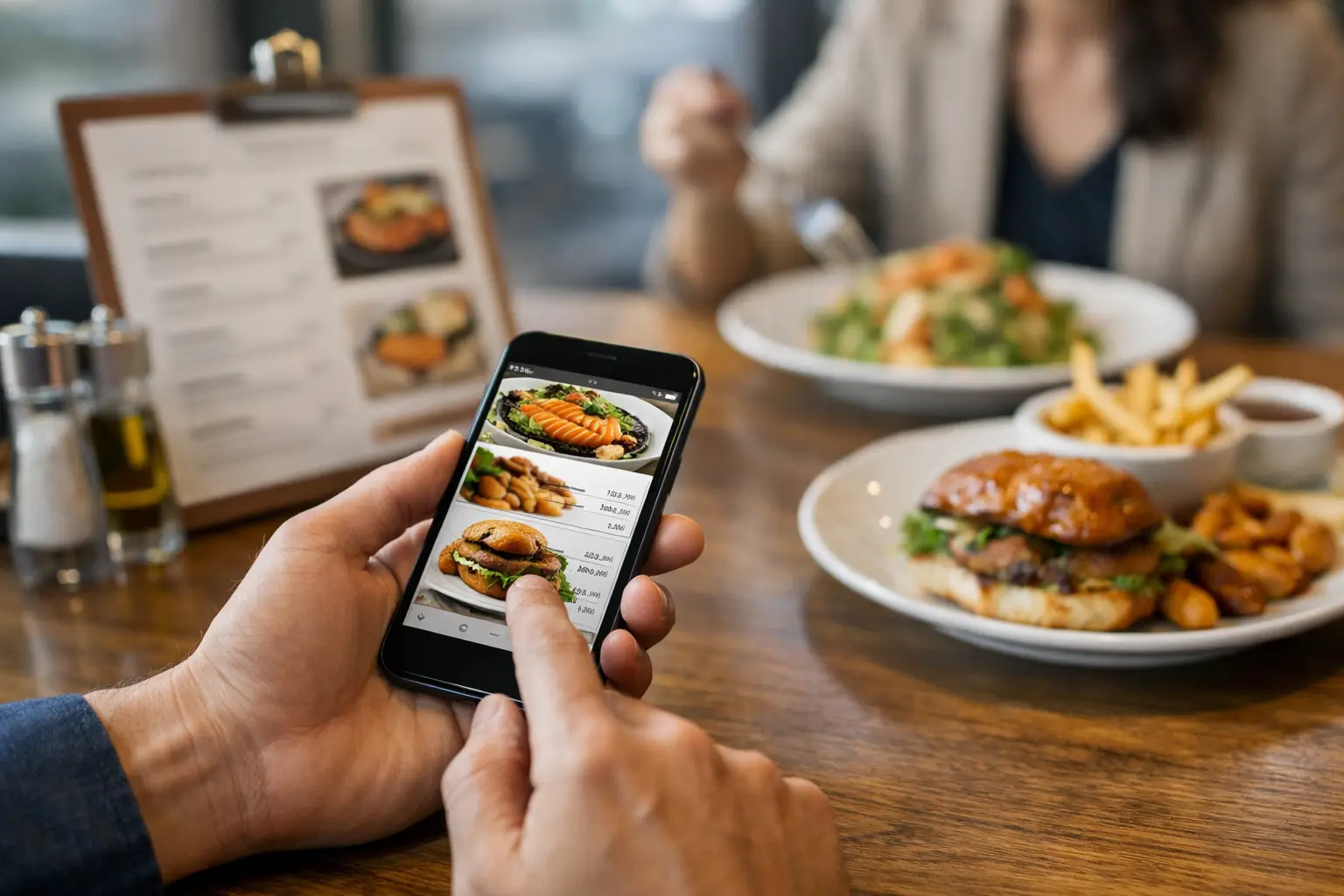
A menu says “crispy,” “loaded,” or “house style,” and somehow you’re still supposed to know what will actually show up at the table. That gap is exactly why a restaurant menu transparency app matters. For a lot of diners, ordering is not a fun little mystery. It is a decision with real stakes – money, time, dietary comfort, accessibility, and the very real possibility of ending up with something disappointing.
Text-only menus have been treated like enough for a long time. They are not enough for everyone. If you have low vision, decision fatigue, sensory sensitivities, or you just want to know whether the pasta looks rich and saucy or dry and sparse, the usual menu experience can feel vague fast. A better system gives people more than dish names and marketing language. It gives them a clearer picture of what they are choosing.
Why a restaurant menu transparency app matters
Most people have had the same moment: you order based on a description, the food arrives, and it is not what you expected. Maybe the portion is smaller. Maybe the toppings are different. Maybe the “spicy” level is way beyond your comfort zone. Maybe the plating makes it obvious that the dish is not worth the price. That disconnect is common because menus often sell the idea of a meal, not the reality of it.
A restaurant menu transparency app closes that gap by showing actual food before you buy it. Not a polished ad shot taken under studio lights five years ago. Not a vague line of menu copy. Real images from real dining experiences. That shift sounds simple, but it changes the decision-making process in a big way.
When people can see what they are ordering, confidence goes up. Refund frustration goes down. Regret drops. And for diners who already spend extra energy interpreting menu language, visual access is not a nice bonus. It is part of being able to participate more fully and independently.
Transparency is not just a food trend
When people hear “transparency,” they often think ingredients, calories, or sourcing. Those matter, but visual transparency deserves the same attention. A dish can technically be described accurately and still leave out the details people care about most. What does it actually look like? How much sauce is there? Are the fries thick-cut or shoestring? Is the sandwich stacked so high it is hard to eat? Does the dessert look shareable or tiny?
That is where visual information becomes practical, not cosmetic. It helps people compare options, set expectations, and avoid wasting money. It also helps diners who process information better visually than verbally. In other words, menu transparency is not just about curiosity. It is about clarity.
There is also a trust factor. Restaurants ask people to spend before they fully know what they are getting. The more honest and current the information, the fairer that exchange feels. A platform built around authentic dish photos supports that trust in a way standard menu text usually cannot.
The accessibility case is bigger than many restaurants realize
Accessibility in dining often gets discussed in terms of entrances, seating, or online checkout. Those are essential. But accessible dining also includes the moment of choice. If someone cannot easily interpret a text-heavy menu or cannot visualize what a dish is from description alone, that is an access issue too.
A restaurant menu transparency app can make that moment easier. Real photos help users with visual impairments when paired with thoughtful app design and image context. They can also help people with cognitive overload, anxiety around ordering, or decision fatigue. When the menu experience is clearer, the decision becomes less draining.
That does not mean photos solve everything. Image quality matters. Coverage matters. Consistency matters. A blurry photo taken in bad lighting can still create confusion. A menu with only two photographed items out of forty still leaves big gaps. Transparency works best when it is treated as an ongoing commitment, not a one-time feature.
Still, even imperfect visual access can be meaningfully better than none at all. For many users, seeing something real is the difference between guessing and choosing.
What actually makes a good restaurant menu transparency app
Not every app with food photos is doing the same job. Some are built mainly for restaurant promotion. Some lean hard on influencers and curated content. Some show images that look great but tell you very little about what a typical order will look like. A true transparency tool should be useful first.
That means the photos need to be authentic, current, and tied clearly to the correct menu item. It helps if users can compare multiple uploads of the same dish, because one plate on one day is not always the whole story. A good app also needs practical search and browsing, so users can find a restaurant, scan a menu, and quickly understand what is worth ordering.
It should also respect different user needs. Some diners want visual confirmation before trying something new. Others want help filtering options because too many choices feel overwhelming. Others are contributing photos because they want to make dining easier for the next person. The best platforms support all three behaviors: checking, choosing, and contributing.
Community matters here. A growing library of user-submitted meal photos creates coverage that no single restaurant team can maintain alone. That kind of model also reflects something bigger: menu transparency gets stronger when diners help build it together.
Why community-powered photos work
Restaurant menus change. Garnishes change. Portion sizes shift. Seasonal specials come and go. Official menu images rarely keep up, and many smaller restaurants do not have the time or budget to photograph every item well. That is one reason community-powered photo libraries can be so valuable.
When diners upload what they actually received, the information stays closer to real life. You get a wider range of dishes, angles, lighting conditions, and order experiences. That variety is useful. It gives a more honest sense of what someone can expect rather than presenting a single idealized version.
There are trade-offs, of course. User-generated content needs moderation, clear labeling, and basic quality standards. Otherwise the app risks becoming messy or unreliable. But when the system is thoughtfully managed, community contribution creates a stronger and more current menu picture than many restaurants can provide on their own.
That is also where incentives can help. Rewarding users for adding meal photos encourages participation and helps expand coverage faster. It turns a passive audience into active contributors, which is a smart fit for a product built around transparency and shared benefit.
A better ordering experience benefits more than the diner
The immediate win is obvious: diners make better choices. But restaurants can benefit too, even if transparency feels uncomfortable at first. Clearer expectations often lead to fewer unhappy surprises. That can mean fewer complaints, fewer mismatched orders, and more trust from customers who feel they know what they are paying for.
There is some nuance here. Not every dish photographs well in every setting, and not every restaurant wants to hand over visual storytelling to user uploads. That concern is fair. But diners are already sharing meal photos everywhere. The question is not whether visual information exists. It is whether that information is organized in a way that helps people order with confidence.
A transparency-focused app creates a more useful environment for that content. Instead of random scrolling, diners get dish-specific context. Instead of polished branding alone, they get a more grounded view of the menu. That can actually strengthen credibility rather than weaken it.
Where this shift is headed
People are getting less patient with vague digital experiences, especially when money is involved. If you can preview a hotel room, compare a couch from ten angles, and read dozens of buyer photos before ordering online, it makes sense to expect more from restaurant menus too.
That expectation is only going to grow. Diners want fewer unknowns. They want more confidence, more accessibility, and less chance of paying for something that misses the mark. A restaurant menu transparency app fits that shift because it responds to a simple demand: show me what I am ordering.
That is part of why platforms like Pic-ture That!™ feel timely. They are not treating food photos as fluff. They are treating them as useful information that helps people make better decisions and participate more fully in the dining experience.
Menus should not force people to guess, especially when a better option is possible. The future of ordering looks a lot more honest when people can actually see what is on the menu before they say yes.
Leave a Reply