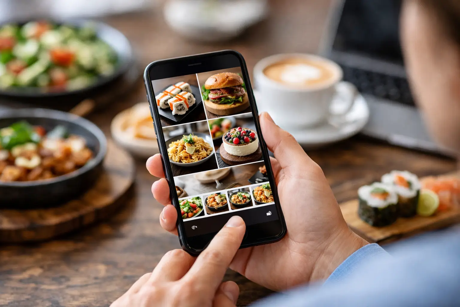
You know the feeling. You open a menu, read a dish description twice, maybe three times, and still have no clear idea what will actually show up at the table. Is the pasta creamy or dry? Is the sandwich huge or snack-sized? Does the “crispy chicken bowl” look fresh and balanced or like something you would regret five minutes after it arrives? A visual food discovery app solves that gap by showing people real images of real menu items before they spend their money.
That sounds simple, but it changes a lot.
For many diners, seeing food before ordering is the difference between confidence and guesswork. For people with visual impairments, text-heavy menus can create another layer of friction. For anyone dealing with decision fatigue, long lists of dish names and vague descriptions can turn a basic lunch order into a draining task. When food discovery starts with clear visuals instead of just text, ordering becomes easier, faster, and more inclusive.
What a visual food discovery app actually does
At its best, a visual food discovery app is not just a gallery of pretty food photos. It is a decision tool. The goal is not to make every dish look glamorous. The goal is to help users understand what they are ordering in a way that feels honest, useful, and immediate.
That distinction matters. Restaurant marketing photos often show an idealized version of a meal. Those images can be polished, staged, and disconnected from what a customer will actually receive. A visual menu platform built around authentic user-submitted images offers something different: transparency. It gives diners a more realistic picture of portion size, plating, ingredients, and overall appeal.
That can prevent bad orders, reduce wasted money, and build trust. It can also help people try something new with less risk. If a dish looks great in real photos from other diners, the decision gets easier.
Why visuals matter more than menu descriptions
Food is visual. That seems obvious, but restaurant ordering still leans heavily on text. Menus describe flavor, ingredients, and preparation style, yet they often leave out what many people want most: What does it actually look like?
Descriptions can only do so much. Words like loaded, house-style, signature, or artisan are common, but they are also vague. Even ingredient lists do not tell you whether a salad is generously portioned, whether the sauce is overwhelming, or whether a dessert looks worth the price.
A visual-first experience closes that gap. It lets diners compare dishes quickly and make decisions with more certainty. That is especially helpful in mobile ordering, where people are often choosing fast, on a small screen, between meetings, in a carpool line, or late at night when they are tired and hungry. In those moments, clarity beats clever menu copy.
A visual food discovery app is also an accessibility tool
This is where the conversation gets bigger than convenience.
A visual food discovery app can support dining accessibility in a meaningful way. People with visual impairments do not all interact with menus in the same way, and images alone are not a complete accessibility solution. Alt text, screen reader support, and thoughtful app design still matter. But food imagery can reduce uncertainty and add context that text-only menus often fail to provide.
It can also support users who struggle with cognitive overload or decision fatigue. That includes people with disabilities, busy parents, neurodivergent users, and honestly anyone who has ever stared at a 60-item menu and felt their brain shut down. Seeing the dish can simplify the choice. Instead of decoding a wall of descriptions, users can respond to what feels clear and appealing.
Accessibility is often treated like an extra feature. It should not be. Better menu transparency helps more people participate in dining with confidence. That is not niche value. That is better design.
Why authenticity matters more than polished food photography
There is nothing wrong with professional food photography. Restaurants need strong visuals, and good marketing images can absolutely help people discover new spots. But when the goal is informed ordering, authenticity matters more.
Real customer photos tend to answer practical questions that studio images do not. How full is the container? How does the side dish compare in size to the main? What does the item look like in normal restaurant lighting? Does the burger really come stacked that high? Those details influence whether someone feels good about an order.
There is a trade-off here. User-generated photos can vary in quality. Some will be better lit, better framed, or more helpful than others. A strong platform needs standards, moderation, and incentives that encourage useful contributions instead of random uploads. But that effort is worth it because authentic images build trust in a way polished brand imagery often cannot.
When people feel like they are seeing the food as it actually arrives, they make better choices.
Community is what makes the model work
A food photo platform only becomes truly useful when it has broad, current menu coverage. That is where community participation matters.
When users upload their own meal photos, they help build a shared library of visual menu information that benefits everyone else. One person’s lunch photo can help the next person avoid an expensive disappointment. Over time, that creates network effects. More contributors mean more dish coverage. More coverage makes the app more useful. More usefulness attracts more users, which brings in more contributors.
That cycle is powerful because it turns diners into active participants, not just passive consumers. It also creates a more democratic version of food discovery. Instead of relying only on restaurants to present their menus, the community helps document what people are really being served.
Rewards can help here too. Earning restaurant gift cards or other perks gives users a tangible reason to contribute. But the bigger motivator is often participation itself. People like helping others make better choices, especially when the action is easy and the impact is immediate.
That community angle is a big part of what makes Pic-ture That! feel timely. It treats diners like collaborators in a more transparent food system, not just customers scrolling through ads.
What diners gain from using it
The most obvious benefit is confidence. You can see a meal before ordering it, which lowers the chance of surprise, disappointment, or wasted money.
But there are smaller wins that add up. Ordering gets faster. Group decisions become easier because everyone can compare options visually. Trying a new restaurant feels less risky. People with specific preferences around ingredients, portion size, or presentation get more context before committing.
There is also a trust benefit. When a platform centers real dish imagery, it respects the diner’s right to make an informed choice. That sounds basic, but it is still missing from a lot of restaurant experiences.
Of course, it depends on the quality and freshness of the content. A visual platform is only as useful as its coverage. If a menu changes often or a restaurant has only one or two uploaded dishes, the experience may still feel incomplete. But even partial visibility can be better than none, especially when users know the library is growing.
What restaurants gain, even if they are not taking the photos
Restaurants may hear “user-generated food photos” and worry about losing control over presentation. That concern is understandable. Not every customer photo is flattering, and no brand wants to be misrepresented.
Still, the upside is real. Transparent visuals can attract customers who would otherwise hesitate to order. They can reduce mismatched expectations and make diners feel more confident about higher-ticket items. They can also surface menu favorites in a way that feels credible because the endorsement comes from real people.
For restaurants, this is less about perfection and more about trust. A business that is comfortable letting diners see what dishes actually look like sends a strong message. It says there is nothing to hide.
Where this category is heading
The demand for visual ordering is only going to grow. Mobile-first diners already expect to see products before buying them in retail, travel, and social commerce. Food should not be the exception.
The next wave of restaurant discovery will likely be more visual, more community-powered, and more accessibility-aware. Not every app in this space will get the balance right. Some will lean too hard into aesthetics and forget usefulness. Others will treat accessibility like a checkbox instead of a core design principle. The platforms that stand out will be the ones that keep the mission clear: help people see what they are ordering, trust what they are seeing, and feel included in the process.
That is bigger than food photos. It is about reducing friction in an everyday decision that should never feel harder than it needs to.
If ordering from a menu has ever felt like guesswork, that is your sign that the old model is not enough. People deserve to see their options clearly, choose with confidence, and help build a dining experience that works better for everyone.
Leave a Reply