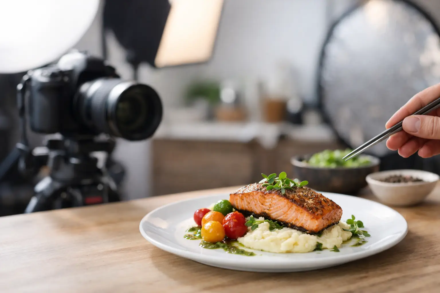
You know the feeling: the menu photo looked stacked, colorful, and generously plated, then your order arrives looking like a distant cousin. That gap is exactly why understanding what makes dish photos accurate matters. Accurate food photos do more than look good – they help people order with confidence, reduce wasted money, and make restaurant choices clearer for everyone.
For some diners, that clarity is a nice-to-have. For others, it is access. If you have low vision, decision fatigue, dietary concerns, or you simply do not want to gamble on a $19 lunch, a photo should help you understand what you are getting. Not sell you a fantasy.
What makes dish photos accurate in real life?
An accurate dish photo shows the food as it is actually served. That sounds obvious, but a lot can distort reality between the kitchen and the camera. Lighting can shift colors. Camera angles can exaggerate size. Heavy editing can make sauces glossier, greens brighter, and textures cleaner than they are in person.
Accuracy starts with a basic question: if this dish arrived at the table right now, would it look recognizably like the photo? Not identical to the pixel, because food is made by humans and varies slightly from plate to plate. But the core experience should match.
That means the photo should reflect the real portion, the typical plating, the actual ingredients, and the way the dish usually appears under normal dining conditions. If a burrito bowl is usually packed to the rim, the image should show that. If it often comes with dressing on the side, that should be visible too. Small details shape expectations.
Accuracy is more than aesthetics
There is nothing wrong with a dish photo being appealing. Restaurants want food to look appetizing, and diners want to know whether something looks fresh and worth ordering. But appealing and accurate are not the same thing.
A beautiful image can still be misleading if it hides scale, overstates color, or leaves out key components. A burger shot from a low angle may look huge, even if it is fairly average in person. A pasta dish photographed tightly from above may conceal that it is served in a shallow bowl. A dessert can appear dense and rich in one image, then arrive smaller or lighter than expected.
That difference matters because people do not order photos. They order meals. When the image sets the wrong expectation, the problem is not just disappointment. It can affect budget, satisfaction, nutrition planning, and trust.
The biggest factors that make dish photos accurate
Real lighting, not trick lighting
Lighting changes everything in food photography. Warm light can make fries look more golden. Cool light can make a soup look flat. Harsh overhead light can wash out details or create shadows that hide texture.
The most accurate dish photos use lighting that stays close to how the food actually appears in a restaurant or natural daylight. That does not mean the image has to be dark or dull. It means the colors should feel honest. The tomato sauce should look like tomato sauce, not neon red. The mashed potatoes should not be edited into a perfectly white cloud.
True-to-life color
Color is one of the fastest ways a photo can mislead. Saturation boosts can make vegetables look fresher, meats look richer, and desserts look more dramatic. This is common in polished food marketing, but it can create a mismatch when the meal arrives.
Accurate photos keep color correction minimal and realistic. If the avocado is slightly darker in person, the photo should reflect that. If the curry is more brown-gold than bright yellow, that matters. For diners making choices based on freshness, ripeness, or ingredient balance, realistic color is useful information.
Portion size you can trust
One of the clearest signs of accuracy is whether the photo gives a fair sense of size. Portion confusion is a huge reason people regret orders. A dish can look abundant in a close crop and turn out to be a small plate. The reverse can happen too.
Photos are more accurate when they include visual cues for scale. A plate edge, a utensil, a to-go container, or even the table setting can help. These cues give your brain context. Without them, almost any dish can look larger or smaller than it really is.
The actual ingredients on the actual plate
Some food images show idealized versions of a dish – extra toppings, more garnish, or ingredients styled for the camera that are not consistently included in service. That may work as advertising, but it does not help someone decide what to order.
An accurate photo shows what normally comes with the meal. If onions are optional, they should not be presented as standard unless they usually are. If the protein sits under the rice, the image should not rearrange the whole dish just to make every ingredient visible. There is always a trade-off between clarity and realism, and the best photos balance both.
Minimal editing
Editing is not the enemy. Every photo benefits from slight adjustments for brightness, sharpness, or white balance. The problem starts when editing changes the food itself.
Over-editing smooths textures, boosts shine, deepens color, and removes imperfections that would naturally be there. A real slice of pizza has uneven cheese. A sandwich might shift a bit in its wrapper. A salad is not arranged like a catalog unless someone actively styles it. Accurate photos keep those real-world details intact.
What makes dish photos accurate for accessibility
Accessibility changes the standard in a useful way. If a photo helps someone make a decision clearly, it is probably doing its job well.
For diners with visual impairments, overly dramatic angles, cluttered backgrounds, or heavy filters can make images harder to interpret. A photo that is technically pretty but visually confusing is not very helpful. Accuracy includes legibility.
That means clear framing, enough contrast to distinguish ingredients, and a view that shows the overall dish without hiding key details. It also means avoiding visual noise. If the table is crowded with drinks, decor, and props, the meal itself becomes harder to parse.
This is one reason community-powered food photos can be so valuable. When people photograph what they are actually served, the result is often more useful than a polished promo shot. It shows the meal in the context diners will really experience.
Why restaurant marketing photos often miss the mark
Marketing photos are built to persuade. That is their job. They are often taken with professional lighting, styling tweaks, and ideal plating. Sometimes they represent the dish well. Sometimes they represent the dish on its very best day, from its very best angle, under its very best conditions.
That does not make them dishonest by default. But it does mean they may not answer the question diners are really asking: what will I get if I order this right now?
There is a place for polished images. They can communicate cuisine, brand feel, and menu variety. But when people need confidence before they spend money, authentic, user-generated photos fill a different need. They bring expectations closer to reality.
A good dish photo is honest about variation
Food is not manufactured to identical specs every time. A handmade taco may be fuller one day and lighter the next. Pancakes may stack slightly differently depending on the cook. A noodle dish may settle during delivery and look less structured than it did at the pass.
So accuracy does not mean pretending every plate is a clone. It means showing the typical version of the dish and being honest about normal variation. This is especially important with takeout and delivery, where presentation changes during transport.
That is why one photo is helpful, but multiple real photos are better. Patterns matter. If several diners upload images of the same item and they all look broadly similar, trust goes up. You are no longer relying on a single best-case image.
What diners should look for before trusting a dish photo
If you are trying to judge whether a photo is useful, ask a few simple questions. Does the dish look naturally lit? Can you tell how big it is? Are the ingredients visible without looking artificially arranged? Does the image feel like something a person would actually receive at a table or in a takeout bag?
Also pay attention to what is missing. If every photo is cropped tightly, edited heavily, or avoids showing the full plate, that may be a sign the image is optimized for appeal over accuracy. The most trustworthy photos usually feel straightforward. They are clear, not theatrical.
That is the bigger idea behind transparency-first food imagery. People deserve to see what they are buying. And when they can, ordering becomes less stressful, more inclusive, and a lot more satisfying.
At Pic-ture That!™, we believe accurate dish photos help turn menus into something people can actually use – with more confidence, more clarity, and fewer unpleasant surprises.
Leave a Reply