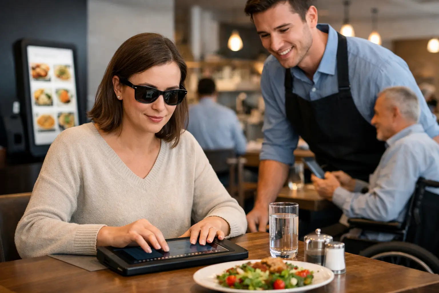
A menu shouldn’t feel like a guessing game, especially when you’re spending real money on a meal. Accessible dining technology is changing that by giving people clearer, more useful ways to understand what they’re ordering before they commit. For some diners, that means convenience. For others, it means independence, less stress, and a much more equitable dining experience.
Restaurants have spent years improving online ordering, mobile payments, and delivery speed. But speed is not the same thing as access. If a menu is text-heavy, vague, poorly structured, or missing visual context, plenty of people are still left making low-confidence decisions. That gap matters more than many businesses realize.
What accessible dining technology actually means
Accessible dining technology includes the digital tools that make restaurant discovery, ordering, and decision-making easier for more people. That can include screen reader-friendly menu layouts, alt text, readable fonts, smart contrast, voice support, and ordering flows that reduce friction. It also includes something the industry often overlooks: accurate, real-world food imagery that helps people understand what a dish actually looks like.
That last piece is bigger than it sounds. Menus are often built around short descriptions, inconsistent naming, and marketing language. “House special pasta” or “loaded bowl” may sound appealing, but those labels do not tell every diner what they need to know. Portion size, ingredients, presentation, toppings, and texture can all influence whether a meal feels like a good choice.
When dining technology adds visual clarity, it becomes more than a convenience feature. It becomes an accessibility tool.
Why accessible dining technology matters in real life
A lot of restaurant tech is built around efficiency for the business. Faster checkout. Higher ticket sizes. Easier upsells. Those goals are understandable, but they do not automatically create a better experience for diners.
Accessible dining technology starts from a different question: what does the customer need to feel informed and confident? That shift changes the whole experience.
For diners with visual impairments, accessible design can support better navigation, compatibility with assistive tools, and a stronger sense of control. For diners with decision fatigue, clearer information can reduce mental load. For anyone ordering from a new place, authentic visuals can lower the risk of disappointment. Even people without a formal accessibility need benefit when restaurant information is easier to interpret.
That broad usefulness is part of the point. Accessibility is not a niche upgrade. It improves the baseline experience for a wide range of people.
Confidence is part of access
One of the most overlooked barriers in dining is uncertainty. If you can’t tell what a dish really looks like, how large it is, or whether the description matches your preferences, you are not making a fully informed decision. You are estimating.
That uncertainty can be frustrating for anyone, but it hits harder when dining out already requires extra effort. If someone relies on assistive technology, manages sensory preferences, or simply gets overwhelmed by too many unclear choices, low-quality menu information creates another layer of work.
Accessible dining technology helps remove that layer. It gives diners more than access to a menu. It gives them access to confidence.
The problem with text-only menus
Text matters, but text alone has limits. Restaurant descriptions are often short because menus need to stay compact. They can also be inconsistent because every restaurant writes differently. One place says “crispy chicken sandwich,” another says “signature fried stack,” and neither tells you much about thickness, toppings, bread type, or plating.
Photos fill in some of those gaps, but only if they are accurate. Polished marketing shots can help with promotion, yet they do not always help people make realistic decisions. Diners want to know what they are actually going to receive, not just what looked best under studio lighting.
That is where community-powered visuals can make a real difference. Real photos from real diners can add transparency that menu copy alone cannot provide. They can also help set expectations in a way that feels useful instead of salesy.
Accessible dining technology and food photos
If food imagery sounds like a branding feature, think again. In the right context, it is part of accessible dining technology because it supports comprehension.
Seeing a dish before ordering can help a diner assess portion size, ingredient mix, presentation, and whether the item matches what they had in mind. That matters for people who process information visually, for people who need to reduce uncertainty, and for people who want to spend their money more carefully.
There is a trade-off, of course. Images only help when they are current, relevant, and easy to interpret. If a platform is full of outdated photos, poor angles, or mismatched items, visual content can create confusion instead of reducing it. Accessibility is not just about having more information. It is about having better information.
That is why authenticity matters so much. Clear, accurate images are not fluff. They are useful decision support.
What restaurants often miss
Many restaurants care about hospitality, but their digital experience does not always reflect that. A dining room can be welcoming while the online menu is cluttered, hard to navigate, or vague. As more ordering happens on phones, that disconnect becomes harder to ignore.
Mobile-first diners expect clarity. They want to browse quickly, compare options, and feel sure about what they are buying. If the digital menu makes that harder, the restaurant creates friction before the meal even starts.
This is also where accessibility and business value overlap. Better menu visibility can reduce abandoned orders, increase trust, and encourage repeat visits. People are more likely to order when they feel informed. They are also more likely to come back when what arrives matches what they expected.
Accessible dining technology is good for inclusion, and it can also be good for conversion. Those goals do not compete.
Community plays a bigger role than people think
Restaurants cannot always keep every dish photo updated across every platform. Menus change. Specials rotate. Presentation varies by location. That is one reason user-generated content has such strong potential in this space.
When diners share real meal photos, they help build a more transparent food ecosystem. They are not just posting for fun. They are making restaurant choices easier for the next person.
That community layer matters because accessibility works best when it grows with actual user behavior. A platform shaped by diner contributions can surface the details people really care about, instead of guessing from the top down. In that sense, accessible dining technology is not only a product category. It is also a participation model.
Pic-ture That!™ fits naturally into that shift by treating food photos as a decision-making tool, not just a nice extra. That approach meets people where they already are: on their phones, comparing options, trying to order with more confidence.
Where accessible dining technology still has room to improve
The category is moving in the right direction, but there is still work to do. Many restaurant apps and ordering systems remain inconsistent in how they support assistive technology. Visual design can also create problems when readability gets sacrificed for branding.
There is also the challenge of standardization. One platform may offer clean images and better menu structure, while another still relies on dense text blocks and confusing navigation. For users, that means the experience can vary a lot from one restaurant to the next.
Another issue is assuming one solution works for everyone. Some diners need better compatibility with screen readers. Others benefit most from authentic dish images. Others need simpler menu architecture to reduce cognitive overload. Accessible dining technology works best when it recognizes that access is not one-size-fits-all.
What the future should look like
The best restaurant tech should help people feel informed before they order, not just processed after they click. That means building menus and discovery tools that are readable, visual when helpful, mobile-friendly, and grounded in real customer needs.
It also means treating transparency as part of hospitality. Showing people what a dish actually looks like, making the menu easier to navigate, and reducing decision stress should not be seen as bonus features. They are part of what makes dining more inclusive.
As diners keep expecting more clarity from restaurants, accessible dining technology will only become more relevant. Not because it is trendy, but because it solves a real problem people deal with every day.
The next time a menu helps someone order with less stress and more certainty, that is not a small upgrade. That is what access looks like when it finally reaches the table.
Leave a Reply