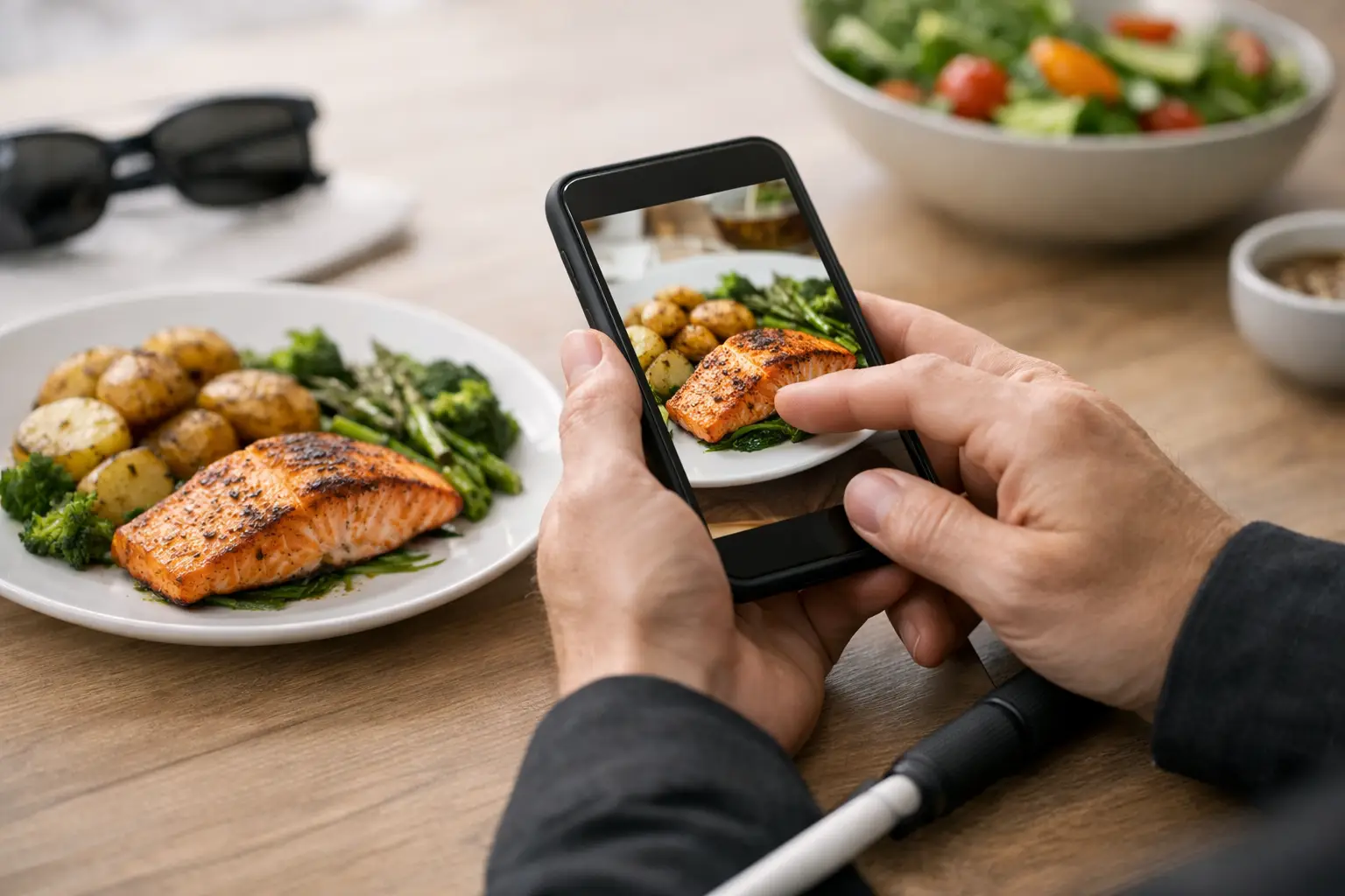
A menu says “crispy,” “loaded,” or “chef’s special,” but those words can still leave a lot unsaid. Can food photos improve accessibility? Absolutely – and not just by making a dish look appealing. Real, accurate food images can reduce uncertainty, support independent decision-making, and give more diners a clearer path to ordering with confidence.
That matters more than many restaurants realize. For some people, text-only menus create friction. For others, they create real barriers. A photo cannot solve every accessibility challenge on its own, but it can fill a major information gap that written descriptions often leave behind.
Why can food photos improve accessibility in the first place?
Accessibility is often framed as ramps, captions, and readable websites. Those things matter. But accessibility also includes whether someone can understand what they are buying before they spend money on it.
Food is visual. Portion size, texture, toppings, side placement, sauces, and presentation all influence whether a meal feels right for a person’s preferences or needs. A menu description might mention grilled chicken with vegetables, but it may not show whether the vegetables are mixed, heavily seasoned, chopped small, or covered in sauce. For many diners, that missing context is frustrating. For some, it is enough to stop them from ordering at all.
Photos can close that gap. When a diner can see the actual dish, they can make faster, more informed choices. That improves confidence, reduces anxiety, and makes the ordering experience feel less like a gamble.
Food photos help people with decision fatigue
Decision fatigue is real, especially on large menus packed with vague descriptions and minor variations. If every burger sounds similar and every pasta has a creative name, choosing can become mentally exhausting.
Photos reduce cognitive load. They help diners narrow options quickly based on what they actually want to eat, not what they think a description might mean. That is a practical accessibility win. It supports people who get overwhelmed by too many choices and helps them move through the process with less stress.
This is one of the most overlooked ways food photos improve access. Not every barrier is physical. Some are mental, emotional, or situational. A clear image can make the difference between abandoning an order and feeling ready to choose.
Visual access is still access
At first glance, it may sound strange to say food photos support people with visual impairments. The reality is more nuanced than that.
Not all visual impairments are the same. Some people have partial vision, low vision, contrast sensitivity issues, or conditions that make reading dense text harder than interpreting a well-framed image. In those cases, a high-quality, zoomable food photo may communicate useful information more quickly than a long menu description.
Photos can also work alongside assistive technology. If images are labeled properly and paired with thoughtful alt text, they become part of a broader accessible experience rather than a visual extra. The image itself may help one user, while the description attached to it may help another.
That is the key point: food photos should not replace accessible text. They should strengthen it. Accessibility works best when people have more than one way to understand what is in front of them.
Text descriptions have limits
Restaurants usually write menus to sell, not to clarify. That is why descriptions often lean on branding language instead of practical detail. “House-made aioli” sounds great, but it does not tell a diner how much sauce is on the plate. “Seasonal vegetables” leaves basic questions unanswered. “Spicy” can mean very different things depending on the kitchen.
Photos add context that marketing language often skips. Diners can spot visible ingredients, see whether a dish looks messy or neatly plated, and get a better read on portion expectations. That can be especially helpful for people with sensory sensitivities, texture preferences, or food-related anxiety.
There is a money side to this too. Ordering the wrong meal is frustrating. Paying for the wrong meal is worse. When people can see what they are getting, they are less likely to feel disappointed, waste food, or need to reorder.
Can food photos improve accessibility for online ordering?
Yes, and online ordering is where the impact becomes even clearer.
When people order in person, they may be able to ask questions, glance at nearby tables, or get a quick recommendation. Online, those cues disappear. The customer is left with whatever the menu provides. If that menu is just a dish name and a short description, uncertainty goes up fast.
Food photos bring back some of the missing context. They help users compare options, avoid surprises, and feel more in control during checkout. That matters for anyone using a delivery app late at night, ordering during a work break, or trying to make a fast choice without a lot of mental energy to spare.
For mobile-first diners, especially, visual clarity is not a bonus feature. It is part of a usable experience. People are making spending decisions on small screens, often quickly. Helpful images can reduce friction in a way that plain text alone often cannot.
The catch: bad food photos can hurt accessibility
Not every food image is useful. Some can actually make ordering harder.
If a photo is heavily edited, poorly lit, cropped too tightly, or clearly staged in a way that does not match the actual dish, it creates false confidence. That is not transparency. It is guesswork dressed up as clarity.
For food photos to support accessibility, they need to be accurate and easy to interpret. That usually means realistic lighting, a clear angle, visible scale, and minimal visual clutter. Diners should be able to tell what is included, not just admire a polished marketing shot.
Authenticity matters here. A community-powered image library often adds value because it reflects what diners really receive, not only what a brand wants to promote. Real-world photos may be less glamorous, but they are often more useful.
What makes a food photo actually accessible?
A useful food photo does a few simple things well. It shows the full dish, gives a sense of portion size, and avoids confusing filters or decorative distractions. If the image is paired with plain-language text and alt text, it becomes even more effective.
There is also a strong case for offering multiple photos when possible. One angle may show plating, while another reveals layers, toppings, or side items. That said, more is not always better. Too many low-quality images can create clutter. A few clear, honest photos usually do more for accessibility than a gallery full of inconsistent ones.
The same principle applies to app and menu design. Photos should load clearly, remain zoomable, and sit next to readable dish names and descriptions. Accessibility is not just about the photo itself. It is about the whole decision-making environment around it.
This is bigger than convenience
When people can see food before ordering, they get more than convenience. They get agency.
That agency matters for diners who have been burned by misleading menu descriptions, for people managing sensory needs, and for anyone who feels stress around ordering something unfamiliar. It also matters for people trying new cuisines, sticking to a budget, or simply wanting fewer disappointing meals.
That is why this conversation should not be limited to marketing. Food imagery is often treated as a conversion tool, but it can also be a fairness tool. It helps level the playing field between diners who are comfortable taking risks and diners who need more certainty before they commit.
For a platform like Pic-ture That!™, that mission is especially clear. Real food photos do not just make menus look better. They help people order with more confidence, more independence, and less guesswork.
So, can food photos improve accessibility?
Yes – when they are accurate, inclusive, and designed to inform rather than just impress.
They can reduce decision fatigue, support clearer online ordering, and give diners a more realistic understanding of what they are about to buy. They can also work as part of a stronger accessibility system that includes readable text, alt text, and thoughtful mobile design.
Photos are not a complete solution. Some users will still need detailed descriptions, allergen information, or other accommodations. But that is exactly the point. Accessibility is rarely one feature. It is a collection of choices that make everyday experiences easier to navigate.
The next step for restaurants and food platforms is not asking whether visuals belong in the ordering experience. It is asking whether diners have enough honest information to choose with confidence – and then building for that reality.
Leave a Reply