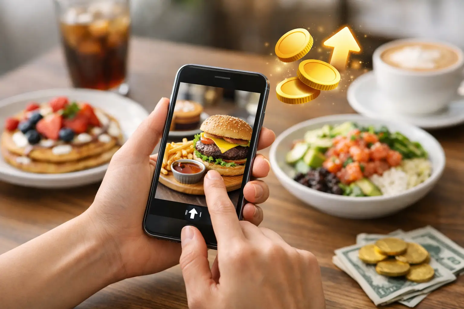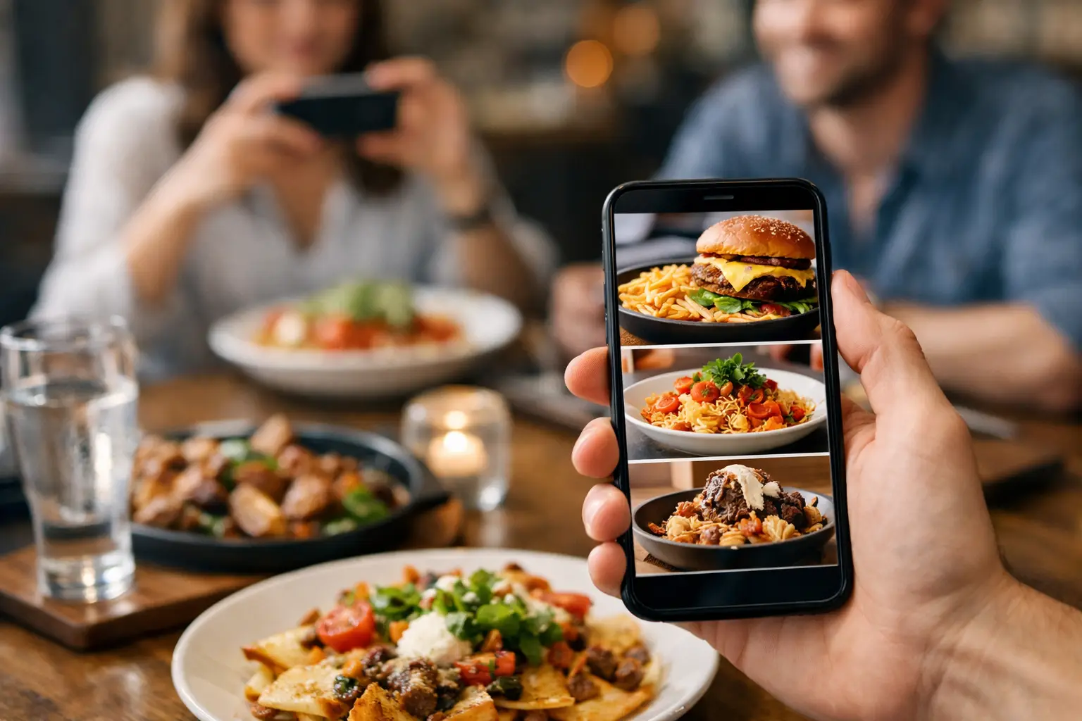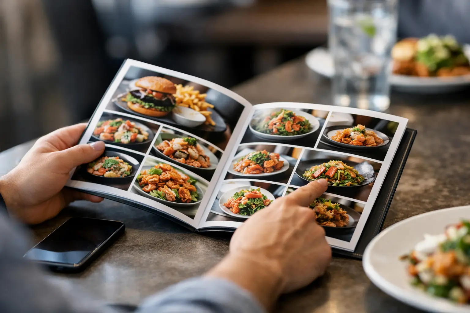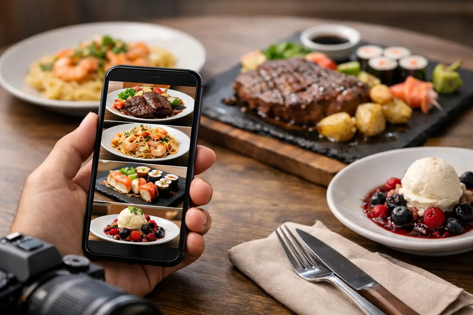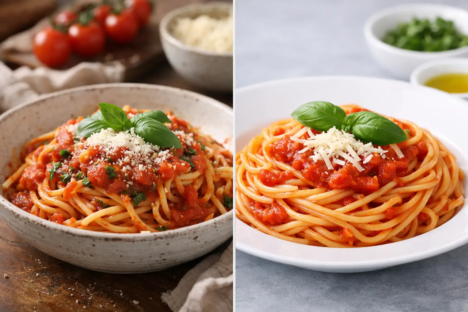
You know the feeling: a menu photo looks perfect, you order with confidence, and what arrives is… not that. That gap is exactly why real dish photos vs stock photos matters so much. For diners, it is not a small branding choice. It affects trust, accessibility, expectations, and whether ordering feels easy or like another gamble.
Restaurants have used polished food imagery for years because it sells. Bright lighting, careful styling, and ideal angles can make almost anything look irresistible. But diners are getting smarter, and they are asking a more useful question: does this photo actually show what I am going to get?
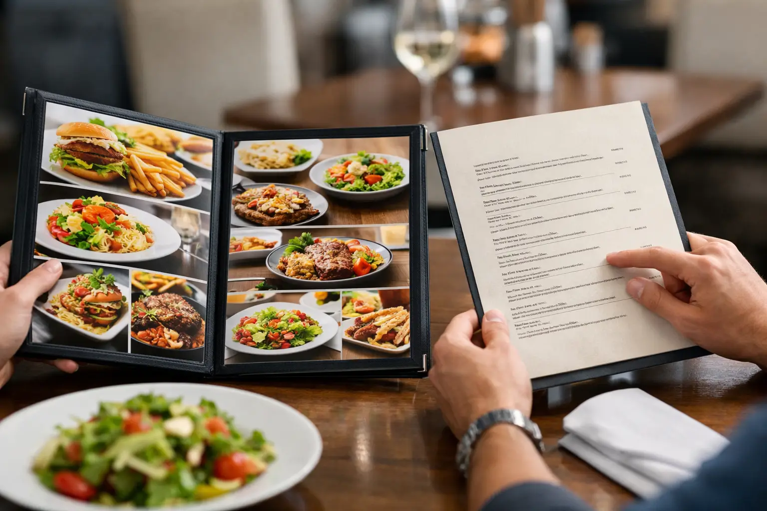
That question matters even more when you’re ordering from a phone, moving fast, managing decision fatigue, or relying on visual information to make a comfortable choice. A menu description can only do so much. Seeing the actual dish closes the gap between guessing and knowing.
Why real dish photos vs stock photos matters
At a glance, stock photos and real dish photos may seem like two versions of the same thing. They are not. They create very different experiences before a customer ever taps “order.”
Stock photos are usually created for broad marketing use. They are clean, attractive, and controlled. Sometimes they represent a type of dish rather than the exact version served by a specific restaurant. That can help a menu look more polished, but it can also create confusion. If the burger in the image has a towering brioche bun, thick-cut tomatoes, and a side of crispy fries, diners naturally expect something close to that.
Real dish photos work differently. They show what people actually receive. Maybe the pasta comes in a shallower bowl than expected. Maybe the taco plate is larger than the description suggests. Maybe the “spicy chicken sandwich” has a sauce-heavy look that helps someone decide yes or no in seconds. That kind of visual honesty gives diners useful information, not just appetite appeal.
This is where transparency becomes practical. Real photos do not need to be perfect to be valuable. They need to be accurate enough to help someone make a better decision.
The trust gap: polished marketing vs accurate expectation
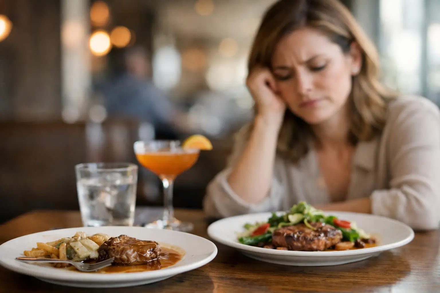
Trust is fragile in food ordering. Once someone feels misled, they remember it. Maybe they spent $18 on an entree that looked nothing like the photo. Maybe the portion felt smaller. Maybe the texture or toppings were different enough that the meal became a disappointment before the first bite.
Stock photos can create that trust gap when they are used as stand-ins for actual menu items. Even when there is no bad intent, the result can still feel misleading. Diners do not experience the image as a generic example. They experience it as a promise.
Real dish photos tend to reduce that problem because they set more realistic expectations. They show portion size, plating style, ingredient visibility, and sometimes even packaging. If a rice bowl arrives compact and sauce-heavy, that is helpful to know. If a salad is loaded with toppings rather than mostly greens, that matters too.
This does not mean every real photo will flatter the food. Some will be dimmer, less styled, or taken from awkward angles. That is the trade-off. A stock image may look better, while a real dish photo may be more useful. For diners trying to spend wisely and avoid regret, useful usually wins.
Accessibility changes the conversation
The usual debate around food photos focuses on marketing performance. But real dish photos vs stock photos is also an accessibility issue.
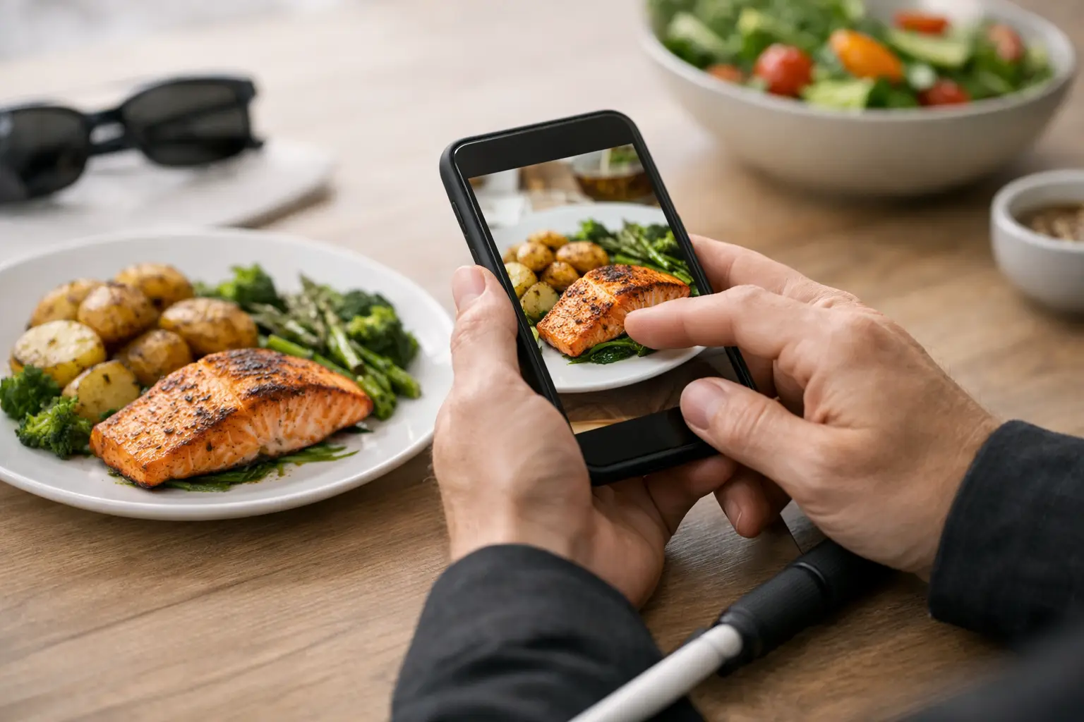
For diners with visual impairments, image quality and image accuracy both matter. A vague or decorative image does not provide the same value as a clear, representative photo of the actual dish. For people who depend on visual cues to understand portion, texture, arrangement, or visible ingredients, authenticity can make ordering far more manageable.
The same goes for people dealing with decision fatigue. Text-heavy menus can be exhausting. Descriptions like “chef’s special aioli,” “seasonal garnish,” or “house style preparation” often leave too much to interpretation. A real dish photo removes some of that mental load. It helps people decide faster and with more confidence.
That is a big shift in how food imagery should be understood. It is not only about making food look good. It is about making menus easier to use.
When stock photos still have a role
To be fair, stock photos are not automatically bad. They can be useful in the right context.
If a restaurant is promoting a general cuisine category, seasonal campaign, or homepage banner, stock imagery can help create a polished visual identity. It can also help new businesses fill an early content gap when they do not yet have high-quality photography. For some brands, that visual consistency matters.
The problem starts when those photos blur into menu-item representation. If the image suggests, “this is the dish,” but the dish is noticeably different, the photo stops being helpful. It becomes aspirational advertising in a place where diners need practical information.
There is also a middle ground. Restaurants can use professional photography of their actual dishes. That gives them stronger quality control without losing accuracy. But even then, the most helpful ecosystem often includes customer-taken images too, because those show what arrives in real ordering conditions, not just in a staged shoot.
What diners actually want from food photos
Most people are not looking for editorial-quality food styling when they open a menu app. They want fast answers.
They want to know whether the serving looks worth the price. They want to see how much sauce comes on the noodles, whether the sandwich is stacked or flat, and whether the dessert is large enough to share. They want fewer surprises.
This is especially true in delivery and pickup, where there is no server nearby to clarify details. The photo becomes part of the decision-making process. If it is accurate, it helps. If it is generic, it adds friction.
That is why community-powered photo libraries are so compelling. They create a broader, more realistic view of what a menu item looks like across time and orders. One professional image might show the ideal version of a burrito bowl. Multiple real-user photos can show consistency, variation, packaging, and portion reality. That is a lot closer to how people actually choose.
Real dish photos vs stock photos in the mobile ordering era
Mobile ordering changed the stakes. On a small screen, people make quick judgments with limited context. They are often scrolling between restaurants, comparing prices, and deciding in minutes. In that environment, visuals carry more weight.
A stock photo may catch attention, but a real dish photo can close the confidence gap. That difference matters because confidence drives action. When diners feel more certain, they are more likely to complete the order and feel better about it afterward.
This is not only good for consumers. It can be good for restaurants too. Better expectation-setting can mean fewer disappointed customers, fewer complaints, and a stronger sense of trust over time. A photo that is slightly less glamorous but more honest can create a better long-term relationship than one that oversells.
For platforms built around real menu discovery, this is where the value becomes obvious. Showing what food really looks like before someone spends money is not a cosmetic feature. It is practical transparency.
So which is better?
If the goal is broad brand marketing, stock photos can still serve a purpose. If the goal is helping someone choose a specific meal with confidence, real dish photos are usually better.
That “usually” matters. Image quality still counts. A dark, blurry photo may not help much, even if it is authentic. The best outcome is clear, representative imagery that reflects the actual dish. That can come from restaurants, diners, or both. Accuracy and clarity should work together.
For everyday ordering, though, authenticity has the edge. Real photos support trust. They support accessibility. They reduce guesswork. And they treat diners like people making real decisions, not just targets for a marketing campaign.
That is the bigger shift behind this conversation. People do not just want food to look appealing. They want menus to feel honest, usable, and inclusive. Pic-ture That!™ is built around that idea because seeing the real dish before ordering should not be a bonus. It should be part of a better dining experience.
The next time a menu photo catches your eye, the better question is not “does this look good?” It is “does this show me what I am actually getting?” That one question can save money, lower stress, and make ordering feel a whole lot better.