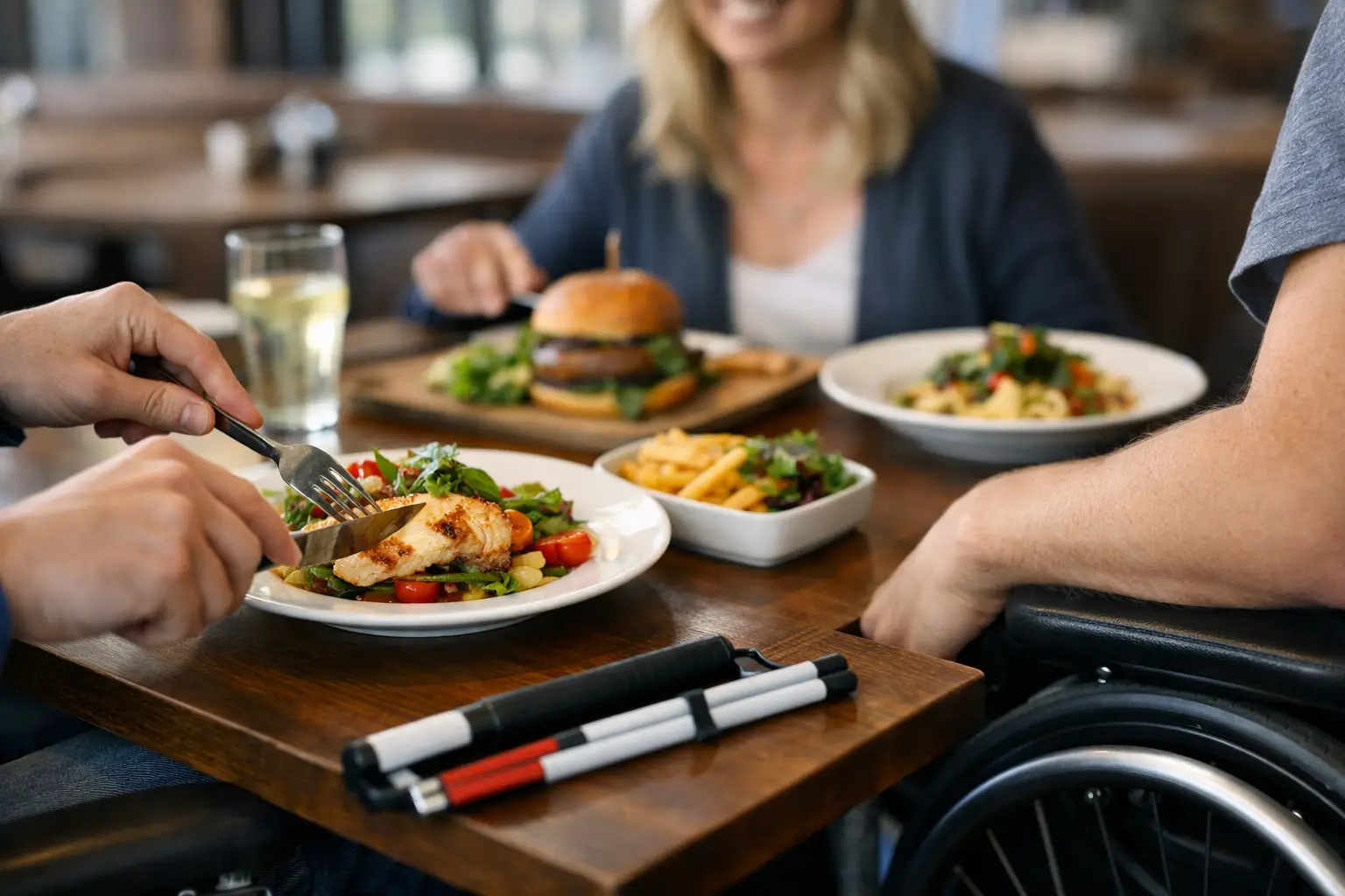
A menu says “crispy chicken sandwich.” But is it a towering, sauce-heavy sandwich that needs two hands, or a small slider with a thin cutlet? Is the side salad actually a full bowl? Does the pasta arrive with mushrooms, spicy peppers, or a cream sauce that the description barely mentions?
That gap between what a menu says and what a meal actually looks like is where accessible dining guides can make a real difference. They give diners clearer information before they spend money, place an order, or arrive at a restaurant already feeling overwhelmed. For many people, a real image is not a nice extra. It is the information that makes an informed choice possible.
What accessible dining guides should actually do
An accessible dining guide is more than a list of restaurants with ramps or a menu with a few dietary labels. Those resources matter, but dining access is broader than getting through the door. It includes being able to understand the options, compare portions, anticipate presentation, and feel confident choosing a meal.
The strongest guides make restaurant information easier to use for different people and different situations. A diner with low vision may need images supported by useful descriptions and accessible app controls. Someone managing food allergies may need clarity about visible ingredients, garnishes, sauces, and substitutions. A person dealing with decision fatigue may simply need to see three realistic options instead of trying to decode a page of menu copy.
Real dish photography helps turn vague language into practical context. “Market vegetables” becomes recognizable. “Family-style” has a visible scale. “Spicy aioli” is no longer an unexpected drizzle covering the whole plate.
Photos are not a replacement for ingredient details, allergen communication, or speaking with restaurant staff. They are one more layer of transparency. That distinction matters. A photo can show a dish’s likely appearance, but it cannot guarantee every preparation or reveal every cross-contact risk.
Why text-only menus leave too much to guesswork
Restaurant menus are built to be short. They need to fit many dishes into limited space, and they often use appealing language instead of complete detail. That is understandable, but it creates uncertainty for diners.
Words such as “loaded,” “classic,” “signature,” and “chef’s style” can mean almost anything. Portion size, plating, color, texture, topping amounts, and side dishes are often left out. Even a detailed description may not communicate whether a bowl is brothy or thick, whether a burger is stacked high, or whether a dish arrives mixed together.
For diners with visual impairments, text-only menus can also create a frustrating imbalance. A restaurant may offer a digital menu that works with a screen reader, yet the menu still may not provide enough descriptive information to help someone form a useful picture of the dish. Accessibility is not just about whether content can be read aloud. It is about whether that content supports a meaningful decision.
Decision fatigue creates a different but equally real barrier. When every dish requires mental translation, choosing food can become tiring fast. This is especially true when ordering for a group, trying a new restaurant, navigating unfamiliar cuisine, or spending money you do not want to waste on a disappointing meal.
A picture should answer practical questions
The best restaurant photos do not need studio lighting or a perfect social-media aesthetic. They need to be accurate. Diners want to know: What will I likely receive? How large is it? What is visibly included? Does it look like something I want to eat?
Authentic photos can help answer those questions faster than another paragraph of menu copy. They also make it easier to compare similar items, such as two breakfast platters, several styles of ramen, or a salad and grain bowl that sound nearly identical on paper.
What makes a dining guide truly accessible
Not every photo-based menu experience is automatically accessible. A guide built around visuals should be designed so more people can benefit from those visuals, not so images become another barrier.
First, photos need context. Clear dish names, restaurant names, prices when available, and concise image descriptions help connect what a person sees with what they are ordering. Descriptions should focus on useful details: a grilled chicken breast over white rice with broccoli, a toasted bagel sandwich with egg and cheese, or three tacos topped with cilantro and onions. Generic labels like “delicious food” do not help anyone decide.
Second, the interface has to work with assistive technology. Screen-reader-friendly labels, logical navigation, readable contrast, scalable text, and controls that do not rely only on tiny visual icons all support independent use. This is not a separate feature set for a small group of users. It is good product design that reduces friction for everyone.
Third, guides should be honest about variation. Restaurant dishes can change based on location, season, availability, customization, or the person preparing the meal. A useful platform signals when an image is community-submitted, identifies the location when possible, and avoids presenting a single photo as a guarantee.
Finally, the information should be easy to contribute to and improve. Restaurants change menus. Diners spot missing photos. Community participation keeps a guide current in a way that one-time menu uploads rarely can.
How to use accessible dining guides before you order
Start with the decision you are trying to make. If you are choosing between two entrées, compare the photos for portion, ingredients, and presentation rather than scrolling through every item. If you are ordering for someone with a specific need, use visuals to spot likely questions, then confirm ingredients or accommodations directly with the restaurant.
Look for recent, location-specific photos when possible. A national chain can serve a dish differently across stores, and an independent restaurant may update plating more often than its menu wording. Multiple community photos are especially helpful because they reveal patterns. If five photos show the same generous portion or the same sauce-heavy presentation, you have stronger context than you would from one polished promotional image.
Use the image as a conversation starter, not the final word. If you see nuts sprinkled on top, ask whether they can be removed. If a meal looks larger than expected, consider sharing or saving leftovers. If a dish appears to include an ingredient you avoid but the menu does not mention it, confirm before ordering.
This approach can lower the pressure of ordering. You are not trying to predict a meal from a few adjectives. You are making a choice with more evidence.
Why community-powered photos matter
Restaurants often have professional photos for their best-selling dishes, but few have current images of every menu item. That leaves many choices invisible, especially sides, kids’ meals, seasonal dishes, and less familiar cuisine.
Community photos help fill that gap. They show meals in real conditions: the takeout container, the actual serving size, the toppings that came with the order, and the presentation a diner is likely to receive. That kind of authenticity supports transparency better than a perfectly styled image that no longer matches the plate.
There is a trade-off, of course. User-submitted images can vary in lighting and quality. A dim photo may not be as appealing as restaurant photography, but it can still be useful if it is accurate, tied to the right dish, and paired with helpful details. Quality review and clear labeling are what turn a collection of food photos into a trustworthy dining resource.
Pic-ture That!™ is built around that idea: helping people see real restaurant meals before they order, while inviting the community to add photos and earn rewards for their contributions. Each useful upload can make a future dining decision easier for someone else.
Better dining information creates more choice
Accessible dining is often discussed in terms of restrictions. But the goal is not simply to avoid a bad experience. It is to expand choice.
When people can see meals clearly, they can try a new cuisine with less anxiety, order with more independence, and feel more included in the small social rituals that happen around food. They can pick the dish that fits their appetite, preferences, budget, and needs instead of settling for the safest-sounding option.
The next time you photograph a meal that matched the menu, showed a surprising portion, or helped you understand what to expect, consider sharing it. A clear, honest photo can be the detail that helps another diner choose with confidence.
Leave a Reply