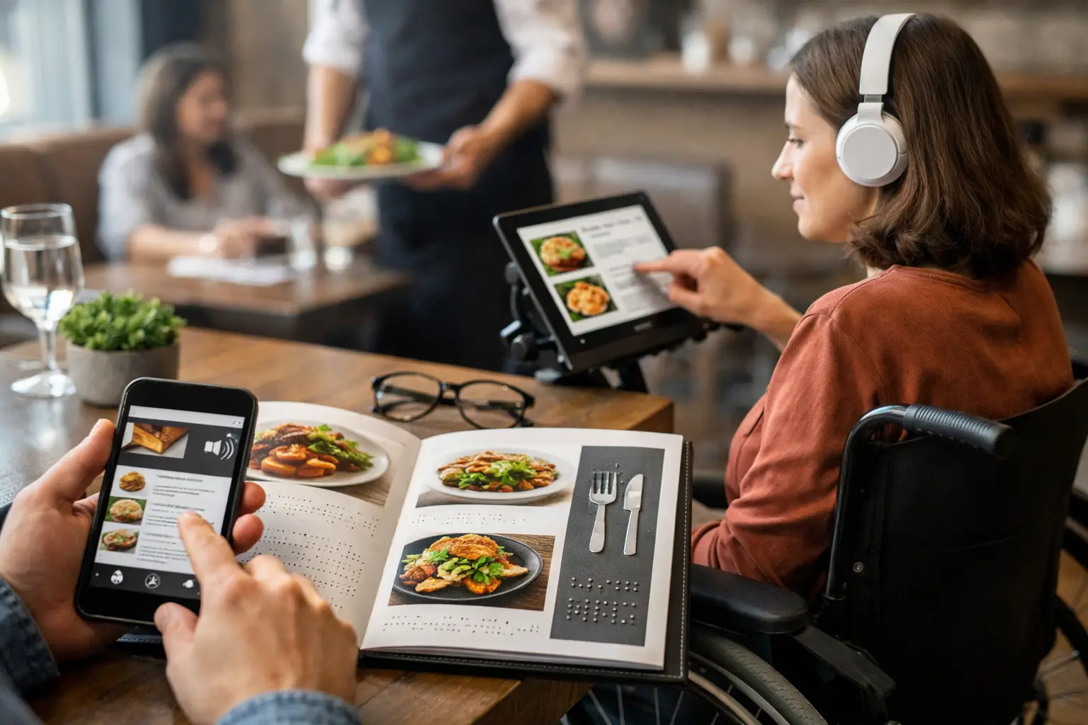
A menu can turn a simple dinner plan into a high-pressure guessing game. When the description is vague, the type is tiny, the ordering flow is confusing, or a dish has no image, diners are asked to spend money before they have the information they need. The most meaningful trends in accessible menu design are changing that. They treat clarity as a basic part of hospitality, not an optional design upgrade.
For mobile-first diners, accessibility is also practical. It means fewer disappointing orders, less time decoding ingredients, and more confidence choosing something that fits their preferences, needs, and budget. For restaurants, it means serving more people well.
Accessible Menu Design Is Becoming More Human
Accessible menus used to be discussed mainly in terms of compliance. Compliance matters, but it is only the starting point. A menu can technically meet a requirement and still leave people confused, excluded, or exhausted by too many unclear choices.
The stronger shift is toward human-centered design. Restaurants and food platforms are asking a better question: can someone understand this item, picture it, compare it, and order it without extra stress?
That question includes people who use screen readers, have low vision, or need larger text and better contrast. It also includes diners managing allergies, sensory preferences, language barriers, or decision fatigue. A parent ordering quickly between appointments and a customer using assistive technology may have different needs, but both benefit from a menu that communicates clearly.
Plain language is replacing menu mystery
Creative dish names can give a restaurant personality. They should not force guests to solve a puzzle before they order. More menus are pairing memorable names with plain descriptions that explain what arrives at the table.
Instead of listing only “The Garden,” a clearer menu might say “The Garden – roasted seasonal vegetables, herbed rice, chickpeas, and lemon tahini.” That small addition helps diners understand the main ingredients, texture, and overall format of the meal.
The best descriptions answer the questions people actually have: What is it? What is it served with? Is it spicy, rich, crispy, creamy, or light? Is the portion meant for one person or for sharing? Plain language does not make a menu boring. It makes the restaurant’s food easier to choose with confidence.
Allergen and dietary information is moving closer to the decision
Diners should not have to hunt for a separate PDF, call the restaurant, or guess whether a sauce contains dairy. Clear allergen and dietary details are becoming a core part of accessible menu design, especially in digital ordering.
Useful labels are specific without being overloaded. Vegetarian, vegan, gluten-conscious, nut-containing, dairy-containing, spicy, and halal-friendly indicators can help people narrow choices quickly. But labels need care. “Gluten-free” and “gluten-friendly” are not interchangeable, particularly where cross-contact is possible. Restaurants earn trust when they use precise language and explain limits clearly.
There is a trade-off here: too many tiny icons can create visual clutter, while too little information creates uncertainty. The answer is a clean structure with visible top-level labels and easy-to-find details for diners who need them.
Real Food Photos Are Becoming Essential Menu Information
A written description can tell a diner that a sandwich comes with pickles, aioli, and fries. It cannot always show how tall it is, how heavily it is sauced, whether the fries are seasoned, or how the plate is portioned. That is why accurate imagery is becoming one of the most useful trends in accessible menu design.
For people with decision fatigue, a real photo reduces the mental work of translating words into an imagined meal. For diners with visual impairments, imagery should always be supported by meaningful text descriptions and compatible screen-reader experiences. Photos are not a replacement for accessible text. They are another layer of information that helps many people make a more informed choice.
Authenticity matters more than perfect styling
Restaurant marketing photography can look beautiful, but it can also create a gap between expectation and reality. Diners want to know what their actual order is likely to look like, not just what it looks like under studio lights.
That is creating more space for authentic, community-contributed meal photos. A well-lit photo from a real diner can reveal scale, presentation, toppings, and sides in a way a polished hero image may not. It can also show variation, which is useful when a dish changes by location, season, or customization.
Accuracy needs guardrails. Old photos, mislabeled dishes, and images that do not match the current menu can cause more confusion than no photo at all. The most helpful visual menu experiences connect pictures to the exact item, encourage recent contributions, and make room for diners to flag mismatches.
Pic-ture That!™ is built around this idea: seeing real restaurant meals before ordering can make dining more transparent, accessible, and less stressful. Community photos turn a personal meal into useful information for the next person deciding what to order.
Image descriptions need to do real work
If a menu includes photos, the image description should not simply repeat “photo of food.” It should add useful context. A description such as “two grilled chicken tacos topped with cabbage slaw and crema, served with black beans on a white plate” gives a screen-reader user a clearer sense of the item.
Good descriptions are brief, factual, and focused on what helps a person decide. They do not need to describe every garnish. They should communicate the food, its visible components, and its presentation when that presentation affects expectations.
Digital Menus Are Giving Diners More Control
QR menus and ordering apps changed restaurant access quickly, but early versions often introduced new barriers. A QR code that leads to a slow, cluttered, low-contrast page is not an accessible solution. Neither is a digital menu that cannot be navigated with a keyboard or read properly by assistive technology.
The next phase is about control. Diners increasingly expect to adjust text size, use clear filters, search by ingredient, save favorites, and move through a menu without fighting pop-ups or endless scrolling. These features are helpful for accessibility, but they are also just better mobile design.
Filters should reduce effort, not hide choices
Smart filters can help diners find vegetarian entrées, mild options, dairy-free dishes, or items under a certain price. The key is to keep filtering transparent. A user should be able to see what is being excluded and remove a filter easily.
Restaurants should avoid making filters too rigid. A dish may be adaptable even if it is not labeled vegan by default. Showing common modifications, such as “make it dairy-free without cheese,” gives diners more options while setting realistic expectations.
Readable design is part of the meal
High contrast, readable type, large tap targets, and clear headings can sound like small details. On a busy phone screen, they are the difference between an easy order and an abandoned cart.
A strong accessible menu does not rely on color alone to communicate key information. It uses words, icons with labels, and visual hierarchy together. It also avoids auto-playing videos, flashing elements, and countdown pressure that can distract or overwhelm diners.
The Best Menus Make Room for Questions
No menu can anticipate every need. The goal is not to pack every possible detail into one screen. The goal is to make the next step clear when a diner needs more information.
That might mean a straightforward way to ask about ingredients, a visible note about substitution policies, or a simple channel for reporting an inaccurate listing. It also means training staff to treat accessibility questions as normal service questions, not special requests that slow things down.
The restaurants and platforms getting this right are listening to the people who use their menus. Feedback from screen-reader users, people with food allergies, neurodivergent diners, and frequent mobile orderers reveals friction that internal teams can easily miss.
What Restaurants Can Prioritize Now
A full menu redesign is not always realistic, especially for independent restaurants. Start where uncertainty is highest: popular dishes, allergy-sensitive items, and the mobile ordering path. Add clear descriptions, verify dietary details, and make sure prices, modifiers, and checkout controls are easy to read and use.
Then look at the visual gap. If diners regularly ask what a dish looks like, that is a signal. Begin collecting accurate photos of your best-selling items and pair them with useful descriptions. Review them regularly as menus change.
Accessible design is not about making every menu look the same. It is about giving more people a fair shot at understanding the choices in front of them. When diners can see, read, hear, and navigate the information they need, ordering feels less like a risk and more like the enjoyable part of going out to eat.
Leave a Reply