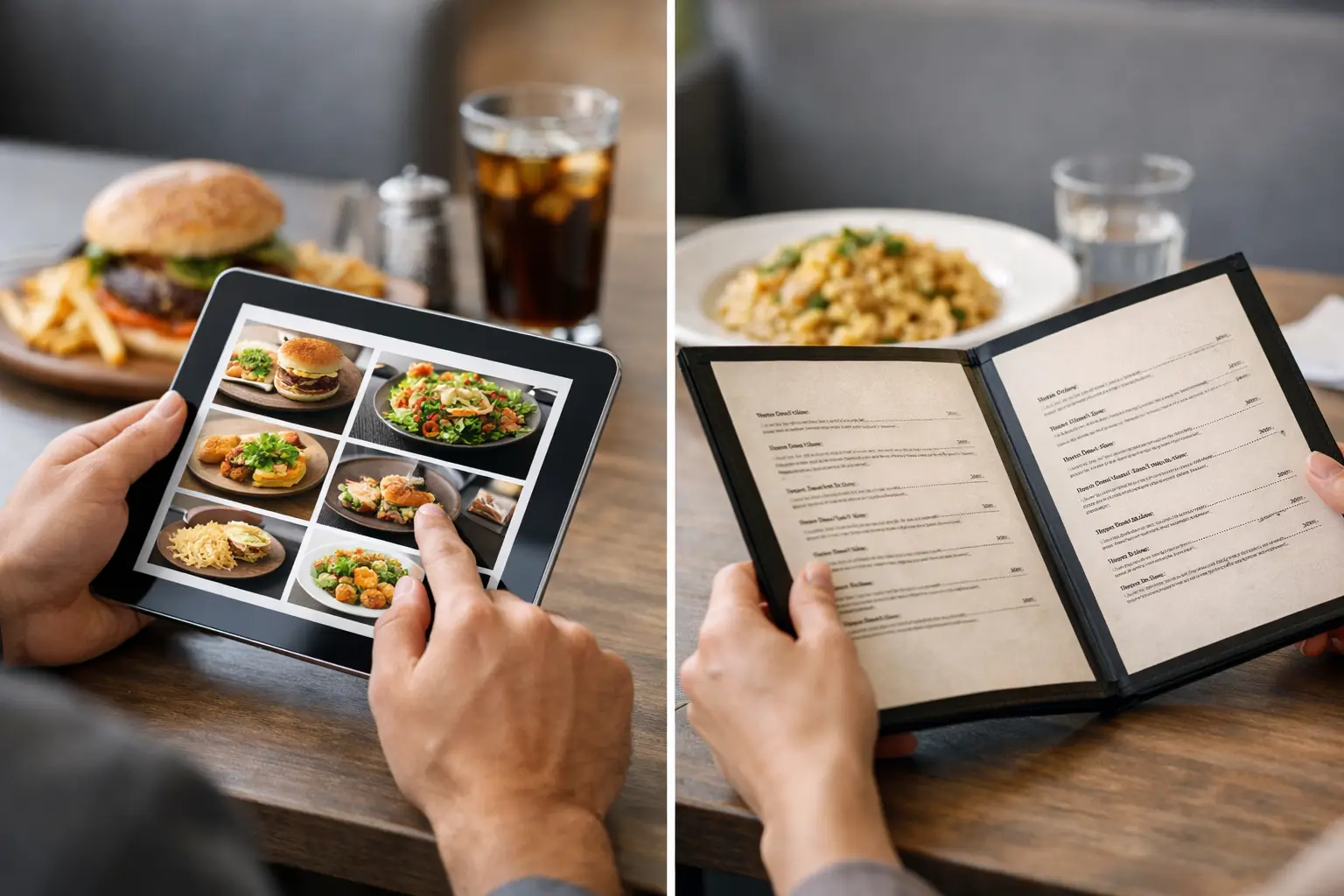
A menu says “crispy chicken sandwich,” but that can mean a thin filet on a plain bun, a towering sandwich covered in sauce, or something in between. When diners are spending $15, $25, or more on a meal, guesswork gets expensive. That is where visual ordering vs traditional menus becomes more than a design choice. It shapes confidence, accessibility, and whether people feel good about the order they just placed.
Text menus still have a job to do. They communicate ingredients, prices, dietary details, and restaurant personality quickly. But words alone leave major questions unanswered: How large is the portion? Is the sauce on top or served on the side? Does the dish look fresh, filling, and worth the price? For many diners, real photos close that gap.
What traditional menus do well
Traditional menus are efficient. A restaurant can list dozens of items in a compact format, update prices without a new photo shoot, and describe techniques or ingredients that are hard to capture in a single image. A well-written menu can create anticipation, too. “Charred corn, lime crema, cotija, and chili oil” tells a flavor story that a photo may not fully explain.
They are also familiar. People know how to scan categories, compare prices, and look for dietary markers. In a busy restaurant, a concise text menu can make ordering feel fast and straightforward.
Still, familiar does not always mean clear. Descriptions rely on shared assumptions. One person’s “spicy” is another person’s perfect level of heat. “Generous portion” can mean enough for leftovers or simply a plate with a lot of garnish. Even common dish names vary widely by restaurant and region.
That uncertainty is frustrating when a diner has allergies, a tight budget, sensory preferences, or simply no energy left for decoding a menu after a long day.
Visual ordering brings the decision closer to the meal
Visual ordering adds authentic dish images to the information diners already use. Instead of imagining a menu item, people can see what was actually served. That makes a difference before food is ordered, paid for, picked up, or delivered.
A real photo can show the size of a burger beside the fries, the amount of dressing on a salad, the texture of a curry, or whether a dessert is a shareable slice or a small plated bite. It helps diners spot the details that matter to them without trying to translate a few words into a mental picture.
This is especially useful for dishes with unfamiliar names. A person may know they enjoy noodles, but not know whether a particular restaurant’s dish is soup-like, dry, creamy, heavily garnished, or packed with ingredients they avoid. Seeing it first lowers the stakes of trying something new.
For mobile ordering, visuals can also reduce the back-and-forth that happens when people search photos elsewhere, scroll through old social posts, or text a friend asking, “Have you tried this?” The decision stays focused on the restaurant and the meal in front of them.
Visual ordering vs traditional menus is not an either-or choice
The strongest ordering experience is not a gallery with no context, and it is not a wall of text that asks diners to imagine every detail. It is both.
Photos answer “What will I get?” Text answers “What is in it?” A price answers “Can I afford it?” Dietary labels and ingredient information answer “Is it right for me?” Together, those details give diners a more complete basis for choosing.
A photo of pasta may look great, for example, but the menu description should still clarify whether it contains dairy, nuts, meat, or gluten. A photo cannot reliably communicate sodium, spice level, preparation methods, or every ingredient. It can support informed decisions, but it should never replace essential information.
The same goes for accuracy. Stock photography and overly edited promotional images can create a new kind of disappointment if the meal that arrives looks nothing like the image. Authentic, recent photos are more useful because they set realistic expectations. The goal is not to make every plate look perfect. The goal is to let people see what they are actually buying.
Accessibility means more than adding pictures
Food images can make menus easier to understand for people who process information visually, people facing decision fatigue, and diners who find dense text overwhelming. A clear image can reduce cognitive load and make choices feel less stressful.
But visual menus must be designed inclusively. For people with visual impairments, an image without meaningful description may add no value at all. Accessible visual ordering should include readable text, logical navigation, screen-reader-friendly labels, useful image descriptions, high color contrast, and controls that work without requiring precise gestures.
That is why accessibility cannot be treated as a decorative feature. Different diners need different paths to the same information. Someone may want to browse food photos first. Someone else may rely on a screen reader and need a detailed description of the dish, its ingredients, and its portion. Both should be able to order with confidence.
Restaurants and ordering platforms also need to avoid putting critical information inside an image. If a photo contains the only indication that a dish includes shellfish or is served with a spicy sauce, the experience excludes people who cannot access that visual detail. Important details belong in accessible text alongside the image.
The real value is fewer disappointing orders
Most people do not expect a menu to answer every question. They do expect it to help them avoid wasting money on food they will not enjoy. Visual ordering can help by making common sources of regret easier to spot before checkout.
Maybe the entrée is much smaller than expected. Maybe the “loaded” fries have ingredients a diner dislikes. Maybe the soup is thicker, creamier, or more heavily seasoned than the description suggested. Photos do not guarantee satisfaction, but they make the choice more grounded.
That matters for restaurants, too. Diners who know what to expect are more likely to feel satisfied with their purchase. Clear expectations can reduce avoidable complaints, awkward substitutions, and abandoned carts. It can also encourage exploration. A customer who would skip an unfamiliar dish based on its name may be willing to try it after seeing a real, appealing photo.
There is a trust benefit here. Restaurants do not need to overpromise when the food can speak for itself. Showing an honest plate signals respect for the customer’s time and budget.
Community photos can keep menus more useful
Restaurant menus change. Portions shift, plating evolves, seasonal items appear, and a dish may look different depending on location or time of day. That makes community-powered photo libraries especially valuable when they prioritize quality and accuracy.
Diners can help other diners make better choices by sharing clear, recent photos of the meals they ordered. The contribution is practical: it gives the next person a better sense of what to expect. It is also a way to make dining more transparent for people who have been left to guess.
That community layer needs standards. Photos should be connected to the correct restaurant and dish, avoid misleading filters, and respect the privacy of other guests. A blurry image in poor lighting is not always helpful, but it can still be more honest than a polished image that no longer reflects the food being served.
Pic-ture That!™ is built around that idea: real meal photos can turn uncertainty into a clearer, more inclusive ordering experience, while rewarding people who help grow the picture library.
When text may be enough
Not every order needs a photo. If someone is reordering a favorite, grabbing a familiar coffee, or choosing a simple item with a clear description, a traditional menu may be all they need. Restaurants with rapidly changing specials may also find it difficult to keep every image current.
Visual ordering works best where the decision carries more uncertainty: a first visit, an unfamiliar cuisine, a higher-priced entrée, a group order, a delivery meal, or a menu that uses creative names and limited descriptions. In those moments, an image is not extra decoration. It is decision support.
The next time a menu leaves you wondering what will actually arrive, do not settle for a guess. Look for a real view of the dish, read the details that matter, and choose the meal that feels right for you.
Leave a Reply