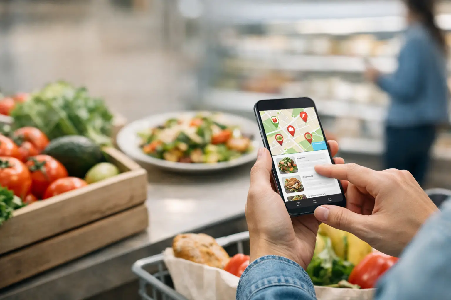
A menu can tell you a dish includes grilled chicken, roasted vegetables, and a citrus sauce. It cannot tell you whether the portion feels worth $22, whether the vegetables are the kind you love, or whether the sauce covers everything on the plate. For many diners, that gap is frustrating. For people with visual impairments, anxiety around unfamiliar foods, or decision fatigue, it can make ordering feel far less accessible than it should be.
A food accessibility app should close that gap with useful visual information, not more guesswork. Real photos of real meals give people a clearer way to choose what works for them before they spend their money.
Why Restaurant Menus Leave So Much Unsaid
Text-only menus ask diners to translate a few ingredients into a complete mental picture. Sometimes that is easy. A burger is familiar. But what happens when the menu says “market fish,” “chef’s seasonal bowl,” or “house-made pasta”? Portion size, texture, presentation, toppings, and side dishes can all be unclear.
That uncertainty is not a small thing. A disappointing order can mean wasted money, an uneaten meal, or the feeling that dining out requires more energy than it should. It can also mean repeatedly choosing the same safe option because trying something new feels like too much of a gamble.
Food photos are often treated as marketing. They are more than that. When they are accurate, current, and connected to the actual menu item, they are practical decision-making tools. They help diners compare options, set expectations, and feel more prepared to order.
Accessibility Is More Than Text Size
Restaurant accessibility is often discussed in terms of ramps, seating, or digital menu formatting. Those matters count. So does the ability to understand what you are ordering.
For a diner with low vision, a well-designed app can work with screen-reader-friendly labels and clear image descriptions to provide additional context beyond a menu’s short description. For a diner managing sensory preferences, photos can reveal whether a dish is heavily sauced, mixed together, served with unexpected garnishes, or built around ingredients they prefer to avoid.
Visual information also supports people who experience decision fatigue. A long menu can turn a simple lunch into a series of tiny, draining choices. Seeing a few real dish images can narrow the field quickly. Instead of decoding every description, diners can spot what appeals to them and read further only when needed.
No single image can answer every question, and photos should never replace clear ingredient details or allergy information. But visuals add a layer of clarity that menus have been missing.
What Makes a Food Accessibility App Truly Useful
A useful app is not just a gallery of polished restaurant photography. It should help people make a more confident choice in the moment, whether they are ordering pickup, sitting at a table, or deciding where to eat with friends.
Real photos beat vague expectations
The most valuable images show what diners actually receive. That means authentic portions, normal lighting, visible sides, and accurate plating. A picture does not need to be perfect to be helpful. In fact, overly staged images can create a different kind of disappointment if the served dish looks nothing like the photo.
Community-powered photos are especially useful because they build a more honest picture of a menu over time. One photo may show the basic presentation. Several can show reasonable variation in portioning, toppings, and preparation. That is transparency diners can use.
The dish needs clear context
A photo without a dish name can create another round of confusion. Every image should be tied to the restaurant, menu item, and relevant details that help a diner understand what they are seeing. Is that creamy-looking item a sauce or mashed potatoes? Is the bowl an appetizer or an entrée? Is the photo from the current menu?
Good organization matters, too. Diners should be able to find images by restaurant and browse dishes without sorting through unrelated content. The goal is not to keep people scrolling. The goal is to help them decide.
Inclusion needs to be built into the experience
A food accessibility app should consider how different people use visual content. Clear labels, meaningful alternative text, readable contrast, and simple navigation make the experience more useful for more diners. Images can be powerful, but they should not become a barrier for people who cannot fully access them.
The strongest product approach combines visual discovery with accessible supporting information. That is how a platform serves people with a range of needs instead of assuming every diner processes menus the same way.
Better Food Decisions Start Before Checkout
Most people have ordered something that looked better in their imagination than it did on the plate. Maybe the “loaded” fries arrived with barely any toppings. Maybe the salad was much smaller than expected. Maybe the dish contained a texture or ingredient that the description did not make clear.
Seeing a real image before ordering helps reduce those surprises. It can answer practical questions quickly: Does this entrée come with rice? Is the sandwich open-faced? Are the vegetables roasted or raw? Does the dessert look shareable?
This does not mean every choice becomes risk-free. Restaurant kitchens vary, menus change, and photos may not capture taste, temperature, or freshness. Diners should still check descriptions, ask questions, and flag allergies directly with the restaurant. But better information means fewer blind decisions.
That confidence matters when money is tight, time is short, or a person is ordering for a group with different preferences. It also makes trying a new place feel more possible. When you can see what is on the table, an unfamiliar menu becomes easier to approach.
Community Photos Create More Transparent Menus
Restaurants update menus constantly, and it would be hard for any single business to photograph every dish at every location. That is where community participation changes the equation.
Diners already take food photos when a meal catches their eye. A platform can turn that everyday habit into something useful by helping those images become searchable menu context for the next person. The contribution is small, but the effect grows as more people add photos across more restaurants and dishes.
There is a responsibility here. Community content works best when it is handled with care. Images should be reviewed for relevance, matched to the right item, and presented in a way that respects restaurants while serving diners honestly. A blurry photo can still be useful if it clearly shows portion size, but a mislabeled photo can lead someone in the wrong direction.
Rewards can also make participation feel worthwhile. Pic-ture That!™ invites diners to contribute meal photos and earn restaurant gift cards, creating a practical give-and-get cycle. You help someone else see their options more clearly, and your next dining experience may come with a little extra value.
How to Use Food Photos Without Losing the Joy of Dining
Food discovery should make choices easier, not turn every meal into research. A quick look at a few dishes may be all you need to avoid an order you will regret. Start with the items you are already considering, then use photos to compare portion, presentation, and ingredients.
If you have a specific need, use images as one part of your decision. A photo may help you notice a likely concern, but it cannot guarantee how a kitchen handles cross-contact, substitutions, spice level, or individual requests. When those details matter, confirm them with the restaurant.
There is also room for surprise. Not every meal has to be pre-approved by a picture. The point is choice. Some diners want a familiar, predictable order. Others want the confidence to try something new. Both deserve better tools than a vague line of menu text.
The next time a menu leaves you wondering what will actually arrive at your table, look for a real view of the dish. One clear photo can turn uncertainty into a choice that feels like your own.
Leave a Reply