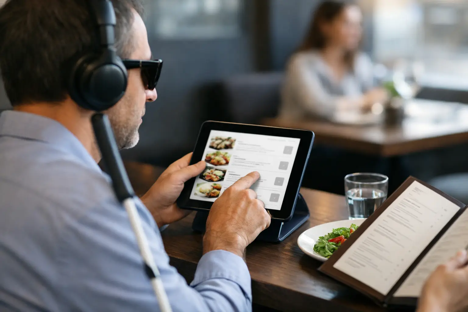
A restaurant menu should help you choose a meal, not make you work for one. Yet tiny type, vague descriptions, cluttered ordering screens, and missing photos can turn a simple dinner decision into a frustrating guessing game. This guide to accessible menu browsing is for anyone who wants more clarity before spending money, whether you use a screen reader, experience decision fatigue, manage food allergies, or simply want to know what your meal will actually look like.
What Accessible Menu Browsing Should Feel Like
Accessible menu browsing is about being able to find, understand, and compare dishes in a way that works for you. It is not one feature or one type of diner. A person with low vision may need readable text and useful image descriptions. Someone who is overwhelmed by too many choices may need simple categories and clear portion details. A diner with dietary restrictions needs ingredient information they can trust.
The common thread is confidence. You should be able to answer a few basic questions before you order: What is this dish? What comes with it? How large is it? How is it prepared? Does it fit my needs? And, when a photo is available, does it look like something I actually want to eat?
Restaurants do not always provide every answer. That is why it helps to approach menus with a few practical habits and use more than one source of information when needed.
Start With Your Own Decision Criteria
Before opening a delivery app or scanning a QR code at the table, know what matters most for this meal. Maybe you are looking for something filling under a certain price, a dish without a specific allergen, or a meal that feels familiar after a long day. These priorities give you a filter when the menu gets noisy.
For decision fatigue, narrow the field early. Choose a category first, such as bowls, sandwiches, or pasta, rather than reading every item in order. Then compare just two or three options based on the details that matter to you. More choices do not always create more freedom. Sometimes they create more stress.
If you have accessibility or dietary needs, keep a short note on your phone with your go-to questions. For example: Is the sauce included? Can the topping be removed? Is the entrée spicy? Is there a gluten-free preparation method? Having the wording ready makes it easier to get a direct answer from restaurant staff.
Make the Menu Easier to Read
A digital menu can be more flexible than a printed one, but only if you use the tools available to you. Increase text size instead of straining through small type. Use your device’s zoom, display settings, or screen reader controls when an ordering page does not present information clearly. If the menu is a PDF, try viewing it in a reader that lets you enlarge text and move through sections more comfortably.
Color alone should never be the only way to communicate information. A red icon for spicy food or a green icon for vegetarian food can be helpful, but the label should also be written out. The same goes for allergen symbols. If an icon is unclear, ask before ordering rather than making an assumption.
Look for descriptions that answer real questions
The most useful descriptions name the core ingredients, cooking method, portion cues, and major add-ons. “House special chicken” may sound appealing, but it leaves a lot unanswered. “Grilled chicken thigh with rice, roasted vegetables, and a garlic herb sauce” gives you something concrete to assess.
When details are missing, look for patterns elsewhere on the menu. If every entrée includes a side, the restaurant may list those choices in a separate section. If multiple dishes use the same sauce or protein, one fuller description may clarify another. This is not a perfect substitute for clear menus, but it can reduce the guesswork.
Use Photos as Information, Not Just Inspiration
Food photos can do more than make a dish look tempting. An authentic image can show portion size, plating style, ingredient balance, texture, sauce level, and whether a meal matches the description in your head. That is especially valuable when the written menu uses unfamiliar terms or broad labels.
Still, photos have limits. A polished promotional image may not show the standard portion, available substitutions, or what arrives after a long delivery trip. Lighting can change color, and a photo cannot confirm ingredients or food safety. Treat images as one useful piece of evidence, then pair them with the written description and any questions you need to ask.
For diners who are blind or have low vision, images need meaningful descriptions to be useful. “Photo of food” does not help much. A helpful description might identify the dish, its visible components, container or plate size, and how it is presented. Good visual access means providing context, not simply attaching an image.
Pic-ture That!™ is built around this idea: real meal photos can reduce uncertainty when they are accurate, community-powered, and connected to the dish someone is considering. Seeing what other diners received can make a menu feel far less abstract.
A Guide to Accessible Menu Browsing Before You Order
Once you have found a likely dish, pause for a quick confidence check. Read the full description rather than the item name alone. Confirm the price and whether sides, protein choices, or sauces cost extra. Check whether modifications are allowed, and make sure your selected changes appear in the final cart before payment.
This step matters because restaurant ordering systems can hide important choices behind small buttons, drop-down menus, or default selections. A side of fries, a spicy sauce, or a paid add-on may be preselected. If a screen reader announces controls unclearly or the app does not show your choices in plain language, consider calling the restaurant directly. A short conversation can be more accessible than fighting a confusing checkout flow.
For allergy-related needs, be specific and realistic. A menu label such as “nut-free” may describe ingredients but not cross-contact procedures. Ask whether the kitchen can accommodate your need, and decide based on the answer. Accessible browsing supports informed choices, but it should never pressure anyone to take a risk they are not comfortable taking.
At the Restaurant, Ask for the Format You Need
QR-only menus can create barriers when phones are low on battery, internet service is weak, or the page is difficult to navigate. You can ask for a printed menu, a staff member to read options aloud, or a clear explanation of a category you are considering. These are reasonable requests, not inconveniences.
Be direct about the information you need. Instead of asking, “What is good?” try, “Which chicken dish is mild, comes with vegetables, and has the sauce on the side?” Specific questions usually lead to useful answers. If you are choosing between two dishes, ask staff to compare portion size, spice level, or preparation.
If you are dining with friends, give yourself permission to take the time you need. Fast ordering culture can make people feel rushed, but a confident choice is worth an extra minute.
Help Build Menus That Work for More People
Accessible dining gets better when diners share useful information. If you upload a meal photo, aim for clarity over perfection. Show the full plate when possible, use natural lighting, and make sure the photo matches the item name. A quick note about portion size, visible ingredients, or a successful modification can help another person decide with less stress.
Authenticity matters here. A slightly imperfect photo of the actual meal can be more valuable than a heavily edited image that sets the wrong expectation. Community contributions make room for more menu coverage, more perspectives, and more people who need a better way to choose.
The next time a menu leaves you guessing, look for the details that turn a name on a screen into a real meal. Clear information is not a luxury. It is how more people get to order with confidence, enjoy what arrives, and feel included at the table.
Leave a Reply