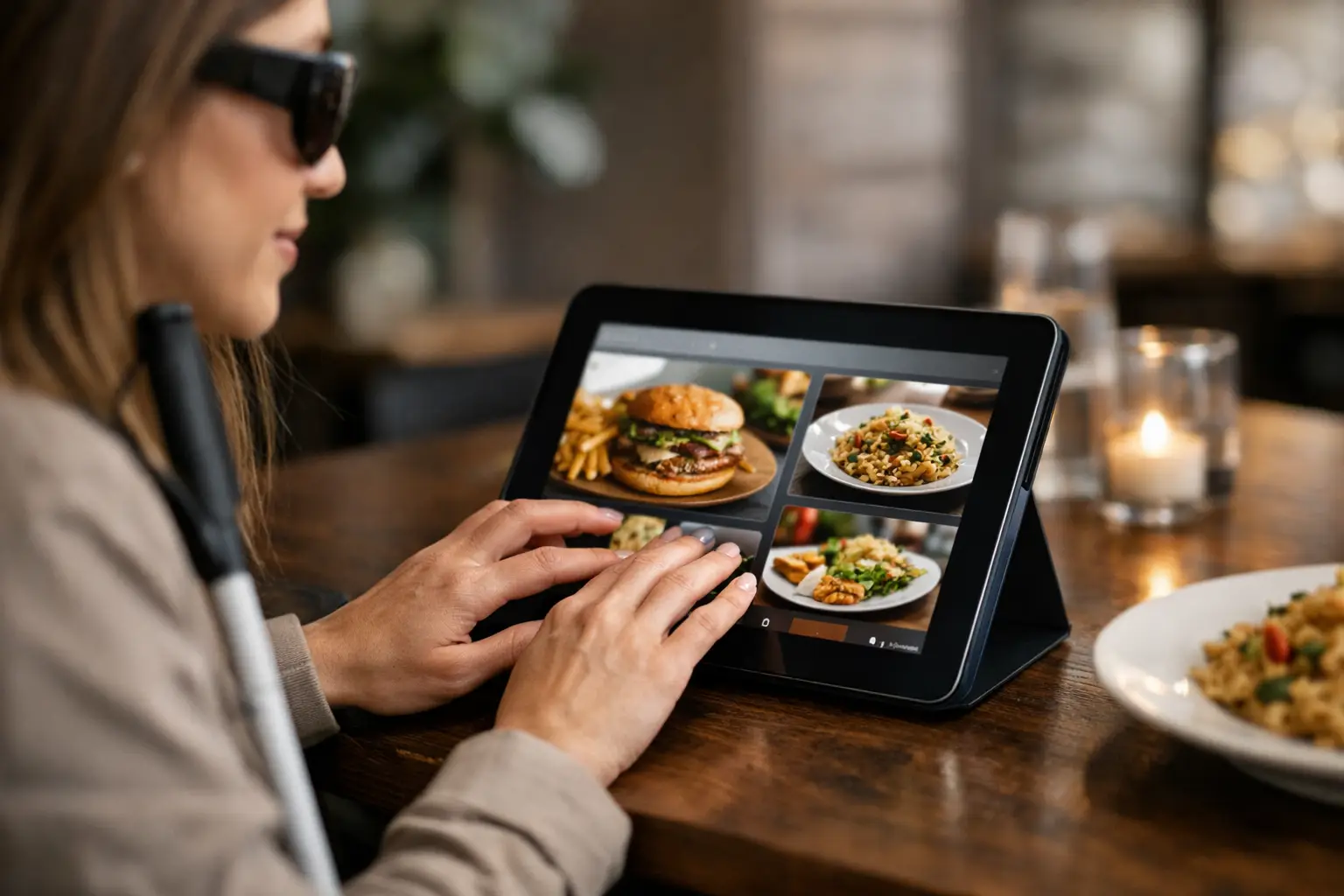
A menu can tell you a dish has grilled chicken, cilantro rice, salsa verde, and queso fresco. But are restaurant menu photos accessible when a diner needs more than a list of ingredients to decide? Not automatically. A food photo can build confidence and reduce the guesswork of ordering, but only when people can find it, view it clearly, understand it, and trust that it represents what will arrive at the table.
That distinction matters. For many diners, a visual menu is not a bonus feature. It is a practical tool for choosing food with greater certainty, whether they have low vision, use a screen reader, manage decision fatigue, follow dietary preferences, or simply do not want to spend money on a meal that looks nothing like they expected.
Are Restaurant Menu Photos Accessible?
Restaurant menu photos can be accessible, but a photo by itself is not accessibility. An image without a meaningful description is invisible to a screen-reader user. A tiny photo that cannot be enlarged may not help someone with low vision. A heavily filtered marketing shot may be technically visible, yet still fail the diner who needs an honest sense of portion size, texture, toppings, or presentation.
Accessibility is about whether a person can use the information to make a decision. The same principle applies to menu photography. If the photo helps one person but creates another barrier for someone else, the experience is incomplete.
For blind and low-vision diners, useful food imagery needs strong text support. That means image descriptions that explain what is actually shown, not vague labels such as “food photo” or a copied menu name. A helpful description might identify the dish, its key visible components, how it is plated, and relevant details such as sauces on the side, a breaded coating, or toppings that are easy to miss in a written menu.
For diners with low vision, usability also depends on image size, zoom controls, readable nearby text, clear contrast, and a layout that works without precision tapping. A beautiful photo squeezed into a thumbnail is not doing much work. Neither is a menu that forces users to pinch, scroll sideways, or hunt through an image gallery disconnected from dish names and prices.
For people who experience decision fatigue, accessible photos create a different kind of relief. They turn an abstract list of choices into faster, more concrete comparisons. Is the salad a full meal or a side? Does the burrito come smothered in sauce? Is the dessert a single slice or something meant for sharing? Seeing the answer can reduce the mental load of ordering.
A Photo Should Add Clarity, Not Create More Guesswork
The best restaurant photos answer real questions a diner has before they order. They show what the meal usually looks like, not just what it looked like under a studio light on opening day. Authenticity is part of accessibility because it helps people act on the information in front of them.
That does not mean every image must be professionally styled. In fact, community photos often provide the details polished marketing images leave out: the actual takeout container, the side dishes, the approximate portion, the amount of sauce, or what happens when a menu item is customized. A well-lit phone photo from a real meal can be more useful than a perfect promotional image when it is accurately labeled.
There is a trade-off. User-generated images can vary in lighting, angle, and quality. They may show an older version of the dish or a personal modification that is not standard. The solution is not to reject community photos. It is to give them context. Clear labels can distinguish a restaurant-provided image from a diner photo, identify the specific menu item, and note visible changes such as “no onions” or “extra avocado.”
Photos should never replace written menu information. A diner still needs ingredients, allergen guidance where available, price, dietary labels, and options for customization. Images work best alongside those details, helping customers form a fuller picture before placing an order.
Making Restaurant Menu Photos Accessible
Accessible menu photos start with the basics, but the basics need to be done well. Every image should be connected to the correct dish name and include a descriptive alternative text field that is available to assistive technology. Descriptions should be specific, plainspoken, and useful.
Compare “A delicious pasta dish” with “Spaghetti in red marinara sauce topped with three meatballs and grated Parmesan, served in a shallow white bowl.” The second description gives a diner something they can use. It does not oversell. It simply shows the meal in words.
Descriptions do not need to catalog every speck of seasoning. Focus on what changes a decision: ingredients that are visible, the dish format, toppings, sides, portion cues, and presentation. If a burger comes open-faced with fries, say so. If the rice bowl has a runny egg on top, say so. If the drink is a bright blue frozen beverage in a tall glass, say so.
The visual design matters, too. Photos should be large enough to inspect, with an obvious way to zoom. Their labels should remain readable at larger text settings. The ordering path should work with keyboard navigation and screen readers, and it should not require a diner to interpret text baked into an image. If text appears in a photo, such as a callout about spice level or a limited-time offer, that information should also exist as real text on the page or app screen.
Consistency helps people move quickly. When every dish image appears in the same place, uses a similar crop, and stays paired with its description, diners do not have to relearn the menu as they browse. A predictable experience is especially valuable when someone is hungry, rushed, tired, or juggling several access needs at once.
Accuracy Needs Ongoing Attention
A photo is only useful if it still represents the item being sold. Restaurants change plates, portions, garnishes, recipes, and packaging. Seasonal menus rotate. Delivery versions may look different from dine-in versions. Keeping images current takes effort, but outdated photos can damage trust faster than having no photo at all.
A smart approach is to treat food photos as living menu information. Let diners flag mismatches, encourage restaurants to update changed items, and make it easy to add current photos when a new dish launches. When several community images show the same item, diners gain a more realistic view of natural variation instead of relying on a single idealized shot.
This is where a community-powered model can make a meaningful difference. Platforms like Pic-ture That!™ invite diners to contribute real meal photos, helping build a fuller visual record of what restaurants serve. When contributions are tied to clear dish labels and thoughtful accessibility practices, they can support more informed choices for everyone.
What Diners Can Look For Right Now
Until visual menus become more consistent, diners can use a few practical signals to decide whether a restaurant’s photos are likely to help. Look for images that are attached to named menu items rather than a general gallery. Check whether the photo shows the full meal, including sides and containers when relevant. Read the menu description alongside the image, especially for ingredients, allergens, and modifications that a photo cannot confirm.
If you use a screen reader and encounter an unlabeled image, that is valuable feedback for the restaurant or ordering platform. A short, specific message can help: “The menu image for the chicken sandwich has no description. Please add alt text describing the sandwich, toppings, and side.” It identifies the barrier and gives a practical next step.
If you are sharing your own meal photos, aim for clarity over perfection. Capture the full dish in decent light, avoid covering it with filters or text, and label the exact item. Mention modifications in the caption when they change the appearance. Those small details can save another diner from an uncertain order.
Food should not be a guessing game reserved for people who can interpret every menu format with ease. The next time you photograph a great meal or notice an unlabeled menu image, think about the decision on the other side of the screen. A clearer picture, paired with clearer words, can help someone order with confidence.
Leave a Reply