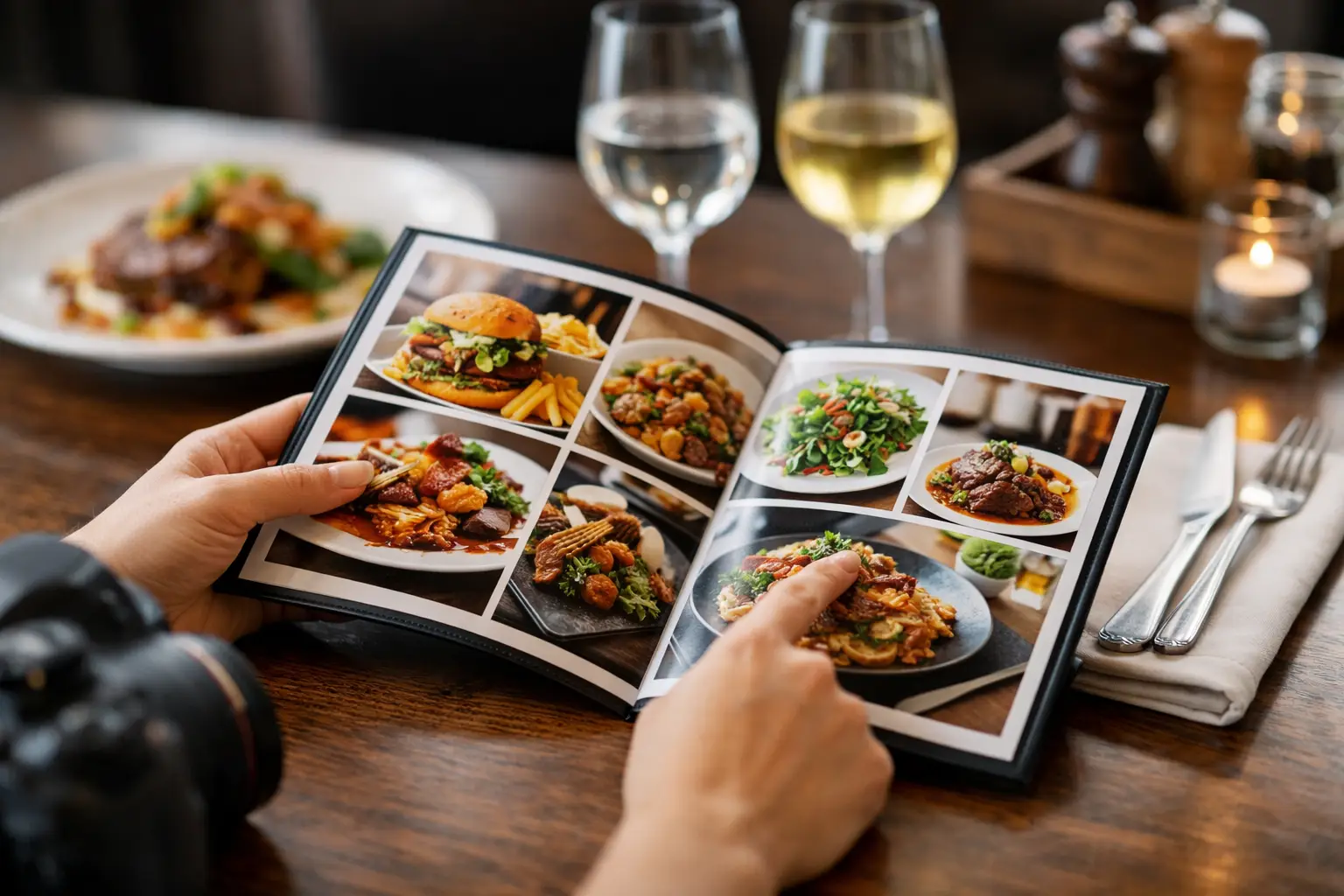
A menu says “crispy,” “loaded,” or “house favorite.” Then your order shows up looking nothing like the description you built in your head. That gap is exactly why a guide to restaurant menu photos matters. Good food photos do more than make dishes look appealing – they help people order with confidence, compare options faster, and avoid the frustration of spending money on the wrong meal.
For a lot of diners, this is about convenience. For others, it is about access. If you live with low vision, decision fatigue, sensory preferences, or dietary caution, seeing the actual dish before you order can change the whole experience. A better photo is not just a marketing extra. It is useful information.
Why a guide to restaurant menu photos matters
Restaurant menus have leaned on text for a long time. That works up to a point, but words leave room for guesswork. Is the pasta portion small or huge? Does the sandwich come stacked high or neatly pressed? Is the sauce spread across the plate or served on the side? Those details shape what people choose, and they are hard to judge from copy alone.
Photos reduce uncertainty. They help people understand portion size, plating, ingredients, texture, and presentation at a glance. That is especially helpful when a menu uses vague language, unfamiliar dish names, or inconsistent descriptions. A strong visual can answer questions in seconds that a paragraph still might not resolve.
There is also a trust factor. Diners are getting smarter about staged food photography. If every image looks overly edited, tiny details disappear, and colors seem exaggerated, people start to wonder what the real plate looks like. The best menu photos are not always the glossiest. Often, they are the clearest and most honest.
What makes restaurant menu photos actually useful
A useful photo is accurate first and attractive second. That order matters. If an image wins attention but misrepresents the dish, it sets the diner up for disappointment.
The strongest menu photos show a dish in realistic lighting with visible ingredients and true-to-life color. You should be able to tell whether the fries are thin or thick, whether the ramen broth is creamy or clear, whether the salad is heavily dressed or lightly finished. Small clues matter because they shape expectations.
Angle matters too. Overhead shots work well for pizzas, grain bowls, and spreads where the full composition matters. Slightly angled shots tend to work better for burgers, stacked sandwiches, pancakes, and layered desserts because height is part of the appeal. A close crop can highlight texture, but if it is too tight, diners lose context on portion size and sides.
Authenticity is another big piece. A photo taken in a real restaurant setting can be more useful than a polished studio image if it better reflects what the diner will actually receive. There is a trade-off here. Studio photography can be cleaner and easier to scan, while real-world images can offer better transparency. The right choice depends on the goal. If the purpose is helping people decide what to order, realism usually wins.
The difference between marketing photos and decision-making photos
Not every food image serves the same purpose. Restaurants often use hero images to sell a brand feeling – rich lighting, perfect styling, dramatic steam, and a carefully controlled background. Those photos can work for ads and homepage banners, but they are not always the best tool for menu decision-making.
Decision-making photos should answer practical questions. What comes with the entree? How much sauce is there? Is the taco stuffed full or lightly filled? Does the drink arrive in a tall glass, a can, or a bottle? These are the details diners look for when they are choosing between two similar options.
That is why community-powered image libraries matter. When real diners share what they actually received, the photo becomes less about selling a fantasy and more about giving the next person confidence. That kind of transparency helps everyone, especially people who need clearer visual cues before ordering.
A good guide to restaurant menu photos starts with accessibility
Accessibility should not be treated like an afterthought in food discovery. For many users, restaurant photos are part of making menus easier to understand. Visual access supports more independent decisions, especially when menu wording is unclear or inconsistent.
At the same time, photos alone are not enough. Images work best when they are paired with clear dish names and simple descriptions. A diner with low vision may rely on zoom, screen magnification, or image context, while another person may use photos to reduce the mental load of comparing multiple similar items. Different people use visual information differently.
That means the best menu-photo experience is built around clarity, not clutter. Images should load cleanly, stay consistent in format, and focus on the food instead of decorative backgrounds or heavy filters. If the goal is informed choice, then accessibility and transparency should shape how images are selected and displayed.
What diners should look for when judging menu photos
When you are deciding whether a restaurant photo is helpful, ask a few basic questions. Does the image look like a real serving, or does it feel overly styled? Can you clearly identify the main ingredients? Is there enough context to understand the portion? Does the photo match the written menu item, or does it leave you guessing?
If the answer is no, the image may still be attractive, but it is not doing the job diners need it to do. This is especially common with combo meals, customizable dishes, and regional items that vary by location. One photo can be misleading if it shows add-ons or upgrades that are not standard.
Photos are also less reliable for items that change often. Daily specials, seasonal bowls, and rotating desserts may look different each visit. In those cases, a photo is still helpful, but it should be treated as a general reference rather than a guarantee.
Why user-generated photos are changing the standard
The old standard for restaurant visuals was controlled perfection. The new standard is useful honesty. That shift matters because people are tired of guessing. They want to know what they are paying for before they tap order.
User-generated photos help fill gaps that restaurants often leave open. A menu may include one image for a category but not for every dish. A diner photo can show the exact plate, sides, packaging, or presentation in normal conditions. That creates a fuller picture of the menu over time.
There are trade-offs, of course. Community photos can vary in quality. Some are dim, rushed, or framed poorly. But even then, a slightly imperfect real photo may be more informative than a heavily styled promotional one. The sweet spot is a platform that encourages clear, authentic uploads and rewards people for contributing useful images.
That is part of what makes Pic-ture That!™ feel timely. It treats food photos as a tool for confidence and dining equity, not just visual decoration. That distinction is a big deal for users who want fewer surprises and better information before they spend.
How restaurants and platforms can do this better
If the goal is a better menu experience, more photos alone will not solve it. The right photos have to be organized in a way that supports decision-making. That means matching each image to the correct dish, keeping visuals current, and avoiding misleading edits.
Consistency helps a lot. When images follow a similar style, diners can compare dishes more easily. When platforms allow multiple photos per item, users get a better sense of what is standard and what varies. One clean image may be enough for a simple dish, but more complex items often benefit from a second angle or a real-world customer photo.
Context also matters. A plate photographed next to a drink, utensil, or takeout container can quietly communicate scale. That is often more helpful than trying to guess portion size from a tightly cropped image. The trick is balance. Too much background becomes distracting, while too little can make every dish look oddly abstract.
The future of menu transparency is visual
Restaurant discovery is moving toward clearer, more visual decision-making because that is how people actually choose. They compare, scan, hesitate, and look for reassurance. A strong image answers uncertainty fast.
That does not mean every photo has to be perfect. It means every photo should be useful. Accurate color, visible texture, realistic portions, and honest presentation go further than dramatic styling ever will when someone is trying to decide what to eat.
The best guide to restaurant menu photos is simple: show the food clearly, show it honestly, and make it easier for people to choose what works for them. When restaurants and communities do that well, ordering becomes less stressful, more accessible, and a lot more satisfying.
Next time you look at a menu, pay attention to which photos actually help you decide. Those are the images worth building around.
Leave a Reply