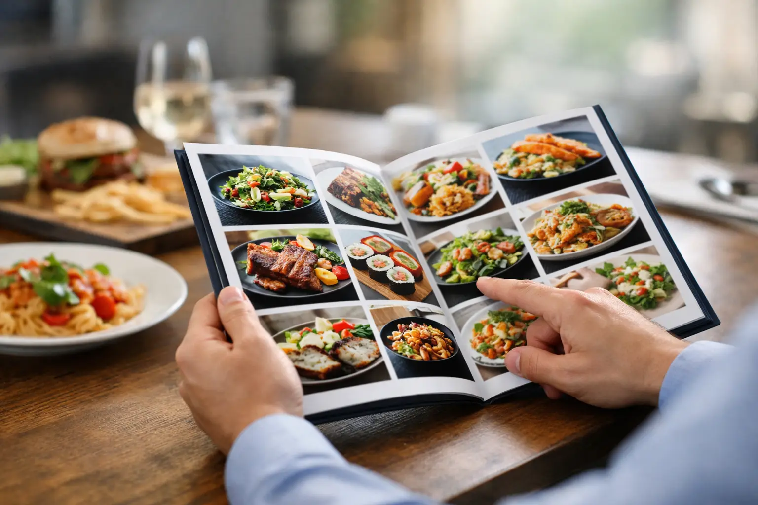
You know the feeling: a menu sounds great, you order fast, and then a plate shows up that is way heavier, smaller, messier, or stranger than you expected. That gap is exactly why learning how to choose dishes visually matters. When you can actually see a dish before you buy it, you make better decisions, waste less money, and walk into the meal with more confidence.
For some people, that confidence is just convenient. For others, it is an accessibility issue. Text-only menus can leave too much room for guessing, especially when dish names are vague, descriptions are incomplete, or decision fatigue kicks in after the third “crispy,” “loaded,” or “chef-inspired” option. Visual context helps close that gap.
Why visual choice beats menu guesswork
A menu description tells you ingredients. A real photo tells you proportion, texture, color, layering, and whether the dish looks like something you actually want to eat. That difference sounds small until you are deciding between spending $18 on a salad that is mostly greens or $18 on a bowl that actually looks filling.
Choosing visually is also more honest. Restaurant descriptions are written to sell. Photos, especially authentic ones from real diners, often show what arrives on the table without the polish. That is useful. You are not just asking, “What is in this?” You are asking, “What am I really getting?”
This matters even more if you have specific needs. Maybe you avoid certain textures. Maybe you want to know whether a sandwich is stacked so high it is impossible to eat neatly. Maybe low lighting, tiny font menus, or vague descriptions make ordering stressful. Visual information reduces friction. It makes dining feel more accessible, not more complicated.
How to choose dishes visually without overthinking it
The goal is not to inspect every meal like a food critic. It is to build a fast, practical filter. When you look at a dish photo, start by asking whether it matches the kind of meal you actually want right now.
That means looking beyond whether the food is “pretty.” A photogenic plate is not always the right order. A glossy sauce and perfect garnish can distract from what matters more, like portion size, balance, or whether the dish looks too rich for lunch. Instead of judging the styling first, judge the eating experience.
Start with portion reality
One of the biggest advantages of visual ordering is portion awareness. Descriptions rarely tell you whether a pasta is an appetizer-sized swirl or a dinner-sized bowl. Photos can.
Look for scale clues. A burger next to fries, a taco beside a lime wedge, or a bowl in relation to the table can tell you a lot. If every photo of the dish looks small, that is a signal. If it looks oversized and heavy, that is also useful. Neither is bad by itself. It depends on whether you want a quick bite, a shareable plate, or a full meal.
Check texture, not just ingredients
Menus often flatten texture into generic words like crispy, creamy, or tender. Photos give you better clues. Is the breading thick or light? Does the pasta look silky or dry? Are the vegetables fresh and crisp or soft and overcooked?
This is where visual choice becomes surprisingly personal. Two dishes with nearly identical ingredients can feel completely different because of texture. If you are sensitive to mushy foods, overly sauced meals, or mixed textures, a good image can save you from an order you will regret halfway through.
Look at the build of the dish
A dish is more than its parts. It is also how those parts come together. Are toppings piled on top where they stay crisp, or buried under sauce where they turn soggy? Is a grain bowl actually balanced, or is it mostly rice with three small toppings? Does the protein look like the star, or like an afterthought?
Build matters because it affects both flavor and function. A sandwich can sound perfect on paper and still be impossible to eat cleanly. Nachos can look generous until you realize only the top layer has toppings. A dish photo often reveals these practical details instantly.
What good food photos should tell you
If you are trying to figure out how to choose dishes visually, not all photos are equally helpful. The best ones are clear, realistic, and show the dish from an angle that reveals shape and volume. You should be able to answer simple questions within seconds: What is the main item? How much food is there? What looks crispy, soft, saucy, or stacked? Does it resemble the menu description?
The most useful photos are usually the least theatrical. Real lighting, real plating, and real table context make a dish easier to judge. Overedited images can hide portion issues, exaggerate color, or make a dish look fresher than it arrives. That is why authentic, community-shared photos are often more helpful than polished promotional shots.
This is where a platform like Pic-ture That!™ fits naturally into the ordering experience. The value is not just seeing food. It is seeing food clearly, accurately, and in a way that helps more people make informed choices.
Red flags to notice before you order
Visual choice is not only about spotting what looks good. It is also about catching warning signs. If a dish photo looks wildly different across uploads, consistency may be an issue. If the sauce overwhelms everything, the balance may be off. If a salad looks limp, a fried item looks greasy, or a dessert looks collapsed instead of plated, that tells you something too.
Presentation is not everything, but it often hints at execution. A messy plate does not always mean bad food. Some of the best meals are not camera-ready. Still, there is a difference between rustic and careless. The more you compare image patterns, the easier it gets to spot that difference.
Another red flag is visual ambiguity. If you cannot tell what the dish actually is from the photo, the menu description may be doing too much work. That may be fine if you like surprises. If you do not, move on.
How visual ordering helps with decision fatigue
Some people love scrolling through menus. Some hit a wall after five options. If that is you, visual cues can make ordering dramatically easier.
Photos reduce the mental load of translation. You do not have to turn vague adjectives into imagined meals. You do not have to guess whether “house style” means spicy, creamy, or overloaded. You can scan, compare, and narrow down quickly.
A simple approach works well: choose the two or three dishes that visually match your appetite, then compare details like price, ingredients, and sides. That flips the process. Instead of reading twenty descriptions and hoping one feels right, you begin with what looks appealing and confirm the fit from there.
This is also more inclusive. People with visual impairments, cognitive fatigue, or menu anxiety often need clearer decision support, not more marketing language. Better food imagery makes ordering more equitable because it gives more people access to the same practical information.
When visuals can mislead you
It depends on the source. One photo is never the whole story. Lighting can flatten color. Camera angles can distort size. Toppings can be added for the shot and missing in real life. Even authentic diner photos vary depending on timing and skill.
That is why patterns matter more than a single image. If multiple photos show the same thick-cut fries, you can trust that more. If one image shows a loaded burrito and three others show a much smaller one, adjust your expectations.
It also helps to separate personal preference from quality. A dish can be well made and still not be for you. Maybe the ramen looks rich and glossy, but you wanted something lighter. Maybe the pizza looks excellent, but the crust is thicker than you like. Visual choice works best when you use photos to match your taste, not just chase whatever looks most impressive.
Make your next order easier
The next time you are staring at a menu and second-guessing yourself, stop reading for a second and look. Ask what the dish actually seems like to eat, not just what it claims to be. Look for portion clues, texture, balance, and build. Compare a few real images if you can. Trust patterns over hype.
Learning how to choose dishes visually is really about giving yourself better information before you spend money. It is a small shift, but it changes the whole ordering experience. Less guessing. Less disappointment. More meals that actually match what you wanted when you tapped order.
Leave a Reply